37. A Packaging Design That Really Helps the Consumer: Avoiding Lingo and Using Customers' Own Words to Stand Out
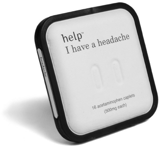
When the Beatles sing, “Help!” it is in full voice with an exclamation point. The makers of Help Remedies took a more soft-spoken approach. The Help home care medication products are designed in low-key white biodegradable packaging with bright colored trim and simple, elegant typography that clearly defines the task at hand: “help, I have a headache” or “help, I've cut myself.” The design has caught the attention of consumers who want simple and effective pain relief from headaches, blisters, and aches and pains. “Too much in the healthcare aisle feels like doctors reading you lists of terrifying warnings,” says company founder Richard Fine. “When you are sick that is the last thing you want: You want a friend to come over and be nice to you.”
Why It Works
Consumers are looking for safe and trusted solutions to address common discomforts. Each Help Remedies product features only one all-natural active ingredient—no additives or coloring—and comes with straightforward directions. Packaging is biodegradable, made of molded paper pulp and a bioplastic. The main idea behind Help Remedies is to make simple health issues simple. In doing so, they have created a visual format that supports the mission of the products they sell. The packaging and the language disdain marketing ...
Get Visual Marketing: 99 Proven Ways for Small Businesses to Market with Images and Design now with the O’Reilly learning platform.
O’Reilly members experience books, live events, courses curated by job role, and more from O’Reilly and nearly 200 top publishers.

