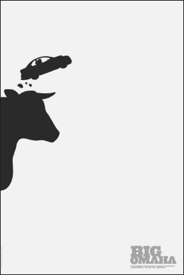
71. The Omaha Cow and Snowboarding: Using an Iconic Symbol Updated with Current Culture to Create an Au Courant Logo
What visual symbol best represents the silicon prairie of Omaha? Drew Davies, Oxide Design creative director and founder, says that after a lot of soul-searching the answer was clear. The cow was the perfect tongue-in-cheek symbol for the city. “Special bonus? Cows are kitschy and kinda funny looking,” adds Davies. The cow indeed became the central image in a campaign to attract creatives, entrepreneurs, and innovators to a weekend conference in Omaha founded by Jeff Slobotski and Dusty Davidson and produced by the Silicon Prairie News.
“The challenge when branding the Big Omaha conference was to pay homage to the history of Omaha, while recognizing its place as a leader in the digital and electronic development,” says Davies.
Why It Works
The identity needed to be uniquely “Omaha,” while conveying the conference's core intent: bringing this key audience to the city. The creative team considered meatpacking, corn, plains, and even football. They spent a lot of time determining what things are uniquely specific to Omaha. With a rich heritage in the beef industry, the cow seemed best suited for the job.
The creative solution combines a shadow image of a very prominent cow (it is “BIG OMAHA” after all) with unexpected extreme sports images like snowboarding, bungee jumping, ...
Get Visual Marketing: 99 Proven Ways for Small Businesses to Market with Images and Design now with the O’Reilly learning platform.
O’Reilly members experience books, live events, courses curated by job role, and more from O’Reilly and nearly 200 top publishers.

