Comparing across Multiple Variables
One of the main challenges when dealing with multiple variables is to determine where to begin. You can look at so many variations and subsets that it can be overwhelming if you don’t stop to think about what data you have. Sometimes, it’s best to look at all the data at once, and interesting points could point you in the next interesting direction.
Getting Warmer
One of the most straightforward ways to visualize a table of data is to show it all at once. Instead of the numbers though, you can use colors to indicate values, as shown in Figure 7-1.
Figure 7-1: Heatmap framework
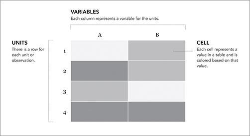
You end up with a grid the same size of the original data table, but you can easily find relatively high and low values based on color. Typically, dark colors mean greater values, and lighter colors represent lower values but that can easily change based on your application.
You also read the heatmap (or heat matrix) the same way you would a table. You can read a row left to right to see the values of all variables for a single unit, or you can see how all the units compare across a single variable.
This layout can still confuse you, especially if you have a large table of data, but with the right color scheme and some sorting, you can make a useful graphic.
Create a Heatmap
It’s easy to make heatmaps in R. There’s a heatmap() function that does all the math work, which ...
Get Visualize This: The FlowingData Guide to Design, Visualization, and Statistics now with the O’Reilly learning platform.
O’Reilly members experience books, live events, courses curated by job role, and more from O’Reilly and nearly 200 top publishers.

