Regions
Mapping points can take you only so far because they represent only single locations. Counties, states, countries, and continents are entire regions with boundaries, and geographic data is usually aggregated in this way. For example, it’s much easier to find health data for a state or a country than it is for individual patients or hospitals. This is usually done for privacy, whereas other times aggregated data is just easier to distribute. In any case, this is usually how you’re going to use your spatial data, so now learn to visualize it.
Color by Data
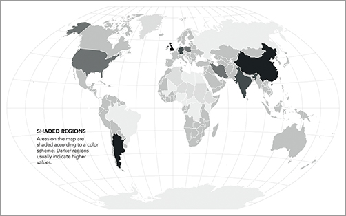
Choropleth maps are the most common way to map regional data. Based on some metric, regions are colored following a color scale that you define, as shown in Figure 8-11. The areas and location are already defined, so your job is to decide the appropriate color scales to use.
Figure 8-11: Choropleth map framework

As touched on in a previous chapter, Cynthia Brewer’s ColorBrewer is a great way to pick your colors, or at least a place to start to design a color palette. If you have continuous data, you might want a similarly continuous color scale that goes from light to dark, but all with the same hue (or multiple similar hues), as shown in Figure 8-12.
A diverging color scheme, as shown in Figure 8-13, might be good if your data has a two-sided quality to it, such as good and bad or above and below a threshold.
Get Visualize This: The FlowingData Guide to Design, Visualization, and Statistics now with the O’Reilly learning platform.
O’Reilly members experience books, live events, courses curated by job role, and more from O’Reilly and nearly 200 top publishers.

