This chapter describes how to create new types of
dialogs, either by customizing Motif dialogs or by creating entirely
new dialogs.
In this chapter we examine methods for creating your
own dialogs. The need for such dialogs exists when those provided by
Motif are too limited in functionality or are not specialized enough
for your application. Sometimes it is not clear when you need to create
your own dialog. In some situations, you may find that a Motif dialog
would be just fine if only they did this one little thing. Fortunately,
you can often make small adjustments to a predefined Motif dialog,
rather than building an entirely new dialog box from scratch.
There are some issues to consider before you decide
how you want to approach the problem of developing custom dialogs. For
example, do you want to use your own widget layout or is the layout of
one of the predefined dialogs sufficient? Do you have specialized
user-interface appearance and functionality needs that go beyond what
is provided by Motif? The answers to these questions affect the design
of your dialogs. The discussion and examples provided in this chapter
address both scenarios. We provide information on how to create dialogs
that are based on the predefined Motif dialogs, as well as how to
design completely new dialogs.
Before we get started, we should mention that
creating your own dialogs makes heavy use of manager widgets, such as
the Form, BulletinBoard, RowColumn, and PanedWindow widgets. While we
use and describe the manager widgets in context, you may want to
consult Chapter 8, Manager Widgets, for specific details about
these widgets.
We begin by discussing the simpler case of modifying
existing Motif dialogs. In Chapter 5, Introduction to Dialogs,
we showed you how to modify a dialog to some extent by changing the
default labels on the buttons in the action area or by unmanaging or
desensitizing certain components in the dialog. What we did not mention
is that you can also add new components to a dialog box to expand its
functionality. All of the predefined Motif dialog widgets let you add
children. In this sense, you can treat a dialog as a manager widget. In
Motif 1.1, you can only add a single work area child to a Motif dialog,
which limits the amount of customization that is possible. Motif 1.2
allows you to add multiple children to an existing dialog, so you can
provide additional controls, action area buttons, and even a MenuBar.
At the end of Chapter 5, Introduction to Dialogs
, we described a scenario where an application might want to have more
than three action area buttons in a MessageDialog. If the user has
selected the Quit button in a text editor but has not saved her
changes, an application might want to post a dialog that asks about
saving the changes before exiting. The user could want to save the
changes and exit, not save the changes and exit anyway, cancel the exit
operation, or get help.
In Motif 1.1, the MessageDialog only supported three
action area buttons, so creating a dialog with four buttons required
designing a custom dialog. However, in Motif 1.2, the MessageDialog
allows you to provide additional action area buttons. the source code
demonstrates how to create a QuestionDialog with four action area
buttons. This example uses functionality that is new in Motif 1.2, so
it only works with the 1.2 version of the Motif toolkit.
   /* question.c -- create a QuestionDialog with four action buttons
    */
   #include <Xm/MessageB.h>
   #include <Xm/PushB.h>

   main(argc, argv)
   int argc;
   char *argv[];
   {
       XtAppContext app;
       Widget toplevel, pb;
       extern void pushed();

       toplevel = XtVaAppInitialize (&app, "Demos", NULL, 0,
           &argc, argv, NULL, NULL);
       pb = XtVaCreateManagedWidget ("Button",
           xmPushButtonWidgetClass, toplevel, NULL);
       XtAddCallback (pb, XmNactivateCallback, pushed, NULL);

       XtRealizeWidget (toplevel);
       XtAppMainLoop (app);
   }

   void
   pushed(w, client_data, call_data)
   Widget w;
   XtPointer client_data;
   XtPointer call_data;
   {
       Widget dialog, no_button;
       extern void dlg_callback();
       Arg args[5];
       int n = 0;
       XmString m = XmStringCreateLocalized
           ("Do you want to update your changes?");
       XmString yes = XmStringCreateLocalized ("Yes");
       XmString no = XmStringCreateLocalized ("No");

       XtSetArg (args[n], XmNautoUnmanage, False); n++;
       XtSetArg (args[n], XmNmessageString, m); n++;
       XtSetArg (args[n], XmNokLabelString, yes); n++;
       dialog = XmCreateQuestionDialog (w, "notice", args, n);
       XtAddCallback (dialog, XmNokCallback, dlg_callback, NULL);
       XtAddCallback (dialog, XmNcancelCallback, dlg_callback, NULL);
       XtAddCallback (dialog, XmNhelpCallback, dlg_callback, NULL);
       XmStringFree (m);
       XmStringFree (yes);

       no_button = XtVaCreateManagedWidget ("no",
           xmPushButtonWidgetClass, dialog,
           XmNlabelString, no,
           NULL);
       XtAddCallback (no_button, XmNactivateCallback, dlg_callback, NULL);

       XtManageChild (dialog);
       XtPopup (XtParent (dialog), XtGrabNone);
   }

   void
   dlg_callback(w, client_data, call_data)
   Widget w;
   XtPointer client_data;
   XtPointer call_data;
   {
       XmAnyCallbackStruct *cbs = (XmAnyCallbackStruct *) call_data;

       switch (cbs->reason) {
           case XmCR_OK :
           case XmCR_CANCEL :
               XtPopdown (XtParent (w));
               break;
           case XmCR_ACTIVATE :
               XtPopdown (XtParent (XtParent (w)));
               break;
           case XmCR_HELP :
               puts ("Help selected");
       }
   }
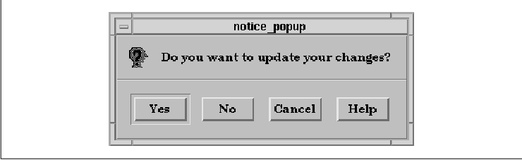
The dialog box from the program is shown in the figure.
The extra button is added to the dialog by creating
a PushButton as a child of the dialog. We are treating the
MessageDialog just like any other manager widget. The MessageDialog
inserts any additional PushButton children into the action area after
the OK button, which is why we added a No button. If you
add more than one button, they are all put after the OK button,
in the order that you create them. We have also changed the label of
the OK button so that it is now the Yes button.
Since the No button is not part of the
standard MessageDialog, we have to set the callback routine on its
XmNactivateCallback. For the rest of the buttons, we use the
callbacks defined by the dialog. The dialog callback routine,
dlg_callback(), has to handle the various callbacks in different
ways. By checking the reason field of the callback structure,
the routine can determine which button was selected. For the Yes
and Cancel buttons, the routine unposts the dialog by popping
down the DialogShell parent of the dialog. For the No button, we
need to be a bit more careful about popping down the right widget.
Since the widget in this case is the PushButton, we need to
call XtParent() twice to get the DialogShell.
With Motif 1.2, the MessageDialog also supports the
addition of other children besides PushButtons. If you add a MenuBar
child, it is placed across the top of the dialog, although it is not
clear why you would want a MenuBar in a MessageDialog. Any other type
of widget child is considered the work area. The work area is placed
below the message text if it exists. If there is a symbol, but no
message, the work area is placed to the right of the symbol. The
MessageDialog only supports the addition of one work area; the layout
of multiple work area children is undefined. In Motif 1.1, only a
single work area child can be added to a MessageDialog. This child is
always placed below the message text.
The XmNdialogType resource can take the
value XmDIALOG_TEMPLATE in Motif 1.2. This value creates a
TemplateDialog, which is basically an empty MessageDialog that can be
modified by the programmer. By default, the dialog only contains a
Separator child. By setting various resources on a TemplateDialog when
it is created, you can cause the dialog to create other standard
children. If you set a string or callback resource for an action area
button, the button is created. If you set the XmNmessageString
resource, the message is displayed in the standard location. If you set
the XmNsymbolPixmap resource, the specified symbol appears in
its normal location. If you don't set a particular resource, then that
child is not created, which means that you cannot modify the resource
later with XtSetValues(), set a callback for the child with
XtAddCallback(), or retrieve the child with
XmMessageBoxGetChild().
The Motif SelectionDialog supports the same types of
modifications as the MessageDialog. With Motif 1.2, you can provide
additional action area buttons, a work area child, and a MenuBar.
Unlike the MessageDialog, the first widget that is added is taken as
the work area, regardless of whether it is a PushButton or a MenuBar.
The fact that the first child is always considered the work area is a
bug. As a result of the bug, you need to be careful about the order in
which you add children to a SelectionDialog. If you want to add a
PushButton to the action area of a SelectionDialog, you need to add an
unmanaged work area widget first, so that the PushButton is placed in
the action area, rather than used as the work area. After you add a
work area, if you add a MenuBar, it is placed along the top of the
dialog, and PushButton children are inserted after the OK
button. The position of the work area child is controlled by the
XmNchildPlacement resource, which can take the following values:
   XmPLACE_ABOVE_SELECTION
   XmPLACE_BELOW_SELECTION
   XmPLACE_TOP
The SelectionDialog only supports the addition of one work area; the layout of multiple work area children is undefined. In Motif 1.1, only a single work area child can be added to a SelectionDialog. This child is always placed between the list and the text entry area.
Consider providing additional controls in a
PromptDialog like the one used in the program prompt_dlg from
Chapter 6, Selection Dialogs. In this program, the dialog
prompts the user for a new label for the PushButton that activated the
dialog. By adding another widget to the dialog, we can expand its
functionality to prompt for either a label name or a button color. The
user enters either value in the same text input area and the RadioBox
controls how the text is evaluated. the source code shows the new
program. XtSetLanguageProc() is only available in X11R5; there
is no corresponding function in X11R4. XmStringCreateLocalized()
is only available in Motif 1.2; XmStringCreateSimple() is the
corresponding function in Motif 1.1. XmFONTLIST_DEFAULT_TAG
replaces XmSTRING_DEFAULT_CHARSET in Motif 1.2.
   /* modify_btn.c -- demonstrate how a default Motif dialog can be
    * modified to support additional items that extend the usability
    * of the dialog itself.  This is a modification of the prompt_dlg.c
    * program.
    */
   #include <Xm/SelectioB.h>
   #include <Xm/RowColumn.h>
   #include <Xm/PushB.h>

   main(argc, argv)
   char *argv[];
   {
       XtAppContext app;
       Widget toplevel, rc, button;
       void pushed();

       XtSetLanguageProc (NULL, NULL, NULL);

       /* Initialize toolkit and create toplevel shell */
       toplevel = XtVaAppInitialize (&app, "Demos", NULL, 0,
           &argc, argv, NULL, NULL);

       /* RowColumn managed both PushButtons */
       rc = XtVaCreateWidget ("rowcol", xmRowColumnWidgetClass, toplevel,
           NULL);
       /* Create two pushbuttons -- both have the same callback */
       button = XtVaCreateManagedWidget ("PushMe 1",
           xmPushButtonWidgetClass, rc, NULL);
       XtAddCallback (button, XmNactivateCallback, pushed, NULL);
       button = XtVaCreateManagedWidget ("PushMe 2",
           xmPushButtonWidgetClass, rc, NULL);
       XtAddCallback (button, XmNactivateCallback, pushed, NULL);

       XtManageChild (rc);
       XtRealizeWidget (toplevel);
       XtAppMainLoop (app);
   }

   /* pushed() --the callback routine for the main app's pushbuttons.
    * Create a dialog that prompts for a new button name or color.
    * A RadioBox is attached to the dialog.  Which button is selected
    * in this box is held as an int (0 or 1) in the XmNuserData resource
    * of the dialog itself.  This value is changed when selecting either
    * of the buttons in the ToggleBox and is queried in the dialog's
    * XmNokCallback function.
    */
   void
   pushed(pb, client_data, call_data)
   Widget pb;
   XtPointer client_data;
   XtPointer call_data;
   {
       Widget dialog, toggle_box;
       XmString t, btn1, btn2;
       extern void read_name(), toggle_callback();
       Arg args[5];
       int n = 0;

       /* Create the dialog -- the PushButton acts as the DialogShell's
        * parent (not the parent of the PromptDialog).  The "userData"
        * is used to store the value
        */
       t = XmStringCreateLocalized ("Enter New Button Name:");
       XtSetArg (args[n], XmNselectionLabelString, t); n++;
       XtSetArg (args[n], XmNautoUnmanage, False); n++;
       XtSetArg (args[n], XmNuserData, 0); n++;
       dialog = XmCreatePromptDialog (pb, "notice_popup", args, n);
       XmStringFree (t); /* always destroy compound strings when done */

       /* When the user types the name, call read_name() ... */
       XtAddCallback (dialog, XmNokCallback, read_name, pb);

       /* If the user selects cancel, just destroy the dialog */
       XtAddCallback (dialog, XmNcancelCallback, XtDestroyWidget, NULL);

       /* No help is available... */
       XtUnmanageChild (XmSelectionBoxGetChild (dialog, XmDIALOG_HELP_BUTTON));

       /* Create a toggle box -- callback routine is toggle_callback() */
       btn1 = XmStringCreateLocalized ("Change Name");
       btn2 = XmStringCreateLocalized ("Change Color");
       toggle_box = XmVaCreateSimpleRadioBox (dialog,
           "radio_box", 0 /* inital value */, toggle_callback,
           XmVaRADIOBUTTON, btn1, 0, NULL, NULL,
           XmVaRADIOBUTTON, btn2, 0, NULL, NULL,
           NULL);
       XtManageChild (toggle_box);

       XtManageChild (dialog);
       XtPopup (XtParent (dialog), XtGrabNone);
   }

   /* callback for the items in the toggle box -- the "client data" is
    * the item number selected.  Since the function gets called whenever
    * either of the buttons changes from true to false or back again,
    * it will always be called in pairs -- ignore the "False" settings.
    * When cbs->set is true, set the dialog's label string accordingly.
    */
   void
   toggle_callback(toggle_box, client_data, call_data)
   Widget toggle_box;
   XtPointer client_data;
   XtPointer call_data;
   {
       Widget dialog = XtParent(XtParent(toggle_box));
       XmString str;
       int n = (int) client_data;
       XmToggleButtonCallbackStruct *cbs =
           (XmToggleButtonCallbackStruct *) call_data;

       if (cbs->set == False)
           return; /* wait for the one that toggles "on" */
       if (n == 0)
           str = XmStringCreateLocalized ("Enter New Button Name:");
       else
           str = XmStringCreateLocalized ("Enter Text Color:");
       XtVaSetValues (dialog,
           XmNselectionLabelString, str,
           XmNuserData, n, /* reset the user data to reflect new value */
           NULL);
       XmStringFree (str);
   }

   /* read_name() --the text field has been filled in.  Get the userData
    * from the dialog widget and set the PushButton's name or color.
    */
   void
   read_name(dialog, client_data, call_data)
   Widget dialog;
   XtPointer client_data;
   XtPointer call_data;
   {
       char *text;
       int n;
       Widget push_button = (Widget) client_data;
       XmSelectionBoxCallbackStruct *cbs =
           (XmSelectionBoxCallbackStruct *) call_data;

       /* userData: n == 0 -> Button Label, n == 1 -> Button Color */
       XtVaGetValues (dialog, XmNuserData, &n, NULL);

       if (n == 0)
           XtVaSetValues (push_button, XmNlabelString, cbs->value, NULL);
       else {
           /* convert compound string into regular text string */
           XmStringGetLtoR (cbs->value, XmFONTLIST_DEFAULT_TAG, &text);
           XtVaSetValues (push_button,
               XtVaTypedArg, XmNforeground,
                   XmRString, text, strlen (text) + 1,
               NULL);
           XtFree (text); /* must free text gotten from XmStringGetLtoR() */
       }
   }
The new dialog is shown in the figure.
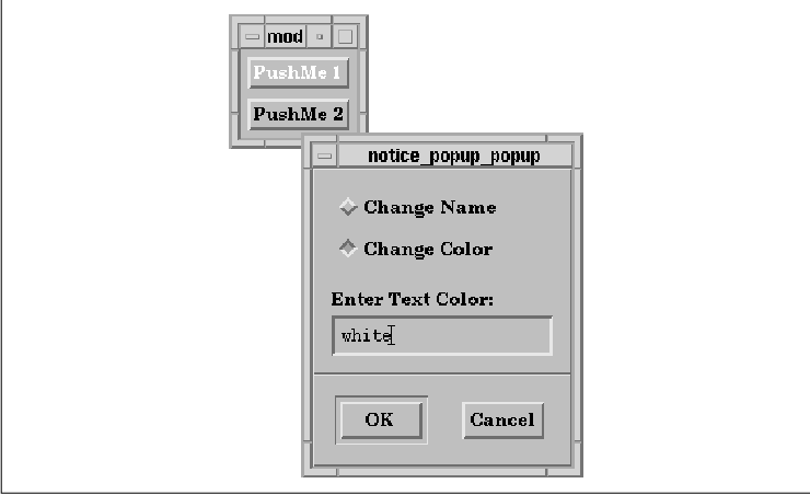
We add a RadioBox as the work area child of the
PromptDialog. The ToggleButtons in the RadioBox indicate whether the
input text is supposed to change the label of the PushButton or its
text color. To determine which of these attributes to change, we use
the callback routine toggle_callback().
Rather than storing the state of the RadioBox in a
global variable, we store the value in the XmNuserData
resource of the dialog widget. Using this technique, we can retrieve
the value anytime we wish and minimize the number of global variables
in the program. The XmNuserData resource is available for all
Motif widgets except shells, so it is a convenient storage area for
arbitrary values. The type of value that XmNuserData takes is
any type whose size is less than or equal to the size of an
XtPointer, which is typically defined as a char pointer.
As a result, storing an int works just fine. If you want to
store a data structure in this resource, you need to store a pointer
to the structure. The size or type of the structure is irrelevant,
since pointers are the same size. You might run into problems with
unusual architectures where pointers of different types are not the
same size, like DOS.
When the user enters new text and presses RETURN or
activates the OK button, read_name() is called. This
callback routine gets the XmNuserData from the dialog widget.
If the value is 0, the label of the PushButton is reset using
the XmNlabelString resource. Since the callback routine
provides the text in compound string format, it is already in the
correct format for the label. If the XmNuserData is 1
, then the text describes a color name for the PushButton.
Rather than converting the string into a color
explicitly, we use the XtVaTypedArg feature of
XtVaSetValues() to do the conversion for us. This feature converts
a value to the format needed by the specified resource. The
XmNforeground resource takes a variable of type Pixel as a
value. The conversion works provided there is an underlying conversion
function to support it. For more information on conversion functions,
how to write them, or how to install your own, see Volume Four, X
Toolkit Intrinsics Programming Manual. Motif does not supply a
conversion function to change a compound string into a Pixel
value, but there is one for converting a C string into a Pixel
. We convert the compound string into a C string using
XmStringGetLtoR() and then set the foreground color as follows:
   XtVaSetValues (push_button,
       XtVaTypedArg, XmNforeground,
           XmRString, text, strlen (text) + 1,
       NULL);
The amount of customization that is possible with
the predefined Motif dialogs varies greatly between Motif 1.1 and Motif
1.2. We've described the possibilities for both MessageDialogs and
SelectionDialogs using the two versions of the toolkit. If the layouts
that are possible do not meet your needs, you should consider building
your own dialogs from scratch.
In this section, we introduce the methods for
building a dialog entirely from scratch. To create a new dialog, you
need to follow basically the same steps that are used by the Motif
convenience routines, which we described in Section #sdlgconv. We've
modified the list a bit to reflect the flexibility that you have in
controlling the kind of dialog that you make. Here are the steps that
you need to follow:
In Chapter 4, The Main Window, we
demonstrated the purpose of a main window in an application and the
kinds of widgets that you use in a top-level window. Dialog boxes, as
introduced in Chapter 5, Introduction to Dialogs, are thought of
as transient windows that act as satellites to a top-level shell. A
transient dialog should use a DialogShell widget. However, not all
dialogs are transient. A dialog may act as a secondary application
window that remains on display for an extended period of time. This
usage is especially common in large applications. The MainWindow widget
can even be used in a dialog box. For dialogs of this type, you may
want to use a TopLevelShell or an ApplicationShell.
Choosing the appropriate shell widget for a dialog
depends on the activities carried out in the dialog, so it is difficult
to provide rules or even heuristics to guide you in your choice. As
discussed in Chapter 5, a DialogShell cannot be iconified, it is always
placed on top of the shell widget that owns the parent of the dialog,
and it is always destroyed or withdrawn from the screen if its parent
is destroyed or withdrawn. These three characteristics may influence
your decision to use a DialogShell. An ApplicationShell or a
TopLevelShell, on the other hand, is always independent of other
windows, so you can change its stacking order, iconify it separately,
and not worry about it being withdrawn because of another widget. The
main difference between an ApplicationShell and a TopLevelShell is that
an ApplicationShell is designed to start a completely new widget tree,
as if it were a completely separate application. It is recommended that
an application only have one ApplicationShell.
For some applications, you may want a shell with
characteristics of several of the available shell classes.
Unfortunately, it is difficult to intermix the capabilities of a
DialogShell with those of an ApplicationShell or a TopLevelShell
because it involves doing quite a bit of intricate window manager
interaction. Having ultimate control over the activities of a shell
widget requires setting up a number of event handlers on the shell and
monitoring certain window property event state changes. Aside from
being very complicated, you run the risk of breaking Motif compliance.
See Chapter 16, Interacting With the Window Manager, for details
on how you might handle this situation.
Once you have chosen the shell widget that you want
to use, you need to decide how to create it. A DialogShell can be
created using XtCreatePopupShell(), XtVaCreatePopupShell()
, or the Motif convenience routine, XmCreateDialogShell(). An
ApplicationShell or a TopLevelShell can be created using either of the
popup shell routines, XtAppCreateShell() or
XtVaAppCreateShell(). The difference between the two types of
routines involves whether the newly-created shell is treated like a
popup shell or as a more permanent window on the desktop. If you create
the shell as a popup shell, you need to select an adequate parent. The
parent for a popup shell must be an initialized and realized widget. It
can be any kind of widget, but it may not be a gadget because the
parent must have a window. A dialog that uses a popup shell inherits
certain attributes from its parent. For example, if the parent is
insensitive (XmNsensitive is set to False), the
entire dialog is insensitive as well.
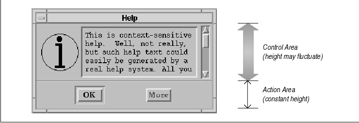
The manager widget that you choose for a dialog is the only managed child of the shell widget, which means that the widget must contain both the control area and the action area of the dialog and manage the relationship between them. Recall that the Motif Style Guide suggests that a dialog be composed of two main areas: the control area and the action area. Both of these areas extend to the left and right sides of a dialog and are stacked vertically, with the control area on the top. The action area usually does not fluctuate in size as the shell is resized, while the control area may be resized in any way. the figure illustrates the general layout of a dialog.
Motif dialog widgets handle this layout
automatically. When you create your own dialog, you are responsible for
managing the layout. We recommend using the PanedWindow widget as the
manager widget for a dialog. The PanedWindow supports vertically
stacked windows, each of which may or may not be resizable, which
allows you to create the suggested layout. If you use a PanedWindow as
the manager widget for a dialog, it can manage two other managers that
act as the control and action areas. The control area can be resizable,
while the action area is not. The PanedWindow also provides a separator
between the panes, which fulfills the Style Guide recommendation
that there be a Separator widget between the control and action areas.
Of course you can use whatever manager widget you
like for a dialog. If you use a BulletinBoard or a Form widget, you may
be able to take advantage of the special interaction these widgets have
with a DialogShell. The RowColumn widget can also lay out its children
vertically, so you could use one to manage the control and action areas
of a dialog. The difficulty with using a RowColumn involves resizing,
in that there is no way to tell the widget to keep the bottom partition
a constant height while allowing the top to fluctuate as necessary. The
same problem can also arise with other manager widgets, so you need to
be sure that the resizing behavior is appropriate.
The control area of a dialog box contains the
widgets that provide the functionality of the dialog, such as Labels,
ToggleButtons, and List widgets. Creating the control area of a dialog
is entirely application-defined. You can use any of the Motif primitive
and manager widgets in the control area to implement the functionality
of the dialog. The ability to design your own control area is the main
reason to create your own dialog as opposed to using one of the
predefined Motif dialogs.
The action area of a dialog contains PushButtons whose callback routines actually perform the action of the dialog box. Constructing the action area for a dialog involves specifying labels and callback routines for the buttons and determining the best way to get information from the control area of the dialog. The Motif Style Guide defines a number of common dialog box actions. The common actions are designed to provide consistency betweeen different Motif applications. You are not required to use the common actions, but you should consider them before creating your own arbitrary actions. The button labels and their corresponding actions are shown in the following list.
The following heuristics can help in designing the
action area for a dialog box:
In this dialog, the Help button is the only
one with a label recommended by Motif. Since the other common actions
did not effectively represent the actions of the dialog, we chose our
own labels. We decided not to use the Cancel action because we
didn't want to combine the actions of Reset and Close in
one button. Instead, we separated the functionality into two actions.
The Clear button resets the controls without closing the window
and the Done button closes the window. While Cancel, the
recommended Motif label, implies that the action specified by the
dialog should not be taken, Done merely suggests that the dialog
be dismissed. Selecting Done does not cancel anything, it just
dismisses the dialog. Close might be more appropriate, but since
the dialog is part of an electronic mail application where the term
"close" is used to describe the action of closing a folder, we are not
using that label to avoid ambiguity.
We do not use the OK action in the dialog
because it doesn't work with the desired usage of the dialog. Let's say
the user selects a date to search for messages and then presses the
OK button to start the search. By definition, OK should
perform the action and dismiss the dialog. If that were to happen here,
the user would never see the results of the search. While Apply
might be more appropriate for our desired action, we decided to use
Search instead because it is more descriptive of the action being
taken by the dialog.
Now that we've explained the design process for a
dialog, let's create a real dialog and identify each of the steps in
the process. Consider the problem of providing help. While the Motif
InformationDialog is adequate for brief help messages, a customized
dialog may be more appropriate for displaying large amounts of text.
Our custom dialog displays the text in a scrolling region which is
capable of handling arbitrarily large amounts of data.
the source code shows a program that uses a main
application window as a generic backdrop. The MainWindow widget
contains a MenuBar that has two menus: File and Help. The
Help menu contains several items that, when selected, pop up a
dialog window that displays the associated help text. The text that we
provide happens to be predefined in the program, but you could
incorporate information from other sources, such as a database or an
external file. XtSetLanguageProc() is only available in X11R5;
there is no corresponding function in X11R4.
XmStringCreateLocalized() is only available in Motif 1.2;
XmStringCreateSimple() is the corresponding function in Motif 1.1.
XmFONTLIST_DEFAULT_TAG replaces XmSTRING_DEFAULT_CHARSET
in Motif 1.2.
   /* help_text.c:
    * Create a simple main window that contains a sample (dummy) work
    * area and a menubar.  The menubar contains two items: File and Help.
    * The items in the Help pulldown call help_cb(), which pops up a
    * home-made dialog that displays predefined help texts.  The purpose
    * of this program is to demonstrate how one might approach the
    * problem displaying a large amount of text in a dialog box.
    */
   #include <stdio.h>
   #include <ctype.h>
   #include <Xm/DialogS.h>
   #include <Xm/MainW.h>
   #include <Xm/RowColumn.h>
   #include <Xm/Form.h>
   #include <Xm/Text.h>
   #include <Xm/PushBG.h>
   #include <Xm/LabelG.h>
   #include <Xm/PanedW.h>

   /* The following help text information is a continuous stream of characters
    * that will all be placed in a single ScrolledText object.  If a specific
    * newline is desired, you must do that yourself.  See "index_help" below.
    */
   String context_help[] = {
       "This is context-sensitive help.  Well, not really, but such",
       "help text could easily be generated by a real help system.",
       "All you really need to do is obtain information from the user",
       "about the widget from which he needs help, or perhaps prompt",
       "for other application-specific contexts.",
       NULL
   };

   String window_help[] = {
       "Each of the windows in your application should have an",
       "XmNhelpCallback associated with it so you can monitor when",
       "the user presses the Help key over any particular widget.",
       "This is another way to provide context-sensitive help.",
       "The MenuBar should always have a Help entry at the far right",
       "that provides help for most aspects of the program, including",
       "the user interface.  By providing different levels of help",
       "indexing, you can provide multiple stages of help, making the",
       "entire help system easier to use.",
       NULL
   };

   String index_help[] = {
       "This is a small demonstration program, so there is very little",
       "material to provide an index.  However, an index should contain",
       "a summary of the type of help available.  For example, we have:0,
       "    Help On Context0,
       "    Help On Windows0,
       "    This Index0,
       "0,
       "Higher-end applications might also provide a tutorial.",
       NULL
   };

   String *help_texts[] = {
       context_help,
       window_help,
       index_help
   };

   main(argc, argv)
   int argc;
   char *argv[];
   {
       XtAppContext app;
       Widget toplevel, rc, main_w, menubar, w;
       extern void help_cb(), file_cb();
       XmString str1, str2, str3;
       Widget *cascade_btns;
       int num_btns;

       XtSetLanguageProc (NULL, NULL, NULL);

       toplevel = XtVaAppInitialize (&app, "Demos", NULL, 0,
           &argc, argv, NULL, NULL);

       /* the main window contains the work area and the menubar */
       main_w = XtVaCreateWidget ("main_w",
           xmMainWindowWidgetClass, toplevel, NULL);

       /* Create a simple MenuBar that contains two cascade buttons */
       str1 = XmStringCreateLocalized ("File");
       str2 = XmStringCreateLocalized ("Help");
       menubar = XmVaCreateSimpleMenuBar (main_w, "main_w",
           XmVaCASCADEBUTTON, str1, 'F',
           XmVaCASCADEBUTTON, str2, 'H',
           NULL);
       XmStringFree (str1);
       XmStringFree (str2);

       /* create the "File" pulldown menu -- callback is file_cb() */
       str1 = XmStringCreateLocalized ("New");
       str2 = XmStringCreateLocalized ("Open");
       str3 = XmStringCreateLocalized ("Quit");
       XmVaCreateSimplePulldownMenu (menubar, "file_menu", 0, file_cb,
           XmVaPUSHBUTTON, str1, 'N', NULL, NULL,
           XmVaPUSHBUTTON, str2, 'O', NULL, NULL,
           XmVaSEPARATOR,
           XmVaPUSHBUTTON, str3, 'Q', NULL, NULL,
           NULL);
       XmStringFree (str1);
       XmStringFree (str2);
       XmStringFree (str3);

       /* create the "Help" menu -- callback is help_cb() */
       str1 = XmStringCreateLocalized ("On Context");
       str2 = XmStringCreateLocalized ("On Window");
       str3 = XmStringCreateLocalized ("Index");
       w = XmVaCreateSimplePulldownMenu (menubar, "help_menu", 1, help_cb,
           XmVaPUSHBUTTON, str1, 'C', NULL, NULL,
           XmVaPUSHBUTTON, str2, 'W', NULL, NULL,
           XmVaPUSHBUTTON, str3, 'I', NULL, NULL,
           NULL);
       XmStringFree (str1);
       XmStringFree (str2);
       XmStringFree (str3);

       /* Identify the Help Menu for the MenuBar */
       XtVaGetValues (menubar,
           XmNchildren,      &cascade_btns,
           XmNnumChildren,   &num_btns,
           NULL);
       XtVaSetValues (menubar,
           XmNmenuHelpWidget, cascade_btns[num_btns-1],
           NULL);
       XtManageChild (menubar);

       /* the work area for the main window -- just create dummy stuff */
       rc = XtVaCreateWidget ("rc", xmRowColumnWidgetClass, main_w, NULL);
       str1 = XmStringCreateLtoR ("0  This is an Empty0ample Control Area0 ",
           XmFONTLIST_DEFAULT_TAG);
       XtVaCreateManagedWidget ("label", xmLabelGadgetClass, rc,
           XmNlabelString,  str1,
           NULL);
       XmStringFree (str1);
       XtManageChild (rc);
       XtManageChild (main_w);

       XtRealizeWidget (toplevel);
       XtAppMainLoop (app);
   }

   /* callback for all the entries in the File pulldown menu. */
   void
   file_cb(w, client_data, call_data)
   Widget w;
   XtPointer client_data;
   XtPointer call_data;
   {
       int item_no = (int) client_data;

       if (item_no == 2) /* the Quit menu button */
           exit (0);
       printf ("Item %d (%s) selected0, item_no + 1, XtName (w));
   }

   /* climb widget tree until we get to the top.  Return the Shell */
   Widget
   GetTopShell(w)
   Widget w;
   {
       while (w && !XtIsWMShell (w))
           w = XtParent (w);
       return w;
   }

   #include "info.xbm"  /* bitmap data used by our dialog */

   /* callback for all the entries in the Help pulldown menu.
    * Create a dialog box that contains control and action areas.
    */
   void
   help_cb(w, client_data, call_data)
   Widget w;
   XtPointer client_data;
   XtPointer call_data;
   {
       Widget help_dialog, pane, text_w, form, sep, widget, label;
       extern void DestroyShell();
       Pixmap pixmap;
       Pixel fg, bg;
       Arg args[10];
       int n = 0;
       int i;
       char *p, buf[BUFSIZ];
       int item_no = (int) client_data;
       Dimension h;

       /* Set up a DialogShell as a popup window.  Set the delete
        * window protocol response to XmDESTROY to make sure that
        * the window goes away appropriately.  Otherwise, it's XmUNMAP
        * which means it'd be lost forever, since we're not storing
        * the widget globally or statically to this function.
        */
       help_dialog = XtVaCreatePopupShell ("Help",
           xmDialogShellWidgetClass, GetTopShell (w),
           XmNdeleteResponse, XmDESTROY,
           NULL);

       /* Create a PanedWindow to manage the stuff in this dialog. */
       pane = XtVaCreateWidget ("pane", xmPanedWindowWidgetClass, help_dialog,
           XmNsashWidth,  1, /* PanedWindow won't let us set these to 0! */
           XmNsashHeight, 1, /* Make small so user doesn't try to resize */
           NULL);

       /* Create a RowColumn in the form for Label and Text widgets.
        * This is the control area.
        */
       form = XtVaCreateWidget ("form1", xmFormWidgetClass, pane, NULL);
       XtVaGetValues (form,  /* once created, we can get its colors */
           XmNforeground, &fg,
           XmNbackground, &bg,
           NULL);

       /* create the pixmap of the appropriate depth using the colors
        * that will be used by the parent (form).
        */
       pixmap = XCreatePixmapFromBitmapData (XtDisplay (form),
           RootWindowOfScreen (XtScreen (form)),
           info_bits, info_width, info_height,
           fg, bg, DefaultDepthOfScreen (XtScreen (form)));

       /* Create a label gadget using this pixmap */
       label = XtVaCreateManagedWidget ("label", xmLabelGadgetClass, form,
           XmNlabelType,        XmPIXMAP,
           XmNlabelPixmap,      pixmap,
           XmNleftAttachment,   XmATTACH_FORM,
           XmNtopAttachment,    XmATTACH_FORM,
           XmNbottomAttachment, XmATTACH_FORM,
           NULL);

       /* prepare the text for display in the ScrolledText object
        * we are about to create.
        */
       for (p = buf, i = 0; help_texts[item_no][i]; i++) {
           p += strlen (strcpy (p, help_texts[item_no][i]));
           if (!isspace (p[-1])) /* spaces, tabs and newlines are spaces.. */
               *p++ = ' '; /* lines are concatenated together, insert a space */
       }
       *--p = 0; /* get rid of trailing space... */

       XtSetArg (args[n], XmNscrollVertical,        True); n++;
       XtSetArg (args[n], XmNscrollHorizontal,      False); n++;
       XtSetArg (args[n], XmNeditMode,              XmMULTI_LINE_EDIT); n++;
       XtSetArg (args[n], XmNeditable,              False); n++;
       XtSetArg (args[n], XmNcursorPositionVisible, False); n++;
       XtSetArg (args[n], XmNwordWrap,              True); n++;
       XtSetArg (args[n], XmNvalue,                 buf); n++;
       XtSetArg (args[n], XmNrows,                  5); n++;
       text_w = XmCreateScrolledText(form, "help_text", args, n);
       /* Attachment values must be set on the Text widget's PARENT,
        * the ScrolledWindow. This is the object that is positioned.
        */
       XtVaSetValues (XtParent (text_w),
           XmNleftAttachment,   XmATTACH_WIDGET,
           XmNleftWidget,       label,
           XmNtopAttachment,    XmATTACH_FORM,
           XmNrightAttachment,  XmATTACH_FORM,
           XmNbottomAttachment, XmATTACH_FORM,
           NULL);
       XtManageChild (text_w);
       XtManageChild (form);

       /* Create another form to act as the action area for the dialog */
       form = XtVaCreateWidget ("form2", xmFormWidgetClass, pane,
           XmNfractionBase,    5,
           NULL);

       /* The OK button is under the pane's separator and is
        * attached to the left edge of the form.  It spreads from
        * position 0 to 1 along the bottom (the form is split into
        * 5 separate grids via XmNfractionBase upon creation).
        */
       widget = XtVaCreateManagedWidget ("OK",
           xmPushButtonGadgetClass, form,
           XmNtopAttachment,        XmATTACH_FORM,
           XmNbottomAttachment,     XmATTACH_FORM,
           XmNleftAttachment,       XmATTACH_POSITION,
           XmNleftPosition,         1,
           XmNrightAttachment,      XmATTACH_POSITION,
           XmNrightPosition,        2,
           XmNshowAsDefault,        True,
           XmNdefaultButtonShadowThickness, 1,
           NULL);
       XtAddCallback (widget, XmNactivateCallback, DestroyShell, help_dialog);

       /* This is created with its XmNsensitive resource set to False
        * because we don't support "more" help.  However, this is the
        * place to attach it to if there were any more.
        */
       widget = XtVaCreateManagedWidget ("More",
           xmPushButtonGadgetClass, form,
           XmNsensitive,            False,
           XmNtopAttachment,        XmATTACH_FORM,
           XmNbottomAttachment,     XmATTACH_FORM,
           XmNleftAttachment,       XmATTACH_POSITION,
           XmNleftPosition,         3,
           XmNrightAttachment,      XmATTACH_POSITION,
           XmNrightPosition,        4,
           XmNshowAsDefault,        False,
           XmNdefaultButtonShadowThickness, 1,
           NULL);

       /* Fix the action area pane to its current height -- never let it resize */
       XtManageChild (form);

       XtVaGetValues (widget, XmNheight, &h, NULL);
       XtVaSetValues (form, XmNpaneMaximum, h, XmNpaneMinimum, h, NULL);

       XtManageChild (pane);

       XtPopup (help_dialog, XtGrabNone);
   }

   /* The callback function for the "OK" button.  Since this is not a
    * predefined Motif dialog, the "widget" parameter is not the dialog
    * itself.  That is only done by Motif dialog callbacks.  Here in the
    * real world, the callback routine is called directly by the widget
    * that was invoked.  Thus, we must pass the dialog as the client
    * data to get its handle.  (We could get it using GetTopShell(),
    * but this way is quicker, since it's immediately available.)
    */
   void
   DestroyShell(widget, client_data, call_data)
   Widget widget;
   XtPointer client_data;
   XtPointer call_data;
   {
       Widget shell = (Widget) client_data;

       XtDestroyWidget(shell);
   }
The output of the program is shown in the figure.
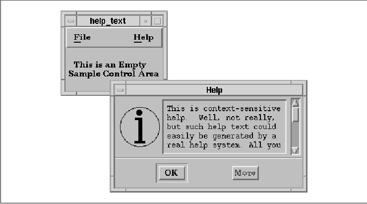
The function help_cb() is the callback
routine that is invoked by all of the Help menu items. This
routine follows the steps that we outlined earlier to create the dialog
box.
Since the dialog is a transient dialog, we use a
DialogShell widget for the shell. We create the shell as follows:
   help_dialog = XtVaCreatePopupShell ("Help",
       xmDialogShellWidgetClass, GetTopShell (w),
       XmNdeleteResponse, XmDESTROY,
       NULL);
Instead of using XtVaCreatePopupShell(), we
could have used a Motif convenience routine as shown in the following
code fragment:
   n = 0;
   XtSetArg (args[n], XmNdeleteResponse, XmDESTROY); n++;
   help_dialog = XmCreateDialogShell (GetTopShell (w), "Help", args, n);
Both methods return a DialogShell. The XmNdeleteResponse resource is set to XmDESTROY because we want the Close item from the window menu in the window manager's titlebar for the shell to destroy the shell and its children. The default value for this resource is XmUNMAP; had we wanted to reuse the same dialog upon each invocation, we would have used XmUNMAP and retained a handle to the dialog widget.
The name of the dialog is Help, since that is
the first parameter in the call to XtVaCreatePopupShell().
Resource specifications in a resource file that pertain to this dialog
should use Help as the widget name, as shown below:
*Help*foreground: greenThe string displayed in the title bar of a dialog defaults to the name of the dialog. Since the name of the dialog is Help, the title defaults to the same value. However, this method of setting the title does not prevent the value from being changed by the user in a resource file. For example, the following specification changes the title:
*Help.title: Help DialogThe title can also be set using the XmNtitle resource, as shown in the following code fragment: XmNtitle is defined identically to XtNtitle, which is an Xt resource, which means that the value is a regular character string, not a compound string.
   help_dialog = XtVaCreatePopupShell ("Help",
       xmDialogShellWidgetClass, parent,
       XmNtitle,   "Help Dialog",
       NULL);
When the title is hard-coded in the application, any resource
specifications in a resource file are ignored.
The next task is to create a manager widget that
acts as the sole child of the DialogShell, since shell widgets can have
only one managed child. This section deals heavily with manager widget
issues, so if you have problems keeping up, you should look ahead to
Chapter 8, Manager Widgets. However, the main point of the
section is to provide enough context for you to understand the source
code We are using a PanedWindow widget as the child of the DialogShell,
as per our earlier recommendations. The PanedWindow is created as
follows:
   pane = XtVaCreateWidget ("pane",
       xmPanedWindowWidgetClass, help_dialog,
       XmNsashWidth,  1,
       XmNsashHeight, 1,
       NULL);
The PanedWindow manages two Form widget children, one each for the
control area and the action area. These children are also called the
PanedWindow's panes. Normally, in a PanedWindow, the user can resize
the panes by moving the control sashes that are placed between the
panes. Because the action area is not supposed to grow or shrink in
size, we don't want to allow the user to adjust the sizes of the panes.
There are really two issues involved here: the user might try to resize
the panes individually or she might resize the entire dialog, which
would cause the PanedWindow itself to resize them.
You can prevent the PanedWindow from resizing the
action area when it is itself resized by setting the pane's
XmNskipAdjust resource to True. However, this technique
still allows the user to resize the individual panes, which means that
you need to disable the control sashes. The best way to prevent both
undesirable resize possibilities is to set the action area pane's
maximum and minimum allowed heights to the same value. These settings
should cause the PanedWindow to disable the sashes for that particular
pane, but due to a bug in the PanedWindow widget class, the sashes are
rarely disabled. To compensate, we try to make the sashes invisible by
setting their sizes to a minimum value. Unfortunately, the PanedWindow
won't let you set the size of a sash to 0 (a design error), so
we set the values for XmNsashWidth and XmNsashHeight
to 1. The only other problem that might arise is that keyboard
traversal still allows the user to reach the sashes, so you may want to
remove them from the traversal list by setting their XmNtraversalOn
resources to False. This issue is described in detail in
Chapter 8, Manager Widgets.
The PanedWindow widget is created unmanaged using
XtVaCreateWidget(). As pointed out in Chapter 8, Manager Widgets
, manager widgets should not be managed until all of their children have
been created and managed. Using this order allows the children's
desired sizes and positions to be specified before the manager widget
tries to negotiate other sizes and positions.
The Form widget is the control area, so it is
created as a child of the PanedWindow, as shown in the following
fragment:
form = XtVaCreateWidget ("form1", xmFormWidgetClass, pane, NULL);
As far as the PanedWindow is concerned, the Form widget is a single
child whose width is stretched to the left and right edges of the
shell. Within the Form, we add two widgets: a Label widget that
contains the help pixmap and a ScrolledText for the help information.
In order to create the Label, we must first create
the pixmap it is going to use. The following code fragment shows how we
create the pixmap and then create the Label:
   XtVaGetValues (form,
       XmNforeground, &fg,
       XmNbackground, &bg,
       NULL);

   pixmap = XCreatePixmapFromBitmapData (XtDisplay (form),
       RootWindowOfScreen (XtScreen (form)),
       bitmap_bits, bitmap_width, bitmap_height,
       fg, bg, DefaultDepthOfScreen (XtScreen (form)));

   label = XtVaCreateManagedWidget ("label", xmLabelGadgetClass, form,
       XmNlabelType,        XmPIXMAP,
       XmNlabelPixmap,      pixmap,
       XmNleftAttachment,   XmATTACH_FORM,
       XmNtopAttachment,    XmATTACH_FORM,
       XmNbottomAttachment, XmATTACH_FORM,
       NULL);
We cannot create the pixmap until we know the foreground and background
colors, so we retrieve these colors from the Form, since it has a valid
window and colormap. This approach works for either monochrome or color
screens. We use these values as the foreground and background for the
pixmap we create in the call to XCreatePixmapFromBitmapData().
We could have used XmGetPixmap() to create a pixmap, but this
routine does not allow us to load a pixmap directly from bitmap data,
as we have done here. For us to use XmGetPixmap(), the file
that contains the bitmap data would have to exist at run-time, or we
would have to load the bitmap data directly into a static XImage
. For more information on this technique, see Section #spixmaps in
Chapter 3, Overview of the Motif Toolkit. The bits for the
bitmap, the width, and the height are predefined in the X bitmap file
included earlier in the program (info.xbm). The Label uses the
pixmap by setting the XmNlabelType and XmNlabelPixmap
resources (see Chapter 11, Labels and Buttons, for more
information on these resources).
The attachment resources we specified for the Label
are constraint resources for the Form widget that describe how the Form
should lay out its children. These constraint resources are ignored by
the Label widget itself. See Chapter 8, Manager Widgets, for a
complete description of how constraint resources are handled by
widgets. In this case, the top, bottom, and left sides of the Label are
all attached to the edge of the Form, which causes the Label to
position itself relative to the Form.
Next, we create a ScrolledText compound object to
display the help text, as shown in the following fragment:
   n = 0;
   XtSetArg (args[n], XmNscrollVertical,        True); n++;
   XtSetArg (args[n], XmNscrollHorizontal,      False); n++;
   XtSetArg (args[n], XmNeditMode,              XmMULTI_LINE_EDIT); n++;
   XtSetArg (args[n], XmNeditable,              False); n++;
   XtSetArg (args[n], XmNcursorPositionVisible, False); n++;
   XtSetArg (args[n], XmNwordWrap,              True); n++;
   XtSetArg (args[n], XmNvalue,                 buf); n++;
   XtSetArg (args[n], XmNrows,                  5); n++;
   text_w = XmCreateScrolledText(form, "help_text", args, n);

   XtVaSetValues (XtParent (text_w),
       XmNleftAttachment,   XmATTACH_WIDGET,
       XmNleftWidget,       label,
       XmNtopAttachment,    XmATTACH_FORM,
       XmNrightAttachment,  XmATTACH_FORM,
       XmNbottomAttachment, XmATTACH_FORM,
       NULL);

   XtManageChild (text_w);
In order to use XmCreateScrolledText(), we must use the
old-style XtSetArg() method of setting the resources that are
passed to the function. The routine actually creates two widgets that
appear to be a single interface object. A ScrolledWindow widget and a
Text widget are created so that the Text widget is a child of the
ScrolledWindow. The toolkit returns a handle to the Text widget, but
since the ScrolledWindow widget is the direct child of the Form, we set
the constraint resources on the ScrolledWindow, not the Text widget.
The top, right, and bottom sides of the ScrolledWindow are attached to
the Form, while the left side is attached to the Label widget, so that
the two widgets are always positioned next to each other.
We could have passed these resource/value pairs in
the args list, but then the resources would have been set on
both the ScrolledWindow widget and the Text widget. Since the
attachment constraints would be ignored by the Text widget, there would
be no real harm in setting them on both widgets. However, it is better
programming style to set the resources directly on the ScrolledWindow.
Details on the Text widget and the ScrolledText object can be found in
Chapter 14, Text Widgets. Chapter 9, ScrolledWindows and
ScrollBars, discusses the ScrolledWindow widget and its resources.
The text for the widget is set using the
XmNvalue resource. The value for this resource is the appropriate
help text taken from the help_texts array declared at the
beginning of the program. We set the XmNeditable resource to
False so that the user cannot edit the help text.
The Text and Label widgets are the only two items in
the Form widget. Once these children are created and managed, the Form
can be managed using XtManageChild().
At this point, the control area of the dialog has
been created, so it is time to create the action area. In our example,
the action area is pretty simple, as the only action needed is to close
the dialog. We use the OK button for this action. For
completeness, we have also provided a More button to support
additional or extended help. Since we don't provide any additional
help, we set this button insensitive (although you can extend this
example by providing it).
The action area does not have to be contained in a
separate widget, although it is generally much easier to do so. We use
a Form widget in order to position the buttons evenly across the width
of the dialog. We create the Form as follows:
   form = XtVaCreateWidget ("form2", xmFormWidgetClass, pane,
       XmNfractionBase,    5,
       NULL);
The XmNfractionBase resource of the Form widget is set to
five, so that the Form is broked down into five equal units, as shown
in the figure.
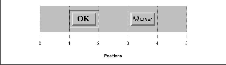
Position zero is the left edge of the form and
position five is the right edge of the form. We chose five because it
gave us the best layout aesthetically. The region is divided up
equally, so you can think of the sections as percentages of the total
width (or height) of the Form. By using this layout method, we don't
have to be concerned with the width of the Form or of the DialogShell
itself, since we know that the placement of the buttons will always be
proportional. We create the OK button as shown in the following
code fragment:
   widget = XtVaCreateManagedWidget ("OK",
       xmPushButtonGadgetClass, form,
       XmNtopAttachment,        XmATTACH_FORM,
       XmNbottomAttachment,     XmATTACH_FORM,
       XmNleftAttachment,       XmATTACH_POSITION,
       XmNleftPosition,         1,
       XmNrightAttachment,      XmATTACH_POSITION,
       XmNrightPosition,        2,
       XmNshowAsDefault,        True,
       XmNdefaultButtonShadowThickness, 1,
       NULL);
The left and right sides of the button are placed at positions one and
two, respectively. Since this button is the default button for the
dialog, we want the button to be displayed as such. We set
XmNshowAsDefault to True and
XmNdefaultButtonShadowThickness to 1. The value for the
latter resource is a pixel value that specifies the width of an extra
three-dimensional border that is placed around the default button to
distinguish it from the other buttons. If the value for
XmNshowAsDefault is False, the button is not shown as the
default, regardless of the value of the default shadow thickness. The
XmNshowAsDefault resource can also take a numeric value that
indicates the shadow thickness to use, but its value is only
interpreted in this way if XmNdefaultButtonShadowThickness is
set to 0. This functionality is for backwards compatibility
with Motif 1.0 and should not be used.
Because the dialog is not reused, we want the
callback for the OK button to destroy the DialogShell. We use
the XmNactivateCallback of the PushButton to implement the
functionality. The callback routine is DestroyShell(), which
is shown below:
   static void
   DestroyShell(widget, client_data, call_data)
   Widget widget;
   XtPointer client_data;
   XtPointer call_data;
   {
       Widget shell = (Widget) client_data;

       XtDestroyWidget(shell);
   }
Since the dialog is not a predefined Motif dialog, the widget
parameter to the callback routine is not the dialog, but the PushButton
that caused the callback to be invoked. This difference is subtle and
it is often overlooked by programmers who are breaking away from the
predefined dialogs to build their own dialogs. We pass the DialogShell,
help_dialog, as client data to the callback routine, so that
the callback can destroy the widget.
The More button is not used in the
application, since we do not provide any additional help for the
dialog. We create the button as follows:
   widget = XtVaCreateManagedWidget ("More",
       xmPushButtonGadgetClass, form,
       XmNsensitive,            False,
       XmNtopAttachment,        XmATTACH_FORM,
       XmNbottomAttachment,     XmATTACH_FORM,
       XmNleftAttachment,       XmATTACH_POSITION,
       XmNleftPosition,         3,
       XmNrightAttachment,      XmATTACH_POSITION,
       XmNrightPosition,        4,
       XmNshowAsDefault,        False,
       XmNdefaultButtonShadowThickness,   1,
       NULL);
In this case, the XmNshowAsDefault resource is set to
False. We have also set XmNsensitive to False so
that the widget is insensitive to user input.
Once the buttons in the action area have been
created, we need to fix the size of the action area. We manage the Form
and then we retrieve the height of one of the action area buttons, so
that we can use the value as the minimum and maximum height of the
pane. We set the XmNpaneMaximum and XmNpaneMinimum
constraint resources on the Form, so that the PanedWindow sets the
action area to a constant height.
Once the control area and the action area have been
created and managed, the PanedWindow is managed using
XtManageChild() and the dialog is popped up using XtPopup()
. This last step is necessary because the DialogShell is not
automatically popped up when you manage the PanedWindow widget. This
special behavior only happens when the immediate child of the
DialogShell is a BulletinBoard or Form widget. This program provides an
example of why you should never rely on this behavior or expect it to
happen. See Chapter 5, Introduction to Dialogs, for a complete
discussion of the posting of dialogs.
While dialogs can vary in many respects, the
structure of the action area usually remains consistent for all
dialogs. Most large programs are going to make use of many customized
dialogs. In the general case, you do not want to rewrite the code to
generate an action area for each special case. It is much easier and
more efficient to write a generalized routine that creates an action
area for any dialog.
Whenever we generalize any procedure, we first
identify how the situation may change from one case to the next. For
example, not all action areas have only two buttons; you may have any
number from one to, say, ten. As a result, you need to be able to
change the number of partitions in the Form widget to an arbitrary
value depending on the number of actions in the dialog. The positions
to which the left and right sides of each action button are attached
also need to be adjusted.
Some known quantities in this equation are that the
action area must be at the bottom of a dialog and it must contains
PushButtons. While the PushButtons may be either widgets or gadgets,
you should probably choose one or the other and use them consistently
throughout your application. Since gadgets use the colors of their
parent, one advantage of using them is that you can set the colors of
all of the buttons quite easily, as shown in the following resource
specification:
*action_area.foreground: redOn the other hand, since widgets have windows, you can specify different colors for different buttons. For example, you could use blue for the OK button and red for the Cancel button, as shown in the following specifications:
   *action_area.ok_button.foreground: blue
   *action_area.cancel_button.foreground: red
In general, all of the buttons in the action area should be from the same class, and all of the action areas in an application should be consistent with one another.
Each button in an action area has its own label, its
own callback routine, and its own associated client data. To create a
general action area, we need a data structure that abstracts this
information. The ActionAreaItem structure is defined as
follows:
   typedef struct {
       char *label;        /* PushButton's Label */
       void (*callback)(); /* pointer to a callback routine */
       XtPointer data;     /* client data for the callback routine */
   } ActionAreaItem;
This data structure contains all of the information that we need to
know in order to create an action area; the rest of the information is
known or it can be derived.
Now we can write a routine that creates an action
area. The purpose of the function is to create and return a composite
widget that contains the specified number of PushButtons, where the
buttons are arranged horizontally and evenly spaced. The
CreateActionArea() routine is used in the source code This program
does not do anything substantial, but it does present a generalized
architecture for creating dialogs for an application.
XtSetLanguageProc() is only available in X11R5; there is no
corresponding function in X11R4. XmStringCreateLocalized() is
only available in Motif 1.2; XmStringCreateSimple() is the
corresponding function in Motif 1.1.
   /* action_area.c -- demonstrate how CreateActionArea() can be used
    * in a real application.  Create what would otherwise be identified
    * as a PromptDialog, only this is of our own creation.  As such,
    * we provide a TextField widget for input.  When the user presses
    * Return, the OK button is activated.
    */
   #include <Xm/DialogS.h>
   #include <Xm/PushBG.h>
   #include <Xm/PushB.h>
   #include <Xm/LabelG.h>
   #include <Xm/PanedW.h>
   #include <Xm/Form.h>
   #include <Xm/RowColumn.h>
   #include <Xm/TextF.h>

   typedef struct {
       char *label;
       void (*callback)();
       XtPointer data;
   } ActionAreaItem;

   static void
       do_dialog(), close_dialog(), activate_cb(),
       ok_pushed(), clear_pushed(), help();

   main(argc, argv)
   int argc;
   char *argv[];
   {
       Widget toplevel, button;
       XtAppContext app;

       XtSetLanguageProc (NULL, NULL, NULL);

       toplevel = XtVaAppInitialize (&app, "Demos",
           NULL, 0, &argc, argv, NULL, NULL);

       button = XtVaCreateManagedWidget ("Push Me",
           xmPushButtonWidgetClass, toplevel, NULL);
       XtAddCallback (button, XmNactivateCallback, do_dialog, NULL);

       XtRealizeWidget (toplevel);
       XtAppMainLoop (app);
   }

   /* callback routine for "Push Me" button.  Actually, this represents
    * a function that could be invoked by any arbitrary callback.  Here,
    * we demonstrate how one can build a standard customized dialog box.
    * The control area is created here and the action area is created in
    * a separate, generic routine: CreateActionArea().
    */
   static void
   do_dialog(w, client_data, call_data)
   Widget w; /* will act as dialog's parent */
   XtPointer client_data;
   XtPointer call_data;
   {
       Widget dialog, pane, rc, text_w, action_a;
       XmString string;
       extern Widget CreateActionArea();
       static ActionAreaItem action_items[] = {
           { "OK",     ok_pushed,     NULL          },
           { "Clear",  clear_pushed,  NULL          },
           { "Cancel", close_dialog,  NULL          },
           { "Help",   help,          "Help Button" },
       };

       /* The DialogShell is the Shell for this dialog.  Set it up so
        * that the "Close" button in the window manager's system menu
        * destroys the shell (it only unmaps it by default).
        */
       dialog = XtVaCreatePopupShell ("dialog",
           xmDialogShellWidgetClass, XtParent (w),
           XmNtitle,  "Dialog Shell",     /* give arbitrary title in wm */
           XmNdeleteResponse, XmDESTROY,  /* system menu "Close" action */
           NULL);

       /* now that the dialog is created, set the Cancel button's
        * client data, so close_dialog() will know what to destroy.
        */
       action_items[2].data = (XtPointer) dialog;

       /* Create the paned window as a child of the dialog.  This will
        * contain the control area and the action area
        * (created by CreateActionArea() using the action_items above).
        */
       pane = XtVaCreateWidget ("pane", xmPanedWindowWidgetClass, dialog,
           XmNsashWidth,  1,
           XmNsashHeight, 1,
           NULL);

       /* create the control area which contains a
        * Label gadget and a TextField widget.
        */
       rc = XtVaCreateWidget ("control_area", xmRowColumnWidgetClass, pane, NULL);
       string = XmStringCreateLocalized ("Type Something:");
       XtVaCreateManagedWidget ("label", xmLabelGadgetClass, rc,
           XmNlabelString,    string,
           NULL);
       XmStringFree (string);

       text_w = XtVaCreateManagedWidget ("text-field",
           xmTextFieldWidgetClass, rc, NULL);

       /* RowColumn is full -- now manage */
       XtManageChild (rc);

       /* Set the client data for the "OK" and "Cancel" buttons */
       action_items[0].data = (XtPointer) text_w;
       action_items[1].data = (XtPointer) text_w;

       /* Create the action area. */
       action_a = CreateActionArea (pane, action_items, XtNumber (action_items));

       /* callback for Return in TextField.  Use action_a as client data */
       XtAddCallback (text_w, XmNactivateCallback, activate_cb, action_a);

       XtManageChild (pane);
       XtPopup (dialog, XtGrabNone);
   }

   /* The next four functions are the callback routines for the buttons
    * in the action area for the dialog created above.  Again, they are
    * simple examples, yet they demonstrate the fundamental design approach.
    */
   static void
   close_dialog(w, client_data, call_data)
   Widget w;
   XtPointer client_data;
   XtPointer call_data;
   {
       Widget shell = (Widget) client_data;

       XtDestroyWidget (shell);
   }

   /* The "ok" button was pushed or the user pressed Return */
   static void
   ok_pushed(w, client_data, call_data)
   Widget w;
   XtPointer client_data;
   XtPointer call_data;
   {
       Widget text_w = (Widget) client_data;
       XmAnyCallbackStruct *cbs = (XmAnyCallbackStruct *) call_data;
       char *text = XmTextFieldGetString (text_w);

       printf ("String = %s0, text);
       XtFree (text);
   }

   static void
   clear_pushed(w, client_data, call_data)
   Widget w;
   XtPointer client_data;
   XtPointer call_data;
   {
       Widget text_w = (Widget) client_data;
       XmAnyCallbackStruct *cbs = (XmAnyCallbackStruct *) call_data;

       /* cancel the whole operation; reset to NULL. */
       XmTextFieldSetString (text_w, "");
   }

   static void
   help(w, client_data, call_data)
   Widget w;
   XtPointer client_data;
   XtPointer call_data;
   {
       String string = (String) client_data;

       puts(string);
   }

   /* When Return is pressed in TextField widget, respond by getting
    * the designated "default button" in the action area and activate
    * it as if the user had selected it.
    */
   static void
   activate_cb(text_w, client_data, call_data)
   Widget text_w;              /* user pressed Return in this widget */
   XtPointer client_data;        /* action_area passed as client data */
   XtPointer call_data;
   {
       XmAnyCallbackStruct *cbs = (XmAnyCallbackStruct *) call_data;
       Widget dflt, action_area = (Widget) client_data;

       /* get the "default button" from the action area... */
       XtVaGetValues (action_area, XmNdefaultButton, &dflt, NULL);
       if (dflt) /* sanity check -- this better work */
           /* make the default button think it got pushed using
            * XtCallActionProc().  This function causes the button
            * to appear to be activated as if the user pressed it.
            */
           XtCallActionProc (dflt, "ArmAndActivate", cbs->event, NULL, 0);
   }

   #define TIGHTNESS 20

   Widget
   CreateActionArea(parent, actions, num_actions)
   Widget parent;
   ActionAreaItem *actions;
   int num_actions;
   {
       Widget action_area, widget;
       int i;

       action_area = XtVaCreateWidget ("action_area", xmFormWidgetClass, parent,
           XmNfractionBase, TIGHTNESS*num_actions - 1,
           XmNleftOffset,   10,
           XmNrightOffset,  10,
           NULL);

       for (i = 0; i < num_actions; i++) {
           widget = XtVaCreateManagedWidget (actions[i].label,
               xmPushButtonWidgetClass, action_area,
               XmNleftAttachment,       i? XmATTACH_POSITION : XmATTACH_FORM,
               XmNleftPosition,         TIGHTNESS*i,
               XmNtopAttachment,        XmATTACH_FORM,
               XmNbottomAttachment,     XmATTACH_FORM,
               XmNrightAttachment,
                   i != num_actions - 1 ? XmATTACH_POSITION : XmATTACH_FORM,
               XmNrightPosition,        TIGHTNESS * i + (TIGHTNESS - 1),
               XmNshowAsDefault,        i == 0,
               XmNdefaultButtonShadowThickness, 1,
               NULL);
           if (actions[i].callback)
               XtAddCallback (widget, XmNactivateCallback,
                   actions[i].callback, actions[i].data);
           if (i == 0) {
               /* Set the action_area's default button to the first widget
                * created (or, make the index a parameter to the function
                * or have it be part of the data structure). Also, set the
                * pane window constraint for max and min heights so this
                * particular pane in the PanedWindow is not resizable.
                */
               Dimension height, h;
               XtVaGetValues (action_area, XmNmarginHeight, &h, NULL);
               XtVaGetValues (widget, XmNheight, &height, NULL);
               height += 2 * h;
               XtVaSetValues (action_area,
                   XmNdefaultButton, widget,
                   XmNpaneMaximum,   height,
                   XmNpaneMinimum,   height,
                   NULL);
           }
       }

       XtManageChild (action_area);

       return action_area;
   }
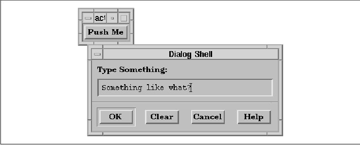
The application uses a PushButton to create and pop up a customized
dialog. The control area is composed of a RowColumn widget that
contains a Label gadget and a TextField widget. The action area is
created using CreateActionArea(). The actions and the number
of actions are specified in the actions and num_actions
parameters. We use a Form widget to lay out the actions. We give the
Form the name action_area, since it is descriptive and it makes
it easy for the user to specify the area in a resource file. The output
of the program in shown in the figure.
In order to distribute the PushButtons evenly across
the action area, we use the XmNfractionBase resource of the
Form widget to segment the widget into equal portions. The value of the
resource is based on the value of the TIGHTNESS definition,
which controls the spacing between buttons. A higher value causes the
PushButtons to be closer together, while a lower value spaces them
further apart. We use the value 20 for purely aesthetic
reasons. As each button is created, its attachments are set. The left
side of the first button and right side of the last button are attached
to the left and right edges of the Form, respectively, while all of the
other left and right edges are attached to positions.
The callback routine and associated client data for
each button are added using XtAddCallback(). The first button
in the action area is specified as the default button for the dialog.
The XmNdefaultButton resource indicates which button is
designated as the default button for certain actions that take place in
the control area of the dialog. The XmNactivateCallback of
the TextField widget in the control area uses the resource to activate
the default button when the user presses the RETURN key in the
TextField.
The CreateActionArea() function also sets
XmNpaneMaximum and XmNpaneMinimum constraint resources on
the action area. These are PanedWindow constraint resources that are
used to specify the height of the action area. The assumption, of
course, is that the parent of the action area is a PanedWindow. If that
is not true, these resource specifications have no effect.
You don't have to use a DialogShell widget to
implement a dialog. In fact, it is quite common to use a TopLevelShell
or even an ApplicationShell in cases where the particular functionality
is an important part of a larger application. For example, an e-mail
application has a variety of functions that range from reading messages
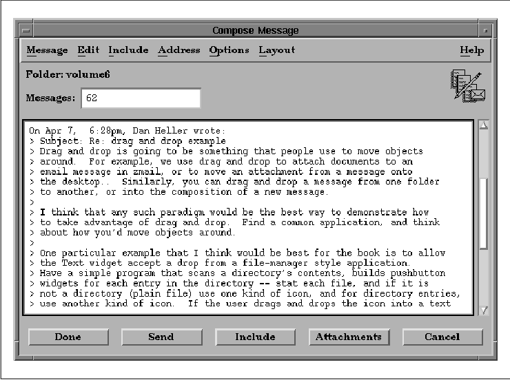
to composing new ones. As shown in the figure, you can have a separate
TopLevelShell, complete with a MenuBar, that looks and acts like a
separate application, but is still considered a dialog, since it is
only a subpart of the whole application.
As you can see, this dialog uses the same elements as other dialogs. The control area is complete with a ScrolledText region and other controls, while the action area contains action buttons. The principal difference between this dialog and a dialog implemented with a DialogShell is that this dialog that uses a TopLevelShell may be iconified separately from the other windows in the program.
When you need to implement a dialog with a
TopLevelShell, you should not regard or implement it as a popup dialog.
But for the most part, there is little difference from this approach
and the method discussed for regular dialogs. You may still use
BulletinBoards, Forms, and RowColumns to manage the inner controls. You
still need an action area (provided you want to look and act like a
dialog), and you still need to handle the cases where the dialog is
popped up and down. You can create the TopLevelShell with
XtVaAppCreateShell(). The shell is automatically mapped onto the
screen when you call XtPopup(). You may also want to call
XMapRaised() on the shell, in case it is already popped up but is
not at the top of the window hierarchy.
In direct contrast to the DialogShell widget,
managing the immediate child of a TopLevelShell does not cause the
dialog to pop up automatically. Even if that child is subclassed from
the BulletinBoard widget, this type of behavior only happens if the
shell is a DialogShell widget. Because you are using a TopLevelShell,
you cannot rely on the special communication that happens between a
DialogShell and a BulletinBoard or Form widget. As a result, many
resources such as XmNautoUnmanage and XmNdialogTitle
no longer apply. To achieve the effects of these resources, you have to
implement the functionality yourself.
If you want to use one of the standard Motif
dialogs, such as a MessageDialog or a FileSelectionDialog, in a shell
widget that can be iconified iconified separately from its primary
window shell, you can put the dialog in a TopLevelShell. Create the
shell using XtVaAppCreateShell() and then use one of the Motif
convenience routines to create a MessageBox or a FileSelectionBox,
rather than the corresponding dialog widget. The following code
fragment shows an example of this usage:
   shell = XtVaAppCreateShell (NULL, "Class",
       topLevelShellWidgetClass, dpy,
       XtNtitle, "Dialog Shell Title",
       NULL);

   dialog = XmCreateMessageBox (shell, "MessageDialog", NULL, 0);

   XtAddCallback (dialog, XmNokCallback, callback_func, NULL);
   XtAddCallback (dialog, XmNcancelCallback, callback_func, NULL);
   XtAddCallback (dialog, XmNhelpCallback, help_func, NULL);
In all of the dialog examples that you have seen so
far, the toolkit has handled the positioning of the dialog. For dialogs
that use the DialogShell widget with a subclass of BulletinBoard as the
immediate child, the XmNdefaultPosition resource controls this
behavior. If the resource is True, the dialog is centered
relative to the parent of the DialogShell and placed on top of the
parent. If the resource is set to False, the application is
responsible for positioning the dialog. It is easy to position a dialog
using the XmNmapCallback resource that is supported by all of
the Motif manager widgets, as shown in the source code
   /* map_dlg.c -- Use the XmNmapCallback to automatically position
    * a dialog on the screen.  Each time the dialog is displayed, it
    * is mapped down and to the right by 200 pixels in each direction.
    */
   #include <Xm/MessageB.h>
   #include <Xm/PushB.h>

   /* main() --create a pushbutton whose callback pops up a dialog box */
   main(argc, argv)
   int argc;
   char *argv[];
   {
       Widget toplevel, button;
       XtAppContext app;
       void pushed();

       toplevel = XtVaAppInitialize (&app, "Demos",
           NULL, 0, &argc, argv, NULL, NULL);

       button = XtVaCreateManagedWidget ("Push Me",
           xmPushButtonWidgetClass, toplevel,
           NULL);

       XtAddCallback (button, XmNactivateCallback, pushed, "Hello World");

       XtRealizeWidget (toplevel);
       XtAppMainLoop (app);
   }

   /* callback function for XmNmapCallback.  Position dialog in 200 pixel
    * "steps".  When the edge of the screen is hit, start over.
    */
   static void
   map_dialog(dialog, client_data, call_data)
   Widget dialog;
   XtPointer client_data;
   XtPointer call_data;
   {
       static Position x, y;
       Dimension w, h;

       XtVaGetValues(dialog,
           XmNwidth, &w,
           XmNheight, &h,
           NULL);

       if ((x + w) >= WidthOfScreen (XtScreen (dialog)))
           x = 0;
       if ((y + h) >= HeightOfScreen (XtScreen (dialog)))
           y = 0;
       XtVaSetValues (dialog,
           XmNx, x,
           XmNy, y,
           NULL);

       x += 200;
       y += 200;
   }

   /* pushed() --the callback routine for the main app's pushbutton.
    * Create and popup a dialog box that has callback functions for
    * the Ok, Cancel and Help buttons.
    */
   void
   pushed(w, client_data, call_data)
   Widget w;
   XtPointer client_data;
   XtPointer call_data;
   {
       extern void response();
       Widget dialog;
       Arg arg[5];
       int n = 0;
       char *message = (char *) client_data;
       XmString t = XmStringCreateLocalized (message);

       XtSetArg (arg[n], XmNmessageString, t); n++;
       XtSetArg (arg[n], XmNdefaultPosition, False); n++;
       dialog = XmCreateMessageDialog (w, "notice", arg, n);
       XmStringFree (t);

       XtAddCallback (dialog, XmNmapCallback, map_dialog, NULL);

       XtManageChild (dialog);
       XtPopup (XtParent (dialog), XtGrabNone);
   }
Each time the dialog is mapped to the screen, the map_dialog()
routine is invoked. The routine merely places the dialog at a location
that is 200 pixels from its previous position. Obviously, this example
is meant to demonstrate the technique of positioning a dialog, rather
than providing any useful functionality. The XmNwidth,
XmNheight, XmNx, and XmNy resources are retrieved
from the DialogShell widget since the dialog is a predefined Motif
dialog. Similarly, the position of the DialogShell is set by calling
XtVaSetValues() using the same resources.
If you are using an ApplicationShell or a
TopLevelShell, rather than a DialogShell, the position of the dialog is
subject to various resources that are controlled by the user and/or the
window manager. For example, if the user is using mwm, she can
set the resource interactivePlacement, which allows her to
position the shell interactively. While it is acceptable for an
application to control the placement of a DialogShell, it should not
try to control the placement of a TopLevelShell or an ApplicationShell
because that is the user's domain. However, if you feel you must, you
can position any shell widget directly by setting its XmNx and
XmNy resources to the desired position when the shell is
created or later using XtVaSetValues(). The Motif toolkit
passes the coordinate values to the window manager and allows it to
position the dialog at the intended location.
This issue is an important dilemma in user-interface
design. If you are going to hard-code the position of a dialog on the
screen, you probably do not want to position the dialog at that
location each time that it is popped up. Imagine that you pop up a
dialog, move it to an uncluttered area on your screen, interact with it
for a while, and then pop it down. If you use the dialog again, you
would probably like it to reappear in the location where you put it
previously. The best way to handle this dilemma is to avoid doing any
of your own dialog placement, with the possible exception of the first
time that a dialog is popped up.
Whether or not you want to position a dialog when it
is displayed, you may still find it useful to be informed about when a
dialog is popped up or down. The XmNmapCallback is not the
best tool for this purpose, since it is not called each time the
popped-up state of the dialog changes. The XmNpopupCallback
and XmNpopdownCallback callbacks are meant for this purpose.
These resources are defined and implemented by X Toolkit Intrinsics for
all shell widgets. The XmNpopupCallback is invoked each time
XtPopup() is called on a shell widget, while the
XmNpopdownCallback is called for XtPopdown().
People often get confused by the terminology of a
dialog being popped down and a shell being iconified. Remember that
whether or not a shell is popped up is independent of its iconic state.
Although a DialogShell cannot be iconified separately, other shells
can. These shells may also be popped up and down using XtPopup()
and XtPopdown() independent of their iconic state.
XtPopup() causes a shell to be deiconified, while XtPopdown()
causes the dialog and its icon to be withdrawn from the screen,
regardless of its iconic state. The subject of window iconification is
discussed in Chapter 16, Interacting With the Window Manager.
Obviously, it is impossible to cover all of the
possible scenarios of how dialogs can and should be used in an
application. If nothing else, you should come away from the chapters on
dialogs with a general feeling for the design approach that we
encourage. You should also understand the steps that are necessary to
create and use both predefined Motif dialogs and customized dialogs.
For a final look at some particularly thorny issues in using dialogs,
see .