This chapter helps the reader understand the
components of a real Motif application. It discusses how to handle the
geometry management of primitive widgets within a manager widget, when
to put components into the main window, when to use dialog boxes and
menus, and how to relate to the window manager. After reading this
chapter, the programmer should have a solid overview of Motif
application programming, and she should be able to read the remaining
chapters in any order.
In Chapter 2, The Motif Programming Model, we
talked about the basic structure of an Xt-based program. We described
how to initialize the toolkit, create and configure widgets, link them
to the application, and turn control over to Xt's main loop. In this
chapter, we discuss the widgets in the Motif toolkit and how you can
put them together to create an effective user interface for an
application.
If you already have a basic understanding of the
Motif widgets, you can jump ahead to any of the later chapters in the
book that focus on individual widget classes. This chapter provides
some insight into the design of the widgets and a general overview of
the Motif style and methodology, which you may find useful when
developing your own applications.
This chapter also describes all of the new features
in Release 1.2 of Motif. If you are familiar with Motif 1.1 but need to
get up to speed with Motif 1.2, you should read Section #smotif12. In
this section, we summarize the new features and tell you where to find
more information about them. We also describe all the changes made to
the example programs in this book to make them up-to-date with Motif
1.2. While Motif 1.2 is backwards-compatible with Motif 1.1, there are
a number of functions and resources in Motif 1.2 that replace obsolete
functions and resources in Motif 1.1.
You don't build a house just by nailing together a
bunch of boards; you have to design it from the ground up before you
really get started. Even with a prefabricated house, where many of the
components have already been built, you need a master plan for putting
the pieces together. Similarly, when you are designing a graphical user
interface for an application, you have to think about the tasks your
application is going to perform. You must envision the interface and
then learn to use your tools effectively in order to create what you've
envisioned.
The Motif toolkit provides basic components that you
can assemble into a graphical user interface. However, without design
schematics, the process of assembling the user-interface elements may
become ad hoc or inconsistent. Here is where the Motif Style Guide
comes in. It presents a set of guidelines for how widgets should be
assembled and grouped, as well as how they should function and interact
with the user.
All Motif programmers should be intimately familiar
with the Style Guide. While we make recommendations for Motif
style from time to time, this book is not a replacement for the
Style Guide. There are many aspects of Motif style that are not
covered in detail here, as they involve the content of an application
rather than just the mechanics. On the other hand, the Motif Style
Guide is not an instructional manual for the Motif toolkit. In
fact, many of the objects described in the Style Guide are not
even widgets, but higher-level, more complex objects that are composed
of many widgets.
For example, the Style Guide describes an
object called a MenuBar, which spans the top of the main window of an
application. The MenuBar contains menu titles that, when clicked on,
display PulldownMenus. The Motif toolkit does not implement MenuBars or
PulldownMenus as distinct widget classes, nor does the Style Guide
make any recommendations about how menu objects should be implemented.
What the Style Guide does talk about (albeit somewhat loosely)
is the actions that can be taken by an item on a menu: it can invoke an
application function, pop up a dialog box containing yet more options
and commands, or display a cascading menu (also known as a pullright
menu).
The Style Guide also makes recommendations
about the menus that an application should provide. For example, most
applications should have a File menu that provides items such as
an Exit button to exit the application and a Save button
to save file. It also specifies details of presentation, such as that
you should provide an ellipsis (...) as part of the label for
a menu item that requires the user to provide more information before
action is taken.
How the Motif toolkit goes about supporting, and in
some cases enforcing, the guidelines of the Motif Style Guide
brings up some interesting points, particularly in relation to some of
the underlying principles of the X Toolkit Intrinsics. In Xt, a widget
is envisioned as a self-contained object that is designed to serve a
specific, clearly-defined function. Many of the Motif widgets, such as
Labels, PushButtons, ScrollBars, and other common interface objects,
are implemented as separate widgets.
In other cases, however, Motif steps outside of the
Xt model by creating compound objects out of several widgets and then
expecting you to treat them as if they were a single object. For
example, Motif provides the ScrolledText and ScrolledList objects,
which combine a Text or List widget with a ScrolledWindow widget, which
in turn automatically manages horizontal and vertical ScrollBars.
In another case, the Motif toolkit provides a
complex, general-purpose widget that can be configured to appear in
several guises. There is no MenuBar widget class and no PulldownMenu
widget class. Instead, the RowColumn widget, which also serves as a
general-purpose manager widget, has resources that allow it to be
configured as either a MenuBar or a PulldownMenu pane. Those familiar
with Xt may find this widget design to be a breach of Xt's design
goals, though.
In order to allow the programmer to think of
ScrolledText objects, MenuBars, and PulldownMenus as distinct objects,
the Motif toolkit provides convenience creation functions. These
routines make it appear as though you are creating discrete objects
when, in fact, you are not. For example, XmCreateMenuBar() and
XmCreateSimplePulldownMenu() automatically create and
configure a RowColumn widget as a MenuBar and a PulldownMenu,
respectively. There are also convenience routines for creating various
types of predefined dialog boxes, which are actually composed of
widgets from four or five separate widget classes.
Convenience routines emphasize the functional side
of user-interface objects while hiding their implementation. However,
since Motif is a truly object-oriented system, it behooves you to
understand what you're really dealing with. For example, if you want to
use resource classes to configure all MenuBars to be one color and all
PulldownMenus another, you cannot do so because they are not actually
distinct widget classes. The class name for both objects is
XmRowColumn.
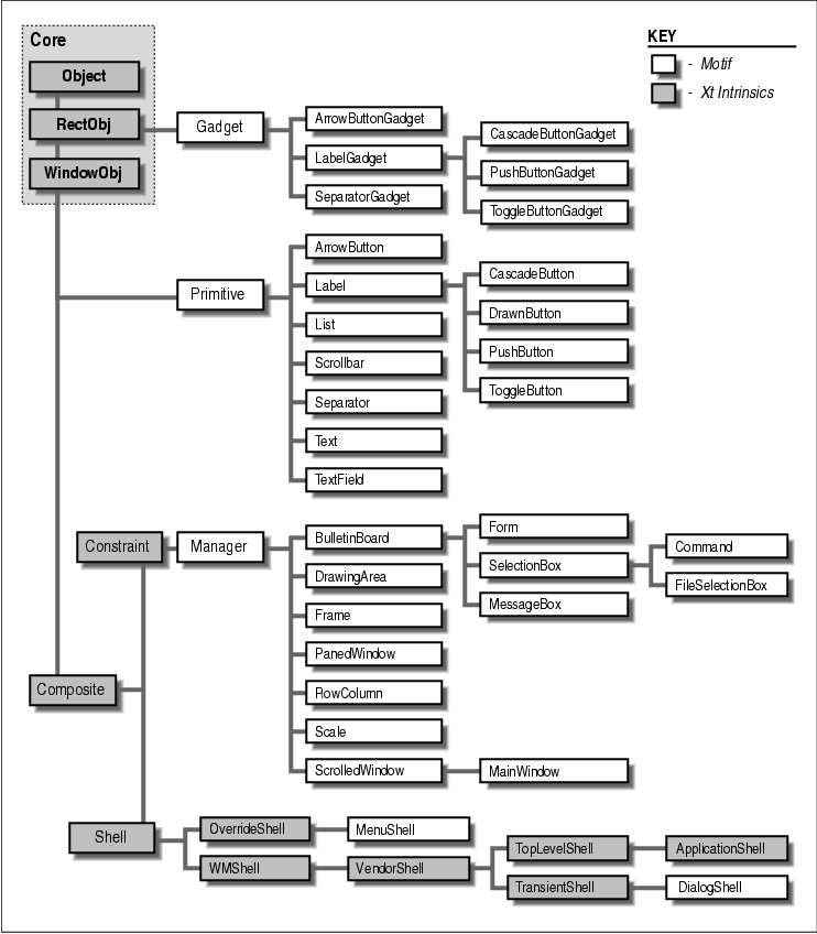
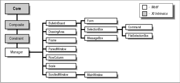
In the remainder of this chapter, we look at Motif user-interface objects from the perspective of both the functional object illusion and the actual widget implementation. In the body of the book, we use the Motif convenience routines for creating most compound objects, but stick to the underlying Xt routines for creating simple widgets or gadgets. With the compound objects, we show you how to pierce the veil of Motif's convenience functions and work directly with the underlying widgets when necessary. the figure shows the entire class hierarchy of the Motif widget set.
We begin by taking a closer look at the Motif
user-interface components with which the user typically interacts. Then
we examine how the manager widget classes are used to arrange the more
visible application controls. And finally, we explore the use of all of
these objects to create functional windows and dialogs that make up a
real application.
In many ways, application controls are the heart of
a graphical user interface. Rather than controlling an application by
typing commands, the user is presented with choices using graphical
elements. The user no longer needs to remember the syntax of commands,
since her choices are presented to her as she goes along. As we've
discussed, some of Motif's application controls (such as menus) are
compound objects assembled by convenience routines. Others are simple,
single-purpose widgets that you can create directly.
The widgets in this latter group are collectively
referred to as primitive widgets -- not because they are simple,
but because they are designed to work alone. The contrast is not
between primitive and sophisticated widgets, but between primitive and
manager widgets. Some of the primitive Motif widget classes have
corresponding gadget classes. The following sections describe the
different types of primitive application controls available in the
Motif toolkit.
The compound objects in the Motif toolkit are
composed of primitive widgets and gadgets. Because an understanding of
these objects relies on an understanding of the primitive widgets, as
well as the Motif manager and shell widgets, we are going to postpone
discussing compound objects until later in the chapter.
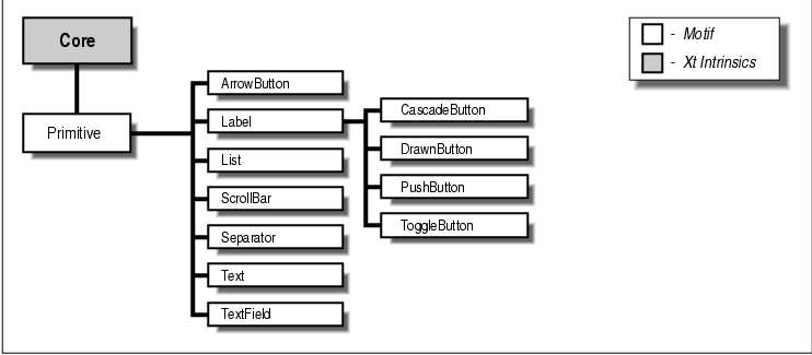
The Primitive widget class is a superclass for all
of the Motif primitive widgets. This widget class is a metaclass; it
serves only to define certain common behavior used by all its
subclasses, so one never instantiates a widget directly from the
Primitive class. This statement is somewhat like saying that hammer is
a class of object, but that you never really have a generic hammer.
You can only have a specific type of hammer, like a claw hammer, a ball
peen hammer, or a sledge hammer. A claw hammer has the prongs in the
back behind the hammer-head that allow you to pull nails out of a wall;
a ball peen hammer has a round corner where the claw would be otherwise
be; a sledge hammer is the large, heavyweight hammer used to drive
thick nails through concrete or to destroy things.
Just as all hammers have particular characteristics that qualify them as hammers, the Primitive widget class provides its subclasses with common resources such as window border attributes, highlighting, and help with keyboard traversal (so the user can avoid the mouse and navigate through the controls in a window using the keyboard). The actual widget classes that you use are subclassed from the Primitive class, as shown in the figure.
The Primitive class itself inherits even more basic
widget behavior from the Xt-defined Core widget class, which
establishes the basic nature of "widgetness." The Core class provides
widgets with the capability to have windows and background colors, as
well as translations, actions, and so on. You could actually use a
simple Core widget as an instance and define your own translations and
action routines, although this technique is not used frequently.
Complete details are provided in Volume Four, X Toolkit Intrinsics
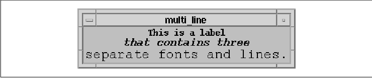
Programming Manual. The Label widget provides a visual label either
as text or as an image in the form of a Pixmap. The text of a
Label is an XmString, or compound string, not a character
string (char*). A compound string can be oriented from
left-to-right or right-to-left and it can also contain multiple lines
and multiple fonts. Chapter 19, Compound Strings, discusses
functions that manipulate compound strings, as well as functions that
convert between character strings and compound strings.
The Label widget does not provide any callback
routines, since it does not have any specified behavior. Using Xt, you
could install event translations and action routines to make a Label
respond to user input, but the Label widget is not intended to be used
this way. It is only meant to be used to display labels or other visual
aids. In Motif 1.2, instances of Label and all of its subclasses are
automatically registered as drag sources for drag and drop operations
by the toolkit.
Label widgets are described in detail in Chapter 11, Labels and Buttons. the figure displays a single Label widget with multiple lines and multiple fonts.
The PushButton widget supports the same visual
display capabilities as a Label, since it is subclassed from Label. In
addition, the PushButton provides resources for the programmer to
install callback routines that are called when the user arms,
activates, or disarms the button. The PushButton also displays a shadow
border that changes in appearance to indicate when the pointer is in
the widget and when it has been activated.
When a PushButton is not selected, it appears to project out towards the user. When the pointer moves into the button, its border is highlighted. When the user actually selects the button by pressing the first mouse button on it, the button appears to be pushed in and is said to be armed. The user activates a PushButton by releasing the mouse button while the button is armed. PushButton widgets are also covered in detail in Chapter 11, Labels and Buttons . the figure shows some examples of PushButtons.
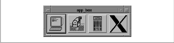
The DrawnButton widget is similar to a PushButton in its functionality and its three-dimensional appearance. However, the DrawnButton is used when an application wants to draw the text or image directly into the widget's window, rather than have the widget handle the drawing. If the image is dynamic and changes frequently during the course of an application, you may want to handle the drawing yourself. The DrawnButton provides additional callback resources that are called when the button is resized or exposed and additional ways to draw an outlined border. The DrawnButton widget is discussed in Chapter 11, Labels and Buttons. the figure shows some DrawnButtons.
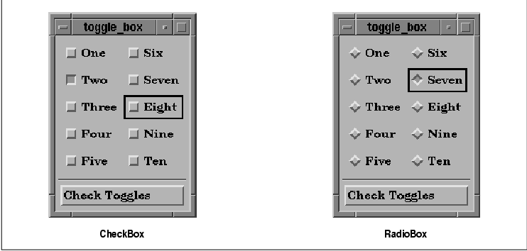
The ToggleButton widget displays text or graphics
like a Label widget, but it has an additional indicator graphic (a
square or diamond shape) to the left of the label. The indicator shows
the state of the ToggleButton: on or off. When the ToggleButton is on,
the indicator is colored and appears to be pushed in. When the button
is off, the indicator appears to project outward. The ToggleButton
provides a additional resource for specifying a callback routine that
is called when the user changes the state of the ToggleButton.
One common use of ToggleButtons is to set the application state. In this case, the callback routines typically set simple Boolean variables internal to the application. ToggleButtons can also be arranged in two different kinds of groups. In one configuration, known as a RadioBox, only one button in the group of buttons can be chosen at a time. The other configuration, a CheckBox, allows the user to select any number of buttons. When ToggleButtons are grouped as a RadioBox, the indicators are diamond-shaped; otherwise, they are square-shaped. ToggleButton widgets are described in detail in Chapter 11. the figure shows the two different ways that ToggleButtons can be grouped.
The CascadeButton widget is a special kind of button
that is used to pop up menus. A CascadeButton can only be used as a
child of a RowColumn widget, such as: in a MenuBar as the title of a
PulldownMenu, in a PulldownMenu pane as an item that has a cascading
menu associated with it, or as the button in an OptionMenu. The menu
that is posted by a CascadeButton is not a part of the widget itself;
the menu is associated with the button through a resource. A
CascadeButton merely provides the label and other visual aids that
support the appearance that a menu can pop up from the object. Even
though the CascadeButton widget class is subclassed from Label and
could inherit all of its functionality, Motif imposes restrictions on
the labels that a CascadeButton can display. CascadeButton labels
cannot contain multiple lines or multiple fonts. Because CascadeButtons
are typically used in menus, they do not display border shadows like
other buttons. They do have similar highlighting behavior when
selected, however. CascadeButton widgets are explained in both
Chapter 4, The Main Window, and Chapter 15, Menus.
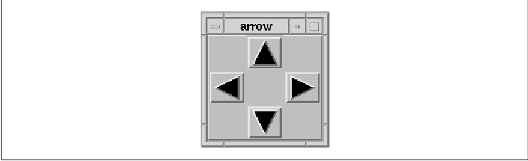
Despite the similarity in its name, the ArrowButton widget is not
subclassed from Label like the other button widgets. Like the remaining
widgets described in this section, it is subclassed directly from the
Primitive widget class. The ArrowButton widget contains an image of an
arrow pointing in one of four directions: up, down, left, or right.
When the user selects this widget, the ArrowButton provides visual
feedback giving the illusion that the button is pressed in and invokes
a callback routine that an application can use to perform
application-specific positioning.
In most respects, an ArrowButton can be considered identical to a PushButton, as it is easy enough to provide an arrow pixmap for a PushButton. Since directional arrows are a common user-interface element, the ArrowButton is provided as a separate widget class for simplicity. ArrowButton widgets are covered in detail in Chapter 11, Labels and Buttons. the figure shows the four variations of the ArrowButton widget.
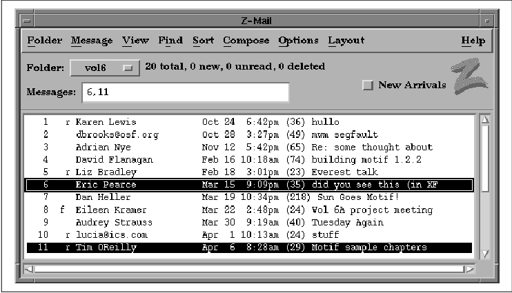
The List widget provides a mechanism for the programmer to make a list of text items available to the user for selection. The user selects items from a List using the mouse or the keyboard. The List widget allows you to specify whether the user can select a single item or multiple items. While List is a Primitive widget, it is typically created as part of a ScrolledList compound object using a Motif convenience function. The advantage of the ScrolledList object is that it provides a ScrollBar when the List grows bigger than the size of its visible area. In Motif 1.2, instances of the List widget are automatically registered as drag sources for drag and drop operations by the toolkit. We explore the List widget in detail in Chapter 12, The List Widget. the figure shows a List widget in context with other interface elements.
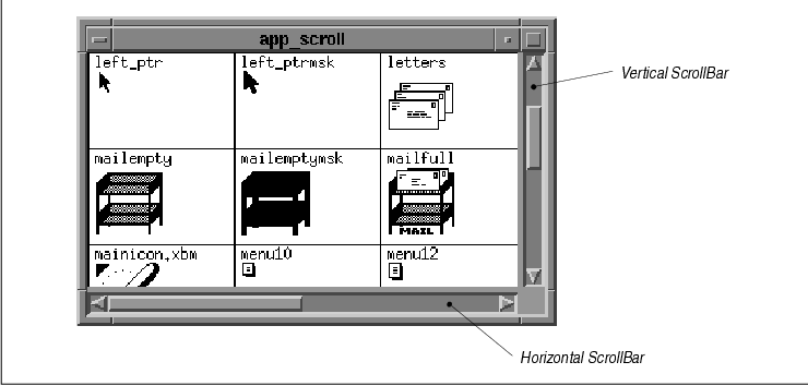
The ScrollBar widget is one of the more intuitive
user-interface elements in the Motif toolkit. ScrollBars are almost
always used as children of a ScrolledWindow widget. When the contents
of a window are larger than the viewing area, a ScrollBar allows the
user to scroll the window to view the entire contents.
ScrollBars can be oriented vertically or horizontally. The ScrollBar also provides a number of callback resources that allow you to control its operation. ScrollBar widgets are discussed in Chapter 9, ScrolledWindows and ScrollBars. the figure shows both vertical and horizontal ScrollBars.
The Separator widget is used as a visual aid to
separate adjacent items in a display. A Separator appears as a line
between the objects it is separating; it can be oriented vertically or
horizontally. Separators can be used in menus to separate menu items,
in dialog boxes to separate discrete areas of control, and at various
points in an interface for purely aesthetic reasons. The Text widget
is a complete text editor contained in a widget. The Text widget
provides resources to configure the editing style of the widget, as
well as callback resources that allow text verification. The widget can
be configured as a multiline text entry area or as a single-line data
entry field. The TextField widget class is available as a somewhat
lighter-weight text entry area. The TextField widget is limited to a
single-line, but in all other respects there is little difference
between the two classes. In Motif 1.2, instances of the Text and
TextField widgets are automatically registered as drag sources and drop
sites for drag and drop operations by the toolkit.
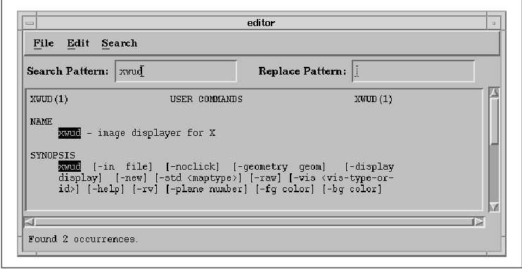
The Text and TextField widgets can be used in many different ways to support the text entry requirements of an application. The two widgets are described in detail in Chapter 14, Text Widgets. the figure shows an application that uses various forms of the Text widget.
Another set of application controls is provided in the form of gadgets. There are gadgets that are equivalent to many of the primitive widgets: LabelGadgets, SeparatorGadgets, PushButtonGadgets, CascadeButtonGadgets, ToggleButtonGadgets, and ArrowButtonGadgets. The appearance and behavior of the gadgets is mostly identical to that of the corresponding widgets. A further understanding of how gadgets work depends on an understanding of the manager widgets that support them, so we are going to return to this topic later in the chapter.
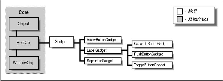
The Gadget class is a superclass for all of the
Motif gadgets. Like Primitive, this class is a metaclass that is never
instantiated. However, gadgets are not widgets. The Gadget class is
subclassed from the RectObj class, not from the Core widget class. the
figure shows the class hierarchy for gadgets.
While the controls are the most obvious part of a
graphical user interface, these elements alone do not make an effective
interface. A random arrangement of buttons or a collection of nested
menus can make an application as obscure and as difficult to use as one
with a command-line interface. The arrangement of the controls in an
application makes all the difference.
To help you lay out your application, Motif provides
you with a set of manager widgets. You can think of manager widgets as
boxes in which you can put things. These boxes, however, can grow or
shrink as necessary to provide the best fit possible for the items that
they contain. You can place boxes inside of other boxes, whether or not
they contain other items. By using different size boxes, you can
organize things in many different ways.
Manager widgets are so named because they manage the
size and position of other widgets. The relationship between a manager
widget and the widgets that it manages is commonly referred to as the
parent-child model. The manager acts as the parent, and the other
widgets are its children.
Unlike primitive widgets, such as PushButtons,
ScrollBars, and Labels, whose usefulness depends on their visual
appearance and interaction with the user, manager widgets provide no
visual feedback and have few callback routines that react to user
input. Manager widgets have two basic purposes: they manage the sizes
and positions of their children, and they provide support for gadgets.
Like other widgets, manager widgets have windows, they can receive
events, and they can be manipulated directly with Motif and Xt
functions. You can draw directly into the window of a manager widget,
look for events in the widget, and specify resources for it.
There are many manager widget classes, each of which
is tuned for a particular kind of widget layout. A manager widget can
manage other manager widgets, as well as primitive widgets like Labels
and PushButtons. In fact, the layout of an application is typically a
kind of tree structure. As discussed in Chapter 2, The Motif
Programming Model, the top of the tree is always a shell widget
like that returned by XtVaAppInitialize(). Shell widgets are
composite widgets that can only have a single managed child. This child
is usually a general-purpose manager widget. This manager contains
other managers and the primitive widgets that compose the user
interface for a window in an application.
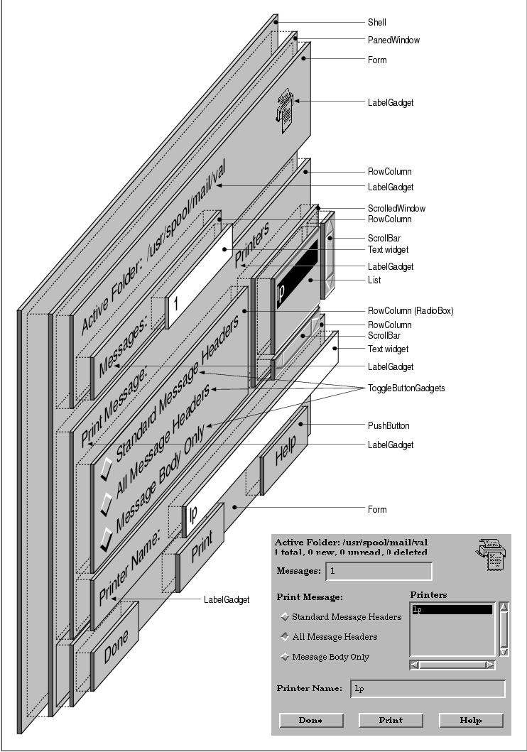
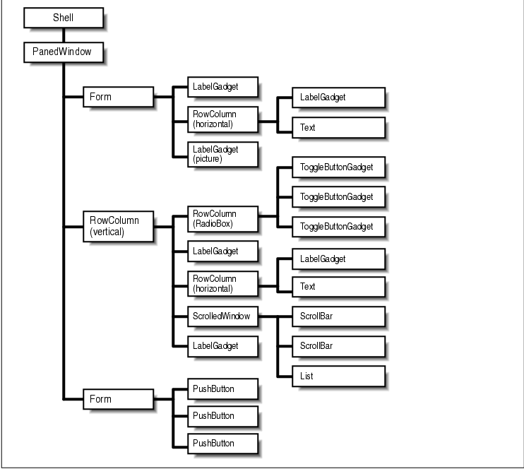
the figure shows the all of the different manager and primitive widgets that make up the displayed dialog box. The parent-child relationships between the widgets in this dialog box are illustrated in the tree structure shown in the figure. Although the dialog box is composed of many different components, it appears to the user as a single, conceptually focused user-interface object.
As with the Primitive widget class and the Gadget
class, the Manager widget class is a superclass for all of the Motif
manager widgets. The Manager class is another metaclass. You never
create an instance of a Manager widget; you create an instance of one
of its subclasses. The actual widget classes that you use are shown in
the figure.
Manager is subclassed from the Xt Constraint class, which in turn is subclassed from the Xt Composite class. The Composite widget class defines the basic characteristics of widgets that are able to manage the size and position of other widgets. Xt uses the general term composite widget for any widget with this capability. The Constraint class adds the capability to provide additional resources for the widgets that are being managed. These resources constrain the position of the widgets. They can be thought of as hints about how the widgets should be laid out.
Motif provides a number of general-purpose manager widgets that allow the programmer to manage the size and arrangement of an arbitrary number of children. In some ways, the art of Motif programming is the design of effective widget layouts, using these particular manager widgets. Motif also provides some narrowly-focused manager widgets, such as certain dialog classes, that can almost be treated as if they were single user-interface components. These widgets create and manage their children with minimal help from an application. We sometimes refer to these widgets as compound objects, since they include both a manager widget and one or more children. This section describes the different manager widgets briefly; a more detailed description of the widgets is given in Chapter 8, Manager Widgets .
The process by which a manager widget controls the
layout of its children is known as geometry management. A child
widget is always placed within the boundaries of its parent. A child
cannot move or resize itself without requesting permission from its
parent, which can deny the request. The manager, acting as the parent,
can even force the child into an arbitrary size or position. However,
like any good parent, a manager widget should be fair at all times and
not deny reasonable requests made by its children. As you might expect,
geometry management can be quite complex in an application with several
levels of managers.
As an example, consider adding a new item to a List
widget. In order to display the new item, the List widget must grow
vertically, so it requests a new size from its manager parent. If that
parent can accomodate the larger size, or it has another mechanism for
satisfying the request, such as ScrollBars, it can approve the request.
However, if the manager itself must grow to honor the List widget's
request, it has to negotiate with its own parent. This chain reaction
may go all the way up to the shell widget, in which case the shell must
communicate with the window manager about the new size. If the window
manager and the shell agree to the new size, the acknowledgement
filters back down through the widget tree to the List widget, which can
now grow to its requested size. If any of the composite widgets in the
hierarchy refuse to resize, the List widget's request is either denied
or only partially fulfilled.
Most of the time, this type of interaction completes
successfully, as there are rarely disputes among children about
resizing negotiations or positional boundaries. Children usually go
where their managers put them and make very few requests of their own.
One exception is a RowColumn widget that is acting as a MenuBar, since
it must be situated at the top of the window, and it must span the
window horizontally. ScrollBars are another possible exception, since
they are typically positioned at the edges of ScrolledWindow widgets.
So, how do children request geometry changes from
their parents? The answer to this question is rather complicated, since
the X Toolkit Intrinsics supports a large selection of functions that
enable two-way communication about geometry management. For example, a
child can use XtMakeGeometryRequest() to request permission to
be made a specific size or to be placed in a particular location. A
parent can use a function like XtQueryGeometry() to give a
child the opportunity to announce its preferred geometry.
Some of these functions and methods are described in
Chapter 8, Manager Widgets, but a detailed treatment of custom
geometry management techniques is beyond the scope of this book. These
functions are mostly used by the internals of composite and constraint
widgets. See Volume Four, X Toolkit Intrinsics Programming Manual
, for a more detailed discussion of geometry management techniques.
In the Motif toolkit, geometry management cannot
work without cooperation. The easiest way for a child to cooperate with
its parents and siblings is simply to comply with whatever layout
policy is supported by its manager widget parent. A child should not
try to force itself into a size or a position that is not supported by
its parent. Each of the manager widget classes described above is
designed to support a specific layout style. For example, the RowColumn
widget lays out its children in rows and columns, the Form widget
allows its children to specify positions relative to other widgets
within the Form, and the PanedWindow widget lets its children specify
their desired maximum and minimum heights.
Manager widgets use constraint resources to support
their layout policies. Constraint resources are defined by Xt's
Constraint widget class, which is a superclass for the Manager widget
class and thus all of the Motif manager widgets. Unlike other
resources, constraint resources apply to the children of a
manager widget, not to the manager itself. Examples of constraint
resources include maximum and minimum heights, relative sizes and
positions, specific positional constraints, and even absolute x,y
coordinates. While these examples deal exclusively with size and
position, constraint resources can be used for any arbitrary
information that needs to be kept on a per-child basis.
Here's how constraint resources work. When a manager
needs to size or position its children, it deals only with the children
that are managed; unmanaged children are ignored in geometry management
negotiations. For each managed child, the manager examines the child's
constraint resources. Depending on the constraints that are specified,
the manager either enforces the geometry changes or negotiates with its
own parent to see if it can comply with the changes. This process uses
an extra internal data structure for each child. The data structure
stores the constraints that are used by the widget's parent to aid it
in geometry management.
In addition to handling geometry management, manager
widgets are responsible for their gadget children. In order to
understand how managers support gadgets, we need to define more clearly
what a gadget is. Every widget has its own X window, which simplifies
many aspects of programming, since each widget can take responsibility
for repainting itself, selecting its own events, and in general being
as self-sufficient as possible. Historically, however, windows have
been perceived as heavyweight objects. The concern is that system
performance will be degraded if an application uses too many windows.
Since an application with a graphical user interface frequently uses
hundreds of widgets, or perhaps even thousands for a very large
program, the performance issue is an important one.
Gadgets, or windowless widgets, were originally
developed as a part of Motif. They were added to Xt as of X11 Release
4. Motif provides gadget versions of many common primitive widgets,
such as PushButtons and Labels. Like widgets, gadgets can be created
using either Motif convenience functions or XtCreateManagedWidget()
. While the widget and gadget versions of an object are functionally
very similar, there are some small but important differences.
Because a gadget does not have its own window, it is
entirely dependent on its parent, a manager widget, for its basic
functionality. For example, the manager must handle redrawing the
gadget on exposure, highlighting it as a result of keyboard traversal,
and notifying it of event activity. Without a window, a gadget has no
control over the colors that it uses or any other window-based
attributes normally associated with a widget. For this reason, gadgets
can only be used in managers that support them. How closely a gadget
emulates its widget counterpart is largely dependent on the
capabilities of the manager widget parent.
The Motif Manager class limits the colors that can
be used by gadgets. A gadget uses the same background, foreground, and
shadow colors as its manager widget parent. These restrictions are not
inherent in the Xt Composite widget class or in Xt-based gadgets; they
are specific to the Motif Manager and Gadget classes. Hypothetically,
you could write a Composite widget that allows its gadget children to
specify their own background colors. Such a widget would have to paint
the area of its window occupied by the gadget with the specified color
to give the user the impression that the gadget is indeed a
separately-colored widget.
You can use the color restrictions of the Motif
managers and gadgets to provide a consistent interface for your
application. For example, by using PushButton gadgets instead of
PushButton widgets, you can ensure that all of the buttons in
particular window are the same color. In this situation, the user can
specify color resources for the manager widget, but not the PushButtons
themselves.
Although gadgets were originally developed to
improve performance, it is no longer necessary to automatically use
them if you are looking for performance improvements in an application
with many widgets. In both X11 Release 4 and Release 5, windows have
become substantially lighter-weight objects than they were when gadgets
were first developed. If anything, gadgets are worse than widgets at
this point from a performance perspective because the Motif managers
take a very simplistic approach to the way they handle events for
gadgets. A manager tracks all events, even MotionNotify,
whether or not its gadgets have expressed interest in the events. As a
result, gadgets typically generate a great deal of network traffic. X
terminal users are especially likely to notice a network performance
drop. There are some other complications that surround the use of
gadgets, which we discuss when they come up in the course of this book.
Keyboard traversal is a mechanism that allows
a user to navigate through the components in a user interface using
only the keyboard. The Motif Style Guide specifies that all
applications must support keyboard traversal for all application
functionality. Support of keyboard traversal is important because not
every display provides a mouse or other pointing device. For some
applications, such as data entry, using keyboard traversal is more
convenient than using a pointing device. All of the Motif widgets
support keyboard-based navigation.
Keyboard traversal is based on the concept of a
tab group. A tab group is a group of widgets that are related for
the purpose of keyboard traversal. For example, all the items in a menu
are considered a tab group, since they are grouped together and perform
related functions.
At any given time, only one component on a display
can be "listening" to the keyboard for keyboard events. The widget that
is listening to the keyboard is said to have the keyboard focus, or
input focus. The widget that has the input focus identifies itself by
displaying a location cursor. The location cursor is often a
highlighted border that surrounds the widget. A user can move the input
focus to another widget using the mouse or the keyboard.
The user can move the keyboard focus between items
in the same tab group using the arrow keys. When the user finds the
item that she wants, she can activate it with the RETURN key or the
SPACEBAR. If the user wants to move from one tab group to another, she
uses the TAB key. (In a multiline Text widget, CTRL-TAB is used because
otherwise there would be no way to insert a tab character.) To traverse
the tab groups in reverse, the SHIFT key is used with the TAB key.
Keyboard traversal wraps from the last item to the first item, both
within a tab group and between tab groups.
Although keyboard traversal is not completely
controlled by manager widgets, they do play a pivotal role in
implementing it. A manager widget is typically initialized as a tab
group; its primitive widget children are members of the tab group. The
Text and List widgets are exceptions to this rule. These widgets are
set up as their own tab groups, so that keyboard traversal can be used
to move among the text in a Text widget or the items in a List widget.
Within a tab group, there is no sense of a manager-within-manager
structure. The widget hierarchy is flattened out so that it appears to
the user that all of the controls in a window are at the same level.
Keyboard traversal only works if each widget in an
interface cooperates. If a PushButton has the keyboard focus and the
user presses the TAB key, the internals of the PushButton widget are
responsible for directing the focus to the next tab group. Manager
widgets play a key role in keyboard traversal because they are
responsible for the keyboard events that take place within gadgets. If
an event occurs within a PushButton gadget, its manager parent is
responsible for directing the input focus to the next tab group.
Although the whole process of keyboard traversal may
seem complex and difficult, it is automated by the Motif toolkit and
does not require application intervention. However, the toolkit does
provide mechanisms that allow you to control keyboard navigation. There
are resources that allow you to specify widgets that are tab groups,
widgets that are in tab groups, and widgets that do not participate in
keyboard navigation. There are also functions that allow you to specify
explicitly the direction of keyboard traversal. Fortunately, such
fine-tuning is rarely necessary.
Managers and primitive widgets provide the basic
tools with which you can build a graphical user interface from the
ground up. Motif also provides several components that address the
large-scale organization of an application. The specialized MainWindow
manager widget is intended to be used as the organizing frame for an
application. Motif also provides different types of menus and dialog
boxes that can be used to organize application functionality.
Since an application is always used in conjuction
with a window manager, we need to discuss the role played by the window
manager. In the course of this discussion, we also need to take a
closer look at shell widgets, since they provide the communication link
between an application and the window manager.
Both pixmaps and colors play an important role in a
graphical user interface. Motif provides routines that cache pixmaps so
that they can be reused throughout an application. The
three-dimensional appearance of Motif components is implemented using a
variety of color resources. It is important to understand these
resources so that the 3D shadows are an effective part of the user
interface.
Every application is different. A word processor,
paint program, or spreadsheet typically has a single main work area,
with controls taking on a peripheral role, perhaps in PulldownMenus.
More sophisticated programs, on the other hand, may have several main
work areas. For example, an electronic mail program may have a work
area in which the user reviews and selects from a list of incoming
messages, another where she reads and responds to messages, and yet
another where she issues commands to organize, delete, or otherwise
affect groups of messages. Still other applications, such as data-entry
programs, don't really have a separate work area. The work area is
really just a collection of controls, such as CheckBoxes and text entry
areas, that are filled in by the user.
It is quite conceivable that an application could
provide multiple windows for performing different tasks. For example,
an order entry program might use one window for looking up a customer
record, another for checking stock on hand, and yet another for
entering the current order. Motif allows for the creation of multiple
top-level application windows, as well as transient dialog boxes that
ask for additional information or confirmation before carrying out a
command.
Nonetheless, every application has at least one main
window. The main window is the most visible window in an application.
It is the first window the user sees and also the place where the user
interacts with most application functionality. No matter how small or
large an application may be, there needs to be a focal point that ties
it all together. As a program grows more complex, the main window may
grow more abstract and perform fewer functions, but it always exists.
In a sophisticated application, the main window is transformed into a
hub where the user starts, finishes, and returns again and again as she
goes from one function to the next.
The Motif Style Guide suggests a particular layout for the main window. Applications should use this layout unless they have a compelling reason not to. The recommended layout is shown in the figure.
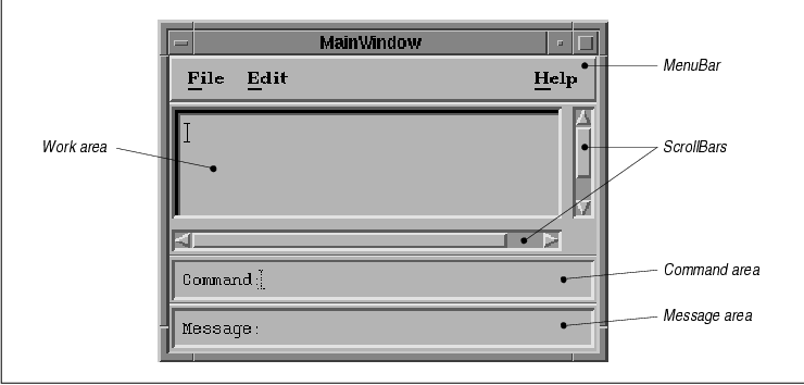
A main window should have a menu bar across the top,
with the work area immediately below it. The work area usually contains
the main interface object of the application. For example, a paint or
draw application might provide a DrawingArea widget as a canvas, an
electronic mail application might provide a ScrolledList of message
summaries from which the user can make selections, and a Text editor
might place a Text widget in the work area. An application work area
might require a custom widget or a non-widget-based X window instead.
The work area can have both horizontal and vertical
scrollbars allowing the user to view its entire contents if they are
too large to be displayed all at once. The main window can also contain
an optional command area below the work area, where the user can
enter typed commands. This area is most helpful for porting
character-based applications to a Motif GUI, but it can be useful for
other applications as well. At the bottom of the main window is an
optional message area. This area should be used for status and
informational messages only, not for error messages or any other type
of message that requires a response from the user.
While it is possible to construct your own main
window, the Motif toolkit provides the special-purpose MainWindow
widget, which supports the recommended style. All of the elements in
the MainWindow are optional, so an application can use it to display
just the areas that it requires. The MainWindow widget is described in
detail in Chapter 4, The Main Window.
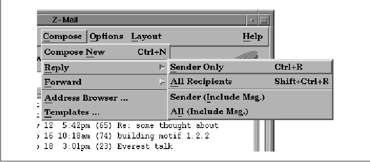
Motif supports three different styles of menus. PulldownMenus that are displayed from the MenuBar in a MainWindow are the most common type of menu. A PulldownMenu is displayed when the user selects a CascadeButton in the MenuBar. The menu pane is displayed below the CascadeButton. the figure shows a typical MenuBar and PulldownMenu.
An item in a PulldownMenu can have a cascading menu associated with it. The cascading menu is displayed to the right of the menu item as shown in the figure, so these menus are sometimes referred to as pullright menus.
MenuBars, PulldownMenus, and cascading menus are all
created in a similar way. Motif provides convenience functions that
create specially configured RowColumn widgets for these menu objects.
The RowColumn widget is then populated with PushButtons,
CascadeButtons, ToggleButtons, and Separators, or their gadget
equivalents. In the case of a MenuBar, all of the children must be
CascadeButtons, since each button brings up a separate menu. In a
PulldownMenu pane, most of the items are PushButtons or ToggleButtons,
although Separators can be used for clarity. If an item posts a
cascading menu, it must be a CascadeButton. The additional menu is
created separately, populated with its own buttons, and attached to
the CascadeButton.
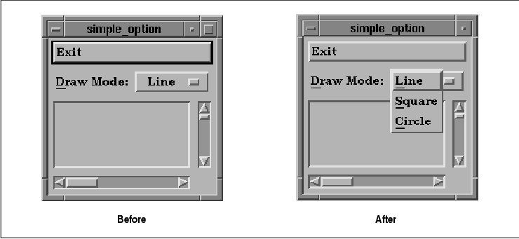
Motif also supports a construct called an
OptionMenu. An OptionMenu is another specially-configured RowColumn
widget, but in this case the behavior is quite different. An OptionMenu
is typically used to prompt the user to choose a value. The RowColumn
widget displays a Label and a CascadeButton that shows the current
value. When the user clicks on the button, a menu that contains the
rest of the choices is popped up directly on top of the CascadeButton.
Choosing an item from the menu modifies the label of the CascadeButton
so that it shows the currently-selected item. the figure shows an
OptionMenu, both before and after it is popped up.
Additionally, Motif provides PopupMenus. Unlike the other types of menus, a PopupMenu is not attached to a visible interface element. A PopupMenu can be popped up at any arbitrary location in an application, usually as a result of the user pressing the third mouse button. PopupMenus are meant to provide shortcuts to application functionality, so an application can use different PopupMenus in different contexts and for different components in an interface.
In Motif 1.2, a menu can be torn off from the
component that posted it. A menu is normally only displayed for as long
as it takes the user to make a selection. Once the selection is made,
the menu is closed. When a menu is torn off, it remains posted in its
own window. Now the user can make as many selections from the menu as
she would like without having to repost the menu each time. For more
information on tear-off menu functionality, as well as the different
types of Motif menus, see Chapter 15, Menus.
To the user, the MainWindow looks like the top-level
window of an application. In window-system talk, a top-level window
resides at the top of the window hierarchy for an application. Its
parent is the root window, which is what the user perceives as
the background behind all the windows on the desktop. In the Xt-world,
however, things are a little different. Behind every visible top-level
application window is a special kind of widget known as a shell widget.
Every window that can be placed independently on the
screen, including top-level windows and dialog boxes, has a shell
widget as its parent. The user does not see the shell because it is
obscured by all of the other widgets in the window. A shell widget can
only contain one managed child widget; the shell does not perform any
geometry management except to shrink-wrap itself around this child. The
child is typically a manager widget, such as a MainWindow, that is
responsible for managing the layout of the primitive components, such
as Labels, Text widgets, ScrollBars, and PushButtons. The items that
the user actually sees and interacts with are descendants of the shell
widget because they are contained within its boundaries.
Aside from managing its single child, the main job
of the shell is to communicate with the window manager on behalf
of the application. Without the shell, the application has no idea what
else is happening on the desktop. It is very important for you to
understand that the window manager is a separate application from your
own. The visual and physical interaction between an application and the
window manager is usually so close that most users cannot tell the
difference between the two, but the distinction is important from a
programming perspective.
To get an idea of the relationship between the
window manager and an application, let's compare it with the way a bed
is built and how it fits into a room. A bed is made up of a frame, a
mattress, and as many accessories as you want to pile on top of it. The
main window is the mattress; the sheets, pillows, blankets, and stuffed
animals you throw on it represent the user-interface controls inside
the main window. The whole lot sits on top of the bed frame, which is
the shell widget. When you push a bed around the room, you're really
pushing the bed's frame. The rest just happens to go along with it. The
same is true for windows on the screen. The user never moves an
application window, she moves the shell widget using the window manager
frame. The application just happens to move with it.
You may have to stretch your imagination a little to
visualize a bed resizing itself with its frame, but this is precisely
what happens when the user resizes an application. It is the window
manager that the user interacts with during a resizing operation. The
window manager only informs the application about the new size when the
user is done resizing. The window manager tells the shell, the shell
communicates the new size to its child, and the change filters down to
the rest of the widgets in the application.
The window manager frame is composed of window decorations that the window manager places on all top-level windows. These controls allow the user to interactively move a window, resize it, cause it to redraw itself, or even to close it. the figure shows the standard Motif window manager (mwm) decorations. For information on how to use mwm, see Volume Three, X Window System User's Guide, Motif Edition.
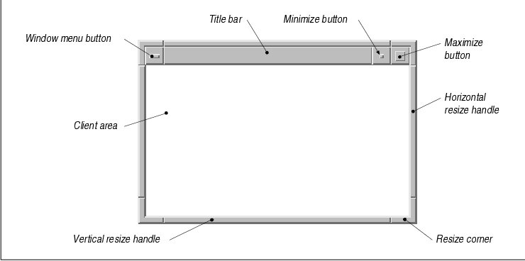
The window menu displays a list of window
manager functions that allow the user to move, resize, and exit the
application. An application does not have access to the menu itself or
the items within it; similarly, it cannot get handles to the minimize
and maximize buttons. These objects belong to the window manager and
act independently from an application.
Motif provides window manager protocols that
allow menu items like these to affect an application. An application
can also interact with the window manager using many of the same types
of protocols. You can specify which of the items in the window menu you
want to appear, whether or not there are resize handles on the window
frame, and whether or not you want to allow the user to iconify the
window. However, the user is expecting all of the applications on her
desktop to interact consistently with the window manager. This
expectation is magnified by the fact that the user has probably set
quite a few resources for the window manager. Since unexpected
interference from an application rarely makes users happy, you should
leave the window manager alone. A technical discussion of the window
manager can be found in Chapter 16, Interacting With the Window
Manager.
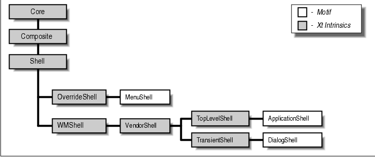
As we pointed out earlier, it is possible for an application to have more than one independent window. In addition to the main window, there may be one or more dialog boxes, as well as popup windows, and even independent application windows that co-exist with the main window. Each of these cases requires different handling by the window manager, and as a result, there are several different classes of shell widgets. the figure shows the class hierarchy of the different types of shell widgets available in the Motif toolkit. The Shell widget class is another metaclass that specifies resources and behaviors inherited by all of its subclasses.
In some cases, an application needs to put up a
temporary window that is completely free of window manager interaction.
Menus are one such a case. When a user pops up a menu, she typically
wants to make a choice immediately, and she wants that choice to take
precedence over any other window system activity. The window manager
does not need to be involved either to decorate or to position the
menu, as it is entirely up to the application.
As its name suggests, the OverrideShell widget class
is provided for windows that bypass the window manager. OverrideShells
are like futons; you can place them on the floor without using a
bed-frame (and without being tasteless). It doesn't make much sense to
use an OverrideShell as the main window for an application, except
possibly for a screen-locking application. The purpose of this type of
application is to prevent other applications from appearing on the
screen while the computer is left unattended. Because the window
manager is unaware of the OverrideShell, it does not provide window
manager controls, and it does not interpret window manager accelerators
and other methods for bypassing the lock.
The OverrideShell is a generic Xt-based widget
class, so the Motif toolkit provides the MenuShell to service the
special interface needs required by the Motif Style Guide. The
MenuShell's translation table is set to support keyboard traversal, its
XmNfocusPolicy is set to XmPOINTER, and its
XmNallowShellResize resource is set to True. The MenuShell
also makes sure that its child is a RowColumn widget. There is little
more to be said about MenuShells, but for an in-depth discussion on the
various types of menus you can use in Motif, see Chapter 15, Menus
. Shell widgets must communicate with the window manager to negotiate
screen real estate and a wide variety of other properties. The
information that is exchanged is defined by the X Consortium's
Inter-Client Communications Conventions Manual (ICCCM). The WMShell
widget class implements ICCCM-compliant behavior as a standard part of
the X Toolkit Intrinsics, so that it is available to all vendors
providing Xt-based widget sets and window managers. This shell widget
is what allows Motif applications to work correctly with virtually any
ICCCM-compliant window manager. In our analogy, a WMShell is a simple,
wire bed-frame that doesn't have any special attributes, like wheels or
rollers.
The VendorShell widget class is subclassed from the
WMShell class; it allows vendors, such as OSF, to define attributes
that are specific to their own window managers. In our analogy, this
widget class is like having a bed frame that has attached cabinets,
shelves above the headboard, or nice wheels that glide on the carpet.
The Motif VendorShell is aware of special features of mwm. The
widget does not actually add any functionality to the window manager,
but it is designed for applications that wish to interact with it. For
example, all the attributes of window manager decorations can be
modified or controlled through resources specific to the VendorShell.
WMShells and VendorShells are never instantiated
directly by an application, but the features they provide are available
to an application. For example, the Motif VendorShell allows an
application to specify the items in the window menu and to control what
happens when the user closes the window from the window menu.
Chapter 16, Interacting With the Window Manager, discusses
window manager interactions in more detail. You can think of dialog
boxes as an application's secondary windows. Since dialogs are
not meant to remain on the screen for very long, they do not need all
of the decorations that are typically provided by the window manager.
However, dialogs are not completely independent like menus, so they do
need to be controlled by the window manager. For example, if an
application is iconified, its dialog boxes are typically iconified as
well. Dialog boxes are usually implemented in Xt using TransientShells.
The DialogShell is a Motif-defined widget class
subclassed from the TransientShell and VendorShell classes. Motif
functions for creating dialog boxes tend to hide the shell widget side
of the dialog. When you make a call like XmCreateMessageDialog()
, you are actually creating a MessageBox widget as a child of a
DialogShell widget. See Chapter 5, Introduction to Dialogs, for
details on Motif dialogs. When you initialize the X Toolkit with a call
such as XtAppInitialize(), you are automatically returned an
ApplicationShell widget to use as the top-level widget in your
application. If an application uses additional top-level windows, they
are typically TopLevelShells. The differences between these two classes
are subtle and deal mostly with how resources are specified in a
resource file. In Chapter 7, Custom Dialogs, we explore some
ways in which TopLevelShells can be used as primary windows apart from
the main window.
Some applications can get all their work done in one
main window. Others may require multiple windows, so Motif allows an
application to have multiple top-level windows. However, even
applications without this level of complexity need to display transient
windows called dialog boxes. Motif provides two main types of dialog
boxes: message dialogs and selection dialogs. Message dialogs are
designed to allow an application to communicate with the user, while
selection dialogs prompt the user to enter different types of
information. It is also possible to create custom dialogs for
specialized application functionality. Message dialogs simply
communicate some kind of message to the user and include buttons that
allow the user to respond to the message. For example, a menu item to
delete a file might issue a dialog with the message, "Are you sure?"
with PushButtons labeled Yes, No, and Cancel.
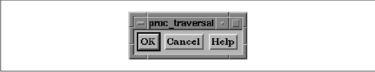
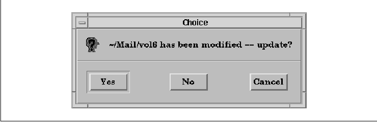
The Motif MessageBox widget that is used to create message dialogs actually comes in seven different guises. The different styles are meant to be used for different types of messages; some of the styles also display a symbol defined by the Motif Style Guide . Motif provides convenience routines for creating all of the different styles, so they are often referred to as if they are distinct widget classes.
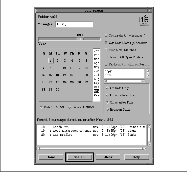
the figure shows a typical QuestionDialog in an application. For more information on message dialogs, see Chapter 5, Introduction to Dialogs.
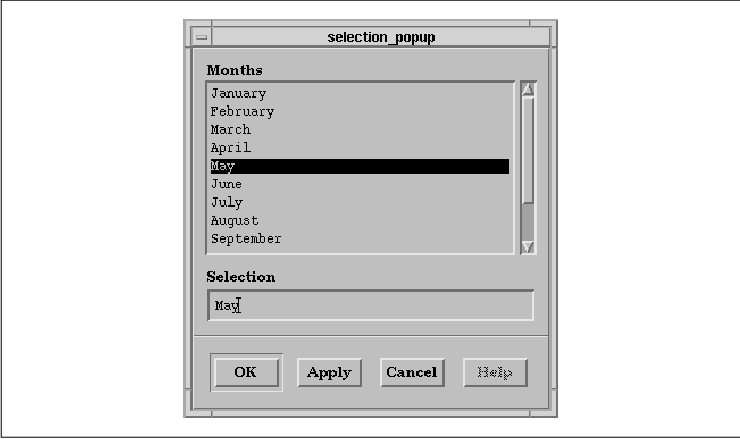
Selection dialogs are meant to provide the user with
a list of choices of some sort. Motif provides different styles of
selection dialogs for different purposes. For example, a
SelectionDialog presents a ScrolledList containing an arbitrary list of
choices that can be selected with the mouse. The dialog also contains a
TextField widget that can be used to type in a choice which may or may
not also be on the list. the figure shows a SelectionDialog.
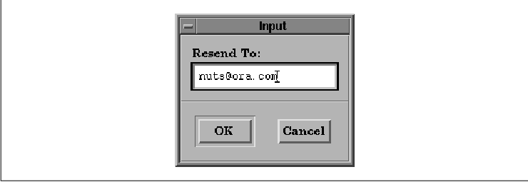
The PromptDialog, as shown in the figure, is useful for prompting the user to enter some information.
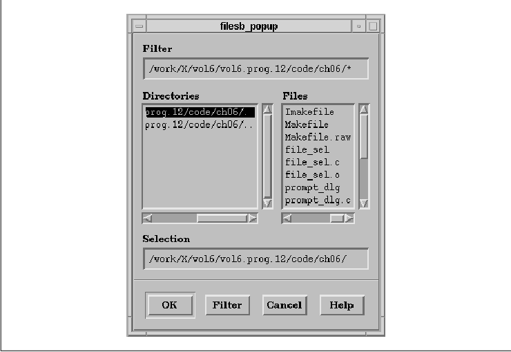
The FileSelectionDialog is a more complex cousin to the SelectionDialog. It is used to select a file in the directory structure. A FileSelectionDialog is shown in the figure.
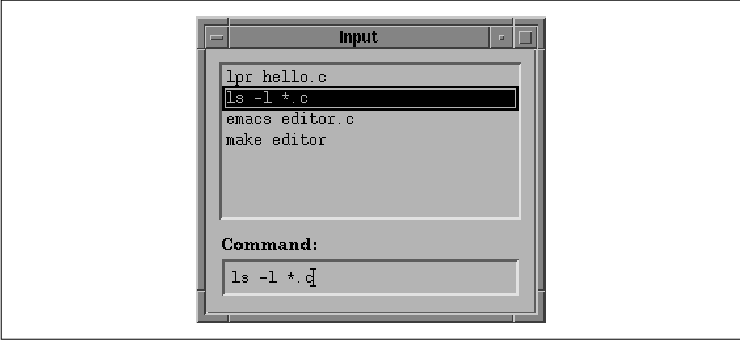
The CommandDialog is an extension of the PromptDialog in that items input to the text entry field are stored in a ScrolledList. The intent is for the user to provide the application with commands; the list region contains a history of the commands that have already been typed. The user can select an item in the history list to reissue a previous command. the figure shows an example of a CommandDialog.
For detailed information about all of the different
Motif selection dialogs, see Chapter 6, Selection Dialogs. There
are many types of functionality that are not covered by the standard
Motif dialog types. Fortunately, it is fairly easy to create your own
dialogs. If you need to create a custom dialog, there are some
guidelines in the Motif Style Guide that you should follow. At
the highest level, all dialogs are broken down into two major
components: the control area (or work area) and the action
area. These areas are conceptual regions that may be represented by
multiple widgets.
In a message dialog, the control area is used only
to display messages, but as you can see from the selection dialogs,
this area can be used to provide a variety of control elements. For
example, the SelectionDialog uses a List widget and a TextField widget.
It is also common for a custom dialog to display an array of
PushButtons or ToggleButtons. A communications program might have a
setup dialog that allows the user to set parameters such as baud rate,
parity, start and stop bits, and so on, using an array of
ToggleButtons. The controls in the control area provide information
that is used by the application once an action area button is pressed.
the figure shows a custom dialog with a control area
that contains many items. Chapter 7, Custom Dialogs, discusses
how to build customized dialogs, which may require the direct creation
of widgets in the control area. Motif dialogs, on the other hand, do
not require you to create any of the objects in the control area. The
widgets displayed in that part of the dialog are always predefined and
automatically created. One important concept to be aware of when it
comes to dialogs is modality. In general, GUI-based programs are
expected to be modeless. What this ultimately means is that the user,
not the application, should be in control. The user should be able to
choose from an array of application functions at any time, rather than
stepping through them in a prearranged sequence, under the
application's control.
Of course, there are limits to modelessness.
Sometimes one thing has to happen before another. Often, sequencing can
be taken care of simply by nesting graphical user interface elements.
For example, faced with the main window, the user may have only a
choice of menu titles; once she pulls down the file menu, she may have
a choice of opening, closing, saving, renaming, or printing the
contents of a file. At some point, though, she goes far enough down a
particular path that her choices need to be constrained.
With respect to dialogs, modality allows a dialog box to require and before the user can go back to working with the application. For example, if the user asks to load a file, she may need to specify a filename in a dialog before she can edit the file. A modal dialog requires an answer immediately, by disallowing input to any other part of the application until it is either satisfied or cancelled. There may be other cases, though, where dialogs are modeless. They can be left up on the screen without an immediate response, while the user interacts with the main application window or another dialog.
In this section, we are going to take a closer look
at how Motif supports graphic images. The Motif Label widget and all of
its subclasses can display pixmaps as their labels. The MessageBox
provides the XmNsymbolPixmap resource for specifying the image
that is displayed in a dialog.
The Motif toolkit provides a number of routines for
manipulating pixmaps. XmGetPixmapByDepth() and
XmGetPixmap() both create a pixmap and cache it, so that it can be
reused by an application. XmGetPixmapByDepth() is new in Motif
1.2; it provides a way to specify the depth of the pixmap that is
created. XmGetPixmap() always creates a pixmap that has the
same depth as the screen on which image is created. The caching
mechanism provided by these routines is on a per-client basis;
different processes cannot share pixmaps.
Whenever a new pixmap is created using one of these
functions, the toolkit retains a handle to the pixmap in case another
call is made requesting the same image. If this occurs, the function
returns the exact same pixmap that was returned to the original
requestor and increments an internal reference counter. In order to
keep a clean house, whenever you retrieve a pixmap using either
XmGetPixmap() or XmGetPixmapByDepth(), you should call
XmDestroyPixmap() when you no longer need the image. This function
decrements the reference count for the pixmap. If the reference count
reaches zero, XmDestroyPixmap() actually calls
XDestroyPixmap() to discard the pixmap.
XmGetPixmapByDepth() takes the following
form:
   Pixmap
   XmGetPixmapByDepth(screen, image_name, foreground,
           background, depth)
       Screen *screen;
       char   *image_name;
       Pixel   foreground;
       Pixel   background;
       int     depth;
The image_name can either be a filename or the name of
an image registered using XmInstallImage(), which we are going
to describe shortly. The background and foreground colors and the depth
of the pixmap are specified by the corresponding parameters.
XmGetPixmap() takes the same form as
XmGetPixmapByDepth(), minus the depth parameter.
XmGetPixmap() creates a pixmap that has the same depth as the given
screen, so you cannot rely on XmGetPixmap() to
create a single-plane pixmap. The terms single-bit and single-plane are
interchangeable; they imply a pixmap with only two colors: 0
and 1. While the term bitmap usually refers to a
single-plane pixmap, this is not necessarily true outside of the X
social culture. In Motif 1.2, you can use XmGetPixmapByDepth()
to create a bitmap; with Motif 1.1 you have to use an Xlib routine,
XCreateBitmapFromData().
Whenever XmGetPixmapByDepth() or
XmGetPixmap() is called, it looks in the cache for a
previously-created pixmap that matches the given name, colors, and
depth. If the routine finds a match, it returns the cached pixmap and
increments the reference count for the image. Since the pixmaps are
cached, two separate parts of an application could have a handle to the
same pixmap.
The image_name parameter is the key
to where the routines get the data for the pixmap. As we just
mentioned, this parameter can either be a filename or a symbolic name
previously registered using XmInstallImage(). Both
XmGetPixmap() and XmGetPixmapByDepth() use the following
algorithm to determine what pixmap to return or create:
   Boolean
   XmInstallImage(image, image_name)
       XImage   *image;
       char     *image_name;
The image parameter is a pointer to an XImage
data structure that has been previously created or, more commonly,
statically initialized by the application. It is possible to create an
image dynamically from an existing window or pixmap using
XGetImage(), but this is not the way the function is typically
used.
If you attempt to install an image using an
image_name that matches one already in the cache, the function
returns False and the image is not installed. Otherwise, the
function returns True. You can uninstall an image by calling
XmUninstallImage(). Once the image is uninstalled, it cannot be
referenced by name anymore and a new image may be installed with the
same name. The XImage structure is not copied by
XmInstallImage(), so if the image pointer you pass has been
allocated using XCreateImage() or XGetImage(), you
must not free the data until after you call XmUninstallImage()
.
If XmGetPixmap() or
XmGetPixmapByDepth() finds a match in the image cache, it creates
the pixmap based on the image data, not on the image itself. As a
result, the pixmap that is created is not affected by the image being
uninstalled by XmUninstallImage().
If the pixmap retrieval routines do not find a match
in the image cache, the pixmap is loaded from a file. If
image_name starts with a slash character (/), it is taken as a
full pathname. Otherwise, the routines look for the file using a search
path. On POSIX systems, the environment variable XBMLANGPATH can be set
to specify a desired directory in which to search for bitmap files. If
this variable is not set, the pathname used is based on the values of
the XAPPLRESDIR, HOME, and LANG environment variables. See the
reference page in Volume Six B, Motif Reference Manual, for
complete details on the search path that is used.
When XmGetPixmap() or
XmGetPixmapByDepth() looks in the pixmap cache for a image name,
the pathname must match completely for the routine to return a cached
image. The file xlogo64 will not match a previously-loaded
pixmap that has the name /usr/include/X11/bitmaps/xlogo64. If
you do not need to worry about using different pixmaps for different
environments, we recommended that you always specify a full pathname to
these routines to be assured that you get the desired file.
Color plays an important role in a graphical user
interface. It appeals to the senses, so it can provide an aesthetic
quality, while at the same time it can be used to convey information to
the user. However, for all the power of color, it is frequently abused
by applications. A color combination that appeals to some people may
offend others. The safest bet with color is to avoid hard-coding any
use of color in your application and provide enough flexibility so that
the user can configure colors in a resource file or interactively using
the application. Of course, many applications are based on the use of
color, so this sweeping generalization only applies to those parts of
an application that are not dependent on color.
The Motif widget set provides a number of widget
resources that specify colors. All of the Motif widgets use the
XmNforeground and XmNbackground resources. However, Motif
gadgets do not use these resources because they are rendered using the
foreground and background colors of their parent. Although every widget
class makes different use of the XmNbackground and
foreground resources, text is typically rendered in the foreground
color and everything else is shown using the background color. Some
widgets provide additional color resources for particular aspects of
their appearance. For example, ToggleButtons use the XmNselectColor
resource for the square/diamond selection indicator, PushButtons use
XmNarmColor as their background when they are armed, and ScrollBars
use XmNtroughColor to set the color of the area behind the
slider and directional arrows.
The XmNborderColor resource is another
resource that can be specified for any widget, as it is defined by the
Core widget class. Since Motif widgets typically have a border width of
0, this resource is rarely used. The XmNhighlightColor
resource specifies the color of the highlighting rectangle that is
displayed around the interface component that has the keyboard focus.
This resource is defined by the Gadget, Manager, and Primitive
metaclasses, so it can be specified for any Motif component.
Perhaps the most troublesome of all the color
resources are XmNtopShadowColor and XmNbottomShadowColor
. These are the colors that give Motif widgets their 3D appearance on a
color display. If set inappropriately, these colors can ruin the
aesthetics of a interface. These resources are set automatically by the
toolkit based on the background color of the object, so the colors are
not normally a problem. If the background color of a PushButton is blue
when it is created, the toolkit automatically calculates the
XmNtopShadowColor to be a slightly lighter shade of blue and the
XmNbottomShadowColor to be a slightly darker shade.
The problems arise if you want to change the
background color of a widget dynamically because the toolkit does not
automatically change the shadow colors for you. So if you change the
XmNbackground of the PushButton to red, the top and bottom shadow
colors remain the different shades of blue. It is important to note
that the shadow resources are only used by widgets, not gadgets. If you
dynamically change the background color of a manager widget, it
automatically recalculates the top and bottom shadow colors and
redisplays its gadgets correctly. Many consider the fact that this
process is not automated for widgets to be a design flaw in the Motif
toolkit.
If you need to change the background color of a
widget dynamically, you can recalculate the shadow colors and set the
resources yourself. If you are using Motif 1.2, you can use the new
XmChangeColor() routine, which takes the following form:
   void
   XmChangeColor(widget, background)
       Widget  widget;
       Pixel   background;
This routine changes all the foreground color, shadow colors, and
select color for the specified widget based on the
background color. The select color only applies to
ToggleButtons (XmNselectColor) and PushButtons (
XmNarmColor).
If you are using Motif 1.1, you have to do a bit
more work to change the colors for a widget. In this case, you need to
use XmGetColors(), which takes the following form:
   void
   XmGetColors(screen, colormap, bg, fg, top_shadow,
           bottom_shadow, select)
       Screen  *screen;
       Colormap colormap;
       Pixel    bg;
       Pixel   *fg;
       Pixel   *top_shadow;
       Pixel   *bottom_shadow;
       Pixel   *select;
This routine takes a colormap and a background color and calculates and
returns an appropriate foreground color, top and bottom shadow colors,
and select color. Once you have the colors, you need to specify the
appropriate resources for the widget. The following code fragment
demonstrates how to set the background of a PushButton to red:
   Pixel bg, top_shadow, bottom_shadow, fg, select_color;
   Colormap cmap;
   Widget pb;

   /* First, set the background color to red... */
   XtVaSetValues (pb,
       XtVaTypedArg, XmNbackground, XmRString, "red", 4,/* strlen("red")+1 */
       NULL);

   /* Once set, get it again, so we know what pixel value it got.
    * Also get the widget's colormap, since we'll be setting its new
    * colors based on the same colormap.
    */
   XtVaGetValues (pb,
       XmNbackground, &bg,
       XmNcolormap,   &cmap,
       NULL);

   /* Let Motif calculate the new colors based on that one color */
   XmGetColors (XtScreen (pb), cmap, bg, &fg,
       &top_shadow, &bottom_shadow, &select_color);

   /* Set the colors accordingly. */
   XtVaSetValues (pb,
       XmNtopShadowColor,    top_shadow,
       XmNbottomShadowColor, bottom_shadow,
       XmNarmColor,          select_color,
       XmNborderColor,       fg,
       NULL);
A basic problem behind setting and getting colors for widgets is that
what you get for a given pixel value depends on the colormap. A pixel
is simply an index value into an array of color definitions (a
colormap). The problem with colormaps is that you never know what
colormap is associated with any particular widget.
By calling XtVaSetValues() using the
type-converting resource, XtVaTypedArg, we defer the problem
to the toolkit and its string-to-color type converter. The toolkit
allocates the color out of the colormap already owned by the toolkit
and sets the background color accordingly. Then we can get the actual
pixel value and the colormap using XtVaGetValues(). We pass
the colormap and the background pixel value to XmGetColors()
to calculate the rest of the colors. Once we have obtained all of the
colors, we can set them using XtVaSetValues().
The Label widget and its subclasses cannot display
text using more than one color. However, you can create a multi-plane
pixmap and render various strings directly into it using
XDrawString(). You can use multiple colors by changing the
foreground color in the GC using XSetForeground() or
XChangeGC(). Once you have the pixmap, you can use it to set the
XmNlabelPixmap resource for the widget.
The text of the entries in a List widget is rendered
using the widget's XmNforeground color. You cannot change the
color of individual items in a List widget. The XmNbackground
of the List affects all areas of the widget not associated with the
entries themselves. The text in a Text widget or a TextField widget is
also displayed using the XmNforeground color; there is no way
to display text using different colors in these widgets. When a List
widget or Text widget is the direct child of a ScrolledWindow, the
ScrollBars automatically match the background color of the List or Text
widget.
Release 1.2 of the Motif toolkit introduces a number
of new features, as well as many enhancements to existing
functionality. This section summarizes all of the changes in Motif 1.2
and refers you to other sections in the book for more detailed
information on specific changes. We also describe the changes that we
made to the example programs in the book to make them accurate with
respect to Motif 1.2.
Many of the changes in Motif 1.2 affect the
functionality of the toolkit as whole, rather than individual widget
classes. This release demonstrates performance improvements, as the
code has been reorganized to improve locality and dynamic memory usage
has been reduced. The toolkit also benefits from the improved
performance of the X11R5 translation manager. Motif 1.2 provides a new
header file, <Xm/XmAll.h>, that includes all of the public
header files for the toolkit. The <Xm/ExtObject.h>, <
Xm/Traversal.h>, <Xm/VaSimple.h>, and <Xm/VendorE.h>
header files that are present in Motif 1.1 are obsolete in Motif 1.2.
The addition of internationalization capabilities is one of the major
enhancements provided by Motif 1.2. An internationalized application
can run in different language environments without any modification.
Most of the support for developing internationalized applications in
Motif is based on features provided by X11R5. Xlib provides support for
internationalized text output, interclient communication, and
localization of the resource database, while Xt handles establishing
the locale. See Section #slangproc in Chapter 2, The Motif
Programming Model, for more information on establishing the
language environment in an Xt-based application; refer to Volume One,
Xlib Programming Manual, for a description of the
internationalization features in X11R5.
The Text and TextField widgets have been modified to
support internationalized text input and output; see Section #stexti18n
in Chapter 14, Text Widgets, for more information. The Motif
routines that manipulate compound strings and font lists have also been
updated for Motif 1.2. See Chapter 19, Compound Strings, for
details on the new API for XmString and XmFontList
values. The ability to transfer data using the drag and drop metaphor
is another major new feature in Motif 1.2. Drag and drop allows the
user to select a data source, drag the data around on the display, and
drop the data on a new location. The drag and drop mechanism handles
data transfer both within and between applications. The Label widget
and its subclasses, the List widget, and the Text and TextField widgets
all provide built-in drag and drop capabilities. The toolkit also
provides some new objects and routines that can be used to implement
custom drag and drop functionality. In Chapter 18, Drag and Drop
, we describe the Motif drag and drop model and the objects that
implement it, and we present some examples of providing custom drag and
drop functionality in an application. Motif provides a new feature in
menus that allows them to be torn off and displayed in separate
windows. Tear-off menus make it easy for the user to make repeated
selections from a menu. Normally, when a menu is posted, it is only
displayed until a selection is made, and then it is removed. If the
menu has been torn off, it is placed in its own window and remains
available for the user to make multiple selections. The tear-off
functionality is activated by a special tear-off button in the menu.
The button displays a dashed line to indicate that the menu can be torn
off, much as a coupon is torn out of a newspaper. Tear-off
functionality is provided for all of the Motif menu types; it is
controlled by the XmNtearOffModel resource of the RowColumn
widget. See Section #stearoff in Chapter 15, Menus, for a more
complete description of tear-off menus. The new Display and Screen
objects store per-display and per-screen resources and data. These
objects essentially provide a way for the toolkit to keep track of
information about the display and the screen that it needs to access
frequently. When Motif creates the first shell on a particular display
or screen, it creates a Display or Screen object automatically. An
application can retrieve the Display and Screen objects using
XmGetXmDisplay() and XmGetXmScreen(), respectively. Values
for the resources defined by the Display and Screen objects can be set
in a resource file or in a program using XtVaSetValues(), and
they can be retrieved using XtVaGetValues().
The Display object defines resources that an
application can set to control the behavior of the application on the
display. The XmNdragInitiatorProtocolStyle and
XmNdragReceiverProtocolStyle resources specify the protocol used
during a drag and drop transfer, as described in Section #sdragprot,
while XmNdefaultVirtualBindings sets the default virtual
bindings for the display. For a complete description of the Display
object, see the reference page in Volume Six B, Motif Reference
Manual.
The Screen object defines a number of resources that
control the default drag icons used during drag and drop; see Section
#smodicon for a discussion of these resources. The
XmNdarkThreshold, XmNforegroundThreshold, and
XmNlightThreshold resources specify values that affect the default
color calculation algorithm, as we describe shortly.
The XmNfont, XmNhorizontalFontUnit
, and XmNverticalFontUnit resources specify the font units that
are used to convert geometry values when the Xm100TH_FONT_UNITS
value is being used for units. These resources make the
XmSetFontUnit() and XmSetFontUnits() routines in Motif 1.1
obsolete.
The XmNmenuCursor resource controls the
pointer shape that is used when a menu is posted; the resource
supercedes the XmGetMenuCursor() and XmSetMenuCursor()
functions in Motif 1.1. The XmNunpostBehavior resource
indicates the behavior of a menu when the mouse button is pressed
outside of the menu. The value XmUNPOST_AND_REPLAY unposts the
menu hierarchy and replays the event, while XmUNPOST just
unposts the menu. For more information on the various Screen resources,
see the reference page in Volume Six B, Motif Reference Manual.
Motif provides a number of new functions that support better control of
keyboard traversal. The XmGetFocusWidget() routine returns the
widget that has the input focus, while XmGetTabGroup() returns
the widget that is the tab group for the specified widget. An
application can also call XmIsTraversable() to determine
whether or not a particular widget is eligible to receive the input
focus. See Section #skeybtrav in Chapter 8, Manager Widgets, for
more information about keyboard traversal.
The Manager widget class defines the
XmNinitialFocus resource to allow an application to specify the
widget that has the initial keyboard focus in a dialog. This resource
can be used for both MessageDialogs and SelectionDialogs, although it
is normally only used for SelectionDialogs. The resource specifies the
widget that has the keyboard focus the first time that the dialog is
popped up, as described in Section #sinitfocus in Chapter 5,
Introduction to Dialogs.
The XmTrackingEvent() routine in Motif 1.2
replaces the existing XmTrackingLocate() routine for
implementing context-sensitive help. XmTrackingEvent() works
for both keyboard and mouse events, and it returns the widget selected
by the user, regardless of whether or not the widget is sensitive to
input. The routine also returns the actual event performed by the user,
as explained in Section #sconthelp in Chapter 21, Advanced Dialog
Programming. Motif 1.2 provides a representation type manager to
handle many of the tasks related to enumerated values, such as
installing resource converters that convert string values to their
numerical representations. The toolkit provides following functions for
managing representation types:
   XmRepTypeAddReverse()
   XmRepTypeGetId()
   XmRepTypeGetNameList()
   XmRepTypeGetRecord()
   XmRepTypeGetRegistered()
   XmRepTypeRegister()
   XmRepTypeValidValue()
For more information about these routines, see the appropriate reference pages in Volume Six B, Motif Reference Manual.
Motif also provides a name-to-widget converter in
this release so that widgets can be specified in resource files. This
converter is most useful for specifying Form attachments in a resource
file. The converter uses XtNameToWidget() from the parent of
the widget specified on the left-hand side of the resource
specification. Motif includes the new xmbind client that
configures the virtual key bindings for Motif applications. This action
is performed at startup by the Motif Window Manager (mwm) or any
application that uses the Motif toolkit, so an application only needs
to use xmbind if it wants to reconfigure the bindings without
restarting mwm or a Motif application. The toolkit also provides
a new function, XmTranslateKey(), to translate a keycode into
a virtual keysym. This function allows an application that overrides
the default XtKeyProc to handle Motif's virtual key bindings.
See Section #seventspec in Chapter 2, The Motif Programming Model
, for more information on virtual bindings. The new XmChangeColor()
routine changes the foreground color, shadow colors, and select color
for a widget based on a background color. The XmNdarkThreshold
, XmNforegroundThreshold, and XmNlightThreshold
resources of the Screen object allow the application or the user to set
values that affect the default color calculation algorithm. The values
for these resources indicate the levels of perceived brightness
(between 0 and 100) that distinguish between a light color and a dark
color. The XmNforegroundThreshold value is used in calculating
the default foreground and highlight colors, while the other two
resources are used in calculating the default shadow and select colors.
See Section #scolor for a discussion of color resources in Motif. An
application can use the new XmWidgetGetBaselines() routine to
get the position of the text baseline in a widget, while
XmWidgetGetDisplayRect() can be used to get the size and position
of the bounding box for the widget. These routines provide information
that is useful in laying out and aligning components in an interface.
Motif 1.2 also introduces a number of new features,
including resources and callback routines, for individual widget
classes. In Motif 1.2, the Frame widget can have two children: a work
area and a title. The Frame draws a border around its work area child
and adds space for a title if one is specified. The XmNchildType
constraint resource specifies whether a child is the work area or the
title. This resource can have either the value
XmFRAME_WORKAREA_CHILD or XmFRAME_TITLE_CHILD. The
XmNchildHorizontalAlignment, XmNchildHorizontalSpacing,
and XmNchildVerticalAlignment constraint resources control the
positioning of the title child. For more information on these
resources, see Section #sframe in Chapter 8, Manager Widgets.
The Label widget functions as a drag source for drag and drop, as
described in Chapter 18, Drag and Drop. The ProcessDrag()
action routine, which is bound to the second mouse button, handles this
functionality. The List widget provides the following new functions for
managing list items:
   XmListAddItemUnselected()
   XmListDeletePositions()
   XmListGetKbdItemPos()
   XmListPosSelected()
   XmListPosToBounds()
   XmListReplaceItemsPosUnselected()
   XmListReplaceItemsUnselected()
   XmListReplacePositions()
   XmListSetKbdItemPos()
   XmListUpdateSelectedList()
   XmListYToPos()
For more information on these routines, see Chapter 12, The List Widget, and the appropriate reference pages in Volume Six B, Motif Reference Manual.
When a List widget is set insensitive, it provides
visual indication by greying out all of its items. The default value of
the XmNvisibleItemCount resource is now set dynamically, based
on the item count and the height of the List.
The List widget functions as a drag source for drag
and drop, as described in Chapter 18, Drag and Drop. The
ListProcessDrag() action routine, which is bound to the second
mouse button, handles this functionality. The List also has a
ListCopyToClipboard() action routine for copying the selected items
to the clipboard, as well as a ListScrollCursorVertically()
routine for scrolling the cursor vertically based on a y-position. The
MessageBox widget supports the addition of a MenuBar child, a work area
child, and multiple PushButton children. The XmNdialogType
resource can also be set to the value XmDIALOG_TEMPLATE to
create a MessageBox that can be used as a template for creating a
custom dialog. Section #smoddialog in Chapter 7, Custom Dialogs,
describes the template dialog in more detail. The PanedWindow defines a
new constraint resource, XmNpositionIndex, for specifying the
position of a child widget in the PanedWindow's list of children. The
children are positioned vertically in the PanedWindow according to this
list. The list of children does not include the Sashes. A value of
0 indicates the beginning of the list, while XmLAST_POSITION
places the child at the end of the list. The RowColumn widget provides
a new resource for controlling the alignment of its children. The
XmNentryVerticalAlignment resource controls the vertical
positioning of children that are subclasses of Label, LabelGadget, and
Text, as described in Section #srowcolumn in Chapter 8, Manager
Widgets.
The RowColumn widget also defines the
XmNpositionIndex constraint resource for specifying the position of
a child widget in the RowColumn's list of children. The children are
positioned in the RowColumn according to this list. A value of 0
indicates the beginning of the list, while XmLAST_POSITION
places the child at the end of the list.
The XmNtearOffModel resource of the
RowColumn widget controls tear-off functionality in Motif menus. The
widget also defines the XmNtearOffMenuActivateCallback and
XmNtearOffMenuDeactivateCallback callback routines for performing
any special processing that is necessary for handling tear-off menus.
Tear-off functionality is described in detail in Section #stearoff in
Chapter 15, Menus. When a ScrollBar is set insensitive, it
provides a visual indication of this state by dimming itself. The
ScrollBar also has new action routine, CancelDrag(), that
cancels the current slider drag. When the user presses the ESCAPE key
while the slider is being dragged, the action is invoked. In Motif 1.2,
the ScrolledWindow has a new callback that supports keyboard traversal.
The XmNtraverseObscuredCallback is invoked when the user
attempts to traverse to a widget that is not visible in a
ScrolledWindow. An application can use this callback to make a widget
visible in a ScrolledWindow so that the widget can receive the input
focus. The XmScrollVisible() routine makes an obscured child
of a ScrolledWindow visible, while XmGetVisibility()
determines whether or not a widget is visible. See Section #sswtrav in
Chapter 9, ScrolledWindows and ScrollBars, for more information
on keyboard traversal in ScrolledWindows.
The SelectionBox and FileSelectionBox widgets now support the
addition of a MenuBar child and multiple PushButton children in
addition to the work area child that was supported in Motif 1.1. The
new XmNchildPlacement resource controls the location of the
work area child, as described in Section #smodseldlg in Chapter 7,
Custom Dialogs.
The Text and TextField widgets have a number of new resources and
callback routines that support wide-character strings. These changes
have been made for internationalization purposes and are described in
Section #stexti18n in Chapter 14, Text Widgets. The widgets
function as drag sources and drop sites for drag and drop, as described
in Chapter 18, Drag and Drop.
The insertion position in the Text and TextField
widgets is marked by an I-beam cursor. The destination cursor now
follows the insertion cursor, so it is no longer drawn independently as
a caret (^). When a Text or TextField widget is set
insensitive, it provides a visual indication of this state by greying
out its text and its insertion cursor. Both the Text and TextField
widgets provide the toggle-overstrike() action routine for
switching between insert and overstrike modes. The Text widget also
provides the scroll-cursor-vertically() action to scroll the
cursor based on a y position. When the user moves the pointer outside
of a Text widget while selecting text, the widget continues selecting
text by scrolling automatically after a time delay.
The new XmTextDisableRedisplay() and
XmTextEnableRedisplay() routines provide a way to control visual
updating in a Text widget. The XmTextFindString(),
XmTextGetSubstring(), and XmTextFieldGetSubstring()
functions make string manipulation easier. For more information on
these routines, see the appropriate reference pages in Volume Six B,
Motif Reference Manual. The TextField widget also has an
XmNfocusCallback in Motif 1.2. The performance of scrolling in the
ScrolledText object has been improved in Motif 1.2. One unfortunate
side-effect of this improvement is that it introduces a new data
structure, which means that subclasses of the Motif 1.1 Text widget may
break under Motif 1.2.
If XmNfillOnSelect is explicitly set to True when
XmNindicatorOn is False, the background of the
ToggleButton is set to the XmNselectColor when the button is
on.
The VendorShell provides the XmNaudibleWarning resource to
specify whether or not an audible cue accompanies a warning message.
The default value is XmBELL, but the resource can also be set
to XmNONE. The value of the XmNverifyBell resource of
the Text and TextField widgets is based on the new VendorShell
resource.
The VendorShell defines the XmNbuttonFontList
, XmNlabelFontList, and XmNtextFontList resources to
replace the existing XmNdefaultFontList resource. The new
resources specify the font lists for the specific types of children of
the VendorShell.
The VendorShell also defines the XmNinputMethod
and XmNpreeditType resources for controlling internationalized
text input. XmNinputMethod specifies the input method for the
application, while XmNpreeditType indicates the input method
styles that are available. The syntax and possible values of both of
these resources are vendor-specific, as discussed in Section #stexti18n
in Chapter 14, Text Widgets.
All of the example programs in this book have been
updated to Motif 1.2 and X11R5. Some of the changes are quite
repetitive and are described in the following list:
The Motif widget set gives you a great deal of
flexibility in designing an application. But with this flexibility can
come indecision, or even confusion, about the most effective way to use
these objects. If you want to give a user a set of exclusive choices,
should you use a PulldownMenu, a dialog box that contains ToggleButtons
arranged in a CheckBox, or a List widget? There is no right answer--or
perhaps it is better to say that the right answer depends on the nature
of the choices and the flow of control in your application.
Designing an effective user-interface is an art.
Only experience and experimentation can teach you the most effective
way to organize an application. What we can do in this book is teach
you how to use each widget class and give you a sense of the tradeoffs
involved in using different widgets. In this chapter, we've given you a
broad overview of the Motif toolkit. Subsequent chapters delve into
each widget class in detail. You should be able to read the chapters in
any order, as the needs of your application dictate.