CSS visual effects
Learn the secrets of creating CSS visual effects, such as one-sided shadows, irregular drop shadows, color tinting, frosted glass, and folded corners. Read this excerpt from Lea Verou's CSS Secrets.
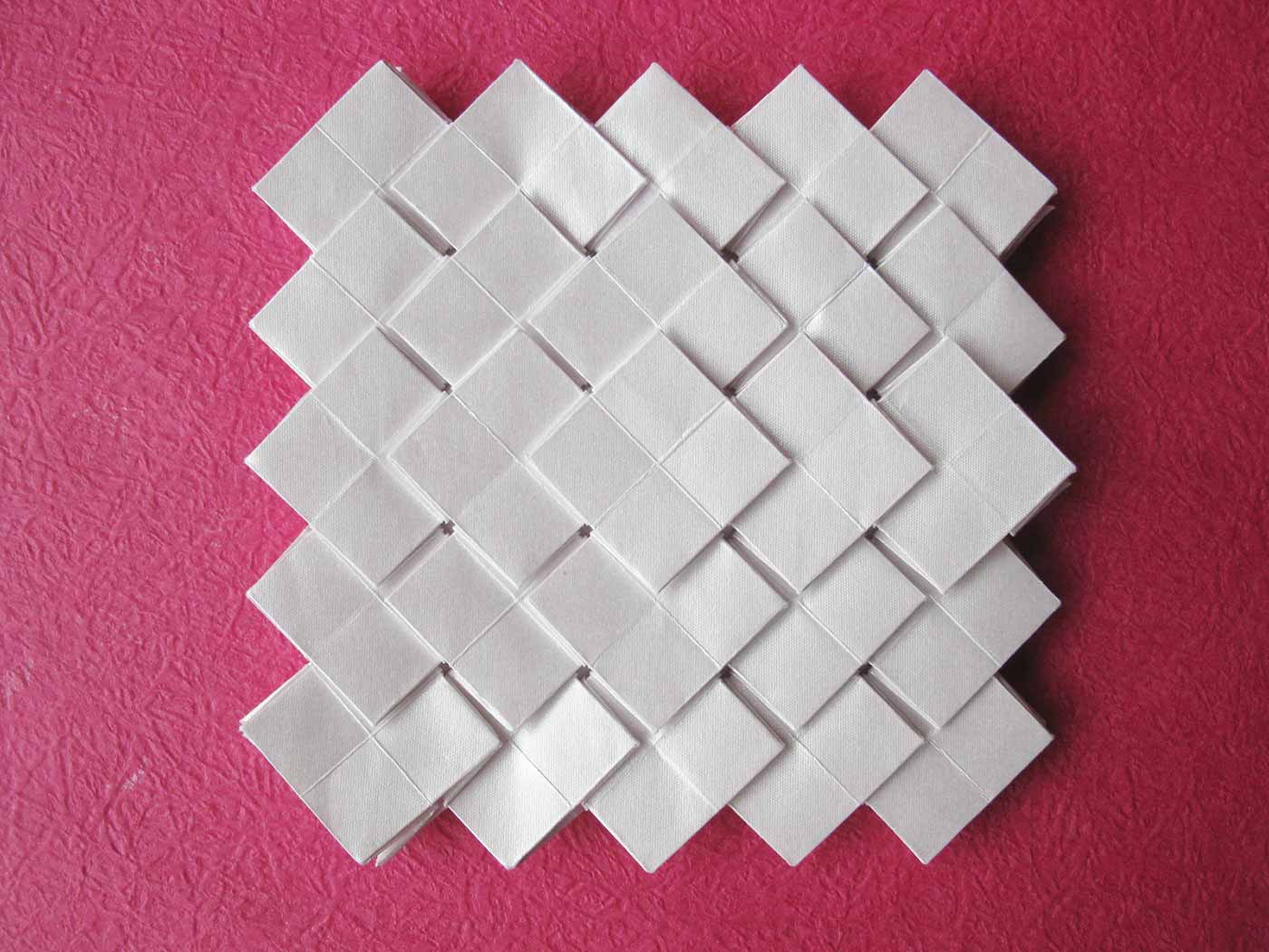 Shuzo Fujimoto's Clover Tessellation (source: Jorge Jaramillo via Flickr)
Note
This is an excerpt from CSS Secrets. It may contain references to unavailable content from the larger resource.
Visual Effects
One-sided shadows
The problem
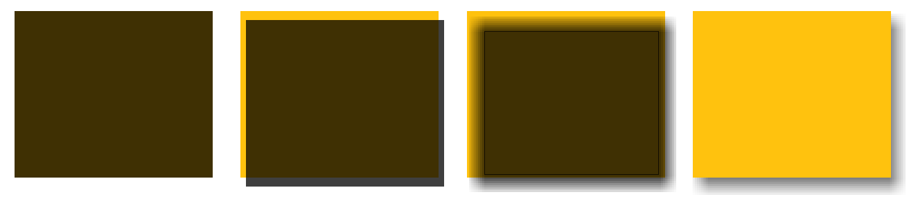
One of the most common questions I see being asked about box-shadow on Q&A websites is how a shadow could be applied on one (or, more rarely, two) sides only. A quick search on stackoverflow.com reveals close to a thousand results for this. This makes sense, as showing a shadow only on one side creates a subtler, but equally realistic effect. Often, frustrated developers will even write to the CSS Working Group mailing list requesting new properties like box-shadow-bottom to be able to do this. However, such effects are already possible with clever use of the good ol’ box-shadow property we’ve learned and love.
Learn faster. Dig deeper. See farther.
Shadow on one side
Most people use box-shadow with three lengths and a color, like so:
box-shadow: 2px 3px 4px rgba(0,0,0,.5);
The following series of steps is a good (albeit not completely technically accurate) way to visualize how this shadow is drawn:
box-shadow being painted- A
rgba(0,0,0,.5)rectangle is drawn with the same dimensions and position as our element. - It’s moved
2pxto the right and3pxto the bottom. - It’s blurred by
4pxwith a Gaussian blur algorithm (or similar). This essentially means that the color transition on the edges of the shadow between the shadow color and complete transparency will be approximately as long as double the blur radius (8px, in our example). - The blurred rectangle is then clipped where it intersects with our original element, so that it appears to be “behind” it. This is a little different from the way most authors visualize shadows (a blurred rectangle underneath the element). However, for some use cases, it’s important to realize that no shadow will be painted underneath the element. For example, if we set a semi-transparent background on the element, we will not see a shadow underneath. This is different than
text-shadow, which is not clipped underneath the text.
The use of 4px blur radius means that the dimensions of our shadow are approximately 4px larger than our element’s dimensions, so part of the shadow will show through from every side of the element. We could change the offsets to hide any shadow from the top and left, by increasing them to at least 4px. However, then this results in a way too conspicuous shadow, which doesn’t look nice (Figure 1-2). Also, even if this wasn’t a problem, we wanted a shadow on only one side, not two, remember?
The solution lies in the lesser known fourth length parameter, specified after the blur radius, which is called the spread radius. The spread radius increases or (if negative) decreases the size of the shadow by the amount you specify. For example, a spread radius of -5px will reduce the width and height of the shadow by 10px (5px on each side).
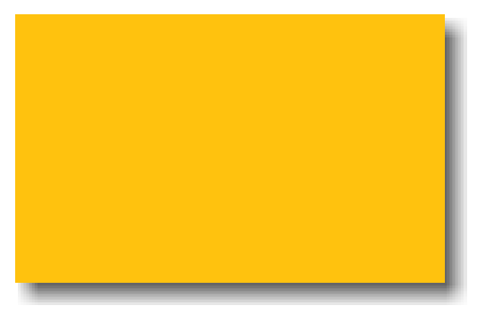
It logically follows that if we apply a negative spread radius whose absolute value is equal to the blur radius, then the shadow has the exact same dimensions as the element it’s applied on. Unless we move it with offsets (the first two lengths), we will not see any of it. Therefore, if we apply a positive vertical offset, we will start seeing a shadow on the bottom of our element, but not on any of the other sides, which is the effect we were trying to achieve:
box-shadow: 0 5px 4px -4px black;
You can see the result in Figure 1-3.

box-shadow on the bottom side onlyShadow on two adjacent sides
Another frequently asked question concerns applying a shadow on two sides. If the two sides are adjacent (e.g., right and bottom), then this is easier: you can either settle for an effect like the one in or apply a variation of the trick discussed in the previous section, with the following differences:
- We don’t want to shrink the shadow to account for blurring in both sides, but only one of them. Therefore, instead of the spread radius having the opposite value of the blur radius, it will be half of that.
- We need both offsets, as we want to move the shadow both horizontally and vertically. Their value needs to be greater or equal to half the blur radius, as we want to hide the remaining shadow from the other two sides.
For example, here is how we can apply a black, 6px shadow to the right and bottom sides:
box-shadow: 3px 3px 6px -3px black;
You can see the result in Figure 1-4.
box-shadow on two adjacent sides onlyShadow on two opposite sides
It starts getting trickier when we want a shadow on two opposite sides, such as the left and right. Because the spread radius is applied on all sides equally (i.e., there is no way to specify that we want to enlarge the shadow horizontally and shrink it vertically), the only way to do this is to use two shadows, one on each side. Then we basically apply the trick discussed in Shadow on one side twice:
box-shadow: 5px 0 5px -5px black,
           -5px 0 5px -5px black;
You can see the result in Figure 1-5.
box-shadow on two opposite sidesIrregular drop shadows
The problem
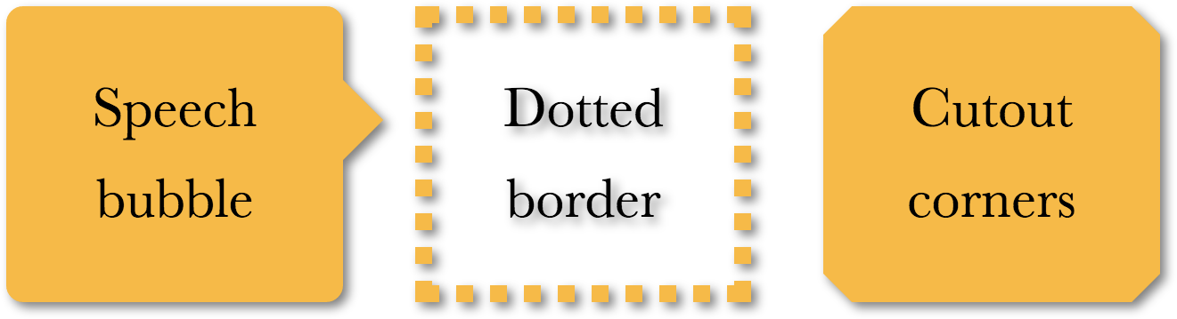
box-shadow works great when we want to cast a drop shadow on a rectangle or any shape that can be created with border-radius (refer to the “Flexible ellipses” secret for a few examples on that). However, it becomes less useful when we have pseudo-elements or other semi-transparent decorations, because box-shadow shamelessly ignores transparency. Some examples include:
- Semi-transparent images, background images, or
border-images (e.g., a vintage gold picture frame) - Dotted, dashed, or semi-transparent borders with no background (or when
background-clipis notborder-box) - Speech bubbles, with their pointer created via a pseudo-element
- Cutout corners like the ones we saw in the “Cutout corners” secret
- Most folded corner effects, including the one later in this chapter
- Shapes created via
clip-path, like the diamond images in the “Diamond images” secret

box-shadow useless; the value of the box-shadow applied is 2px 2px 10px rgba(0,0,0,.5)The results of the futile attempt to apply box-shadow to some of them is shown in Figure 1-6. Is there a solution for such cases, or do we have to give up shadows altogether?
The solution
The Filter Effects specification offers a solution to this problem, through a new filter property, borrowed from SVG. However, although CSS filters are basically SVG filters, they do not require any SVG knowledge. Instead, they are specified through a number of convenient functions, such as blur(), grayscale(), or—wait for it—drop-shadow()! You may even daisy-chain multiple filters if you want to, by whitespace separating them, like this:
filter: blur() grayscale() drop-shadow();
The drop-shadow() filter accepts the same parameters as basic box-shadows, meaning no spread radius, no inset keyword, and no multiple, comma-separated shadows. For example, instead of:
box-shadow: 2px 2px 10px rgba(0,0,0,.5);
we would write:
filter: drop-shadow(2px 2px 10px rgba(0,0,0,.5));
You can see the result of this drop-shadow() filter when applied on the same elements as in Figure 1-7.
drop-shadow() filter, applied to the elements from Figure 1-6.The best thing about CSS filters is that they degrade gracefully: when they are not supported, nothing breaks, there is just no effect applied. You can get slightly better browser support by using an SVG filter alongside, if you absolutely need this effect to work in as many browsers as possible. You can find the corresponding SVG filters for every filter function in the Filter Effects specification. You can include both the SVG filter and the simplified CSS one alongside and let the cascade take care of which one wins:
filter: url(drop-shadow.svg#drop-shadow);
filter: drop-shadow(2px 2px 10px rgba(0,0,0,.5));
Unfortunately, if the SVG filter is a separate file, it’s not as customizable as a nice, human-friendly function that’s right in your CSS code, and if it’s inline, it clutters the code. The parameters are fixed inside the file, and it’s not practical to have multiple files if we want a slightly different shadow. We could use data URIs (which would also save the extra HTTP request), but they would still contribute to a large filesize. Because this is a fallback, it makes sense to use one or two variations, even for slightly different drop-shadow() filters.
Another consideration to keep in mind is that every non-transparent area will cast a shadow indiscriminately, including text (when your background is transparent), as you have already seen in Figure 1-7. You might think you can cancel this by using text-shadow: none;, but text-shadow is completely separate and will not cancel the effects of a drop-shadow() filter on text. In addition, if you’re using text-shadow to cast an actual shadow on the text, this shadow will also be shadowed by a drop-shadow() filter, essentially creating a shadow of a shadow! Take a look at the following example CSS code (and excuse the cheesiness of the result—it’s trying to demonstrate the issue in all its weirdness):
color: deeppink;
border: 2px solid;
text-shadow: .1em .2em yellow;
filter: drop-shadow(.05em .05em .1em gray);
You can see a sample rendering in Figure 1-8, showing both the text-shadow and the drop-shadow() it casts.
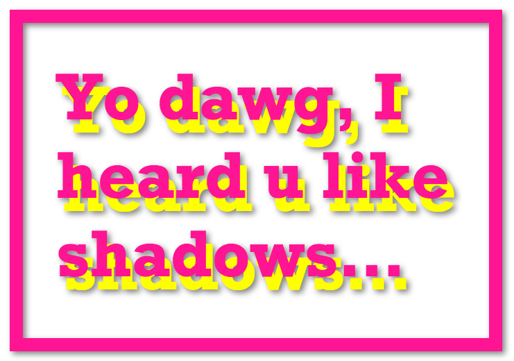
text-shadows also cast a shadow through the drop-shadow() filterRelated specs
Color tinting
The problem
Adding a color tint to a grayscale image (or an image that has been converted to grayscale) is a popular and elegant way to give visual unity to a group of photos with very disparate styles. Often, the effect is applied statically and removed on :hover and/or some other interaction.
Traditionally, we use an image editing application to create two versions of the image, and write some simple CSS code to take care of swapping them. This approach works, but it adds bloat and extra HTTP requests, and is a maintenance nightmare. Imagine deciding to change the color of the effect: you would have to go through all the images and create new monochrome versions!
Other approaches involve overlaying a semi-transparent color on top of the image or applying opacity to the image and overlaying it on a solid color. However, this is not a real tint: in addition to not converting all the colors in the image to tints of the target color, it also reduces contrast significantly.
There are also scripts that turn images into a <canvas> element and apply the tint through JavaScript. This does produce proper tinting, but is fairly slow and restrictive.
Wouldn’t it be so much easier to be able to apply a color tint to images straight from our CSS?
Filter-based solution
Because there is no single filter function specifically designed for this effect, we need to get a bit crafty and combine multiple filters.
The first filter we will apply is sepia(), which gives the image a desaturated orange-yellow tint, with most pixels having a hue of around 35–40. If this is the color we wanted, then we’re done. However, in most cases it won’t be. If our color is more saturated, we can use the saturate() filter to increase the saturation of every pixel. Let’s assume we want to give the image a tint of hsl(335, 100%, 50%). We need to increase saturation quite a bit, so we will use a parameter of 4. The exact value depends on your case, and we generally have to eyeball it. As Figure 1-11 demonstrates, this combined filter gives our image a warm golden tint.
Bottom: Image after
sepia() filter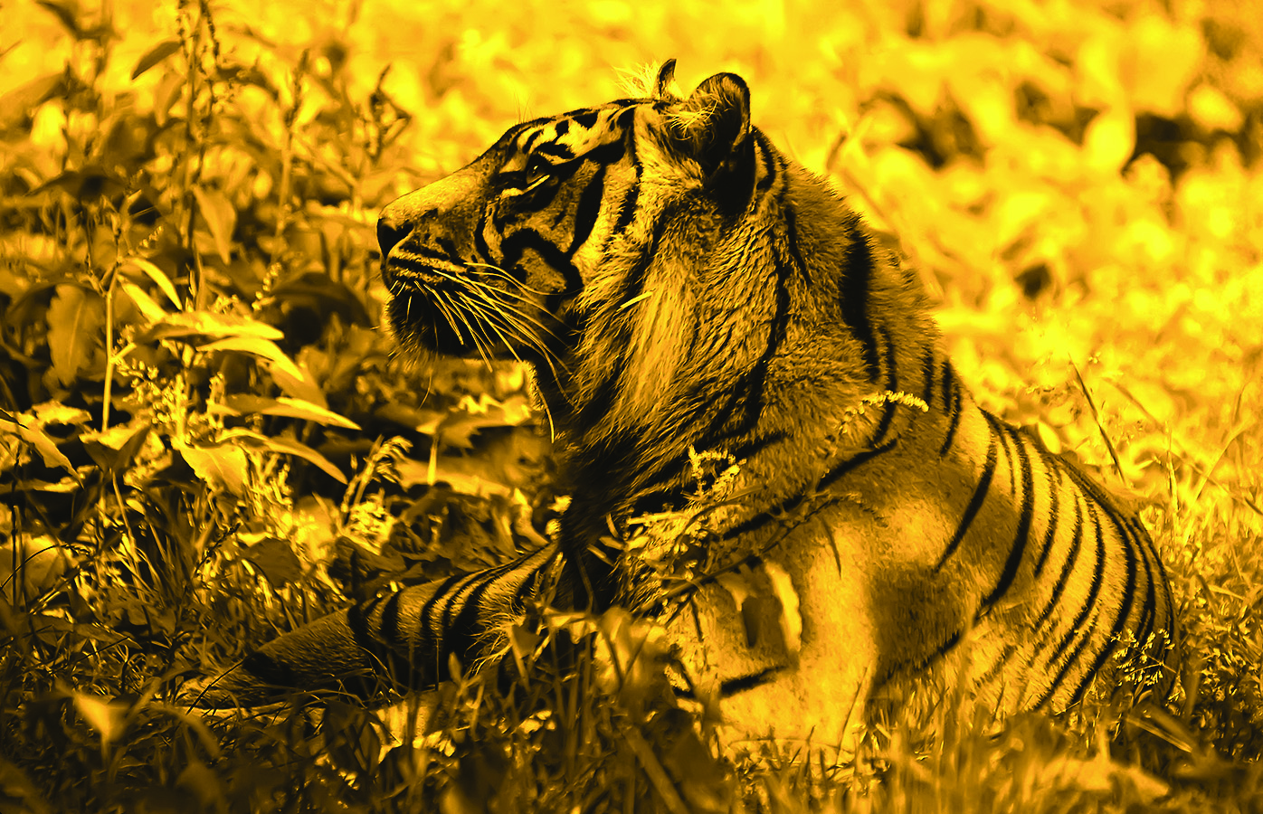
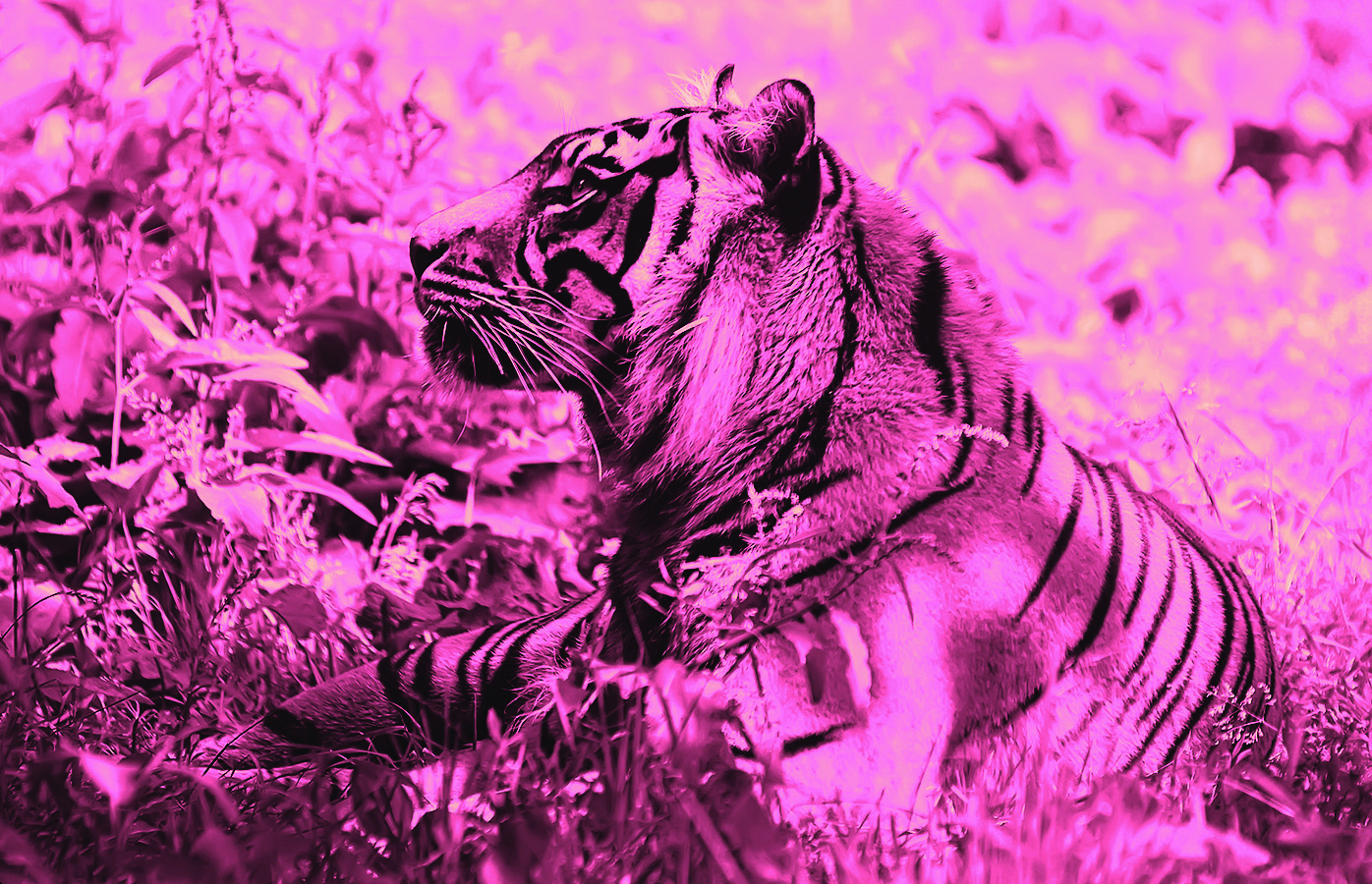
saturate() filterAs nice as our image now looks, we didn’t want to colorize it with this orangish yellow, but with a deep, bright pink. Therefore, we also need to apply a hue-rotate() filter, to offset the hue of every pixel by the degrees we specify. To make the hue 335 from around 40, we’d need to add around 295 (335 – 40) to it:
filter: sepia() saturate(4) hue-rotate(295deg);
At this point, we’ve colorized our image and you can check out how it looks in Figure 1-12. If it’s an effect that gets toggled on :hover or other states, we could even apply CSS transitions to it:
img {
	transition: .5s filter;
	filter: sepia() saturate(4) hue-rotate(295deg);
}

img:hover,
img:focus {
	filter: none;
}
hue-rotate() filter as wellBlending mode solution
The filter solution works, but you might have noticed that the result is not exactly the same as what can be obtained with an image editor. Even though we were trying to colorize with a very bright color, the result still looks rather washed out. If we try to increase the parameter in the saturate() filter, we start getting a different, overly stylized effect. Thankfully, there is a better way to approach this: blending modes!
If you’ve ever used an image editor such as Adobe Photoshop, you are probably already familiar with blending modes. When two elements overlap, blending modes control how the colors of the topmost element blend with the colors of whatever is underneath it. When it comes to colorizing images, the blending mode you need is luminosity. The luminosity blending mode maintains the HSL lightness of the topmost element, while adopting the hue and saturation of its backdrop. If the backdrop is our color and the element with the blending mode applied to it is our image, isn’t this essentially what color tinting is supposed to do?
To apply a blending mode to an element, there are two properties available to us: mix-blend-mode for applying blending modes to entire elements and background-blend-mode for applying blending modes to each background layer separately. This means that to use this method on an image we have two options, neither of them ideal:
- Wrapping our image in a container with a background color of the color we want
- Using a
<div>instead of an image, with itsbackground-imageset to the image we want to colorize and a second background layer underneath with our color
Depending on the specific use case, we can choose either of the two. For example, if we wanted to apply the effect to an <img> element, we would need to wrap it in another element. However, if we already have another element, such as an <a>, we can use that:
<a href="#something">
	<img src="tiger.jpg" alt="Rawrrr!" />
</a>
Then, you only need two declarations to apply the effect:
a {
	background: hsl(335, 100%, 50%);
}

img {
	mix-blend-mode: luminosity;
}
Just like CSS filters, blending modes degrade gracefully: if they are not supported, no effect is applied but the image is still perfectly visible.
An important consideration is that while filters are animatable, blending modes are not. We already saw how you can animate the picture slowly fading into monochrome with a simple CSS transition on the filter property, but you cannot do the same with blending modes. However, do not fret, as this does not mean animations are out of the question, it just means we need to think outside the box.
As already explained, mix-blend-mode blends the whole element with whatever is underneath it. Therefore, if we apply the luminosity blending mode through this property, the image is always going to be blended with something. However, using the background-blend-mode property blends each background image layer with the ones underneath it, unaware of anything outside the element. What happens then when we only have one background image and a transparent background color? You guessed it: no blending takes place!
We can take advantage of that observation and use the background-blend-mode property for our effect. The HTML will have to be a little different:
<div class="tinted-image"
     style="background-image:url(tiger.jpg)">
</div>
Then we only need to apply CSS to that one <div>, as this technique does not require any extra elements:
.tinted-image {
	width: 640px; height: 440px;
	background-size: cover;
	background-color: hsl(335, 100%, 50%);
	background-blend-mode: luminosity;
	transition: .5s background-color;
}

.tinted-image:hover {
	background-color: transparent;
}
However, as mentioned previously, neither of the two techniques are ideal. The main issues at play here are:
- The dimensions of the image need to be hardcoded in the CSS code.
- Semantically, this is not an image and will not be read as such by screen readers.
Like most things in life, there is no perfect way to do this, but in this section we’ve seen three different ways to apply this effect, each with its own pros and cons. The one you choose depends on the specific needs of your project.
Related specs
Frosted glass effect
The problem
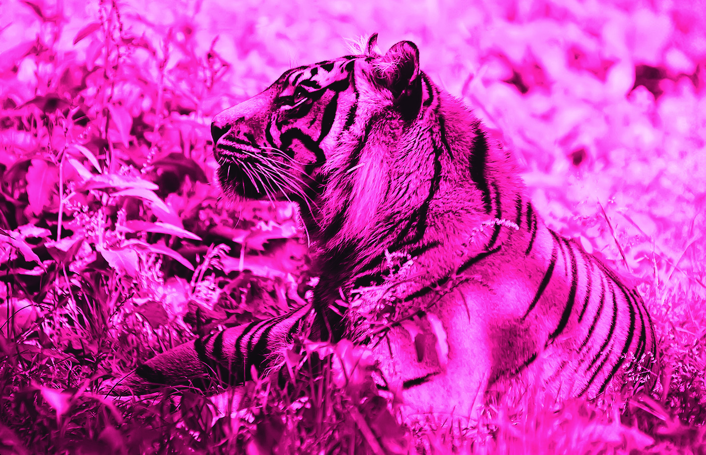
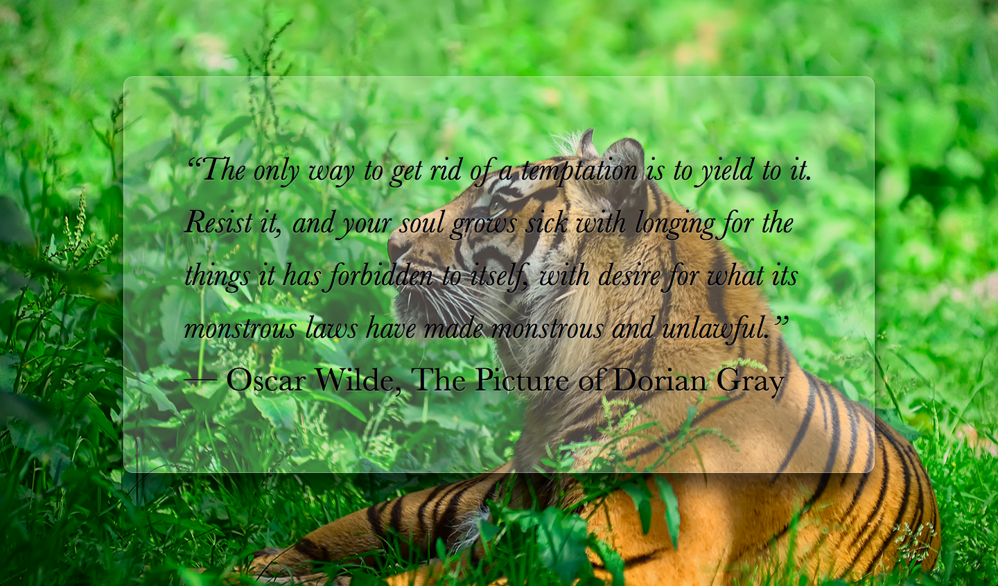
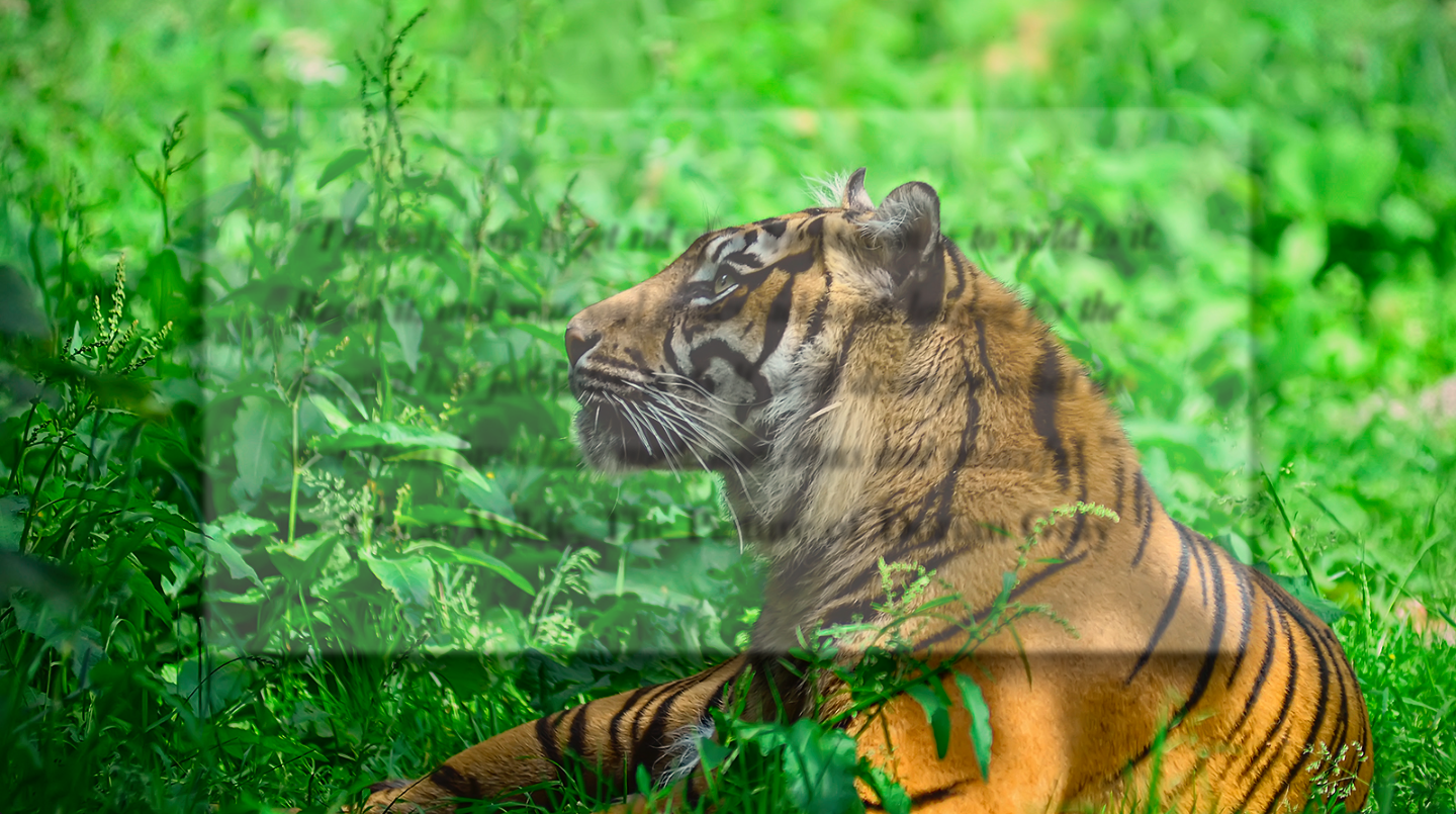
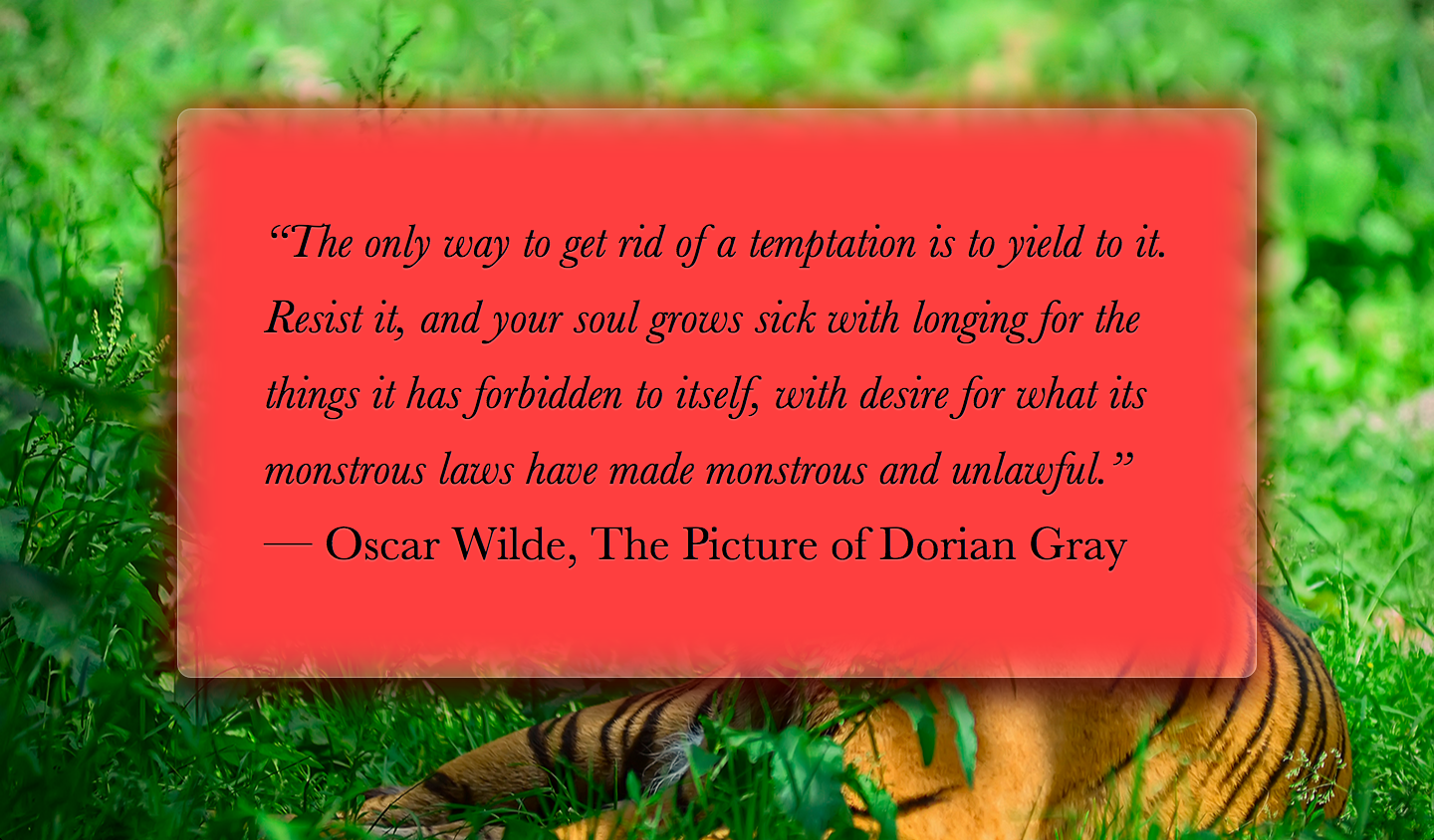
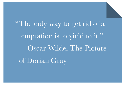
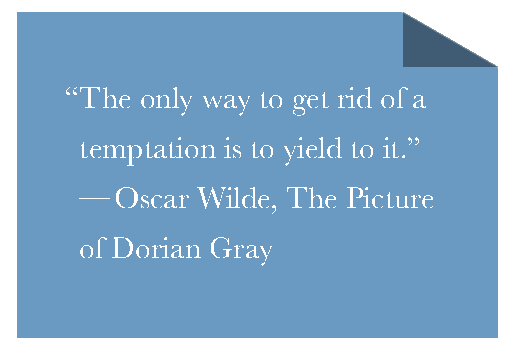
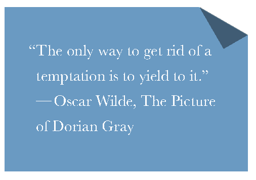
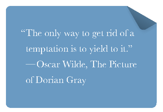
One of the first use cases of semi-transparent colors was using them as backgrounds, over photographic or otherwise busy backdrops, to decrease contrast and make the text possible to read. The result is quite impressive, but can still be hard to read, especially with very low opacity colors and/or busy backdrops. For example, take a look at , where the main element has a semi-transparent white background. The markup looks like this:
<main>
	<blockquote>
		“The only way to get rid of a temptation[…]”
		<footer>—
			<cite>
				Oscar Wilde,
				The Picture of Dorian Gray
			</cite>
		</footer>
	</blockquote>
</main>
And the CSS looks like this (with all irrelevant bits omitted for brevity):
body {
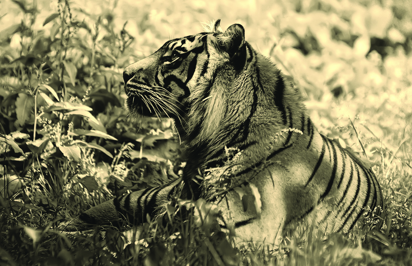
background: url("tiger.jpg") 0 / cover fixed;
}
main {
background: hsla(0,0%,100%,.3);
}
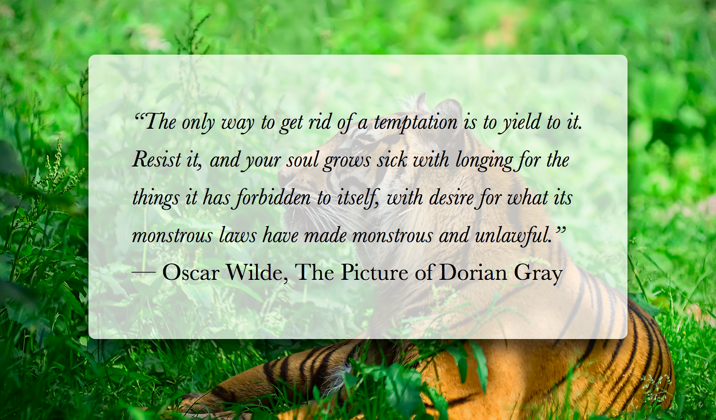
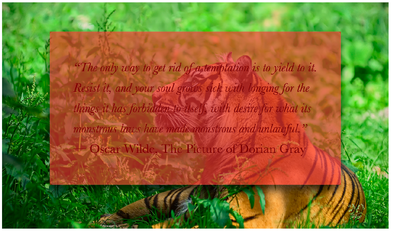
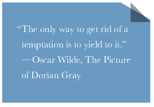
As you can observe, the text is really hard to read, due to the image behind it being busy and the background color only being 25% opaque. We could of course improve readability by increasing the alpha parameter of the background color, but then the effect will not be as interesting (see Figure 1-15).
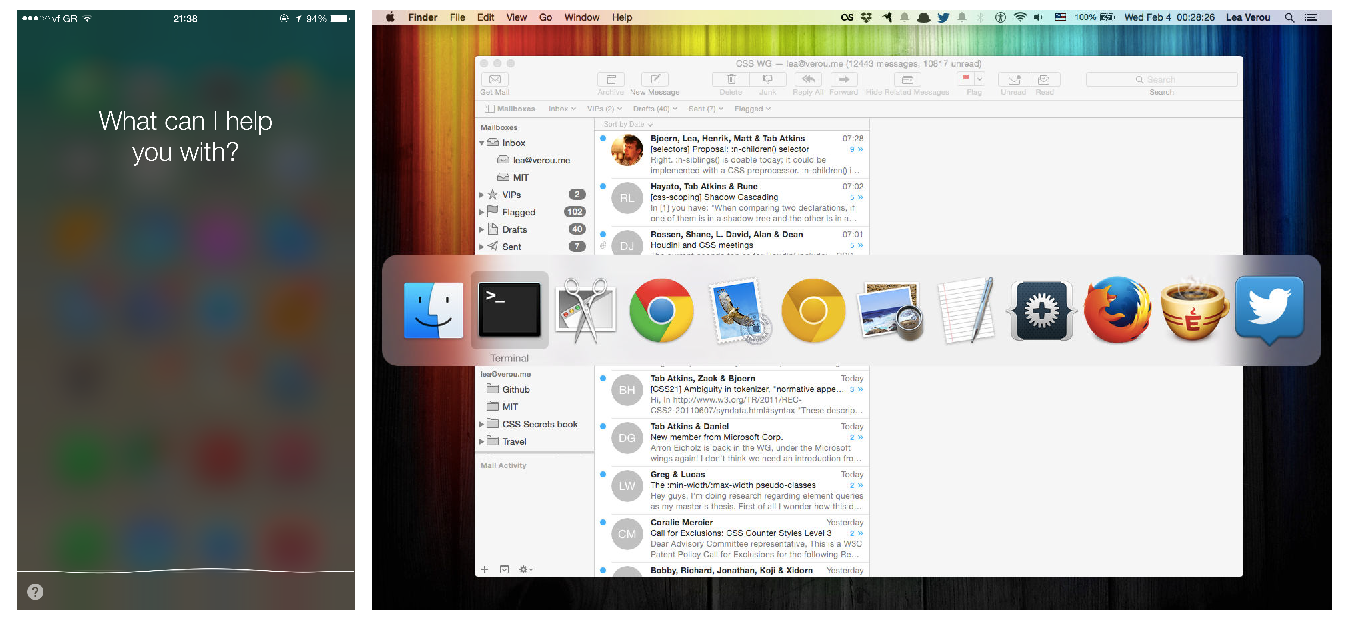
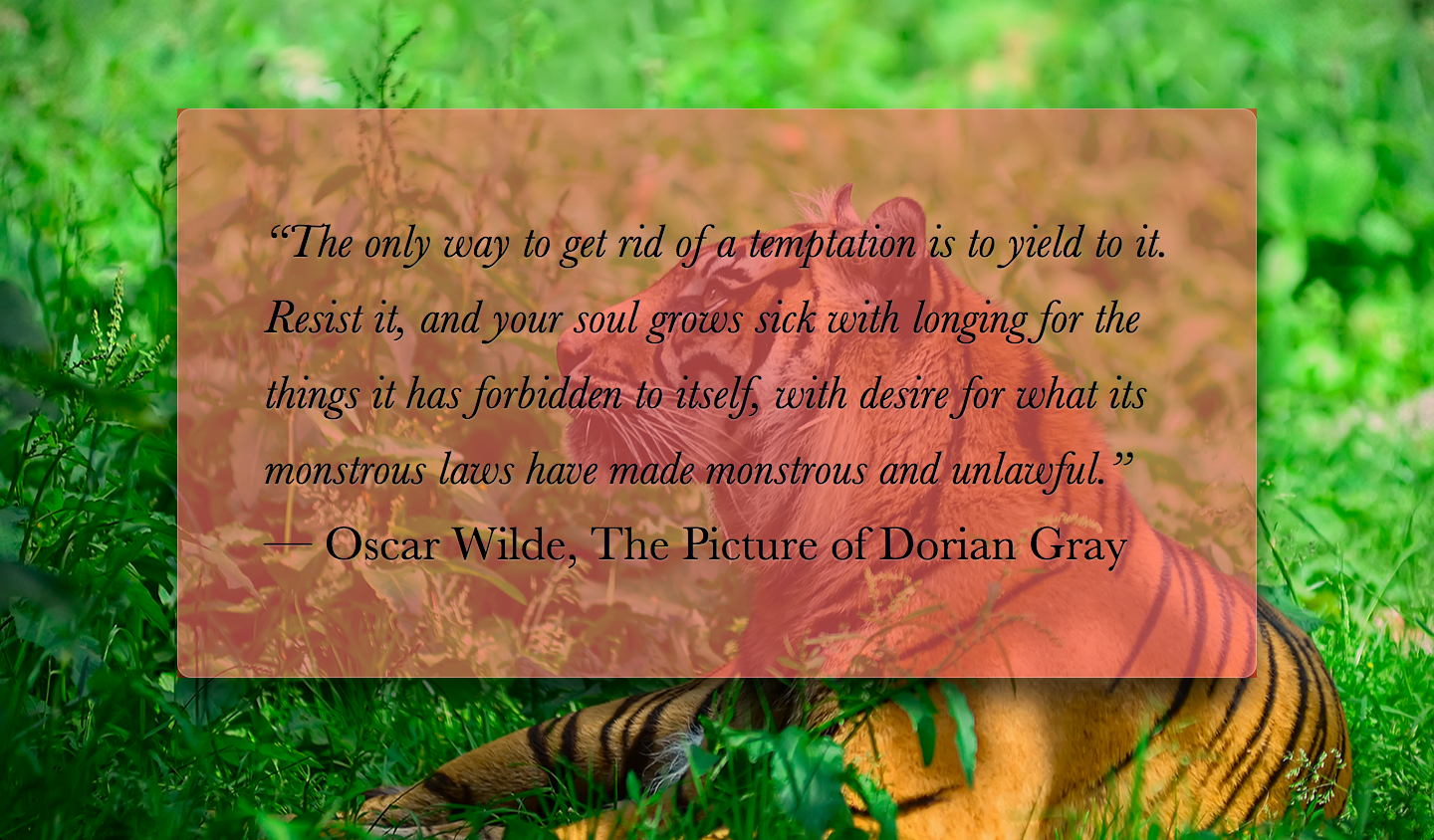
In traditional print design, this issue is often addressed by blurring the part of the photo that is underneath our text container. Blurred backgrounds are not as busy, and thus, text on them is easier to read. Because blurring is computationally expensive, in the past its toll on resources was prohibitive for using this technique in websites and UI design. However, with GPUs improving and hardware acceleration becoming more commonplace for more and more things, these days it’s used quite frequently. In the past few years, we have seen this technique in newer versions of both Microsoft Windows, as well as Apple iOS and Mac OS X (Figure 1-16).
We also got the ability to blur elements in CSS, via the blur() filter, which is essentially a hardware-accelerated version of the corresponding SVG blur filter primitive that we always had for SVG elements. However, if we directly apply a blur() filter to our example, the entire element is blurred, which makes it even less readable. (Figure 1-17). Is there any way to just apply it to the element’s backdrop (i.e., the part of the background that is behind our element)?
blur() filter to the element itself makes things worseThe solution
Provided that our element has a background-attachment of fixed, this is possible, albeit a bit tricky. Because we cannot apply the blurring to our element itself, we will apply it to a pseudo-element that is positioned behind the element and whose background seamlessly matches the one on <body>.
First, we add the pseudo-element and position it absolutely, with all offsets being 0, so that it covers the entire <main> element:
main {
	position: relative;
	/* [Rest of styling] */
}

main::before {
	content: '';
	position: absolute;
	top: 0; right: 0; bottom: 0; left: 0;
	background: rgba(255,0,0,.5); /* for debugging */
}
We also applied a semi-transparent red background, so we can see what we’re doing, otherwise debugging becomes difficult when we’re dealing with a transparent (and therefore, invisible) element. As you can see in Figure 1-19, our pseudo-element is currently above our content, thus obscuring it. We can fix this by adding z-index: -1; (Figure 1-20).
Now it’s time to replace that semi-transparent red background, with one that actually matches our backdrop, either by copying over the <body> background, or by splitting it into its own rule. Can we blur now? Let’s try it:
body, main::before {
	background: url("tiger.jpg") 0 / cover fixed;
}

main {
	position: relative;
	background: hsla(0,0%,100%,.3);
}

main::before {
	content: '';
	position: absolute;
	top: 0; right: 0; bottom: 0; left: 0;
	filter: blur(20px);
}
As you can see in Figure 1-18, we’re pretty much there. The blurring effect looks perfect toward the middle, but is less blurred closer to the edges. This happens because blurring reduces the area that is covered by a solid color by the blur radius. Applying a red background to our pseudo-element helps clarify what’s going on (Figure 1-22).

To circumvent this issue, we will make the pseudo-element at least 20px (as much as our blur radius) larger than the dimensions of its container, by applying a margin of -20px or less to be on the safe side, as different browsers might use different blurring algorithms. As Figure 1-18 demonstrates, this fixes the issue with the faded blurring at the edges, but now there is also some blurring outside our container, which makes it look like a smudge instead of frosted glass. Thankfully, this is also easy to fix: we will just apply overflow: hidden; to main, in order to clip that extraneous blurring. The final code looks as follows, and its result can be seen in Figure 1-23:
body, main::before {
	background: url("tiger.jpg") 0 / cover fixed;
}

main {
	position: relative;
	background: hsla(0,0%,100%,.3);
	**overflow: hidden;**
}

main::before {
	content: '';
	position: absolute;
	top: 0; right: 0; bottom: 0; left: 0;
	filter: blur(20px);
	**margin: -30px;**
}
z-index: -1;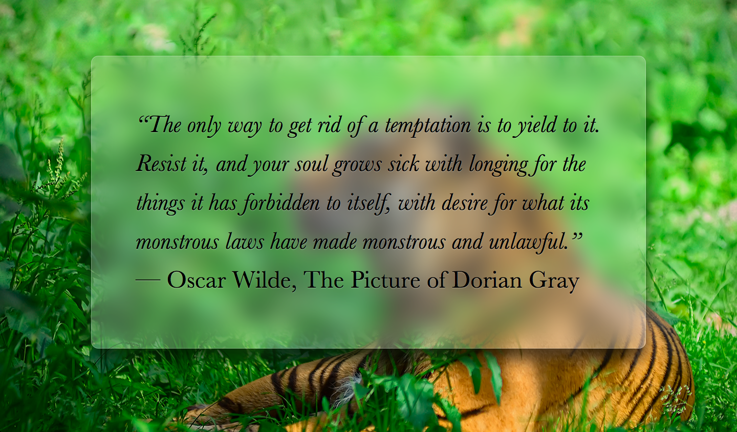
red background helps make sense of what’s happening
Note how much more readable our page has now become, and how much more elegant it looks. It’s debatable whether the fallback for this effect constitutes graceful degradation. If filters are not supported, we will get the result we saw in the beginning (Figure 1-14). We can make our fallback a bit more readable by increasing the opacity of the background color.
Related specs
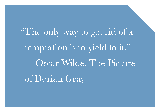
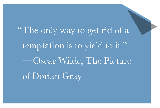
Folded corner effect
The problem
Styling one corner (usually the top-right or bottom-right one) of an element in a way that makes it look folded, with various degrees of realism, has been a very popular decoration for years now.
These days, there are several helpful pure CSS solutions, the first of which was published as early as 2010 by the pseudo-element master, Nicolas Gallagher. Their main premise is usually adding two triangles on the top-left corner: one for the page flip and a white one, to obscure the corner of the main element. These triangles are usually created with the old border trick.
Impressive as these solutions were for their time, today they are very limiting and fall short in several cases:
- When the background behind our element is not a solid color, but a pattern, a texture, a photo, a gradient, or any other kind of background image
- When we want a different angle than 45° and/or a rotated fold
Is there a way to create a more flexible folded corner effect with CSS that doesn’t fail on these cases?
The 45° solution
We will start from an element with a beveled top-right corner, which is created with the gradient-based solution in the “Cutout corners” secret. To create a top-right bevel corner of size 1em with this technique, the code looks like this and the sample rendering can be seen in Figure 1-25:
background: #58a; /* Fallback */
background:
	linear-gradient(-135deg, transparent 2em, #58a 0);
At this point, we’re already halfway done: all we need to do is to add a darker triangle for the page flip. We will do that by adding another gradient to create the triangle, which we will resize to our needs with background-size and position on the top-right corner.
To create the triangle, all we need is an angled linear gradient with two stops that meet in the middle:
background:
	linear-gradient(to left bottom,
		transparent 50%, rgba(0,0,0,.4) 0)
		no-repeat 100% 0 / 2em 2em;

You can see the result of having only this background in Figure 1-26. The last step would be to combine them, and we’ll be done, right? Let’s try that, making sure that the page flip triangle is above our cutout corner gradient:
background: #58a; /* Fallback */
background:
	linear-gradient(to left bottom,
		transparent 50%, rgba(0,0,0,.4) 0)
		no-repeat 100% 0 / 2em 2em,
	linear-gradient(-135deg, transparent 2em, #58a 0);
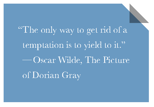
As you can see in Figure 1-27, the result is not exactly what we expected. Why don’t the sizes match? They’re both 2em!
The reason is that (as we’ve discussed in the “Cutout corners” secret) the 2em corner size in our second gradient is in the color stop, and thus is measured along the gradient line, which is diagonal. On the other hand, the 2em length in background-size is the width and height of the background tile, which is measured horizontally and vertically.
To make the two align, we need to do one of the following, depending on which of the two sizes we want to keep:
- To keep the diagonal
2emsize, we can multiply thebackground-sizewith .
. - To keep the horizontal and vertical
2emsize, we can divide the color stop position of our cutout corner gradient by.
Because the background-size is repeated twice, and most other CSS measurements are not measured diagonally, going with the latter is usually preferable. The color stop position will become 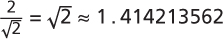 , which we will round up to
 1.5em:
background: #58a; /* Fallback */
background:
	linear-gradient(to left bottom,
		transparent 50%, rgba(0,0,0,.4) 0)
		no-repeat 100% 0 / 2em 2em,
	linear-gradient(-135deg,
	    transparent 1.5em, #58a 0);
As you can see in Figure 1-28, this finally gives us a nice, flexible, minimalistic rounded corner.
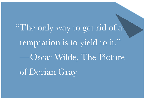
Solution for other angles
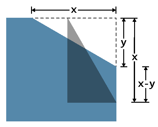
Folded corners in real life are rarely exactly 45°. If we want something a tad more realistic, we can use a slightly different angle, for example -150deg for a 30° one. If we just change the angle of the beveled corner, however, the triangle representing the flipped part of the page will not adjust, resulting in breakage that looks like Figure 1-29. However, adjusting its dimensions is not straightforward. The size of that triangle is not defined by an angle, but by its width and height. How can we find what width and height we need? Well, it’s time for some—gasp—trigonometry!
The code currently looks like this:
background: #58a; /* Fallback */
background:
	linear-gradient(to left bottom,
		transparent 50%, rgba(0,0,0,.4) 0)
		no-repeat 100% 0 / 2em 2em,
	linear-gradient(**-150deg**,
		transparent 1.5em, #58a 0);
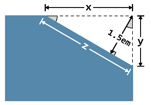

As you can see in Figure 1-30, we basically need to calculate the length of the hypotenuse from two 30-60-90 right triangles when we know the length of one of their legs. As the trigonometric circle shown in Figure 1-31 reminds us, if we know the angles and the length of one of a right triangle’s sides, we can calculate the length of its other two sides by using sines, cosines, and the Pythagorean theorem. We know from math (or a calculator) that 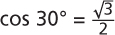 and
and  . We also know from the trigonometric circle that in our case,
  and
and  . Therefore:
At this point, we can also calculate z, via the Pythagorean theorem:

We can now resize the triangle to match:
background: #58a; /* Fallback */
background:
	linear-gradient(to left bottom,
		transparent 50%, rgba(0,0,0,.4) 0)
		no-repeat 100% 0 / **3em 1.73em**,
	linear-gradient(-150deg,
		transparent 1.5em, #58a 0);
At this point, our corner looks like Figure 1-32. As you can see, the triangle now does match our cutout corner, but the result looks even less realistic! Although we might not be able to easily figure out why, our eyes have seen many folded corners before and instantly know that this grossly deviates from the pattern they are used to. You can help your conscious mind understand why it looks so fake by trying to fold an actual sheet of paper in approximately this angle. There is literally no way to fold it and make it look even vaguely like Figure 1-32.
As you can see in an actual, real-life folded corner, such as the one in Figure 1-33, the triangle we need to create is slightly rotated and has the same dimensions as the triangle we “cut” from our element’s corner. Because we cannot rotate backgrounds, it’s time to move the effect to a pseudo-element:
.note {
	position: relative;
	background: #58a; /* Fallback */
	background:
		linear-gradient(-150deg,
			transparent 1.5em, #58a 0);
}
.note::before {
	content: '';
	position: absolute;
	top: 0; right: 0;
	background: linear-gradient(to left bottom,
		transparent 50%, rgba(0,0,0,.4) 0)
		100% 0 no-repeat;
	width: 3em;
	height: 1.73em;
}
At this point, we’ve just replicated the same effect as in Figure 1-33 with pseudo-elements. Our next step would be to change the orientation of the existing triangle by swapping its width and height to make it mirror the cutout corner instead of complementing it. Then, we will rotate it by 30° ((90° – 30°) – 30°) counterclockwise, so that its hypotenuse becomes parallel to our cutout corner:
.note::before {
	content: '';
	position: absolute;
	top: 0; right: 0;
	background: linear-gradient(to left bottom,
		transparent 50%, rgba(0,0,0,.4) 0)
		100% 0 no-repeat;
	**width: 1.73em;
	height: 3em;
	transform: rotate(-30deg);**
}
You can see how our note looks after these changes in Figure 1-34. As you can see, we’re basically there and we just need to move the triangle so that the hypotenuses of our two triangles (the dark one and the cutout one) coincide. As things currently stand, we need to move the triangle both horizontally and vertically, so it’s more difficult to figure out what to do. We can make things easier for ourselves by setting transform-origin to bottom right, so that the bottom-right corner of the triangle becomes the center of rotation, and thus, stays fixed in the same place:
.note::before {
	/* [Rest of styling] */
	transform: rotate(-30deg);
	transform-origin: bottom right;
}
transform-origin: bottom right; makes things easier: now we only need to move our triangle verticallyAs you can see in Figure 1-35, we now only need to move our triangle vertically toward the top. To find the exact amount, we can use some geometry again. As you can see in , the vertical offset our triangle needs is  , which we can round up to
 1.3em:
.note::before {
	/* [Rest of styling] */
	transform: **translateY(-1.3em)** rotate(-30deg);
	transform-origin: bottom right;
}
The sample rendering in confirms that this finally gives us the effect we were going for. Phew, that was intense! In addition, now that our triangle is generated via pseudo-elements, we can make it even more realistic, by adding rounded corners, (actual) gradients, and box-shadows! The final code looks as follows:
.note {
	position: relative;
	background: #58a; /* Fallback */
	background:
		linear-gradient(-150deg,
			transparent 1.5em, #58a 0);
	**border-radius: .5em;**
}
.note::before {
	content: '';
	position: absolute;
	top: 0; right: 0;
	background: linear-gradient(to left bottom,
		transparent 50%, **rgba(0,0,0,.2) 0, rgba(0,0,0,.4)**)
		100% 0 no-repeat;
	width: 1.73em;
	height: 3em;
	transform: translateY(-1.3em) rotate(-30deg);
	transform-origin: bottom right;
	**border-bottom-left-radius: inherit;
	box-shadow: -.2em .2em .3em -.1em rgba(0,0,0,.15);**
}
And you can admire the fruits of our labor in Figure 1-38.
The effect looks nice, but how DRY is it? Let’s think about some common edits and variations one might want to make:
- It only takes one edit to change the element dimensions and other metrics (padding, etc.).
- It only takes two edits (one without the fallback) to change the background color.
- It takes four edits and several nontrivial calculations to change the folded corner size.
- It takes five edits and several even less trivial calculations to change the folded corner angle.
The last two are really bad. It might be time for a preprocessor mixin:
@mixin folded-corner($background, $size,
                     $angle: 30deg) {
position: relative;
background: $background; /* Fallback */
background:
	linear-gradient($angle - 180deg,
		transparent $size, $background 0);
border-radius: .5em;

$x: $size / sin($angle);
$y: $size / cos($angle);

&::before {
	content: '';
	position: absolute;
	top: 0; right: 0;
	background: linear-gradient(to left bottom,
		transparent 50%, rgba(0,0,0,.2) 0,
		rgba(0,0,0,.4)) 100% 0 no-repeat;
	width: $y; height: $x;
	transform: translateY($y - $x)
	           rotate(2*$angle - 90deg);
	transform-origin: bottom right;
	border-bottom-left-radius: inherit;
	box-shadow: -.2em .2em .3em -.1em rgba(0,0,0,.2);
}
}

/* used as... */
.note {
	@include folded-corner(#58a, 2em, 40deg);
}