Data Science in the Cloud with Microsoft Azure Machine Learning and R
This report covers the basics of manipulating data, as well as constructing and evaluating models in Azure ML, illustrated with a data science example.
 Adansonia (source: Internet Archive Book Images)
Data Science in the Cloud with Microsoft Azure Machine Learning and R
Introduction
Recently, Microsoft launched the Azure Machine Learning cloud platform—Azure ML. Azure ML provides an easy-to-use and powerful set of cloud-based data transformation and machine learning tools. This report covers the basics of manipulating data, as well as constructing and evaluating models in Azure ML, illustrated with a data science example.
Before we get started, here are a few of the benefits Azure ML provides for machine learning solutions:

Learn faster. Dig deeper. See farther.
-
Solutions can be quickly deployed as web services.
-
Models run in a highly scalable cloud environment.
-
Code and data are maintained in a secure cloud environment.
-
Available algorithms and data transformations are extendable using the R language for solution-specific functionality.
Throughout this report, we’ll perform the required data manipulation then construct and evaluate a regression model for a bicycle sharing demand dataset. You can follow along by downloading the code and data provided below. Afterwards, we’ll review how to publish your trained models as web services in the Azure cloud.
Downloads
For our example, we will be using the Bike Rental UCI dataset available in Azure ML. This data is also preloaded in the Azure ML Studio environment, or you can download this data as a .csv file from the UCI website. The reference for this data is Fanaee-T, Hadi, and Gama, Joao, “Event labeling combining ensemble detectors and background knowledge,” Progress in Artificial Intelligence (2013): pp. 1-15, Springer Berlin Heidelberg.
The R code for our example can be found at GitHub.
Working Between Azure ML and RStudio
When you are working between AzureML and RStudio, it is helpful to do your preliminary editing, testing, and debugging in RStudio. This report assumes the reader is familiar with the basics of R. If you are not familiar with using R in Azure ML you should check out the following resources:
The R source code for the data science example in this report can be run in either Azure ML or RStudio. Read the comments in the source files to see the changes required to work between these two environments.
Overview of Azure ML
This section provides a short overview of Azure Machine Learning. You can find more detail and specifics, including tutorials, at the Microsoft Azure web page.
In subsequent sections, we include specific examples of the concepts presented here, as we work through our data science example.
Azure ML Studio
Azure ML models are built and tested in the web-based Azure ML Studio using a workflow paradigm. Figure 1 shows the Azure ML Studio.

In Figure 1, the canvas showing the workflow of the model is in the center, with a dataset and an Execute R Script module on the canvas. On the left side of the Studio display, you can see datasets, and a series of tabs containing various types of modules. Properties of whichever dataset or module has been clicked on can be seen in the right panel. In this case, you can also see the R code contained in the Execute R Script module.
Modules and Datasets
Mixing native modules and R in Azure ML
Azure ML provides a wide range of modules for data I/O, data transformation, predictive modeling, and model evaluation. Most native Azure ML modules are computationally efficient and scalable.
The deep and powerful R language and its packages can be used to meet the requirements of specific data science problems. For example, solution-specific data transformation and cleaning can be coded in R. R language scripts contained in Execute R Script modules can be run in-line with native Azure ML modules. Additionally, the R language gives Azure ML powerful data visualization capabilities. In other cases, data science problems that require specific models available in R can be integrated with Azure ML.
As we work through the examples in subsequent sections, you will see how to mix native Azure ML modules with Execute R Script modules.
Module I/O
In the AzureML Studio, input ports are located above module icons, and output ports are located below module icons.
Note
If you move your mouse over any of the ports on a module, you will see a “tool tip” showing the type of the port.
For example, the Execute R Script module has five ports:
-
The Dataset1 and Dataset2 ports are inputs for rectangular Azure data tables.
-
The Script Bundle port accepts a zipped R script file (.R file) or R dataset file.
-
The Result Dataset output port produces an Azure rectangular data table from a data frame.
-
The R Device port produces output of text or graphics from R.
Workflows are created by connecting the appropriate ports between modules—output port to input port. Connections are made by dragging your mouse from the output port of one module to the input port of another module.
In Figure 1, you can see that the output of the data is connected to the Dataset1 input port of the Execute R Script module.
Azure ML Workflows
Model training workflow
Figure 2 shows a generalized workflow for training, scoring, and evaluating a model in Azure ML. This general workflow is the same for most regression and classification algorithms.

Key points on the model training workflow:
-
Data input can come from a variety of data interfaces, including HTTP connections, SQLAzure, and Hive Query.
-
For training and testing models, you will use a saved dataset.
-
Transformations of the data can be performed using a combination of native Azure ML modules and the R language.
-
A Model Definition module defines the model type and properties. On the lefthand pane of the Studio you will see numerous choices for models. The parameters of the model are set in the properties pane.
-
The Training module trains the model. Training of the model is scored in the Score module and performance summary statistics are computed in the Evaluate module.
The following sections include specific examples of each of the steps illustrated in Figure 2.
Workflow for R model training
The Azure ML workflow changes slightly if you are using an R model. The generalized workflow for this case is shown in Figure 3.

In the R model workflow shown in Figure 3, the computation and prediction steps are in separate Execute R Script modules. The R model object is serialized, passed to the Prediction module, and unserialized. The model object is used to make predictions, and the Evaluate module measures the performance of the model.
Two advantages of separating the model computation step from the prediction step are:
-
Predictions can be made rapidly on any number of new data, without recomputing the model.
-
The Prediction module can be published as a web service.
Publishing a model as a web service
Once you have developed a satisfactory model you can publish it as a web service. You will need to create streamlined workflow for promotion to production. A generalized example is shown in Figure 4.

Key points on the workflow for publishing a web service:
-
Data transformations are typically the same as those used to create the trained model.
-
The product of the training processes (discussed above) is the trained model.
-
You can apply transformations to results produced by the model. Examples of transformations include deleting unneeded columns, and converting units of numerical results.
A Regression Example
Problem and Data Overview
Demand and inventory forecasting are fundamental business processes. Forecasting is used for supply chain management, staff level management, production management, and many other applications.
In this example, we will construct and test models to forecast hourly demand for a bicycle rental system. The ability to forecast demand is important for the effective operation of this system. If insufficient bikes are available, users will be inconvenienced and can become reluctant to use the system. If too many bikes are available, operating costs increase unnecessarily.
For this example, we’ll use a dataset containing a time series of demand information for the bicycle rental system. This data contains hourly information over a two-year period on bike demand, for both registered and casual users, along with nine predictor, or independent, variables. There are a total of 17,379 rows in the dataset.
The first, and possibly most important, task in any predictive analytics project is to determine the feature set for the predictive model. Feature selection is usually more important than the specific choice of model. Feature candidates include variables in the dataset, transformed or filtered values of these variables, or new variables computed using several of the variables in the dataset. The process of creating the feature set is sometimes known as feature selection or feature engineering.
In addition to feature engineering, data cleaning and editing are critical in most situations. Filters can be applied to both the predictor and response variables.
See Section 1 for details on how to access the dataset for this example.
A first set of transformations
For our first step, we’ll perform some transformations on the raw input data using the code shown below in an Azure ML Execute R Script module:
## This file contains the code for the transformation
## of the raw bike rental data. It is intended to run in an
## Azure ML Execute R Script module. By changing
## some comments you can test the code in RStudio
## reading data from a .csv file.

## The next lines are used for testing in RStudio only.
## These lines should be commented out and the following
## line should be uncommented when running in Azure ML.
#BikeShare <- read.csv("BikeSharing.csv", sep = ",",
#                      header = T, stringsAsFactors = F )
#BikeShare$dteday <- as.POSIXct(strptime(
#                         paste(BikeShare$dteday, " ",
#                               "00:00:00",
#                               sep = ""),
#                         "%Y-%m-%d %H:%M:%S"))
BikeShare <- maml.mapInputPort(1)

## Select the columns we need
BikeShare <- BikeShare[, c(2, 5, 6, 7, 9, 10,
                           11, 13, 14, 15, 16, 17)]

## Normalize the numeric perdictors
BikeShare[, 6:9] <- scale(BikeShare[, 6:9])

## Take the log of response variables. First we
## must ensure there are no zero values. The difference
## between 0 and 1 is inconsequential.
BikeShare[, 10:12] <- lapply(BikeShare[, 10:12],
                             function(x){ifelse(x == 0,
                                                1,x)})
BikeShare[, 10:12] <- lapply(BikeShare[, 10:12],
                             function(x){log(x)})

## Create a new variable to indicate workday
BikeShare$isWorking <- ifelse(BikeShare$workingday &
                                !BikeShare$holiday, 1, 0)  ## Create a new variable to indicate workday

## Add a column of the count of months which could
## help model trend. Next line is only needed running
## in Azure ML
Dteday <- strftime(BikeShare$dteday,
                   format = "%Y-%m-%dT%H:%M:%S")
yearCount <- as.numeric(unlist(lapply(strsplit(
                                    Dteday, "-"),
                                  function(x){x[1]}))) - 2011
BikeShare$monthCount <- 12 * yearCount + BikeShare$mnth

## Create an ordered factor for the day of the week
## starting with Monday. Note this factor is then
## converted to an "ordered" numerical value to be
## compatible with Azure ML table data types.
BikeShare$dayWeek <- as.factor(weekdays(BikeShare$dteday))
BikeShare$dayWeek <- as.numeric(ordered(BikeShare$dayWeek,
                                        levels = c("Monday",
                                                   "Tuesday",
                                                   "Wednesday",
                                                   "Thursday",
                                                   "Friday",
                                                   "Saturday",
                                                   "Sunday")))

## Output the transformed data frame.
maml.mapOutputPort('BikeShare')
In this case, five basic types of transformations are being performed:
-
A filter, to remove columns we will not be using.
-
Transforming the values in some columns. The numeric predictor variables are being centered and scaled and we are taking the log of the response variables. Taking a log of a response variable is commonly done to transform variables with non-negative values to a more symmetric distribution.
-
Creating a column indicating whether it’s a workday or not.
-
Counting the months from the start of the series. This variable is used to model trend.
-
Creating a variable indicating the day of the week.
Tip
In most cases, Azure ML will treat date-time formatted character columns as having a date-time type. R will interpret the Azure ML date-time type as POSIXct. To be consistent, a type conversion is required when reading data from a .csv file. You can see a commented out line of code to do just this.
If you encounter errors with date-time fields when working with R in Azure ML, check that the type conversions are working as expected.
Exploring the data
Let’s have a first look at the data by walking through a series of exploratory plots.
At this point, our Azure ML experiment looks like Figure 5. The first Execute R Script module, titled “Transform Data,” contains the code shown here.

The Execute R Script module shown at the bottom of Figure 5 runs code for exploring the data, using output from the Execute R Script module that transforms the data.
Our first step is to read the transformed data and create a correlation matrix using the following code:
## This code will create a series of data visualizations
## to explore the bike rental dataset. This code is
## intended to run in an Azure ML Execute R
## Script module. By changing some comments you can
## test the code in RStudio.

## Source the zipped utility file
source("src/utilities.R")

## Read in the dataset.
BikeShare <- maml.mapInputPort(1)

## Extract the date in character format
BikeShare$dteday <- get.date(BikeShare$dteday)

## Look at the correlation between the predictors and
## between predictors and quality. Use a linear
## time series regression to detrend the demand.
Time <- POSIX.date(BikeShare$dteday, BikeShare$hr)
BikeShare$count <- BikeShare$cnt - fitted(
  lm(BikeShare$cnt ~ Time, data = BikeShare))
cor.BikeShare.all <- cor(BikeShare[, c("mnth",
                                       "hr",
                                       "weathersit",
                                       "temp",
                                       "hum",
                                       "windspeed",
                                       "isWorking",
                                       "monthCount",
                                       "dayWeek",
                                       "count")])

diag(cor.BikeShare.all) <- 0.0
cor.BikeShare.all
library(lattice)
plot( levelplot(cor.BikeShare.all,
        main ="Correlation matrix for all bike users",
        scales=list(x=list(rot=90), cex=1.0)) )
We’ll use lm() to compute a linear model used for de-trending the response variable column in the data frame. De-trending removes a source of bias in the correlation estimates. We are particularly interested in the correlation of the predictor variables with this de-trended response.
Note
The levelplot() function from the lattice package is wrapped by a call to plot(). This is required since, in some cases, Azure ML suppresses automatic printing, and hence plotting. Suppressing printing is desirable in a production environment as automatically produced output will not clutter the result. As a result, you may need to wrap expressions you intend to produce as printed or plotted output with the print() or plot() functions.
You can suppress unwanted output from R functions with the capture.output() function. The output file can be set equal to NUL. You will see some examples of this as we proceed.
This code requires a few functions, which are defined in the utilities.R file. This file is zipped and used as an input to the Execute R Script module on the Script Bundle port. The zipped file is read with the familiar source() function.
fact.conv <- function(inVec){
  ## Function gives the day variable meaningful
  ## level names.
  outVec <- as.factor(inVec)
  levels(outVec) <- c("Monday", "Tuesday", "Wednesday",
                      "Thursday", "Friday", "Saturday",
                      "Sunday")
  outVec
}


get.date <- function(Date){
  ## Funciton returns the data as a character
  ## string from a POSIXct datatime object.
  strftime(Date, format = "%Y-%m-%d %H:%M:%S")
}


POSIX.date <- function(Date,Hour){
  ## Function returns POSIXct time series object
  ## from date and hour arguments.
  as.POSIXct(strptime(paste(Date, " ", as.character(Hour),
                            ":00:00", sep = ""),
                        "%Y-%m-%d %H:%M:%S"))
}
Using the cor() function, we’ll compute the correlation matrix. This correlation matrix is displayed using the levelplot() function in the lattice package.
A plot of the correlation matrix showing the relationship between the predictors, and the predictors and the response variable, can be seen in Figure 6. If you run this code in an Azure ML Execute R Script, you can see the plots at the R Device port.

This plot is dominated by the strong correlation between dayWeek and isWorking—this is hardly surprising. It’s clear that we don’t need to include both of these variables in any model, as they are proxies for each other.
To get a better look at the correlations between other variables, see the second plot, in Figure 7, without the dayWeek variable.

In this plot we can see that a few of the predictor variables exhibit fairly strong correlation with the response. The hour (hr), temp, and month (mnth) are positively correlated, whereas humidity (hum) and the overall weather (weathersit) are negatively correlated. The variable windspeed is nearly uncorrelated. For this plot, the correlation of a variable with itself has been set to 0.0. Note that the scale is asymmetric.
We can also see that several of the predictor variables are highly correlated—for example, hum and weathersit or hr and hum. These correlated variables could cause problems for some types of predictive models.
Warning
You should always keep in mind the pitfalls in the interpretation of correlation. First, and most importantly, correlation should never be confused with causation. A highly correlated variable may or may not imply causation. Second, a highly correlated or nearly uncorrelated variable may, or may not, be a good predictor. The variable may be nearly collinear with some other predictor or the relationship with the response may be nonlinear.
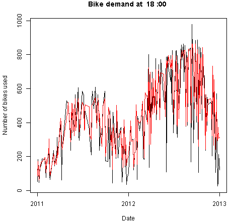
Next, time series plots for selected hours of the day are created, using the following code:
## Make time series plots for certain hours of the day
times <- c(7, 9, 12, 15, 18, 20, 22)
lapply(times, function(x){
       plot(Time[BikeShare$hr == x],
            BikeShare$cnt[BikeShare$hr == x],
            type = "l", xlab = "Date",
            ylab = "Number of bikes used",
            main = paste("Bike demand at ",
                      as.character(x), ":00", spe ="")) } )
Two examples of the time series plots for two specific hours of the day are shown in Figures 8 and 9.
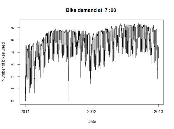

Notice the differences in the shape of these curves at the two different hours. Also, note the outliers at the low side of demand.
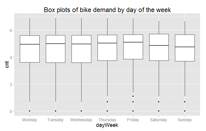
Next, we’ll create a number of box plots for some of the factor variables using the following code:
## Convert dayWeek back to an ordered factor so the plot is in
## time order.
BikeShare$dayWeek <- fact.conv(BikeShare$dayWeek)

## This code gives a first look at the predictor values vs the demand for bikes.
library(ggplot2)
labels <- list("Box plots of hourly bike demand",
            "Box plots of monthly bike demand",
            "Box plots of bike demand by weather factor",
            "Box plots of bike demand by workday vs. holiday",
            "Box plots of bike demand by day of the week")
xAxis <- list("hr", "mnth", "weathersit",
              "isWorking", "dayWeek")
capture.output( Map(function(X, label){
      ggplot(BikeShare, aes_string(x = X,
                                   y = "cnt",
                                  group = X)) +
      geom_boxplot( ) + ggtitle(label) +
                           theme(text =
                                   element_text(size=18)) },
    xAxis, labels),
  file = "NUL" )
If you are not familiar with using Map() this code may look a bit intimidating. When faced with functional code like this, always read from the inside out. On the inside, you can see the ggplot2 package functions. This code is wrapped in an anonymous function with two arguments. Map() iterates over the two argument lists to produce the series of plots.
Three of the resulting box plots are shown in Figures 10, 11, and 12.
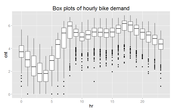

From these plots you can see a significant difference in the likely predictive power of these three variables. Significant and complex variation in hourly bike demand can be seen in Figure 10. In contrast, it looks doubtful that weathersit is going to be very helpful in predicting bike demand, despite the relatively high (negative) correlation value observed.
The result shown in Figure 12 is surprising—we expected bike demand to depend on the day of the week.
Once again, the outliers at the low end of bike demand can be seen in the box plots.
Tip
In our example, we are making heavy use of the ggplot2 package. If you would like to learn more about ggplot2, we recommend R Graphics Cookbook: Practical Recipes for Visualizing Data by Winston Chang (O’Reilly).
Finally, we’ll create some plots to explore the continuous variables, using the following code:
## Look at the relationship between predictors and bike demand
labels <- c("Bike demand vs temperature",
            "Bike demand vs humidity",
            "Bike demand vs windspeed",
            "Bike demand vs hr")
xAxis <- c("temp", "hum", "windspeed", "hr")
capture.output( Map(function(X, label){
      ggplot(BikeShare, aes_string(x = X, y = "cnt")) +
      geom_point(aes_string(colour = "cnt"), alpha = 0.1) +
      scale_colour_gradient(low = "green", high = "blue") +
      geom_smooth(method = "loess") +
      ggtitle(label) +
      theme(text = element_text(size=20)) },
    xAxis, labels),
  file = "NUL" )
This code is quite similar to the code used for the box plots. We have included a “loess” smoothed line on each of these plots. Also, note that we have added a color scale so we can get a feel for the number of overlapping data points. Examples of the resulting scatter plots are shown in Figures 13 and 14.

Figure 13 shows a clear trend of generally decreasing bike demand with increased humidity. However, at the low end of humidity, the data are sparse and the trend is less certain. We will need to proceed with care.

Figure 14 shows the scatter plot of bike demand by hour. Note that the “loess” smoother does not fit parts of these data very well. This is a warning that we may have trouble modeling this complex behavior.
Once again, in both scatter plots we can see the prevalence of outliers at the low end of bike demand.
Exploring a potential interaction
Perhaps there is an interaction between time of day and day of the week. A day of week effect is not apparent from Figure 12, but we may need to look in more detail. This idea is easy to explore. Adding the following code to the visualization Execute R Script module creates box plots for working and non-working days for peak demand hours:
## Explore the interaction between time of day
## and working or non-working days.
labels <- list("Box plots of bike demand at 0900 for \n working and non-working days",
               "Box plots of bike demand at 1800 for \n working and non-working days")
Times <- list(8, 17)
capture.output( Map(function(time, label){
      ggplot(BikeShare[BikeShare$hr == time, ],
         aes(x = isWorking, y = cnt, group = isWorking)) +
      geom_boxplot( ) + ggtitle(label) +
      theme(text = element_text(size=18)) },
    Times, labels),
  file = "NUL" )
The result of running this code can be seen in Figures 15 and 16.
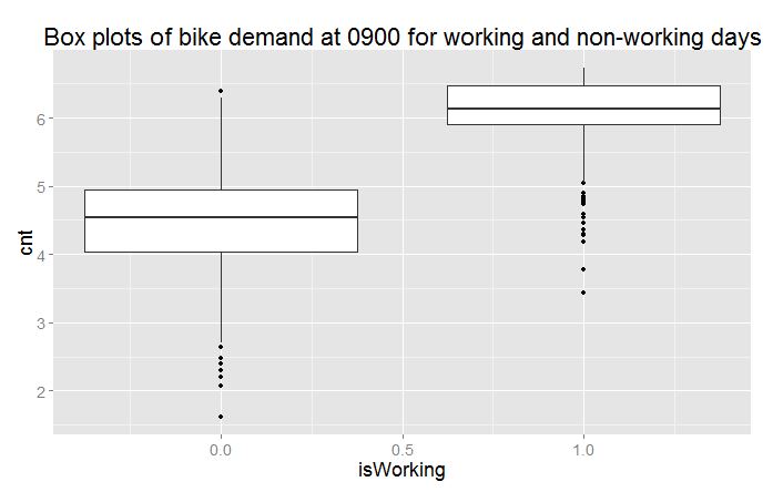

Now we can clearly see that we are missing something important in the initial set of features. There is clearly a different demand between working and non-working days at peak demand hours.
Creating a new variable
We need a new variable that differentiates the time of the day by working and non-working days; to do this, we will add the following code to the transform Execute R Script module:
## Add a variable with unique values for time of day for working and non-working days.
BikeShare$workTime <- ifelse(BikeShare$isWorking,
                             BikeShare$hr,
                             BikeShare$hr + 24)
Note
We have created the new variable using working versus non-working days. This leads to 48 levels (2 × 24) in this variable. We could have used the day of the week, but this approach would have created 168 levels (7 × 24). Reducing the number of levels reduces complexity and the chance of overfitting—generally leading to a better model.
Transformed time: Another new variable
As noted earlier, the complex hour-to-hour variation bike demand shown in Figures 10 and 14 may be difficult for some models to deal with. Perhaps, if we shift the time axis we will create a new variable where demand is closer to a simple hump shape. The following code shifts the time axis by five hours:
## Shift the order of the hour variable so that it is smoothly
## "humped over 24 hours.
BikeShare$xformHr <- ifelse(BikeShare$hr > 4,
                            BikeShare$hr - 5,
                            BikeShare$hr + 19)
We can add one more plot type to the scatter plots we created in the visualization model, with the following code:
## Look at the relationship between predictors and bike demand
labels <- c("Bike demand vs temperature",
            "Bike demand vs humidity",
            "Bike demand vs windspeed",
            "Bike demand vs hr",
            "Bike demand vs xformHr")
xAxis <- c("temp", "hum", "windspeed", "hr", "xformHr")
capture.output( Map(function(X, label){
      ggplot(BikeShare, aes_string(x = X, y = "cnt")) +
      geom_point(aes_string(colour = "cnt"), alpha = 0.1) +
      scale_colour_gradient(low = "green", high = "blue") +
      geom_smooth(method = "loess") +
      ggtitle(label) +
      theme(text = element_text(size=20)) },
    xAxis, labels),
  file = "NUL" )
The resulting plot is shown in Figure 17.
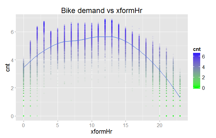
The bike demand by transformed hour is definitely more of a hump shape. However, there is still a bit of residual structure at the lower end of the horizontal axis. The question is, will this new variable improve the performance of any of the models?
A First Model
Now that we have some basic data transformations, and had a first look at the data, it’s time to create a first model. Given the complex relationships we see in the data, we will use a nonlinear regression model. In particular, we will try the Decision Forest Regression module. Figure 18 shows our Azure ML Studio canvas once we have all the modules in place.
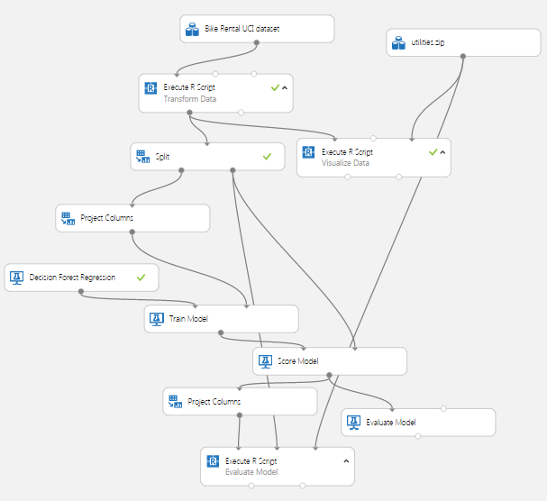
There are quite a few new modules on the canvas at this point.
We added a Split module after the Transform Data Execute R Script module. The subselected data are then sampled into training and test (evaluation) sets with a 70%/30% split. Ideally, we should introduce another split to make separate test and evaluation datasets. The test dataset is used for performing model parameter tuning and feature selection. The evaluation dataset is used for final performance evaluation. For the sake of simplifying our discussion here, we will not perform this additional split.
Note that we have placed the Project Columns module after the Split module so we can prune the features we’re using without affecting the model evaluation. We use the Project Columns module to select the following columns of transformed data for the model:
-
dteday
-
mnth
-
hr
-
weathersit
-
temp
-
hum
-
cnt
-
monthCount
-
isWorking
-
workTime
For the Decision Forest Regression module, we have set the following parameters:
-
Resampling method = Bagging
-
Number of decision trees = 100
-
Maximum depth = 32
-
Number of random splits = 128
-
Minimum number of samples per leaf = 10
The model is scored with the Score Model module, which provides predicted values for the module from the evaluation data. These results are used in the Evaluate Model module to compute the summary statistics shown in Figure 19.
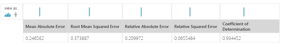
These results are interesting, but a bit abstract. We have included another Execute R Script module, which provides some performance evaluations specific to our use case.
The second Project Columns module selects two columns from the Scoring module: cnt and Scored Labels. This data is then used in an Execute R Script module.
For the first step of this evaluation we’ll create some time series plots to compare the actual bike demand to the demand predicted by the model using the following code:
Please replace this entire listing with the following to ensure proper indentation:

## This code will produce various measures of model
## performance using the actual and predicted values
## from the Bike rental data. This code is intended
## to run in an Azure ML Execute R Script module.
## By changing some comments you can test the code
## in RStudio.

## Source the zipped utility file
source("src/utilities.R")

## Read in the dataset if in Azure ML.
## The second and third line are for test in RStudio
## and should be commented out if running in Azure ML.
inFrame <- maml.mapInputPort(1)
#inFrame <- outFrame[, c("actual", "predicted")]
#refFrame <- BikeShare

## Another data frame is created from the data produced
## by the Azure Split module. The columns we need are
## added to inFrame
## Comment out the next line when running in RStudio.
refFrame <- maml.mapInputPort(2)
inFrame[, c("dteday", "monthCount", "hr")] <-
  refFrame[, c("dteday", "monthCount", "hr")]

## Assign names to the data frame for easy reference
names(inFrame) <- c("cnt", "predicted", "dteday",
                    "monthCount", "hr")

## Since the model was computed using the log of bike
## demand transform the results to actual counts.
inFrame[ , 1:2] <- lapply(inFrame[, 1:2], exp)

## If running in Azure ML uncomment the following line
## to create a character representation of the POSIXct
## Datetime object. This is required since
## R will interpret the Azure DateTime type as POSIXct.
inFrame$dteday <- get.date(inFrame$dteday)

## A POSIXct time series object for the x axis of the
## time series plots.
inFrame$Time <- POSIX.date(inFrame$dteday, inFrame$hr)

## Since the sampling process randomized the order of
## the rows sort the data by the Time object.
inFrame <- inFrame[order(inFrame$Time),]

## Time series plots showing actual and predicted values;
## columns 3 and 4.
times <- c(7, 9, 12, 15, 18, 20, 22)
lapply(times, function(x){
  plot(inFrame$Time[inFrame$hr == x],
     inFrame$cnt[inFrame$hr == x], type = "l",
     xlab = "Date", ylab = "Number of bikes used",
     main = paste("Bike demand at ",
                  as.character(x), ":00", spe =""));
  lines(inFrame$Time[inFrame$hr == x],
        inFrame$predicted[inFrame$hr == x], type = "l",
        col = "red")} )
Please note the following key steps in this code:
-
A second data frame is read using a second
maml.mapInputPort()function. The second data frame contains columns used to compute the evaluation summaries. Reading these columns independently allows you to prune any columns used in the model without breaking the evaluation code. -
The actual and predicted bike demand are transformed to actual counts from the logarithmic scale used for the modeling.
-
A POSIXct time series object including both date and hours is created.
-
The rows of the data frame are sorted in time series order. The Split module randomly samples the rows in the data table. To plot these data properly, they must be in time order.
-
Time series plots are created for the actual and predicted values using
lapply(). Note that we use theplot()andline()functions in the same iteration oflapplyso that the two sets of lines will be on the correct plot.
Some results of running this code are shown in Figures 20 and 21.

By examining these time series plots, you can see that the model is a reasonably good fit. However, there are quite a few cases where the actual demand exceeds the predicted demand.
Let’s have a look at the residuals. The following code creates box plots of the residuals, by hour:
## Box plots of the residuals by hour
library(ggplot2)
inFrame$resids <-  inFrame$predicted - inFrame$cnt
capture.output( plot( ggplot(inFrame, aes(x = as.factor(hr),
                                          y = resids)) +
                        geom_boxplot( ) +
                        ggtitle("Residual of actual versus predicted bike demand by hour") ),
                file = "NUL" )
The results can be seen in Figure 22.

Studying this plot, we see that there are significant residuals at certain hours. The model consistently underestimates demand at 0800, 1700, and 1800—peak commuting hours. Further, the dispersion of the residuals appears to be greater at the peak hours. Clearly, to be useful, a bike sharing system should meet demand at these peak hours.
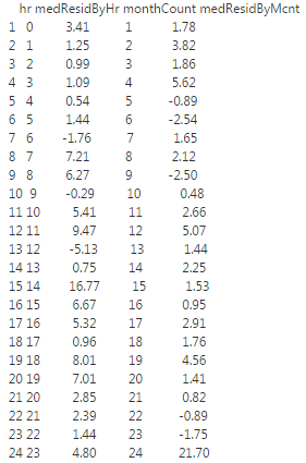
Using the following code, we’ll compute the median residuals by both hour and month count:
library(dplyr)
## First compute and display the median residual by hour
evalFrame <- inFrame %>%
    group_by(hr) %>%
    summarise(medResidByHr = format(round(
        median(predicted - cnt), 2),
      nsmall = 2))

## Next compute and display the median residual by month
tempFrame <- inFrame %>%
    group_by(monthCount) %>%
    summarise(medResid = median(predicted - cnt))

evalFrame$monthCount <- tempFrame$monthCount
evalFrame$medResidByMcnt <- format(round(
    tempFrame$medResid, 2),
  nsmall = 2)

print("Breakdown of residuals")
print(evalFrame)

## Output the evaluation results
outFrame <- data.frame(evalFrame)
maml.mapOutputPort('outFrame')
The median residuals by hour and by month are shown in Figure 23.

The results in Figure 23 show that residuals are consistently biased to the negative side, both by hour and by month. This confirms that our model consistently underestimates bike demand.
Warning
The danger of over-parameterizing or overfitting a model is always present. While decision forest algorithms are known to be fairly insensitive to this problem, we ignore this problem at our peril. Dropping features that do little to improve a model is always a good idea.
In the course of this model investigation, I pruned the features one at a time to determine which ones contributed little to the reduction of the residuals. I found that while wind speed improved the aggregate error statistics, it caused residuals for some times of the day to increase quite a lot. This behavior is a sign of overfitting, so I dropped this feature from the model.
As we try other models, we’ll continue to prune features, so that the remaining features are those best suited to each model.
Tip
In our example, we’ve made use of the dplyr package. This package is both powerful and deep with functionality. If you would like to know more about dplyr, read the vignettes in CRAN.
Improving the Model and Transformations
The question now is, how can we improve these model results? It is possible that improvements in the choice of model parameters or an alternative model might give better results. However, it is typically the case that improved feature engineering and data cleaning leads to greater improvements in results than small model improvements.
Another Data Transformation
Looking at Figures 10, 13, and 14, as well as differences in the time series plots in Figures 8 and 9, you can see outliers in demand on the low side. These outliers may well be a source of bias leading to the model underestimating demand.
Let’s try another data transformation—filtering out the low end outliers. To wit, we’ve added another Execute R Script module as shown in Figure 24. The code in this module will filter out down-side outliers in the training data.
We only want to apply this filter to the training data, not the evaluation data. When using the predictive module in production, we are computing an estimate of the response, and will not have the actual response values to trim. Consequently, the new Execute R Script module is placed after the Split module.
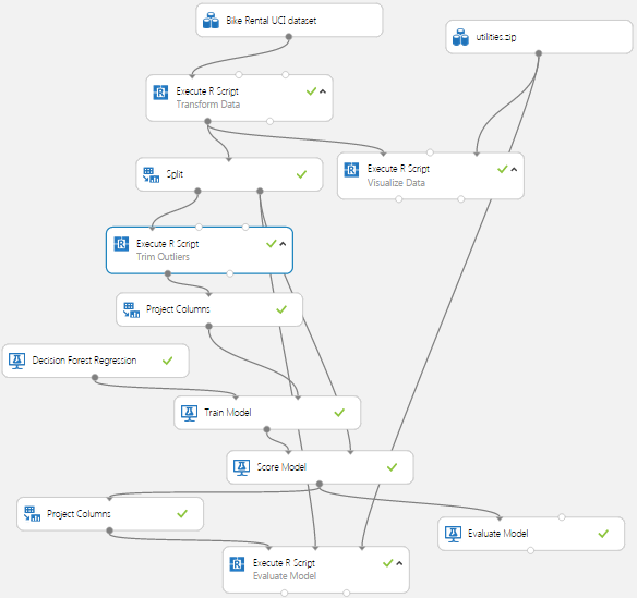
The code for this new Execute R Script module is shown here:
## This code removes downside outliers from the
## training sample of the bike rental data.
## The value of Quantile variable can be changed
## to change the trim level. This code is s intended
## to run in an Azure ML Execute R Script module.
## By changing some comments you can test the code
## in RStudio.

## Read in the dataset.
BikeShare <- maml.mapInputPort(1)

## Build a dataframe with the quantile by month and
## hour. Parameter Quantile determines the trim point.
Quantile <- 0.10
library(dplyr)
BikeShare$dteday <- as.character(BikeShare$dteday)
quantByPer <- (
  BikeShare %>%
    group_by(workTime, monthCount) %>%
    summarise(Quant = quantile(cnt,
                               probs = Quantile,
                               na.rm = TRUE))
 )

## Create a data frame to hold the logical vector
## indexed by monthCount and hr.
indFrame <- data.frame(
  workTime = BikeShare$workTime,
  monthCount = BikeShare$monthCount,
  ind = rep(TRUE, nrow(BikeShare))
  )

## Need to loop through all months and hours since
## these are now randomized by the sample. Memory for
## the data frame is allocated so this in-place
## operation should not be too slow.
for(month in 1:48){
  for(hour in 0:47){
    indFrame$ind[indFrame$workTime == hour &
                   indFrame$monthCount == month] <-
      BikeShare$cnt[BikeShare$workTime == hour &
                      BikeShare$monthCount == month] >
      quantByPer$Quant[quantByPer$workTime == hour &
                         quantByPer$monthCount == month]
  }
}

BikeShare$dteday <- as.POSIXct(strptime(paste(
    BikeShare$dteday, "00:00:00", sep = ""),
  "%Y-%m-%d %H:%M:%S"))
## Filter the rows we want.
BikeShare <- BikeShare[indFrame$ind, ]

## Output the transformed data frame.
maml.mapOutputPort('BikeShare')
This code is a bit complicated, partly because the order of the data is randomized by the Split module. There are three steps in this filter:
-
Using the dplyr package, we compute the quantiles of bike demand (
cnt) by workTime and monthCount. The workTime variable distinguishes between time on working and non-working days. Since bike demand is clearly different for working and non-working days, this stratification is necessary for the trimming operation. In this case, we use a 10% quantile. -
Compute a data frame containing a logical vector, indicating if the bike demand (
cnt) value is an outlier. This operation requires a fairly complicated mapping between a single value from thequantByPerdata frame and multiple values in the vectorBikeShare$cnt. We use nested for loops, since the order of the data in time is randomized by the Split module. Even if you are fairly new to R, you may notice this is a decidedly “un-R-like” practice. To ensure efficiency, we pre-allocate the memory for this data frame to ensure that the assignment of values in the inner loop is performed in place. -
Finally, use the logical vector to remove rows with outlier values from the data frame.
Evaluating the Improved Model
Let’s look at the results of using this filter. As a first step, the summary statistics produced by the Evaluate module are shown in Figure 25.

When compared with Figure 19, all of these statistics are a bit worse than before. However, keep in mind that our goal is to limit the number of times we underestimate bike demand. This process will cause some degradation in the aggregate statistics as bias is introduced.
Let’s look in depth and see if we can make sense of these results. Figure 26 shows box plots of the residuals by hour of the day.

If you compare these results with Figure 22 you will notice that the residuals are now biased to the positive—this is exactly what we hoped for. It is better for users if the bike share system has a slight excess of inventory rather than a shortage. In comparing Figures 22 and 26, notice the vertical scales are different, effectively shifted up by 100.
Figure 27 shows the median residuals by both hour and month count.
Comparing Figure 27 to Figure 23, we immediately see that Figure 27 shows a positive bias in the residuals, whereas Figure 23 had an often strong, negative bias in the residuals. Again, this is the result we were hoping to see.
Despite some success, our model is still not ideal. Figure 26 still shows some large residuals, sometimes in the hundreds. These large outliers could cause managers of the bike share system to lose confidence in the model.
Tip
By now you probably realize that careful study of residuals is absolutely essential to understanding and improving model performance. It is also essential to understand the business requirements when interpreting and improving predictive models.
Another Azure ML Model
Perhaps another model type will provide better performance—fortunately, Azure ML makes it quick and easy to test other model types.
We have added a neural network regression model to our project. Figure 28 shows the updated canvas in the Azure ML Studio.

Note
Given that you can cut and paste modules in Azure ML Studio, it took only minutes to add this additional model to the experiment.
We also added a second Project Columns module, so the features used by the two models can be selected independently. Heeding the Warning on page 14, we selected the following features for the neural network model:
-
hr
-
xformHr
-
temp
-
hum
-
dteday
-
monthCount
-
workTime
-
mnth
The parameters of the Neural Network Regression module are:
-
Hidden layer specification: Fully connected case
-
Number of hidden nodes: 100
-
Initial learning weights diameter: 0.05
-
Learning rate: 0.005
-
Momentum: 0
-
Type of normalizer: Gaussian normalizer
-
Number of learning iterations: 500
-
Random seed: 5467
Figure 29 presents a comparison of the summary statistics of the tree model and the new neural network model (second line).

The summary statistics for the new model are at least a bit better, overall; this is an encouraging result, but we need to look further.
Let’s look at the residuals in more detail. Figure 30 shows a box plot of the residuals by the hour of the day.

The box plot shows that the residuals of the neural network model exhibit some significant outliers, both on the positive and negative side. Comparing these residuals to Figure 26, the outliers are not as extreme.
The details of the mean residual by hour and by month can be seen below in Figure 31.

The results in Figure 31 confirm the presence of some negative residuals at certain hours of the day; compared to Figure 27, these figures look quite similar.
In summary, there may be a tradeoff between bias in the results and dispersion of the residuals; such phenomena are common. More investigation is required to fully understand this problem.
Using an R Model in Azure ML
In this section, you will learn how to incorporate an R language model into your Azure ML workflow. For a schematic view of an R language model in an Azure ML workflow, see Figure 3.
We’ve added two new Execute R Script modules to our experiment. We also use the copy and paste feature to add another Execute R Script module with the evaluation code. The resulting workflow is shown in Figure 32.

In this example, we’ll try a support vector machine (SVM) regression model, using the ksvm() function from the kernlab package.
The first Execute R Script module computes the model from the training data, using the following code:
## This code computes a random forest model.
## This code is s intended to run in an Azure ML
## Execute R Script module. It can be tested in
## RStudio by now executing the Azure ML specific code.

## Source the zipped utility file
source("src/utilities.R")

## Read in the dataset.
BikeShare <- maml.mapInputPort(1)

library(randomForest)
rf.bike <- randomForest(cnt ~ xformHr + temp +
                          monthCount + hum + dayWeek +
                          mnth + isWorking + workTime,
                        data = BikeShare, ntree = 500,
                        importance = TRUE, nodesize = 25)

importance(rf.bike)

outFrame <- serList(list(bike.model = rf.bike))

## Output the serialized model data frame.
maml.mapOutputPort('outFrame')
This code is rather straightforward, but here are a few key points:
-
The utilities are read from the ZIP file using the
source()function. -
In this model formula, we have reduced the number of facets because SVM models are known to be sensitive to over-parameterization.
-
The cost (C) is set to a value of 1000. The higher the cost, the greater the complexity of the model and the greater the likelihood of overfitting.
-
Since we are running on a hefty cloud server, we increased the cache size to 1000 MB.
-
The completed model is serialized for output using the
serList()function from the utilities.
Tip
There is additional information available on serialization and unserialization of R model objects in Azure ML:
Note: According to Microsoft, an R object interface between Execute R Script modules will become available in the future. Once this feature is in place, the need to serialize R objects is obviated.
The second Execute R Script module computes predictions from test data using the model. The code for this module is shown below:
## This code will compute predictions from test data
## for R models of various types. This code is
## intended to run in an Azure ML Execute R Script module.
## By changing some comments you can test the code
## in RStudio.

## Source the zipped utility file
source("src/utilities.R")

## Get the data frame with the model from port 1
## and the data set from port 2. These two lines
## will only work in Azure ML.
modelFrame  <- maml.mapInputPort(1)
BikeShare <- maml.mapInputPort(2)

## comment out the following line if running in Azure ML.
#modelFrame <- outFrame

## Extract the model from the serialized input and assign
## to a convenient name.
modelList <- unserList(modelFrame)
bike.model <- modelList$bike.model

## Output a data frame with actual and values predicted
## by the model.
library(gam)
library(randomForest)
library(kernlab)
library(nnet)
outFrame <- data.frame( actual = BikeShare$cnt,
                       predicted =
                         predict(bike.model,
                                 newdata = BikeShare))

## The following line should be executed only when running in
## Azure ML Studio to output the serialized model.
maml.mapOutputPort('outFrame')
Here are a few key points on this code:
-
Data frames containing the test data and the serialized model are read in. The model object is extracted by the
unserList()function. Note that we are using both table input ports here. -
A number of packages are loaded—you can make predictions for any model object class in these packages, with a predict method.
Tip
There are some alternatives to serializing R model objects that you should keep in mind.
In some cases, it may be desirable to re-compute an R model each time it is used. For example, if the size of the data sets you receive through a web service is relatively small and includes training data, you can re-compute the model on each use. Or, if the training data is changing fairly rapidly it might be best to re-compute your model.
Alternatively, you may wish to use an R model object you have computed outside of Azure ML. For example, you may wish to use a model you have created interactively in RStudio. In this case:
-
Save the model object into a zip file.
-
Upload the zip file to Azure ML.
-
Connect the zip file to the script bundle port of an Execute R Script module.
-
Load the model object into your R script with load (“src/your.model.rdata”).
Running this model and the evaluation code will produce a box plot of residuals by hour, as shown in Figure 33.

The table of median residuals by hour and by month is shown in Figure 34.

The box plots in Figure 33 and the median residuals displayed in Figure 34 show that the SVM model has inferior performance to the neural network and decision tree models. Regardless of this performance, we hope you find this example of integrating R models into an Azure M workflow useful.
Some Possible Next Steps
It is always possible to do more when refining a predictive model. The question must always be: is it worth the effort for the possible improvement? The median performance of the decision forest regression model and the neural network regression model are both fairly good. However, there are some significant outliers in the residuals; thus, some additional effort is probably justified before either model is put into production.
There is a lot to think about when trying to improve the results. We could consider several possible next steps, including the following:
-
Understand the source of the residual outliers. We have not investigated if there are systematic sources of these outliers. Are there certain ranges of predictor variable values that give these erroneous results? Do the outliers correspond to exogenous events, such as parades and festivals, failures of other public transit, holidays that are not observed as non-working days, etc.? Such an investigation will require additional data. Or, are these outliers a sign of overfitting?
-
Perform additional feature engineering. We have tried a few obvious new features with some success, but there is no reason to think this process has run its course. Perhaps another time axis transformation that orders the hour-to-hour variation in demand would perform better. Some moving averages might reduce the effects of the outliers.
-
Prune features to prevent overfitting. Overfitting is a major source of poor model performance. As noted earlier, we have pruned some features; perhaps additional pruning is required.
-
Change the quantile of the outlier filter. We arbitrarily chose the 0.10 quantile, but it could easily be the case that another value might give better performance; it is also possible that some other type of filter might help.
-
Try some other models. Azure ML has a Boosted Decision Tree Regression module. Further, we have tried only one of many possible R models and packages.
-
Optimize the parameters of the models. We are using our initial guesses on parameters for each of these models, and there is no reason to believe these are the best settings possible. The Azure ML Sweep module systematically steps over a grid of possible model parameters. In a similar way, the
train()function in the caret package can be used to optimize the parameters of some R models.
Publishing a Model as a Web Service
Now that we have some reasonably good models, we can publish one of them as a web service. The workflow for a published model is shown in Figure 4. Complete documentation on publishing and testing an Azure ML model as a web service can be found at the Microsoft Azure web page.
Both the decision tree regression model and the neural network regression model produced reasonable results. We’ll select the neural network model because the residual outliers are not quite as extreme.
Right-click on the output port of the Train Model module for the neural network and select “Save As Trained Model.” The form shown in Figure 35 pops up and you can enter an annotation for the trained model.

Create and test the published web services model using the following steps:
-
Drag the trained model from the “Trained Models” tab on the pallet onto the canvas.
-
Connect the trained model to the Score Model module.
-
Delete the unneeded modules from the canvas.
-
Set the input by right-clicking on the input to the Transform Data Execute R Script module and selecting “Set and Published Input.”
-
Set the output by right-clicking on the output of the second Transform Output Execute R Script module and selecting “Set as Published Output.”
-
Test the model.
The second Execute R Script module transforms bike demand to actual numbers from the logarithmic scale used in the model. The code shown below also subselects the columns of interest:
## Read in the dataset
inFrame <- maml.mapInputPort(1)

## Since the model was computed using the log of bike demand
## transform the results to actual counts.
inFrame[, 9] <- exp(inFrame[, 9])

## Select the columns and apply names for output.
outFrame <- inFrame[, c(1, 2, 3, 9)]
colnames(outFrame) <- c('Date', "Month", "Hour", "BikeDemand")

## Output the transformed data frame.
maml.mapOutputPort('outFrame')
The completed model is shown in Figure 36. We need to remove the test dataset and promote the model to the Azure Live Server, and then it is ready for production.

Tip
We can use an R model object in a web service. In the above example, we would substitute an Execute R Script module in place of the Score Module. This Execute R Script module uses the R model object’s predict method. The model object can be passed through one of the dataset ports in serialized form, or from a zip file via the script bundle port.
Summary
We hope this article has motivated you to try your own data science problems in Azure ML. Here are some final key points:
-
Azure ML is an easy-to-use and powerful environment for the creation and cloud deployment of predictive analytic solutions.
-
R code is readily integrated into the Azure ML workflow.
-
Careful development, selection, and filtering of features is the key to most data science problems.
-
Understanding business goals and requirements is essential to creating a successful data science solution.
- A complete understanding of residuals is essential to the evaluation of predictive model performance.