 Compass (source: Pxhere.com)
 I like to read reviews in mobile marketplaces to better understand how people are using apps. The marketplace rating system offers incredibly valuable feedback of a kind that doesn’t exist for web and desktop applications. It provides a rich source of information about customer preferences and expectations.
In general, most 4- and 5-star reviews aren’t very specific. They often don’t go beyond “What a great app; it looks good and works well.” But the 1- and 2-star reviews are much more telling; they tend to offer a truer picture of problems users are having with applications. The most common complaints seem to revolve around:
- Crashing
- Lack of key features (e.g., syncing, filtering, account linking)
- Confusing interface design
- Poor navigation (e.g., can’t go back, can’t find things)
The first two issues can’t be fixed with design patterns—they’ll both require user and device testing—but the third and fourth complaints certainly can. Following the common design patterns for navigation will ensure that people can find and use the valuable features in your application.
Good navigation, like good design, is invisible. Applications with good navigation just feel simple and make it easy to accomplish any task, from browsing through pictures to applying for a car loan.
Primary Navigation Patterns, Persistent
The first set of patterns we’ll look at are used for primary navigation, like navigating from one primary category to another, as with the top-level menus of a desktop application. Since the first edition of this book, primary navigation has evolved into two distinct types: persistent and transient.
Persistent navigation encompasses simple menu structures like the List Menu and Tab Menu. As soon as you open an app with persistent navigation, it is immediately clear what the primary navigation options are.
Transient navigation, however, must be explicitly revealed with a tap or gesture. These patterns arise from the constraints of smartphone screen sizes, which have pushed mobile designers to think “outside of the box,” literally.
To me, this classic 9-dot puzzle perfectly illustrates the change in thinking around mobile navigation patterns. Give it a try: your challenge is to connect all of the dots using four straight lines or fewer, without taking your pencil off the paper or retracing any of the lines.

How’d you do? You probably figured out that the only way to solve this puzzle is to break free of the artificial boundaries. In the mobile world, it’s called thinking “off-canvas.”

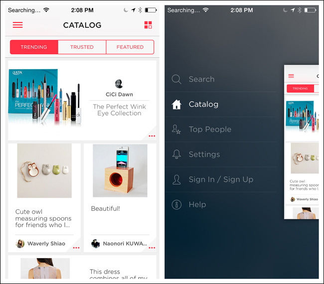
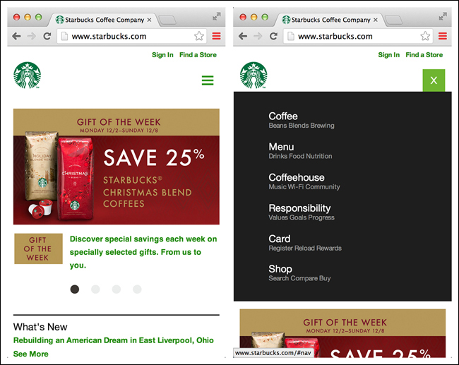
This off-canvas thinking inspired the Side Drawer, which is currently one of the most popular primary navigation patterns in iOS and Android apps.
Windows Phone 8 and Ubuntu Touch, a new open source mobile OS, are both highly influenced by this move to break artificial boundaries as well.
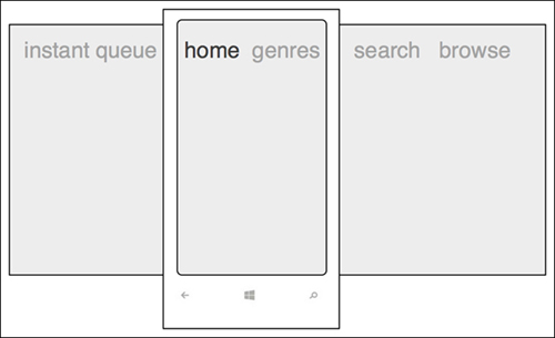

Designers have also made a significant shift in design thinking, layering content instead of relegating the UI to a single plane. Twitter’s early iPad design was a fantastic example of how 3D layers and gestures can create a uniquely mobile experience: the left panel is the menu bar, the middle panel is the listing of contents, and the right panel displays those contents. Tapping an item in the middle section collapses the left menu bar and shows a preview of the contents within the right panel. When tapped, the right panel expands to cover about 70% of the screen.
When deciding between persistent and transient navigation, ask yourself a few questions:
- Is your application “flat”? Are the menu categories equivalent in hierarchy, and are there just a few primary categories (i.e., three to five) in the app?
- Do your users need the menu to be always visible for quick access?
- Do the menu categories have status indicators, like the number of unread emails, for instance?
If you answered “yes” to one or more of these questions, it’s probably best to stick with persistent navigation. Now let’s take a look at those patterns.
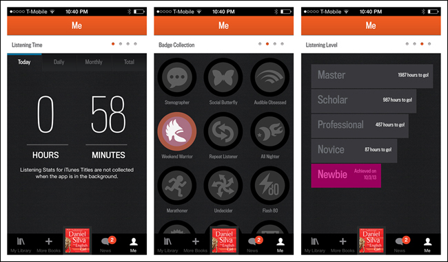
Springboard
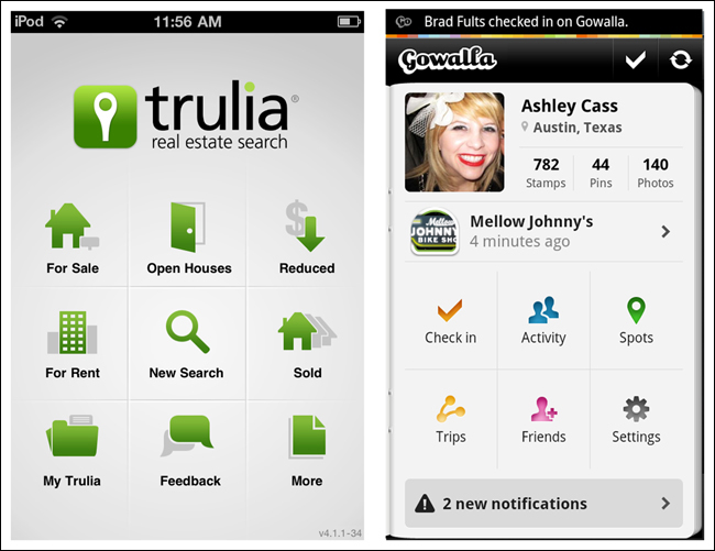
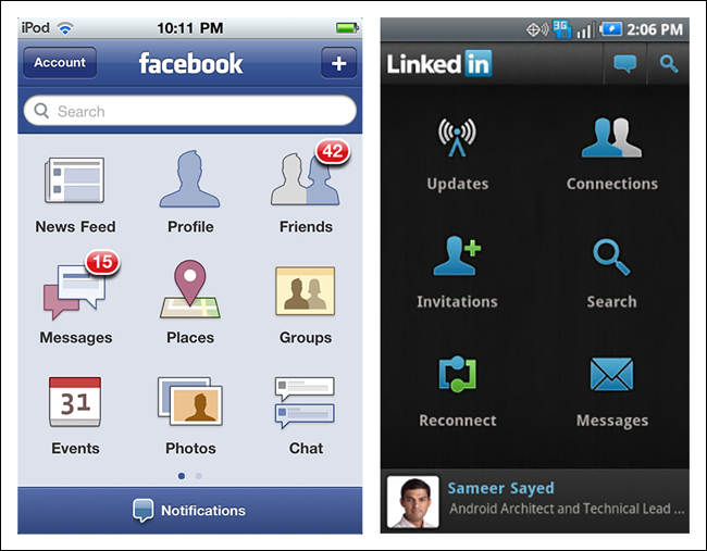
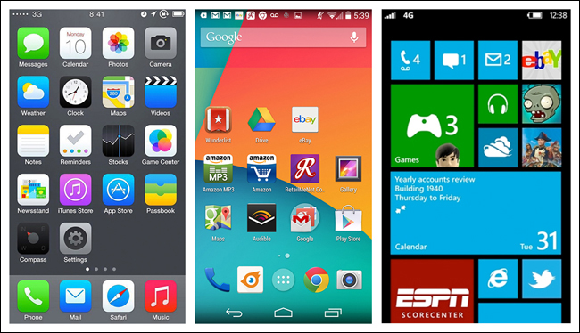
The Springboard pattern, also called a Launchpad, was the most popular navigation pattern in 2011. This design is a landing screen with options that act as launch points into the application.
One of the reasons for its popularity was that it worked equally well across platforms. At the time, many of us were still thinking in terms of OS-neutral designs that allowed for consistency and reuse. It was also popular because up to nine options (in a 3×3 grid) could be displayed, compared to the limits of three to five tabs imposed by iOS and Android tab bars. And by adding a paging indicator (those little dots at the bottom), designers could provide even more menu options.
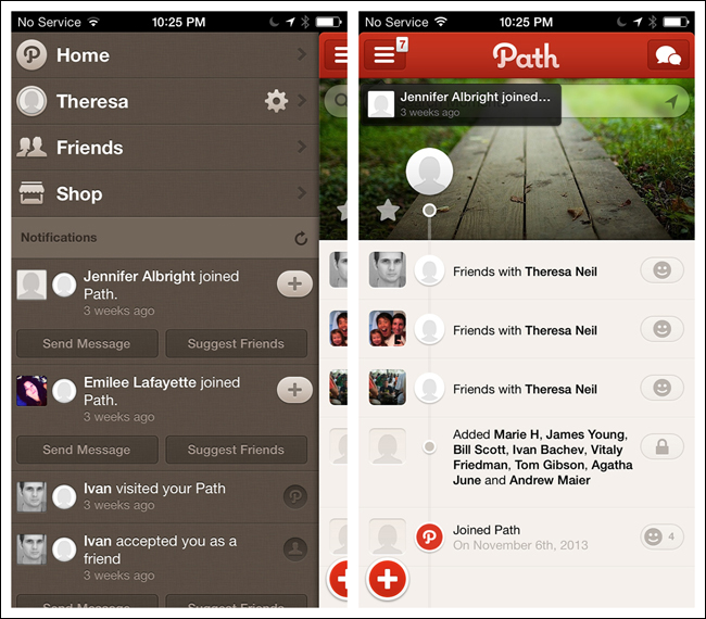
The main drawback of the Springboard pattern is that it flattens all options to the same level of importance. Enter the Side Drawer pattern, first designed by Aza Raskin for Firefox Mobile (http://www.azarask.in/blog/post/firefox-mobile-concept-video/), and adopted by Path in 2011. This pattern accommodates more options than a tab bar, and those options can be logically grouped to communicate importance and/or hierarchy. We’ll discuss it more later in this chapter.

However, the Springboard pattern is not dead. Android, iOS, and Windows Phone all still use this navigation pattern at the OS level.
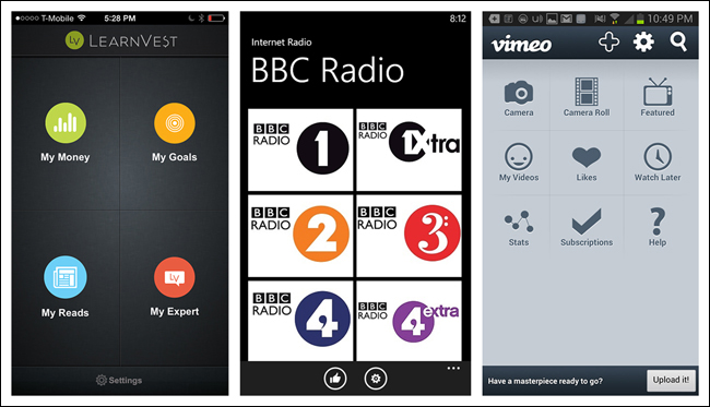
And there are still apps with traditional implementations of the Springboard pattern around. LearnVest, BBC Radio, and Vimeo use basic 4-, 6-, and 9-grid layouts, respectively.
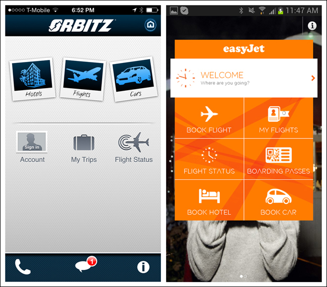
Orbitz and EasyJet vary the icon treatment and grid layout to introduce visual hierarchy to the menu.
Windows Phone has pushed the Springboard pattern the farthest with tiles. Tiles can be live or static, and come in three different sizes. Live tiles convey dynamic information like number of calls missed, details of your next appointment, or the avatar of your last caller. Read the Windows Design Guide for more about tiles at http://bit.ly/1hsl2R5.
Windows Phone tiles can be used for primary navigation or paired with the Panorama control as a secondary navigation pattern. Examples from three apps show their versatility. CalendarPro uses live tiles for primary navigation and NBC News for subnavigation, while Evernote uses static tiles for subnavigation.

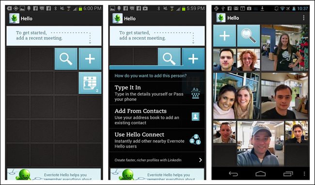
Evernote Hello for Android and iOS uses a tile-inspired design for the Springboard. Users can customize the UI, first by adding people, then by adding meetings.
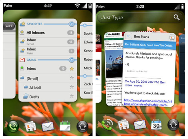
Cards
Cards may seem familiar to those of us who had a Palm in 2010–2011. Card navigation is based on a card deck metaphor, including common card deck manipulations such as stacking, shuffling, discarding, and flipping.
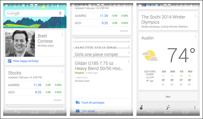
This pattern has become popular again with the release of Google Now, which stacks information-rich cards vertically to display a long list of launch points into the app, or quick actions in context.
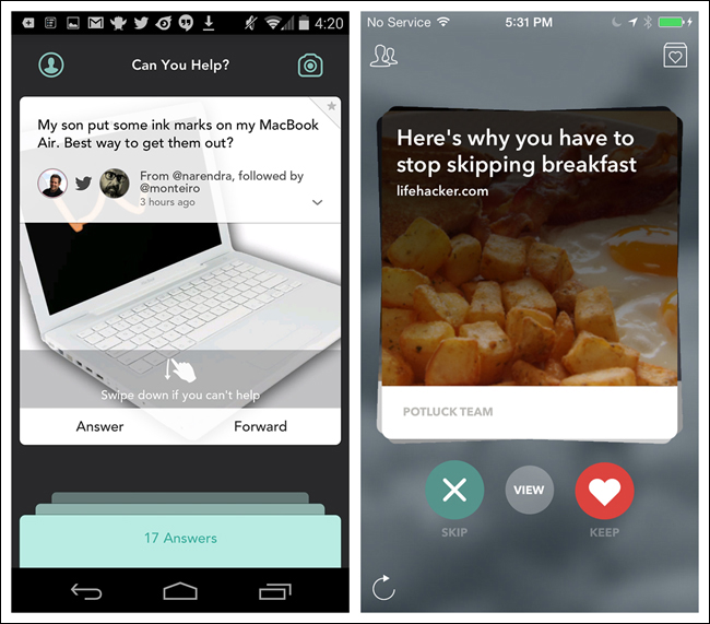
In a similar vein, Jelly and Potluck use Cards as the primary means to navigate and interact with content. With Jelly, when you swipe the card down to remove it from the screen—indicating that you can’t help answer the posted question—a new card replaces it. With Potluck, swiping left on the top card in the stack will skip the story; swiping right will move it to a new pile, the “keep” pile.
Facebook and Pinterest use the visual style of Cards but are missing the gesture-based interactions of the aforementioned examples. This makes them more like stylized list elements than true Cards.
For an example of the Card pattern gone wrong, see the discussion of Alaska Airlines in the section Novel Notions in Chapter 11.
Note
Cards provide an elegant way to display content for browsing. A true Card pattern will offer interactions like stacking, swiping, or flipping.
List Menu
The List Menu pattern is similar to the Springboard in that each list item is a launch point into the application, and switching modules requires navigating back to the list. Apple (http://bit.ly/1dZDU8J) calls this hierarchal navigation:
In a hierarchical app, users navigate by making one choice per screen until they reach their destination. To navigate to another destination, users must retrace some of their steps—or start over from the beginning—and make different choices. Settings and Mail are good examples of apps that use a hierarchical structure.
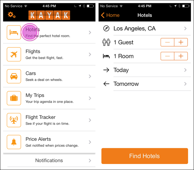
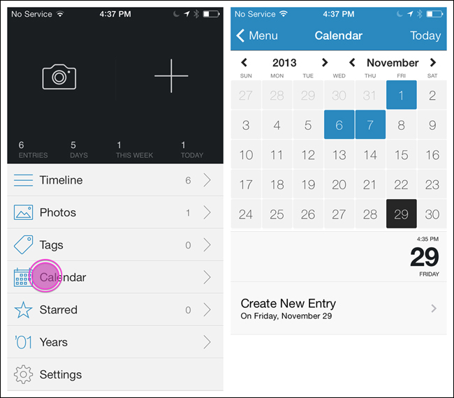
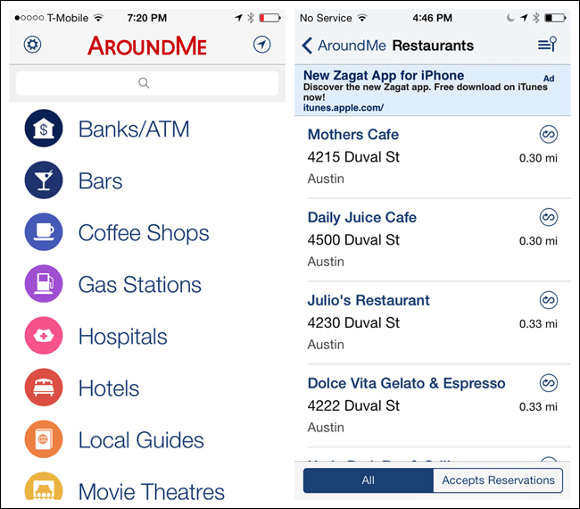
The Kayak, Day One, and AroundMe apps illustrate various implementations of the List Menu.
The List Menu navigation pattern is similar in Android, but the Back button is called the Up button, conveying the pattern’s hierarchical structure, as described in the Android documentation:
The Up button is used to navigate within an app based on the hierarchical relationships between screens. For instance, if screen A displays a list of items, and selecting an item leads to screen B (which presents that item in more detail), then screen B should offer an Up button that returns to screen A. If a screen is the topmost one in an app (that is, the app’s home), it should not present an Up button.
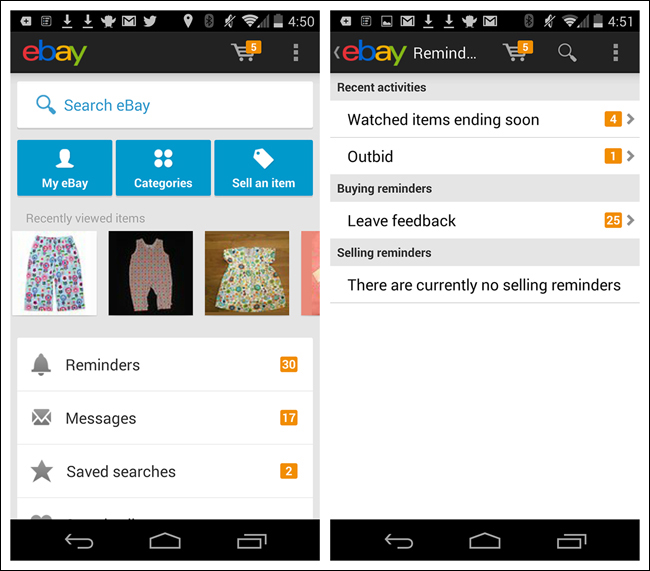
An example of this is shown in the eBay app; the Up button is the app icon preceded by a left chevron. Note that most users expect the chevron plus the logo or icon to be tappable.
Note
Consider List Menus for navigating within a hierarchy. They also work well for menus with long item names, and where items need descriptions as well as titles. Follow OS conventions for implementing this navigation pattern.
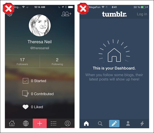
Dashboard
The Dashboard pattern is similar to the Springboard and List Menu patterns.
With a quick glance, a good Dashboard gives the user a snapshot of the most relevant information she needs to know, without making her navigate into another screen.
When you design the drill-down screens, the rules for providing navigation back to the Dashboard are the same as with the List Menu and Springboard. See Chapter 6 for more on the Dashboard design pattern.
Note
Use a Dashboard when it makes sense to use key metrics or data as launch points into the app. But don’t overload the Dashboard; conduct research to determine which key metrics or data to include.
Gallery
The Gallery pattern displays live content—like news stories, recipes, or photos—arranged in a grid (as with Recipeas and Square Wallet), a carousel (as with LinkedIn Pulse and BBC News), or a slideshow.
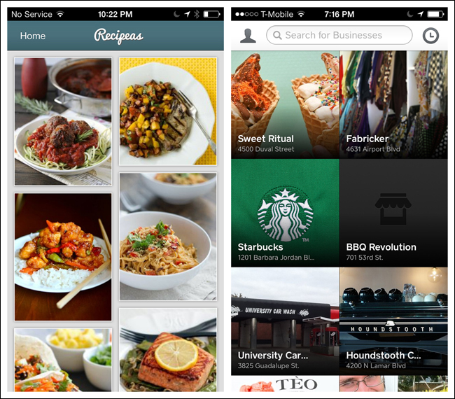

Notice the BBC News example is easier to scan than the LinkedIn Pulse example, because the titles are below the photo instead of overlaid on them.
Note
The Gallery pattern works best for showing frequently updated, highly visual content where no hierarchy is implied.
Tab Menu
Android, iOS, and Windows Phone each have their own specific nomenclature and design guidelines for Tab Menus. I’m going to go over them here, because it is important that you understand them, even if you choose to deviate from them in your design iterations.
iOS
Since the first release of iOS, Apple has recommended (http://bit.ly/1dZF9Vt) the Tab Bar for navigating flat apps:
In an app with a flat information structure, users can navigate directly from one primary category to another because all primary categories are accessible from the main screen. Music and App Store are good examples of apps that use a flat structure.
Interestingly, Facebook recently has returned to the Tab Bar after two years of using Side Drawer navigation. Read more about its user testing process and results at http://tcrn.ch/1dZFlUF.
The iOS Tab Bar is restricted to five menu items. If the application has more than five primary categories, a More option can be provided as the fifth tab on the right.
It is important to understand the difference between the Tab Bar and Toolbar in iOS. The Tab Bar is for navigating the main categories of the application; the Toolbar presents the tools, or possible actions, for a specific screen.

Some applications, like Instagram and RunKeeper, rely so heavily on the user taking a single action (like taking a picture or starting a run) that they place calls to action (a single action more prominent than the rest) in their Tab Bars.
If you design for this variation, make sure the selected tab is conspicuous. It’s hard to tell where you are in Everlapse and Tumblr, for instance, because the selected tabs are overshadowed by the visual emphasis on the action buttons.
Android
Android offers three different Tab Menu patterns for top-level, or primary, navigation: Fixed Tabs, Spinners, and Navigation Drawers. Here are the Android guidelines (http://developer.android.com/design/patterns/app-structure.html) for Fixed Tabs:
Fixed tabs display top-level views concurrently and make it easy to explore and switch between them. They are always visible on the screen, and can’t be moved out of the way like scrollable tabs. Fixed tabs should always allow the user to navigate between the views by swiping left or right on the content area.
Use tabs if:
- You expect your app’s users to switch views frequently.
- You have a limited number of up to three top-level views.
- You want the user to be highly aware of the alternate views.
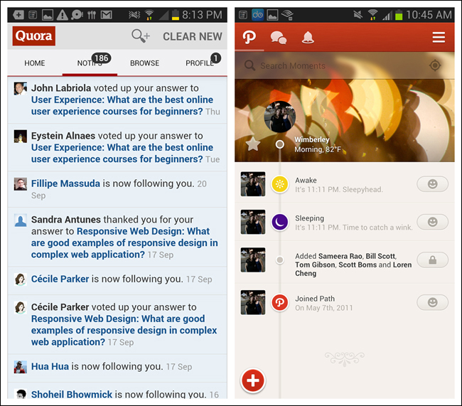
Path makes Fixed Tabs work by using icon-based tabs, while Quora pushes the limit, squeezing in four text-based tabs. More often than not, designers incorrectly use the Scrolling Tab control for primary navigation when they should be using a Spinner or Navigation Drawer instead.
Windows Phone
In Windows Phone, the Tab Menu is called App Tabs, and tabs that extend offscreen are accessible via panning, through the Pivot control. The Windows Phone design guide (http://bit.ly/1iJWnpE) suggests:
You can use the Pivot control (http://bit.ly/1iJWy4v) to implement the App Tab UI style. This control allows the user to navigate right and left through each page (called a pivot page).
Emerging Patterns
There is a new trend in both desktop and mobile web design to hide or collapse the website header when the user is scrolling or swiping down through content.
This Retracting Tab design is showing up in native apps too. Pinterest retracts the Toolbar when the user swipes down to browse content. The Toolbar reappears when the user swipes up. Luvocracy and Polar for iOS are other apps that use this effect.

Configurable Tabs are another variation of the standard Tab Menu. The design of Frequency mimics the way tabs are implemented in all the major desktop web browsers. Adding a channel adds a new tab. If there are too many tabs to fit on the screen, the header scrolls. To reorganize the tab order, the user can simply press and hold a tab, then drag it to the desired location.
Sidebars are gaining popularity in web applications as well as native tablet apps. Twitter offers clearly labeled side tabs for navigating the main views of its iPad application. Yammer has almost twice as many tabs, but no labels, making navigation more of a challenge.
It is unlikely that Sidebars will ever be widely adopted as a persistent navigation pattern on smartphones, for two reasons:
- Most people hold their smartphones in portrait mode, and the sidebar takes up a fair amount of horizontal real estate.
- Since the space is so limited, labels will get dropped, which reduces the usability of the app.
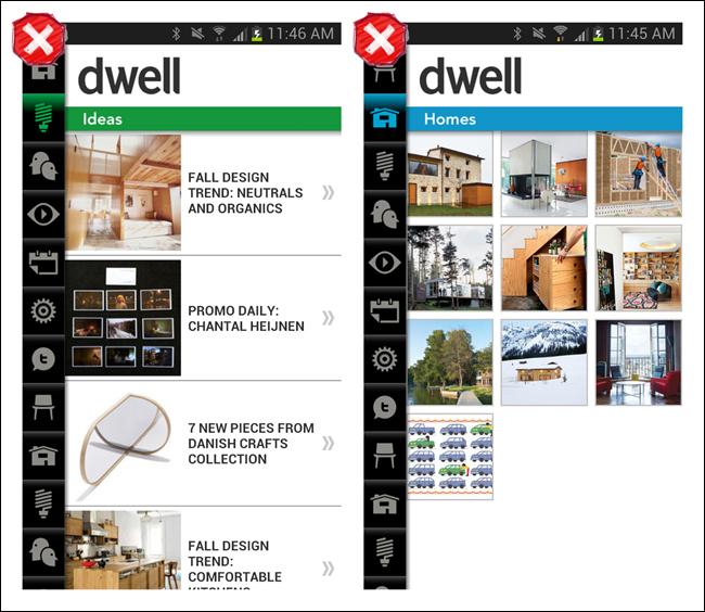
Dwell is a cautionary example. It looks nice, but you have to tap every single icon to see what the primary categories are—a classic example of mystery meat navigation (http://www.webpagesthatsuck.com/mysterymeatnavigation.html).
Note
Learn and follow the different OS design guidelines for Tab Menus. Clearly indicate where the user is by visually differentiating the selected tab from the others.
Skeuomorphic
The Skeuomorphic pattern is characterized by an interface designed to match its real-world counterpart. Even though the trend in visual design is now toward a flatter design aesthetic, some apps can still aid usability by emulating objects and tools from the real world.
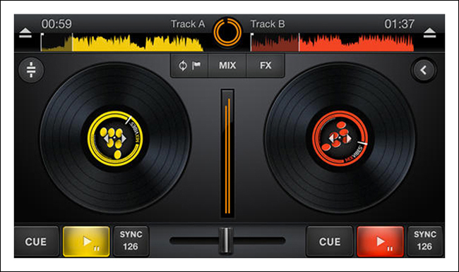
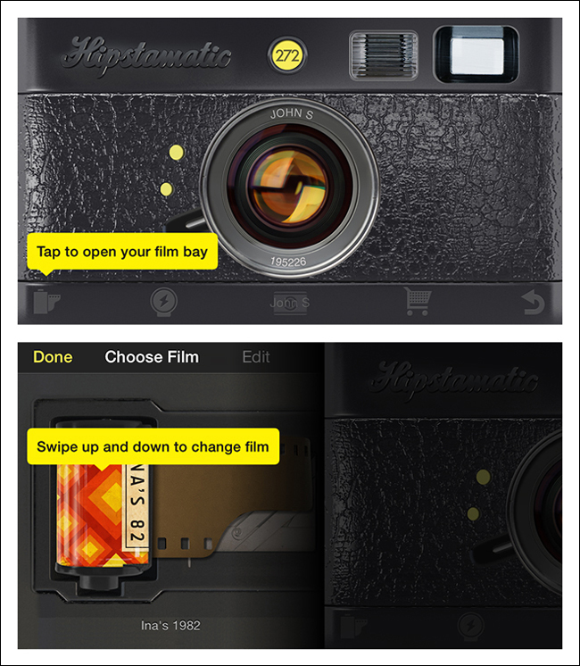
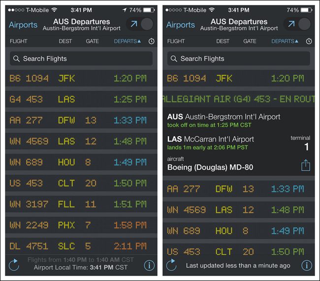
Skeuomorphism is the dominant navigation pattern in game design, as in Sniper Ghost Warrior 2, but it can also have its uses in nongame apps, like the music-mixing app Cross DJ, the photo app Hipstamatic, and the travel app FlightBoard.

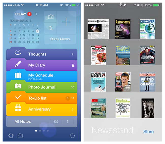
Other examples include the iOS 7 redesign of Awesome Note and Apple’s Newsstand. Both designs are immediately recognizable and feel intuitive because we recognize the folder and bookshelf metaphors.
There are, of course, limits to any metaphor being extended to the digital realm. For example, there was confusion around the early versions of iBook: some users thought that the digital bookshelf size implied a limit to the number of ebooks it could hold, which it didn’t.
Note
Exercise restraint in choosing the metaphor to model the navigation on—a poor implementation can result in the Novel Notion anti-pattern discussed in Chapter 11.
Primary Navigation Patterns, Transient
The term transient means staying a short time, which is exactly how the following navigation menus work. They are hidden until we reveal them; then we make a selection and they disappear again. The three patterns we’ll look at here are Side Drawers, Toggle Menus, and Pie Menus.
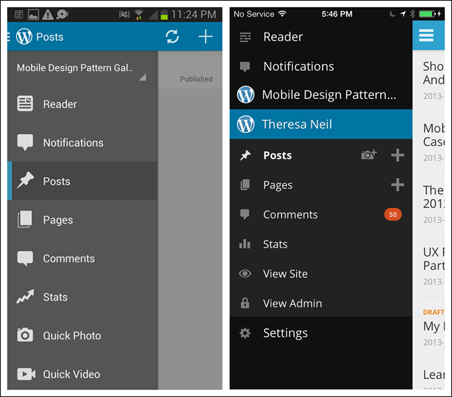
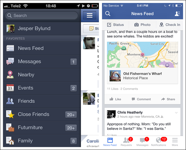
Side Drawer
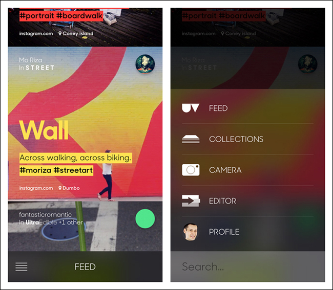
There are two styles of Side Drawers. The first is an overlay, meaning a swipe or tap gesture will reveal a drawer that partially covers or overlaps the original screen content, as in RetailMeNot. The second style is an inlay, in which a swipe, pan, or tap will open a drawer that pushes the original screen content partially off-canvas, as in Path.

What is the best way to let users know that there is a Side Drawer?
The Android design guidelines (http://bit.ly/1iKuQV5) recommend having the drawer open on first use so the user can see the menu and learn how to close the drawer:
Upon first launch of your app, introduce the user to the navigation drawer by automatically opening it. This ensures that users know about the navigation drawer and prompts them to learn about the structure of your app by exploring its content. Continue showing the drawer upon subsequent launches until the user actively expands the navigation drawer manually. Once you know that the user understands how to open the drawer, launch the app with the navigation drawer closed.
Sounds good, right? However, this suggestion has not performed well in the user testing I’ve conducted for clients. Instead, I recommend a design like Allthecooks, where the drawer “bumps” open just the first time the app is opened.
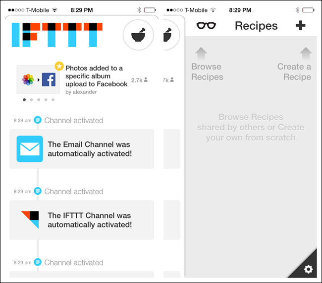
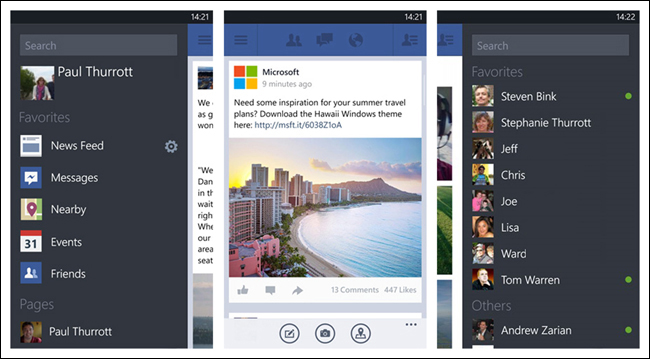
The most popular orientation for the Side Drawer is on the left, but it can be on the right instead, as with IfThisThenThat, or there can be drawers on the right and the left, as with the Facebook Beta for Windows Phone.

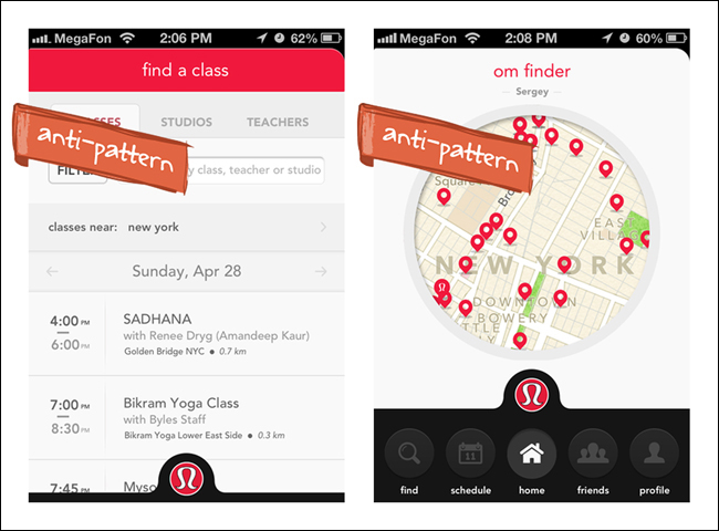
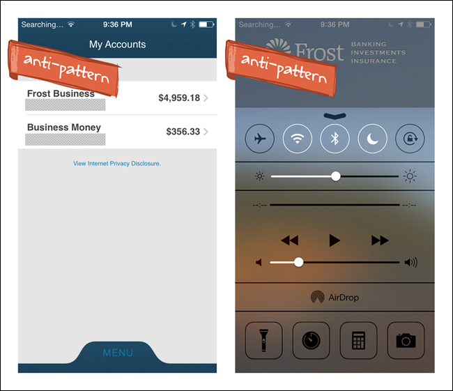
But don’t position the drawer on the bottom, as in the om finder and Frost apps. This positioning conflicts with the swipe-up gesture that reveals the Control Center in iOS 7.
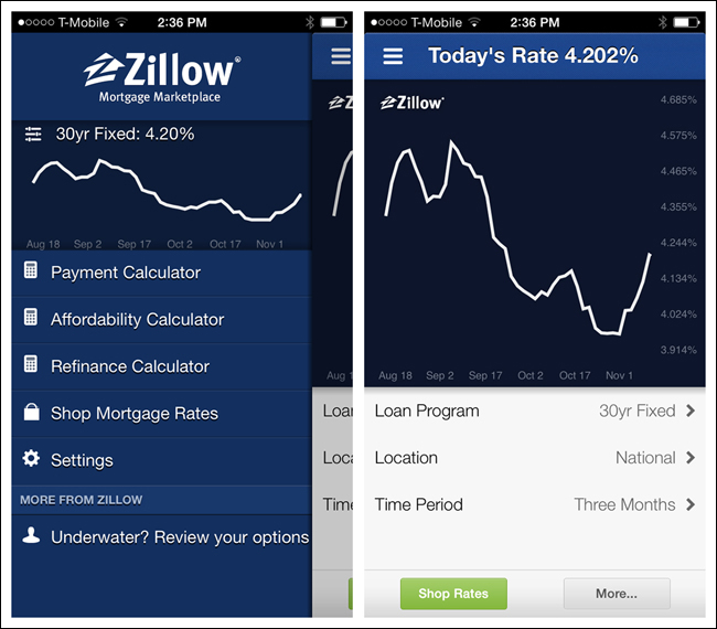
Side Drawer content need not be limited to only navigation options. Zillow’s Mortgage Marketplace drawer has a real-time chart of mortgage rates, and social apps like LinkedIn frequently include profile information.

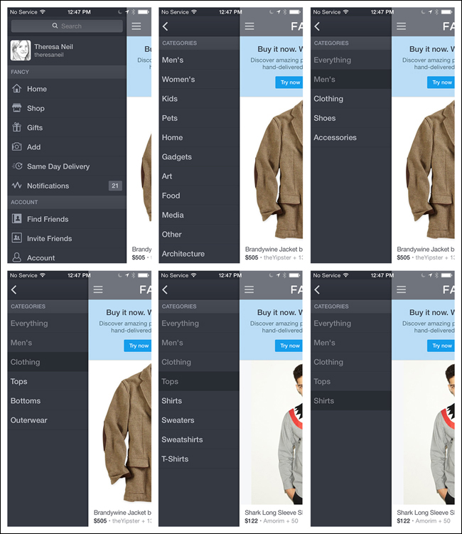
The Side Drawer can be more than one level deep. In Fancy, for instance, you can tap-tap-tap down the path until you reach the lowest-level category. As you drill down through the categories, the content on the right updates. In Wish, the Side Drawer path for Categories is only two levels deep; categories are selected Springboard-style.
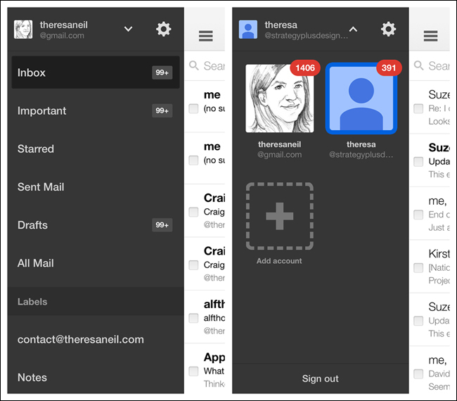
The Side Drawer can also let users switch high-level context. With the Side Drawer in Gmail for iOS, tapping the arrow by my name opens a panel that slides down over the menu options. There I can switch between email accounts, or add a new one.
Note
The Side Drawer can be versatile, but be careful not to overload it with too many features. It should show the primary navigation options first and foremost.
Emerging Pattern
In response to iOS 7 guidelines, the designers of Luvocracy have been experimenting with a variation of the inlay Side Drawer (http://uxmag.com/articles/adapting-ui-to-ios-7-the-side-menu).
Tapping the navicon (or the “hamburger”) reveals the Side Drawer, but instead of the drawer inlay simply pushing the parent screen to the right, it also uses a 3D effect to push it back.
Luvocracy is simple to navigate and the transitions are smooth. However, a similar-style menu in Airbnb for iOS constitutes an anti-pattern. The new design creates three high-level menu categories: Travel, Host, and Log In. The Travel title is positioned across the top (with the actual travel menu options disconnected down below), while Host and Log In are next to each other on the bottom edge. Tapping on Host or swiping vertically switches Host to the top and Travel to the bottom (Log In stays static). Swiping again switches them back. This design is impractical and inefficient for users. I don’t always agree with everything in the iOS Design Guide (http://bit.ly/1iK1juP), but substitute the word swipe for scroll in the following and it’s on point in this case:
Don’t make users scroll to see all their choices. This causes a disconcerting experience for users, because they must spend extra time to distinguish the choices. Also, it can be very difficult for users to scroll without inadvertently tapping an option.
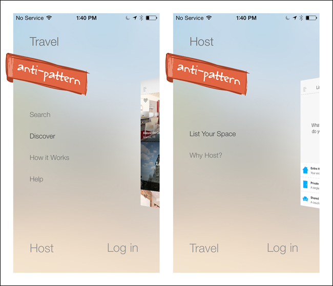
The Navigation Drawer in the Android version of Airbnb, by comparison, is crystal-clear—no guesswork required.
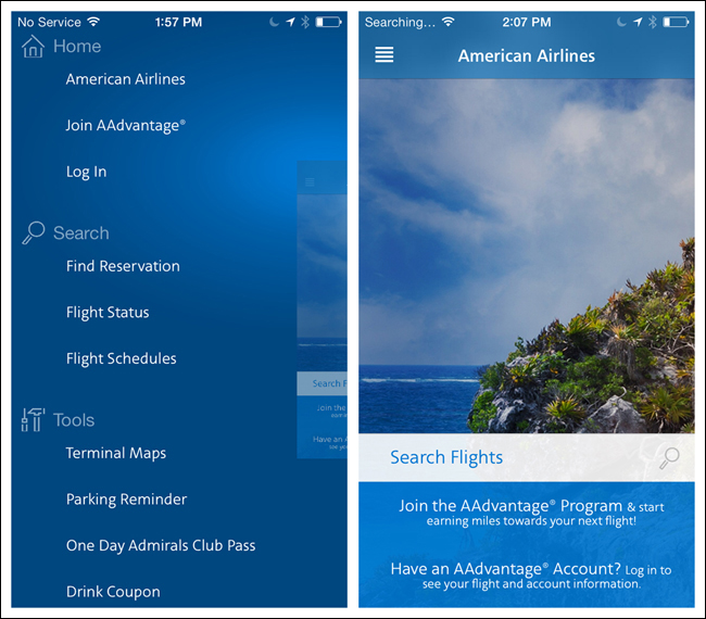
A better implementation for iOS is American Airlines, where the Side Drawer reveals a well-designed grouped menu. I wish the parent screen weren’t translucent, though, since it is still a touch target.
Note
Before you choose Side Drawer navigation, map out the information architecture for the app and validate it with users. Then, if a Side Drawer seems to make sense, you should prototype and test a couple of variations to see which one works best.
Toggle Menu
In this book’s first edition, I labeled this pattern the Mega Menu, after its web equivalent. Since then, mobile web and responsive web design have pushed this design further, and it is now more commonly known as the Toggle Menu.
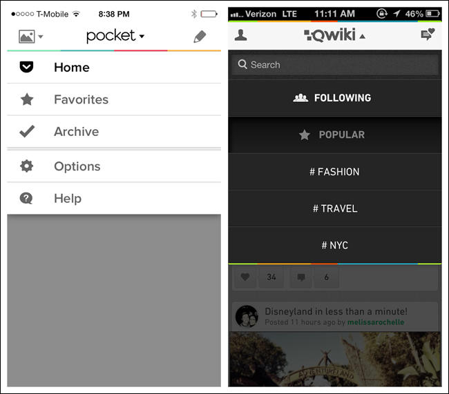
Like the Side Drawer, the Toggle Menu can be an inlay that pushes the content down below the menu, as with Pocket or Qwiki, or an overlay that appears as a layer above the content, as with Walmart and Home Depot. The overlay design is the more common option in native mobile apps. In Ultravisual, the overlay Toggle Menu comes up from the bottom.

A key convention of the Toggle Menu is that whatever gesture reveals the menu—tapping an icon, swiping, or panning, for example—should also hide it.
The menu shouldn’t cover the whole screen, but instead let the background peek through. Tapping anywhere in the background should also hide the menu.
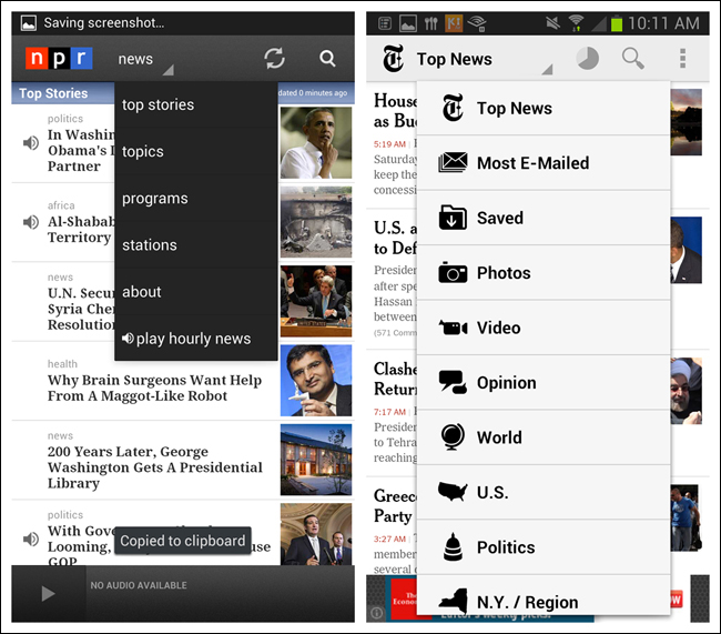
Android provides a specific control, the Spinner, for this type of primary navigation. But keep in mind the Spinner should be reserved for navigating between views in a category, as opposed to jumping between completely different categories.
For example, both the NPR and the NYTimes apps serve up news, and the Spinner offers different ways to slice and dice the massive amount of news content they offer. But if, say, NPR needed to offer other options in this menu, like Music or Weather, Android guidelines would dictate using a Tab Bar or Navigation Drawer instead.
For Android, use the Spinner control where the Toggle Menu is intended to show the views within a category. For iOS and Windows, bear in mind that the Toggle Menu is a custom control, which could take more time to implement, test, and maintain.
Pie Menu
Pie Menus—also known as wheels, circular menus, or radial menus—have been around since the ’90s in desktop software, and more recently in web applications. They are also very popular in game design. So I was excited to play with PIE, a Pie Menu interface in the open source Paranoid Android OS, and was surprised at how well it works.
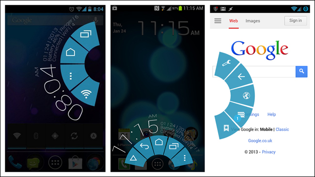
If the Pie Menu option ever becomes a standard part of the stock Android OS, though, I think that will disqualify it for use as primary navigation within apps—it would create too many conflicts between the OS and the apps.
Looking at the other operating systems, I discovered only a handful of apps experimenting with this pattern for primary navigation. The examples I did find were discouraging. PortalWebBrowser, for instance, has a multitier wheel that requires psychic powers and surgeon-like precision to navigate.

The primary design differences between Paranoid Android’s PIE and the Pie Menu in PortalWebBrowser are the latter’s multiple tiers and tiny touch targets. Having to tap, hold, and then slide across tiers to variably sized wedges is not a simple or natural gesture. There are some good examples of Pie Menus for selecting actions, though; see Chapter 5.
Note
This is probably the weakest pattern for primary navigation and should be avoided for any menu with multiple tiers. If you have an application with flat information architecture, consider the Tab Menu—familiar to all users—instead.
Secondary Navigation Patterns
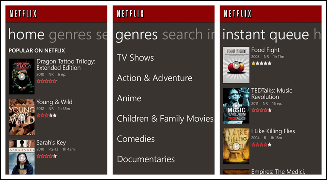
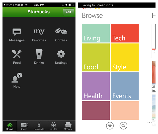
This chapter didn’t feel complete with only primary navigation patterns, so I broadened it to include secondary navigation. By secondary navigation, I mean moving about within a selected module. For example, Starbucks uses the Tab Menu for primary navigation and a Springboard for secondary navigation on the Home screen. Similarly, Brit & Co. uses a Tab Menu for primary navigation (a Windows Pivot control) and a Springboard for secondary navigation in the Browse module.
All of the primary navigation patterns can also serve as secondary navigation patterns. It is common to see Tabs with Tabs, Tabs with Lists, Tabs with a Dashboard, a Springboard with a Gallery, and so on.
Additional patterns that work well for secondary navigation include Page Swiping, Scrolling Tabs, and the Expand/Collapse Panel.
Page Swiping
This pattern can be used to navigate quickly through content using the swipe gesture. The most common way to communicate this navigation pattern is via page indicators (the iOS term for the horizontal line of little dots). The card metaphor also works for paging, as in Ness and Foodspotting. In these examples, partially visible background cards or pages cue the user to swipe.
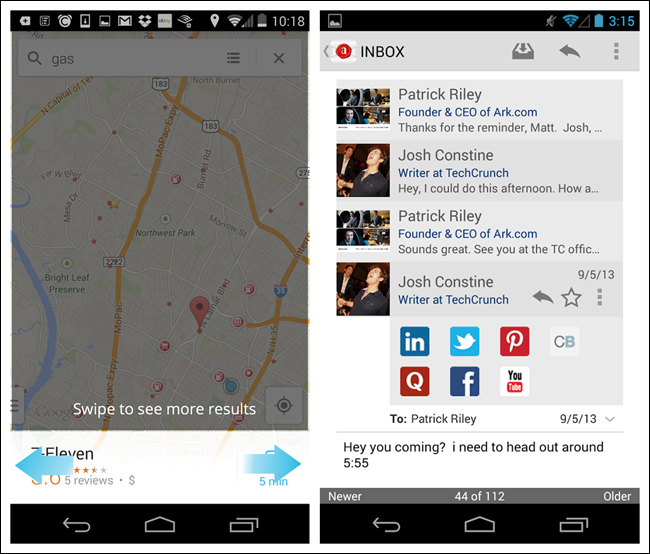
Many Android apps offer a similar paging experience. In Google Maps, you can swipe through the list of search results. A tip is shown on first use to communicate this Page Swiping option.
Ark Mail, like Gmail, offers Page Swiping for quick navigation through email messages. A thin footer shows the total number of messages, current message number, and Newer and Older labels in the corners, giving some indication that swiping horizontally will reveal another email.
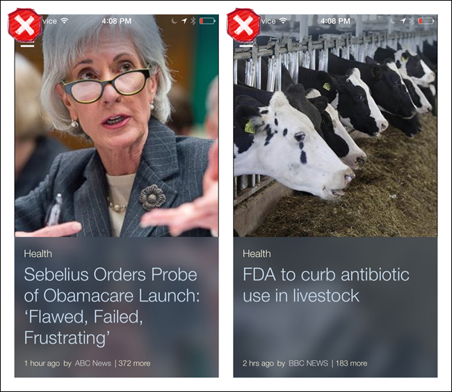
News360 is an anti-pattern implementation of Page Swiping, because of its lack of affordance. Adding the paging indicator dots across the top, as in HuffPost, would have made it immediately obvious that a horizontal swipe gesture is required to see the next story, versus a vertical scroll.
Note
Use Page Swiping to take advantage of mobile’s gestural controls, instead of relying on desktop holdovers like Next buttons or Tabs. But provide visual affordance that swiping is available.
Scrolling Tabs
The Android design guidelines (http://bit.ly/1hsr9VF) refer to these secondary navigation controls as Scrolling Tabs, so I stuck with that term. This pattern is useful for displaying multiple categories or views within a specific module. Scrolling Tabs are usually thinner than standard Tab Bars since they are not necessarily touch targets. More typically, they are an affordance to swipe horizontally.
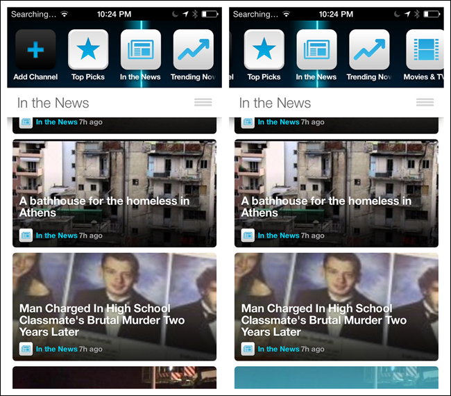
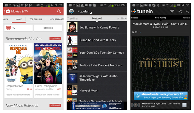
In Google Play, Scrolling Tabs offer a way to filter the results after selecting an item (such as “Movies & TV”) in the Navigation Drawer. Examples from Songza and TuneIn show other ways to integrate the pattern.
If you incorporate this pattern, make sure your design clearly indicates the selected tab.
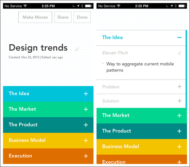
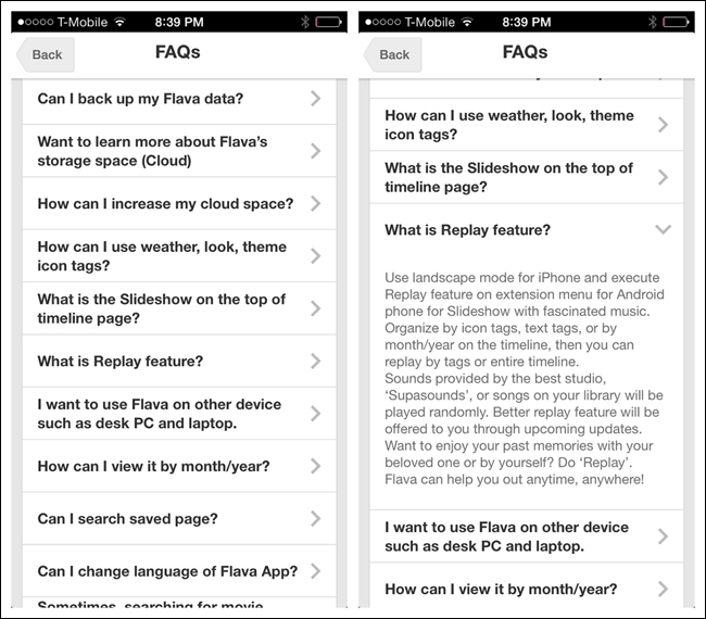
Accordion
An Accordion lets the user see more information while staying on the same screen. This pattern can be more efficient than navigating to a new screen, and then having to navigate back up. Note that examples from Elevatr, Flava, and the Android Play Store all use familiar icons to indicate a panel’s expanded or collapsed state.