3. Designing for Mobile Devices
Lesson Overview
In this lesson, you’ll learn about these concepts and strategies for designing websites for mobile devices:
• Creating designs that adapt to different screen sizes by using Dreamweaver CSS Fluid Grids
• Designing with themes for mobile devices by using jQuery Mobile
• Building apps for multiple platforms by using the PhoneGap Build service

This lesson will take about 45 minutes to complete.
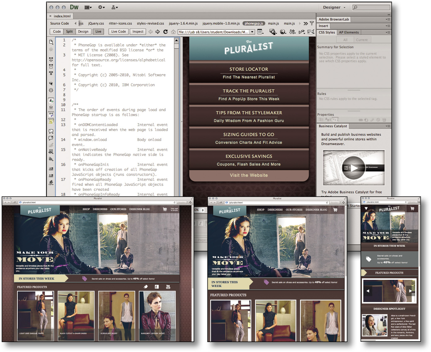
Mobile devices come in a wide range of shapes and sizes. Adobe Creative Suite 6 Design & Web Premium provides ...
Get Adobe® Creative Suite® 6 Design & Web Premium Classroom in a Book® now with the O’Reilly learning platform.
O’Reilly members experience books, live events, courses curated by job role, and more from O’Reilly and nearly 200 top publishers.

