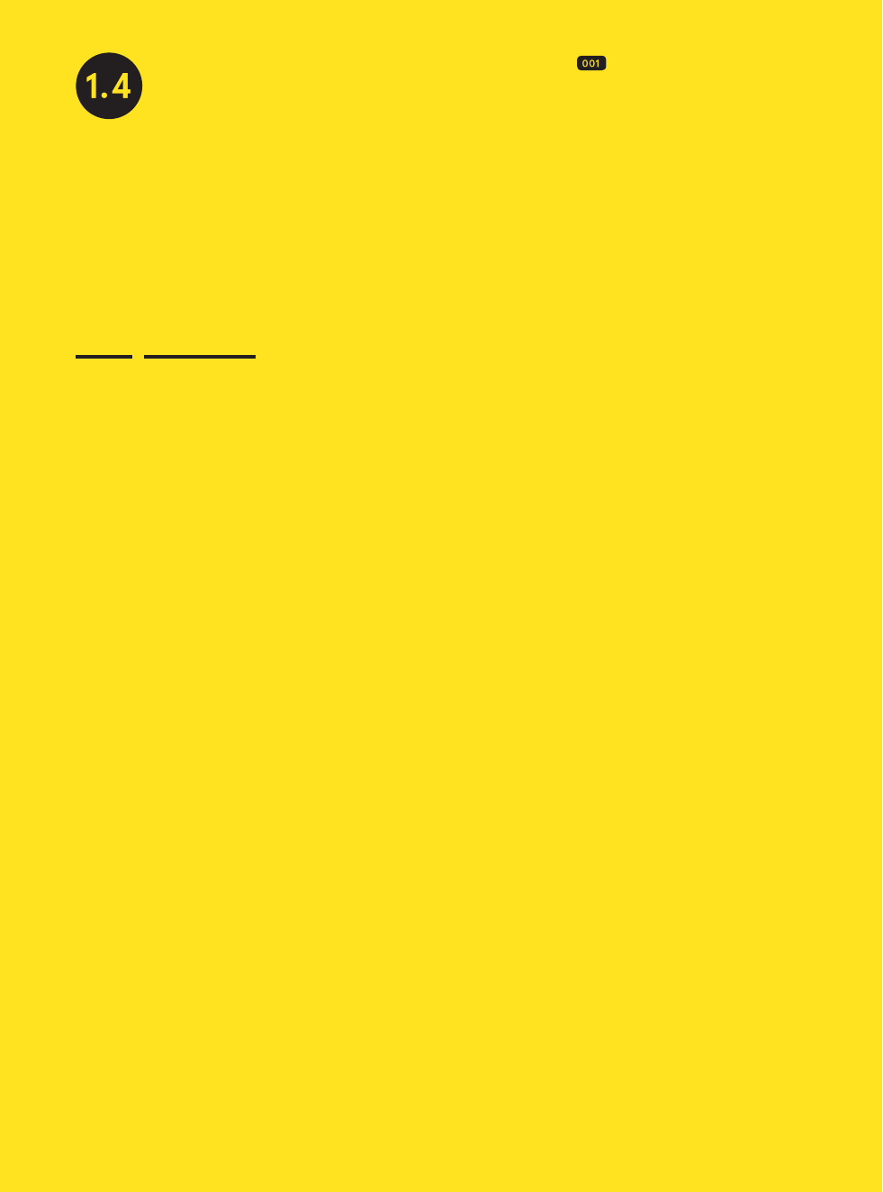
Print magazine commissioned
Spin to design a special edition centered
on the theme of movement. For the cover,
Spin uses a mixture of halftoning, grada-
tion, and overprinting. Notice the change
in coloration when the halftone gradation
from red to yellow overlaps the halftone
gradation of light to dark blue, symboliz-
ing change and movement.
Concept
and Color
Tony Brook
The way I work is conceptual—I’m looking for ideas
and connections that allow form to be delivered
and content to be expressed. Part of this is under-
standing that the use of color can be both rational
and emotional.

fig. 001

1.4
Context30 Color Works
1.2
6.3
1.2
5.5
1.5/2.2
1.5
Concept and Color
Spin uses overlay and overprint-
ing techniques with subtle changes in
translucency and halftoning. Notice how
the overlapping of colored imagery gener-
ates a dynamic feel to the overall spreads,
connecting once disparate imagery and
typography into a flowing composition.
By playing off the vibrancy of the
yellow and using the white as a highlight
to contrast with the black, Spin reinvents
the colors. Then their boldness and solid-
ity are reinforced through the strength
and composition of the form.
I once saw an exhibition composed of several tunnels made out of
a semitransparent material, and each tunnel was flooded with colored
light. I hadn’t realized the profound physical reaction the body has to
color until I walked into the cavern of the red tube and a feeling of
warmth engulfed me. Imagine not being able to see any horizon,
your eyes completely full of color. Then moving into the blue tube you
physically feel cold, the temperature seems to change. It’s a remarkable
thing. There are subconscious responses to color within specific
contextual spaces.
Color sets the psychological tone of what one is trying to create, where
color follows form. I believe in beginning to design from a rational start-
ing point, then applying the emotional. I have achieved this successfully
whenever I’m not beholden to a particular color. If the visual language
and behavior is strong, that should give you license to play with color
and to use color as a tool to express different emotions.
In our project for the Proa Foundation in Argentina, the color of the
space was a reaction to the physical environment. It’s located in
a profoundly colorful and vibrant area in the Boca District of Buenos
Aires. The beginning of the color conversation with the Foundation
was based around that context, which eventually allowed the space
to find its own voice, and therefore its color. Now our color options have
gone from being inspired by the surroundings to being inspired
by a specific artist or artists on exhibit. For example, we created
a color palette for a group show on Brazilian and Argentinean pop art.
This allowed us to have fun using the national colors of both countries
and then imagining what those national colors were like in the 1960s
and 1970s, and how the sun might have faded them over time. This
procedure became purely subjective and emotional, with the
colors ending up as a pale blue and a slightly dirty green. So time has
become an effective factor in thinking about color. The type is evoca-
tive—it’s telling you this is about 1960s and ’70s South American
pop art—and the color is intended to be a reflection of us today looking
back at that period, kind of how we use Instagram.
All of the ideas that go into a designer’s work can never be fully articu-
lated or explained. But I think if you design with a sense of purpose,
and you’re thoughtful about your ideas, they will come across.
For Renault 4+, a new warranty program for the car manufacturer, the
project started as pure corporate design, with an identity package to
be developed from the existing Renault corporate branding specifica-
tions, including existing colors (golden yellow, white, and gray). But
Renault had never really used the golden ochre yellow (Pantone 7408)
in the way we proposed; we also replaced the dark gray (Pantone 432)
with a solid black and used these colors in a way that, through scale,
felt dense.
This technique is used to vivid effect in several publications, notably on
the cover of Kwadraat-Bladen, and in a special issue of Print magazine
designed by Spin. Kwadraat-Bladen, a book by Unit Editions, showcases
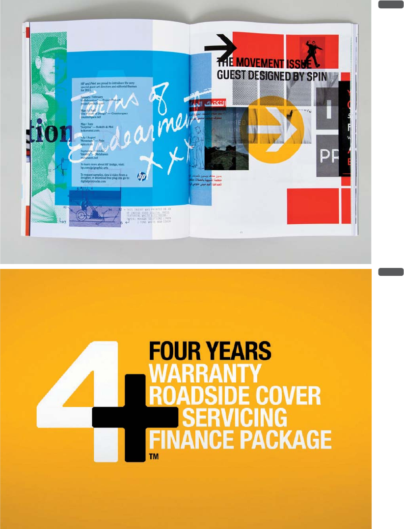
fig. 002
fig. 003
Get Best Practices for Graphic Designers, Color Works now with the O’Reilly learning platform.
O’Reilly members experience books, live events, courses curated by job role, and more from O’Reilly and nearly 200 top publishers.

