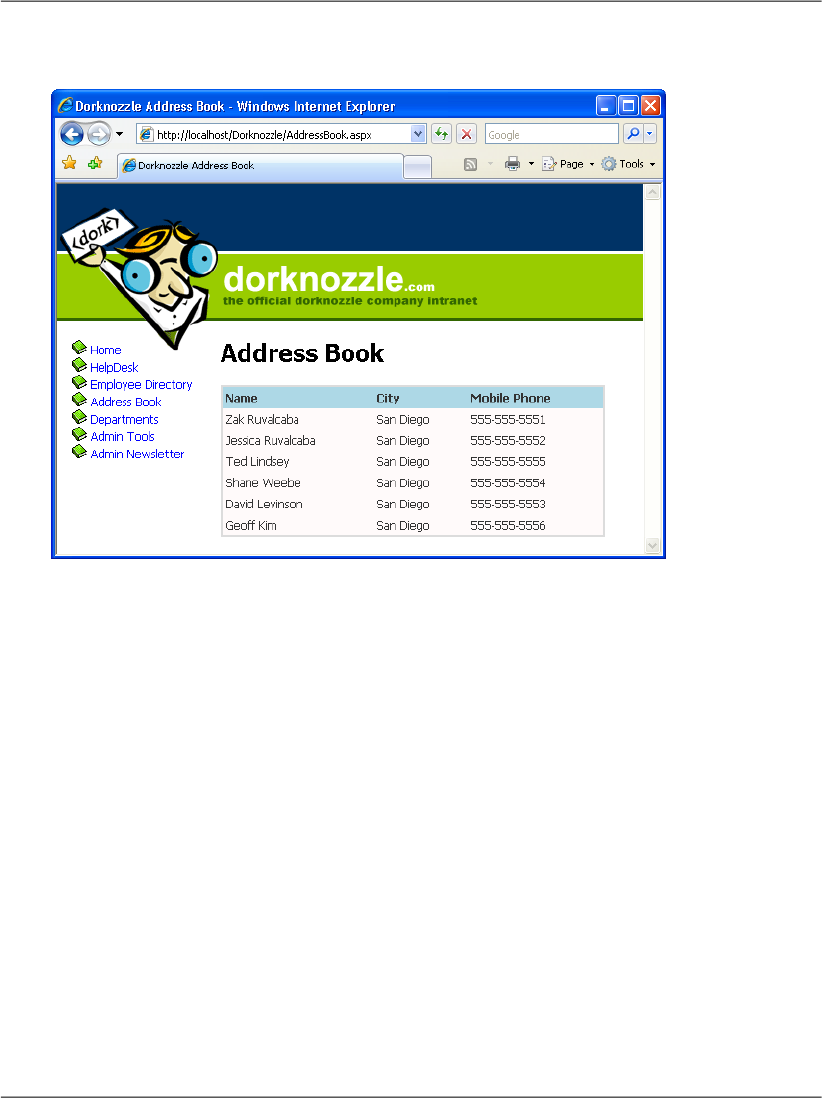
Figure 11.5. The styled address book
All the styling we need is already defined in the skin file; we’d only need to define
new properties if we wanted to alter the default values provided through the skin
file. Save your work and view the results in the browser. Do they look like the
display in Figure 11.5?
Congratulations! You’ve harnessed the power of CSS and skin files, and combined
it with the flexibility of GridView to easily create a good-looking address book!
As you can see, you can style the items in the GridView by altering their font
types, colors, and sizes. You can also style the column headers and apply an al-
ternating item style to alternate rows in the table. Now, when the GridView is
viewed in the browser, we see a little more room between cells, and the lines
surrounding the GridView are gone.
Selecting Grid Records
We’ve already made quite a few changes to the display of our GridView. The
next step will be to allow users to select one of the rows in the GridView so they
can view more information about the selected employee.
440
Chapter 11: Managing Content Using Grid View and Details View

There are several types of columns that we can create in a GridView in addition
to the BoundField columns we’ve already seen. For instance, we could create a
ButtonField column, which displays a button in each row. The complete set of
column controls and their descriptions are listed here:
BoundField
As you’ve seen, the BoundField provides flexibility in presentation by allowing
you to specify which columns will appear within the GridView. When the
grid enters edit mode, this field renders itself as an editable text box, as we’ll
see later.
ButtonField
Use the ButtonField to display a clickable button for each row within the
GridView. When clicked, the button triggers a configurable event that you
can handle within your code to respond to the user’s action. The possible
event types that a button can trigger are: Cancel, Delete, Edit, Select, and
Update.
CheckBoxField
The CheckBoxField displays a checkbox in each row, allowing you to easily
present Boolean data in the display.
CommandField
The CommandField column automatically generates a ButtonField in your
grid. The actions performed by these buttons depend on the grid’s current
state. For example, if CommandField is set to generate Edit buttons, it will
display an Edit button when the grid is in non-editable mode, and will display
Update and Cancel buttons when the grid is being edited.
HyperLinkField
Use the HyperLinkField to display a clickable link within the GridView.
This link simply acts as a hyperlink to a URL; it raises no server-side events.
ImageField
This control displays an image inside your grid.
TemplateField
Use the TemplateField to display markup within the GridView.
441
Selecting Grid Records
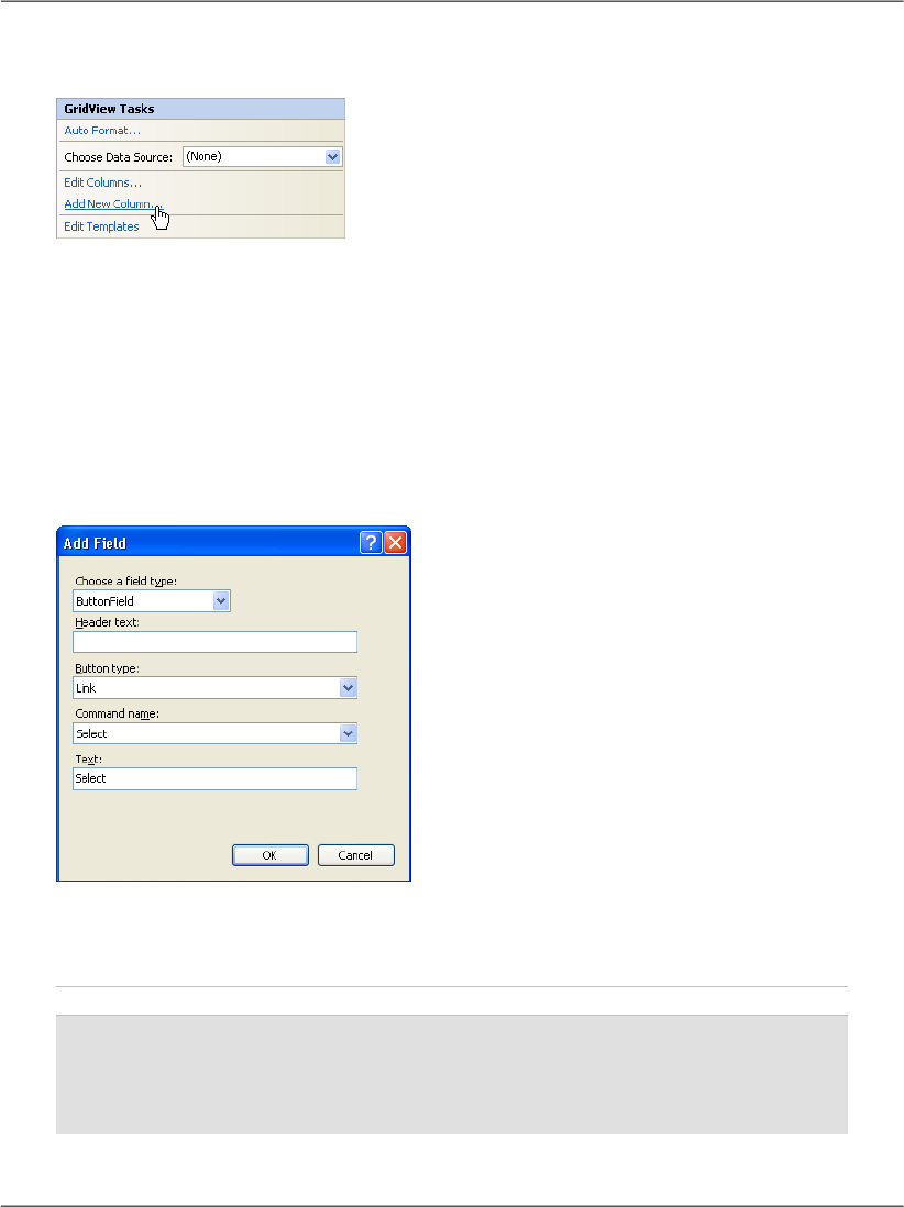
Figure 11.6. Adding a new GridView column
If you’re using Visual Web Developer, you can quickly and easily add a new
column to your table in Design View. Click the GridView’s smart tag, and click
the Add New Column... item, as shown in Figure 11.6.
In the dialog that appears, change the field type to ButtonField, the command
name to Select, and set the Text field to Select, so the dialog appears as it does
in Figure 11.7.
Figure 11.7. Adding a new field
After clicking OK, your brand new column shows up in Design View. If you switch
to Source View, you can see it there, too:
File: AddressBook.aspx (excerpt)
<asp:GridView ID="grid" runat="server"
AutoGenerateColumns="false">
<Columns>
<asp:BoundField DataField="Name" HeaderText="Name" />
<asp:BoundField DataField="City" HeaderText="City" />
442
Chapter 11: Managing Content Using Grid View and Details View
<asp:BoundField DataField="MobilePhone"
HeaderText="Mobile Phone" />
<asp:ButtonField CommandName="Select" Text="Select" />
</Columns>
</asp:GridView>
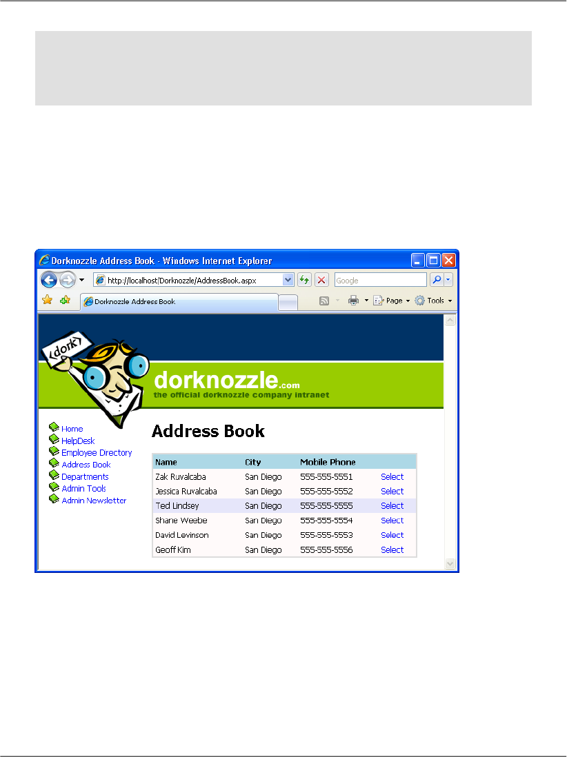
If you execute the project now, and click the new button, the row will become
highlighted, as Figure 11.8 indicates. Notice that you didn’t write any code to
implement this feature? We’re relying on the functionality provided by the
ButtonField control when it’s CommandName property is set to Select, and the
style settings you set earlier, to produce this functionality.
Figure 11.8. Highlighting the selected field in the Address Book
We usually want extra work—in addition to the row highlight—to be performed
when a user selects a row in the address book. When the Select button is pressed,
the GridView fires the SelectedIndexChanged event, which we handle if we need
to do any further processing. We can generate the GridView’s SelectedIndex-
Changed event handler simply by double-clicking the GridView in the Visual
Web Developer designer.
443
Selecting Grid Records
Get Build Your Own ASP.NET 2.0 Web Site Using C# & VB, Second Edition now with the O’Reilly learning platform.
O’Reilly members experience books, live events, courses curated by job role, and more from O’Reilly and nearly 200 top publishers.

