Chapter 4. Analyzing Open Data for Fun (and Profit?), Part 2
This is the the second article in a series of articles that takes a look at using open source technology to analyze the World Development Indicators data set from the World Bank’s data catalog.
Implementing Table and Line Chart Visualizations
The bad news is that it’s taken a little bit of work to put together the scaffolding needed to get our data into a format that’s easily consumed on the front end. The good news is that most of this effort is a one-time expense to get infrastructure in place and learn the ropes; the scaffolding we have in place is pretty robust and generalizes pretty well to any kind of tabular data that you might run across. The next step is to actually start visualizing it, and this is where things get a lot more interesting. At this point, it might be helpful to visit Google’s Visualization Playground to get a basic idea of the various options available and peruse some sample code.
The steps involved in visualizing a query are generally the same: construct the query, run it, and pass the results into a visualization for rendering. The simplest visualization to start out with is a table, since it requires simply passing the result of the query into a Table constructor function. To see it in action you can copy the table1.jsp code into the myWebApp directory, modify the database connection variables, and point your browser to http://localhost:8080/myWebApp/table1.jsp. The following program listing demonstrates:
<!DOCTYPE html>
<html>
    <head>
        <title>Simple Table</title>

        <!-- Google JS lib -->
        <script type="text/javascript" src="http://www.google.com/jsapi">
</script>

        <script type="text/javascript">

            /* Load the Google visualization packages being used */
            google.load('visualization', '1', {'packages':['table']});

            google.setOnLoadCallback(function () {
                // Known constants for the data set
                var FIRST_YEAR = 1960;
                var LAST_YEAR = 2008;

                /* Modify the following variables to fit your
                environment */
                var DB_URL = "jdbc:mysql://localhost:3306/mydb";
                var DB_USER = "user";
                var DB_PASSWORD = "password";
                var DB_TABLE = "wdi_gdf";

                var years = ["y1960","y1970","y1980","y1990","y2000"];

                // Build a query to get data by year for a given
                // series and country
                var query = new google.visualization.Query(
                        'sql?tq=' +
                        'select ' + years.join(",") +
                        ' where series_name = "Urban population" and
country_name = "China"' +
                        "&url="+ escape(DB_URL) +
                        "&user="+ DB_USER +
                        "&password="+ DB_PASSWORD +
                        "&table="+ DB_TABLE
                );

                // Send the query to the server and run callback
                query.send(function(response) {
                    if (response.isError()) {
                      alert('Error in query: ' + response.getMessage()
+ ' ' + response.getDetailedMessage());
                      return;
                    }

                    var table = new google.visualization.Table(
document.getElementById('viz'));
                    var data = response.getDataTable();

                    // Formatting isn't required but dramatically
                    // increases readability of cell data
                    var formatter = new google.visualization.TableNumber
Format();
                    for (var c=0; c< years.length; c++) {
                        formatter.format(data, c); // Format each column
                    }

                    table.draw(data);
                });
            });
        </script>
    </head>
    <body>
        <div id="viz" style="width:600px"></div>
    </body>
</html>Hopefully, the code is pretty easy to follow from top to bottom. The visualization package is loaded for a table, and then a callback function executes a query and constructs a Table. Most of the code is a template that we can expand upon for more complex visualizations. From here on out, you could spend almost all of your time time coding and analyzing since you have an accessible data pipe and the ability to query it. The one exception is that you might need to restart Tomcat with more heap space if you begin to run very large queries or add additional indices if you’d like to query by series code or country code for some reason.
To demonstrate the Table visualization’s API, let’s expand upon the table example by writing a simple transpose function that will swap the rows and columns. As it turns out, this transformation is necessary for rendering a line chart in just a moment. The following code snippet illustrates the transpose function that is used in example table2.jsp.
var transposeData = function (data) {
    var newData = new google.visualization.DataTable();

    newData.addColumn("string", "Year");
    newData.addColumn("number", "Urban Population for China");

    for (var c = 0; c < data.getNumberOfColumns(); c++) {
        newData.addRow([{v : data.getColumnId(c)}, {v :
data.getValue(0, c) }]);
    }
    return newData;
}
From here on out, very minimal changes to the working template code
are needed to produce common visualizations such as line charts, bar
charts, maps, etc. For example, visualizing a line chart instead of a
table only requires adding a reference to the linechart package in the
google.load function and then making the following
substitution. See linechart.jsp
for the full program listing.
// Remember to make this update:
google.load('visualization', '1', {'packages':['linechart']});

// And here's how you create it
var data = transposeData(response.getDataTable());
var linechart = new google.visualization.LineChart(
document.getElementById('viz'));
linechart.draw(data);
That was pretty nifty, eh? But what about charting multiple populations on the same chart? Simply update the query to collect the additional country/series information and then make an update to the transpose function to account for the change (a wonderful exercise to sling some custom code of your own.) The line chart itself does the rest of the work for you.

Creating an Event-Driven Line Chart Application
Once you’ve hacked on the data long enough to determine that it’s interesting and have enough example code in place that you can do something useful with it, the next step is automating a workflow so that you don’t need to modify your code for every change you’d like to make. For the examples we’ve been working through, a nice workflow would be the ability to select a country and series combination from combo boxes and have the visualization automatically update to reflect the new data. Heck, that’s the kind of thing that you might even want to share!
Combo boxes can be produced by writing standalone JSPs that can be inlined into the page. The JSPs will simply connect to MySQL, query the country or series information, and emit the expected markup by iterating over the result set. The following code listing shows the full JSP for creating the SELECT elements. The following listing demonstrates:
<%
// country_options.jsp
try {
    /* Modify the following variables to fit your environment */
    String DB_URL = "jdbc:mysql://localhost:3306/mydb";
    String DB_USER = "user";
    String DB_PASSWORD = "password";
    String DB_TABLE = "wdi_gdf"

    String query = "select distinct country_name from " + DB_TABLE +
" order by country_name";
    Class.forName("com.mysql.jdbc.Driver");

    java.sql.Connection conn = java.sql.DriverManager.getConnection(
DB_URL, DB_USER, DB_PASSWORD);
    java.sql.Statement stmt = conn.createStatement();
    java.sql.ResultSet rs = stmt.executeQuery(query);

    while (rs.next()) {
        out.println("<option>" + rs.getString("country_name") +
"</option>" );
    }

    rs.close();
    stmt.close();
    conn.close();
}
catch (java.sql.SQLException ex) {
    while (ex != null) {
        System.out.println("SQL Exception:  " + ex.getMessage ());
        ex = ex.getNextException ();
    }
}
catch (java.lang.Exception ex) {
    System.out.println("java.lang.Exception:  " + ex.getMessage ());
}
%>
The logic for the series-based element works exactly the same except that the basis of the query is series_name instead of country_name. Inlining these JSPs into our existing template compartmentalizes the code and eases the maintenance burden; it’s as simple as this:
<select id="country_name">
    <!-- Use a JSP to build up the options -->
    <%@ include file="./country_options.jsp" %>
</select>
Once you create the SELECT elements, one thing will quickly become apparent: there is so much data in them that they’re burdensome to use. JavaScript toolkits offer ComboBox widgets that can trivially transform any SELECT element into components with autocomplete and filtering capabilities, so let’s use one of those. Dojo’s ComboBox widget sounds like a good choice for this kind of job, but you could just as easily integrate any other widget that fits the bill.
The basic steps involved in integrating the ComboBox widget are building up the SELECT elements with all of the appropriate OPTION tags from the JSP, loading Dojo, instantiating the SELECTs as ComboBoxes, and finally, wiring up some event handlers to reload the visualization when a selection in one of the ComboBoxes changes.
Loading Dojo or other Ajax toolkits is trivial since Google has integrated it into their JavaScript infrastructure. The following snippet demonstrates a couple of SCRIPT blocks with the bare minimums required to load Dojo (and a ComboBox) from Google’s CDN (Content Delivery Network). Consult DojoCampus.org for extensive online documentation and examples about Dojo. What follows is a template for integrating Dojo into our working example code:
<script type="text/javascript" src="http://www.google.com/jsapi">
</script>

<script type="text/javascript">
    /* Use Google's CDN to load Dojo, parse widgets, and handle page
    load */
    djConfig={
        require : ["dijit.form.ComboBox"], // Pull in the resources/
                                           // widgets needed
        parseOnLoad: true,                 //Parse widgets once Dojo
                                           // is ready
        addOnLoad : function() {
            // Do something interesting in here with Dojo. Don't reference
            // dojo.* or dijit.* anywhere else until you are are sure that
            // the page has loaded or you'll have a race-condition on
            // your hands
        }
    };
    google.load("dojo", "1.5.0");
With Dojo at our fingertips, all that’s left at this point is instantiating the ComboBoxes from the SELECT elements and creating the event handlers to reload the visualization whenever a value changes. The approach we’ll take is to add a dojoType=“dijit.form.ComboBox” attribute in the SELECT tag and use the dojo.connect function to listen for changes. That might sound like a lot to swallow, but it’s actually pretty simple and makes a lot more sense when you see it. An abbreviated program listing for wdi_gdf.jsp follows:
<!DOCTYPE html>
<html>
<head>
<title>World Development Indicators</title>
<!-- Stylesheets for Dojo widget/look-feel -->
<style type="text/css">
@import "http://ajax.googleapis.com/ajax/libs/dojo/1.5.0/dojo
/resources/dojo.css";
@import "http://ajax.googleapis.com/ajax/libs/dojo/1.5.0/dijit
/themes/tundra/tundra.css";
</style>
<!-- Google JS lib -->
<script type="text/javascript" src="http://www.google.com/jsapi">
</script>
<script type="text/javascript">
/* Load the Google visualization packages being used */
google.load('visualization', '1', {'packages':['linechart']});
/* Use Google's CDN to load Dojo, parse widgets, and handle
page load */
djConfig={
parseOnLoad: true,
require : ["dijit.form.ComboBox"],
addOnLoad : function() {
// Reload chart whenever combo boxes change
dojo.connect(dijit.byId("country"), "onChange",
loadSeriesForCountry);
dojo.connect(dijit.byId("series"), "onChange",
loadSeriesForCountry);
//Set a default
dijit.byId("series").attr('value', 'Urban population');
dijit.byId("country").attr('value', 'China');
}
};
google.load("dojo", "1.5.0");
function loadSeriesForCountry() {
/* See wdi_gdf.jsp for full program listing */
}
</script>
</head>
<body class="tundra" style="padding:20px">
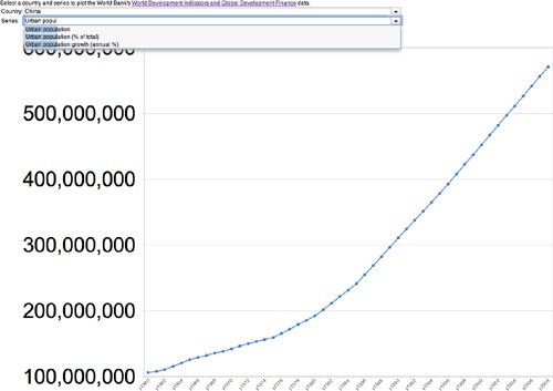
Select a country and series to plot the World Bank's
<a href="http://data.worldbank.org/data-catalog/world-development
-indicators">
World Development Indicators and Global Development Finance
</a> data.
<table>
<tr>
<td>Country:</td>
<td>
<!-- Use a JSP to build up the options and use Dojo
for auto-complete/filtering-->
<select id="country" dojoType="dijit.form.ComboBox"
style="width:800px">
<%@ include file="./country_options.jsp" %>
</select>
</td>
</tr>
<tr>
<td>Series:</td>
<td>
<!-- Use a JSP to build up the options and use Dojo
for auto-complete/filtering-->
<select id="series" dojoType="dijit.form.ComboBox"
style="width:800px">
<%@ include file="./series_options.jsp" %>
</select>
</td>
</tr>
</table>
<div id="viz"></div>
</body>
</html>With convenient combo boxes in place, you now have a bona fide mini-application on your hands that can plot a line chart for any country/series combination of your choosing.
Next Steps
We covered a serious amount of ground in this short article series, and you’re now equipped with the tools and know-how to grab some interesting data, load it into a convenient infrastructure, and make sense of it using powerful visualizations that you can easily share with others via the Web. There are many interesting things you could do at this point. A few recommendations for next steps include:
Plotting multiple data series on the same Line Chart
Rendering on the GeoMap visualization
Using animated visualizations such as the Motion Chart to show changes over time
Implementing custom event handlers to provide additional user interactions
The Visualization Playground provides some sample code for all of their visualizations, and with the infrastructure you already have in place, your imagination should be the only limiting factor.
Until Next Time
In the third and final installment to this article series, we’ll discuss some possible ways that you can monetize open data using PayPal X payment flows. In the meanwhile, have some fun hacking and visualizing the World Bank’s WDI data set and try to come up with some nice visualizations.
All sample code for this article is available here.
Get Building eCommerce Applications now with the O’Reilly learning platform.
O’Reilly members experience books, live events, courses curated by job role, and more from O’Reilly and nearly 200 top publishers.

