Chapter 1. Basic Concepts
Adding Styles to HTML
Styles can be applied to documents in three distinct ways, as discussed in the following sections.
Inline Styles
In HTML, style information can be specified for an individual element via the style attribute. The value of a style attribute is a declaration block (see the section “Rule Structure”) without the curly braces:
<pstyle="color: red; background: yellow;">Lookout!Thistextisalarminglypresented!</p>
Note that as of this writing, only the content of a single declaration block can be used as a style attribute value. For example, it is not possible to place hover styles (using :hover) in a style attribute, nor can @import be used in this context.
Although typical XML document languages (such as SVG) support the style attribute, it is unlikely that all XML languages will support a similar capability. Because of this—and especially because it encourages poor authoring practices—authors are discouraged from using the style attribute, and thus inline styles.
Embedded Stylesheets
A stylesheet can be embedded within an HTML document using the style element:
<html><head><title>Stylin'!</title><styletype="text/css">h1{color:purple;}p{font-size:smaller;color:gray;}</style></head>...</html>
XML-based languages may or may not provide an equivalent capability; always check the document type definition (DTD) to be certain.
While style elements are often found inside the head element, as shown in the preceding example, this is not required. Sometimes stylesheets are embedded near the end of a document for performance reasons.
External Stylesheets
Styles can be stored in a separate file. The primary advantage to using a separate file is that when commonly used styles are collected in a single file, all pages using those styles can be updated by editing a single stylesheet. A downside is that it’s generally more efficient to embed all styles (and scripts) into an HTML document in order to reduce network calls, although this downside will disappear as HTTP/2 usage increases.
An external stylesheet can be referenced in one of three ways.
@import directive
One or more @import directives can be placed at the beginning of any stylesheet. For HTML documents, this is done within an embedded stylesheet:
<head><title>My Document</title><styletype="text/css">@importurl(site.css);@importurl(navbar.css);@importurl(footer.css)screenand(min-width:960px);body{background:yellow;}</style></head>
Note that @import directives can appear at the top (and, according to the specification, only at the top) of any stylesheet. Thus, one stylesheet could import another, which in turn would import a third.
link element
In HTML documents, the link element can be used to associate a stylesheet with a document. Multiple link elements are permitted. The media attribute can be used to restrict a stylesheet to one or more media environments:
<head><title>A Document</title><linkrel="stylesheet"type="text/css"href="basic.css"media="all"><linkrel="stylesheet"type="text/css"href="web.css"media="screen and (max-width: 960px)"><linkrel="stylesheet"type="text/css"href="paper.css"media="print and (color-depth: 2)"></head>
It is also possible to link to alternate stylesheets, but few browsers provide a way for users to make use of them. As of this writing, most or all known user agents load all linked stylesheets, including the alternate stylesheets, regardless of whether the user ever needs them.
xml-stylesheet processing instruction
In XML documents (such as XHTML documents sent with a MIME type of text/xml, application/xml, or application/xhtml+xml), an xml-stylesheet processing instruction can be used to associate a stylesheet with a document. Any xml-stylesheet processing instructions must be placed in the prolog of an XML document. Multiple xml-stylesheet processing instructions are permitted. The media pseudo-attribute can be used to restrict a stylesheet to one or more forms of media:
<?xml-stylesheet type="text/css" href="basic.css"media="all"?><?xml-stylesheet type="text/css" href="web.css"media="screen"?><?xml-stylesheet type="text/css" href="paper.css"media="print"?>
HTTP Link headers
The last (and least common by far) way of associating an external stylesheet with your pages is to use an HTTP Link header. This approach uses HTTP headers to replicate the effects of a link element or @import directive.
Adding a line such as this to the .htaccess file at the root level of your server will make this happen for all pages on the site, where /style.css is the server path of the stylesheet to be loaded:
Header add Link
   "</style.css>;rel=stylesheet;type=text/css;media=all"
As an alternative to using .htaccess, which has been known to cause performance problems, you can edit your httpd.conf file to do the same thing:
<Directory /usr/local/username/httpdocs>
Header add Link
   "</style.css>;rel=stylesheet;type=text/css;media=all"
</Directory>
where /usr/local/username/httpdocs is replaced with the Unix pathname of your website’s actual home directory, and /style.css is replaced with the location of the stylesheet within that home directory.
As of this writing, HTTP headers were not supported by all user agents, most notably Internet Explorer and Safari. Thus, this technique is usually limited to production environments based on other user agents, and the occasional Easter egg for Firefox and Opera users.
Rule Structure
A stylesheet consists of one or more rules that describe how page elements should be presented. Every rule has two fundamental parts: the selector and the declaration block. Figure 1-1 illustrates the structure of a rule.
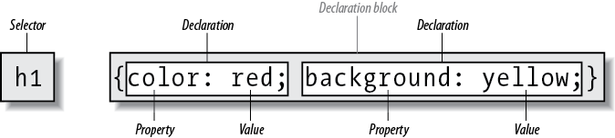
Figure 1-1. Rule structure
On the left side of the rule, we find the selector, which selects the parts of the document to which the rule should be applied. Selectors can stand singly or be grouped as a comma-separated list; e.g., to select the top three heading levels at once, the selector group would be h1, h2, h3. On the right side of the rule, we have the declaration block. A declaration block is made up of one or more declarations; each declaration is a combination of a CSS property and a value of that property.
The declaration block is always enclosed in curly braces. A declaration block can contain several declarations; each declaration must be terminated with a semicolon (;). The exception is the final declaration in a declaration block, for which the semicolon is optional (though recommended).
Each property, which represents a particular stylistic parameter, is separated from its value by a colon (:). Property names in CSS are not case-sensitive. Legal values for a property are defined by the property description. Chapter 4 provides details on acceptable values for CSS properties.
At-rules
A CSS at-rule is a statement or block of rules that begins with a specific identifier preceded by an @ sign. These are:
@charset-
Allows an author to define the encoding of the styles within the stylesheet (e.g.,
@charset "utf-8";). This enables authors to define the encoding of their styles even when they do not control the encoding of the file or system in which the styles are written. If multiple@charsetrules are declared, only the first will be used. This must be the first line of a stylesheet in which it appears, and cannot be preceded by any character.@charsetcannot be used in a stylesheet embedded in a document. @import-
Allows an author to include the styles of another stylesheet (see “@import directive”). Multiple
@importrules are permitted. Any@importrules must appear before all other parts of the stylesheet except for@charset. @namespace-
Allows an author to define an XML namespace to be used in selectors (e.g.,
@namespace svg url(http://www.w3.org/2000/svg);, permitting the use ofsvg|a {color: black;}to select<a>elements within SVG files differently than<a>elements in HTML). Multiple@namespacerules are permitted. Any@namespacemust appear before all other parts of the stylesheet except for@charsetand@importrules.
Besides these statements, there are a number of conditional at-rules. These include:
@counter-style-
Defines symbol and counting patterns used in CSS counters (e.g., the numbering of list items in an ordered list).
@font-face-
Defines an external font to be downloaded and used, including definitions of the identifiers to be used in other style rules. This is part of what is often called “web fonts” or “custom fonts.”
@keyframes-
Defines the states of various steps in an animation sequence, grouped together under a unique identifier.
@media-
Defines the media types and parameters in which a block of styles are to be applied: e.g., writing
@media (max-width: 600px)and then the styles to be used for smaller screens. This is the key to Responsive Web Design. @supports-
Defines the browser-support conditions under which a block of styles should be used: e.g., writing
@supports (display: grid)and then the styles that should be used in a CSS Grid–supporting browser.
There are other proposed at-rules which are, as of early 2018, at various stages of development. These include @document, @font-feature-values, @page, and @viewport.
Comments
Including comments in CSS is simple. You open with /* and end with */, like this:
/* This is a comment! */
Comments can be multiple lines long:
/* This is a comment!
  This is a continuation of the comment.
 And so is this. */
They can also occur anywhere within a stylesheet except in the middle of a property name or value:
h1/* heading-level-1 */{color/* foreground color */:rgba(23,58,89,0.42)/* RGB + opacity */;}
HTML (properly SGML) comments <!-- such as this --> are permitted in stylesheets so as to hide the styles from browsers so old that they don’t understand HTML 3.2. They do not act as CSS comments; that is, anything contained in an HTML comment will be seen and interpreted by the CSS parser.
Style Precedence
A single HTML document can import and link to multiple external stylesheets, contain one or more embedded stylesheets, and make use of inline styles. In the process, it is quite possible that some rules will conflict with one another. Cascading Style Sheets uses a mechanism called the cascade to resolve any such conflicts and arrive at a final set of styles to be applied to the document. Two key components of the cascade are specificity and inheritance.
Specificity Calculations
Specificity describes the weight of a selector and any declarations associated with it. Table 1-1 shows how much each part of a selector contributes to the total specificity of that selector.
| Selector type | Example | Specificity |
|---|---|---|
Universal selector Combinator |
|
|
Element identifier Pseudo-element identifier |
|
|
Class identifier Pseudo-class identifier Attribute identifier |
|
|
ID identifier |
|
|
Inline |
|
|
Specificity values are cumulative; thus, a selector containing two element identifiers and a class identifier (e.g., div.aside p) has a specificity of 0,0,1,2. Specificity values are sorted from right to left; thus, a selector containing 11 element identifiers (0,0,0,11) has a lower specificity than a selector containing just a single class identifier (0,0,1,0).
The !important directive gives a declaration more weight than nonimportant declarations. The declaration retains the specificity of its selectors and is used only in comparison with other important declarations.
Inheritance
The elements in a document form a treelike hierarchy, with the root element at the top and the rest of the document structure spreading out below it (which makes it look more like a tree root system, really). In an HTML document, the html element is at the top of the tree, with the head and body elements descending from it. The rest of the document structure descends from those elements. In such a structure, elements lower down in the tree are descendants of the ancestors, which are higher in the tree.
CSS uses the document tree for the mechanism of inheritance, in which a style applied to an element is inherited by its descendants. For example, if the body element is set to have a color of red, that value propagates down the document tree to the elements that descend from the body element. Inheritance is interrupted only by a conflicting style rule that applies directly to an element. Inherited values have no specificity at all (which is not the same as having zero specificity).
Note that some properties are not inherited. A property will always define whether it is inherited. Some examples of non-inherited properties are padding, border, margin, and background.
The Cascade
The cascade is how CSS resolves conflicts between styles; in other words, it is the mechanism by which a user agent decides, for example, what color to make an element when two different rules apply to it and each one tries to set a different color. Here’s how the cascade works:
-
Find all rules with a selector that matches a given element.
-
Sort all declarations applying to the given element by explicit weight. Those rules that are marked
!importanthave a higher explicit weight than those that are not. -
Sort all declarations applying to the given element by origin. There are three basic origins: author, reader, and user agent. Under normal circumstances, the author’s styles win out over the reader’s styles. Howerver,
!importantreader styles are stronger than any other styles, including!importantauthor styles. Both author and reader styles override the user agent’s default styles. -
Sort all declarations applying to the given element by specificity. Those elements with a higher specificity have more weight than those with lower specificity.
-
Sort all declarations applying to the given element by order. The later a declaration appears in the stylesheet or document, the more weight it is given. Declarations that appear in an imported stylesheet are considered to come before all declarations within the stylesheet that imports them.
Any presentational hints that come from non-CSS sources (e.g., the preference dialog within a browser) are given the same weight as the user agent’s default styles (see step 2 above).
Element Classification
Broadly speaking, CSS groups elements into two types: nonreplaced and replaced. Although the types may seem rather abstract, there actually are some profound differences in how the two types of elements are presented. These differences are explored in detail in Chapter 7 of CSS: The Definitive Guide, 4th Edition (O’Reilly).
Nonreplaced Elements
The majority of HTML elements are nonreplaced elements, which means their content is presented by the user agent inside a box generated by the element itself. For example, <span>hi there</span> is a nonreplaced element, and the text hi there will be displayed by the user agent. Paragraphs, headings, table cells, lists, and almost everything else in HTML are nonreplaced elements.
Replaced Elements
In contrast, replaced elements are those whose content is replaced by something not directly represented by document content. The most familiar HTML example is the img element, which is replaced by an image file external to the document itself. In fact, img itself has no actual content, as we can see by considering a simple example:
<imgsrc="howdy.gif"alt="Hi">
There is no content contained in the element—only an element name and attributes. Only by replacing the element’s lack of content with content found through other means (in this case, loading an external image specified by the src attribute) can the element have any presentation at all. Another example is the input element, which may be replaced with a radio button, checkbox, or text input box, depending on its type. Replaced elements also generate boxes in their display.
Element Display Roles
In addition to being replaced or not, there are two basic types of element display roles in CSS: block-level and inline-level. All CSS display values fall into one of these two categories. It can be important to know which general role a box falls into, since some properties only apply to one type or the other.
Block-Level
Block-level boxes are those where the element box (by default) fills its parent element’s content area width and cannot have other elements to its sides. In other words, block-level elements generate “breaks” before and after the element box. The most familiar block elements from HTML are p and div. Replaced elements can be block-level elements but usually are not.
List items are a special case of block-level elements. In addition to behaving in a manner consistent with other block elements, they generate a marker—typically a bullet for unordered lists or a number for ordered lists—which is “attached” to the element box. Except for the presence of this marker, list items are identical to other block elements.
As of early 2018, the display values that create block boxes are block, list-item, table, table-row-group, table-header-group, table-footer-group, table-column-group, table-row, table-column, table-cell, table-caption, flex, and grid.
Inline-Level
Inline-level boxes are those where an element box is generated within a line of text and does not break up the flow of that line. Perhaps the best-known inline element is the a element in HTML. Other examples are span and em. These elements do not generate a break before or after themselves, so they can appear within the content of another element without disrupting its display.
Note that although the CSS block and inline elements have a great deal in common with HTML block- and inline-level elements, there is an important difference. In HTML, block-level elements cannot descend from inline-level elements, whereas in CSS, there is no restriction on how display roles can be nested within each other.
The display values that create inline boxes are: inline, inline-block, inline-table, and ruby. As of this writing, it was not explicitly defined that the various Ruby-related values (e.g., ruby-text) also generate inline boxes, but this seems the most likely outcome.
Basic Visual Layout
CSS defines algorithms for laying out any element in a document. These algorithms form the underpinnings of visual presentation in CSS. There are two primary kinds of layout, each with very different behaviors: block-level and inline-level layout.
Block-Level Layout
A block-level box in CSS generates a rectangular box called the element box, which describes the amount of space occupied by an element. Figure 1-2 shows the components of an element box.
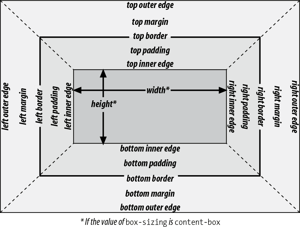
Figure 1-2. The complete box model
The following rules apply to an element box:
-
By default, the background of the element box extends to the outer edge of the border, thus filling the content, padding, and border areas (though this can be changed with
background-clip). If the border has any transparent portions (e.g., it is dotted or dashed), the element background will be visible in those portions. The background does not extend into the margin areas of the box. Any outlines are drawn in the margin area and do not affect layout. -
Only the margins,
height, andwidthof an element box may be set toauto. -
Only margins can be given negative values.
-
The padding and border widths of the element box default to
0(zero), and the border style defaults tonone. -
If
box-sizingiscontent-box(the default value), the propertywidthdefines only the width of the content area; any padding, borders, or margins are added to it. The same is true forheightwith respect to the height. -
If
box-sizingispadding-box, the propertywidthdefines the total width of the content and the padding. Any borders and margins are added to it. The same is true forheightwith respect to the height. -
If
box-sizingisborder-box, the propertywidthdefines the total width of the content, padding, and borders; any margins are added to it. The same is true forheightwith respect to the height.
Inline Layout
An inline-level box in CSS generates one or more rectangular boxes called inline boxes. The following rules apply to inline boxes:
-
widthandheightdo not apply to nonreplaced inline boxes. -
For the properties
left,right,top,bottom,margin-left,margin-right,margin-top, andmargin-bottom, any value ofautois converted to0(zero). -
For replaced inline boxes, the following rules apply:
-
If
heightandwidthare bothautoand the element has an intrinsic width (e.g., an image), the value ofwidthis equal to the element’s intrinsic width. The same holds true forheight. -
If
heightandwidthare bothautoand the element does not have an intrinsic width but does have an intrinsic height and layout ratio, thenwidthis set to be the intrinsic height times the ratio. -
If
heightandwidthare bothautoand the element does not have an intrinsic height but does have an intrinsic width and layout ratio, thenheightis set to be the intrinsic width divided by the ratio.
-
There are a few rules even more obscure than those last two; see the CSS box model documentation for details.
All inline elements have a line-height, which has a great deal to do with how the elements are displayed. The height of a line of text is determined by taking the following factors into account:
- Anonymous text
-
Any string of characters not contained within an inline element. Thus, in the markup:
<p>I'm<em>so</em>happy!</p>the sequences “I’m ” and “ happy!” are anonymous text. Note that the spaces are part of the anonymous text, as a space is a character like any other.
- Em-box
-
The space taken up by a capital letter M in the given font; otherwise known as the character box. Actual glyphs can be taller or shorter than their em-boxes, as discussed in Chapter 5 of CSS: The Definitive Guide, 4th Edition. In CSS, the value of
font-sizedetermines the height of each em-box. - Content area
-
In nonreplaced elements, this can be the box described by the em-boxes of every character in the element, strung together, or else the box described by the character glyphs in the element. In CSS2.1 and later, user agents can choose either. This text uses the em-box definition for simplicity’s sake. In replaced elements, the content area is the intrinsic height of the element plus any margins, borders, or padding.
- Leading
-
The difference between the values of
font-sizeandline-height. Half this difference is applied to the top and half to the bottom of the content area. These additions to the content area are called, not surprisingly, half-leading. Leading is applied only to nonreplaced elements. - Inline box
-
The box described by the addition of the leading to the content area. For nonreplaced elements, the height of the inline box of an element will be equal to the value for
line-height. For replaced elements, the height of the inline box of an element will be equal to the content area, as leading is not applied to replaced elements. - Line box
-
The shortest box that bounds the highest and lowest points of the inline boxes that are found in the line. In other words, the top edge of the line box will be placed along the top of the highest inline box top, and the bottom of the line box is placed along the bottom of the lowest inline box bottom. (See Figure 1-3.
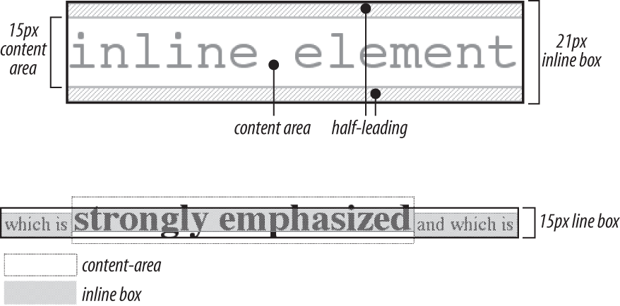
Figure 1-3. Inline layout details
Floating
Floating allows an element to be placed to the left or right of its containing block (which is the nearest block-level ancestor element), with following content flowing around the element. Any floated element automatically generates a block box, regardless of what type of box it would generate if not floated. A floated element is placed according to the following rules:
-
The left (or right) outer edge of a floated element may not be to the left (or right) of the inner edge of its containing block.
-
The left (or right) outer edge of a floated element must be to the right (or left) of the right (left) outer edge of a left-floating (or right-floating) element that occurs earlier in the document’s source, unless the top of the latter element is below the bottom of the former.
-
The right outer edge of a left-floating element may not be to the right of the left outer edge of any right-floating element to its right. The left outer edge of a right-floating element may not be to the left of the right outer edge of any left-floating element to its left.
-
A floating element’s top may not be higher than the inner top of its containing block.
-
A floating element’s top may not be higher than the top of any earlier floating or block-level element.
-
A floating element’s top may not be higher than the top of any line box with content that precedes the floating element.
-
A left (or right) floating element that has another floating element to its left (right) may not have its right (left) outer edge to the right (left) of its containing block’s right (left) edge.
-
A floating element must be placed as high as possible.
-
A left-floating element must be put as far to the left as possible, and a right-floating element as far to the right as possible. A higher position is preferred to one that is farther to the right or left.
Positioning
When elements are positioned, a number of special rules come into play. These rules govern not only the containing block of the element, but also how it is laid out within that element.
Types of Positioning
There are five types of positioning:
- Static
-
The element’s box is generated as normal. Block-level elements generate a rectangular box that is part of the document’s flow, and inline-level boxes generate one or more line boxes that flow within their parent element.
- Relative
-
The element’s box is offset by some distance. Its containing block can be considered to be the area that the element would occupy if it were not positioned. The element retains the shape it would have had were it not positioned, and the space that the element would otherwise have occupied in the normal flow is preserved.
- Absolute
-
The element’s box is completely removed from the flow of the document and positioned with respect to its containing block, which may be another element in the document or the initial containing block (described in the next section). Whatever space the element might have occupied in the normal document flow is closed up, as though the element did not exist. The positioned element generates a block box, regardless of the type of box it would generate if it were in the normal flow.
- Sticky
-
The element’s box stays in the normal flow until it reaches a sticky edge of the containing box, at which time it “sticks” there as if absolutely positioned. The space that the element would otherwise have occupied in the normal flow is preserved.
- Fixed
-
The element’s box behaves as though set to
absolute, but its containing block is the viewport itself.
The Containing Block
The containing block of a positioned element is determined as follows:
-
The containing block of the root element (also called the initial containing block) is established by the user agent. In HTML, the root element is the
htmlelement, although some browsers may usebody. -
For nonroot elements, if an element’s
positionvalue isrelativeorstatic, its containing block is formed by the content edge of the nearest block-level, table-, cell-, or inline-block ancestor box. Despite this rule, relatively positioned elements are still simply offset (not positioned with respect to the containing block described here) and statically positioned elements do not move from their place in the normal flow. -
For nonroot elements that have a
positionvalue ofabsolute, the containing block is set to the nearest ancestor (of any kind) that has apositionvalue other thanstatic, afiltervalue other thannone, or atransformvalue other thannone. This happens as follows:-
If the ancestor is block-level, the containing block is that element’s outer padding edge; in other words, it is the area bounded by the element’s border.
-
If the ancestor is inline-level, the containing block is set to the content edge of the ancestor. In left-to-right languages, the top and left of the containing block are the top and left content edges of the first box in the ancestor, and the bottom and right edges are the bottom and right content edges of the last box. In right-to-left languages, the right edge of the containing block corresponds to the right content edge of the first box, and the left is taken from the last box. The top and bottom are the same.
-
If there are no ancestors as described in 3a and 3b, the absolutely positioned element’s containing block is defined to be the initial containing block.
-
Flexible Box Layout
Flexible box layout (also known as flexbox or flex layout) is ideal for almost any one-dimensional layout; that is, situations where a number of elements need to be placed and distributed along a line. There are two kinds of flex elements: the flex container and the flex items that are placed within the container. All the direct children of the flex container element are flex items.
There are two kinds of flex containers: block flexboxes (display: flex) and inline flexboxes (display: inline-flex). These are very much like block and inline-block boxes.
Flex items are laid out in a single line by default, even if this causes the flex items to overflow the flex container. This behavior can be changed using the flex-wrap property.
Figure 1-4 shows the values (and their effects) of the justify-content and align-items properties.
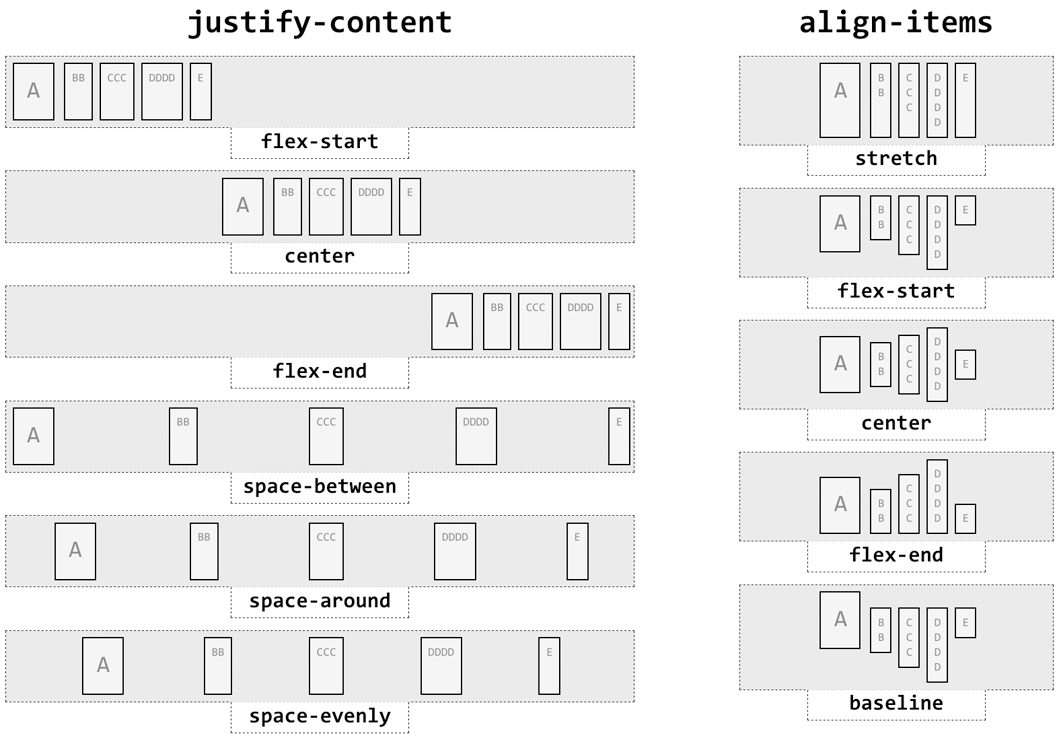
Figure 1-4. Justify and align values
The process of calculating flex sizes is fairly complex. Here’s a simplified version of the algorithm:
-
Add together all the hypothetical outer main sizes of the flex items in a flex container. If the sum is smaller than the container size, the flex factor is to grow; otherwise, the flex factor is to shrink.
-
Any items that are inflexible are frozen in size. These are:
-
Any item with a flex factor of zero
-
Any item whose hypothetical main size is greater (if growing) or smaller (if shrinking) than its base size
-
Any item with a growth factor (if growing) or shrink factor (if shrinking) of zero
-
-
Calculate the initial free space by finding the difference between the outer sizes of all flex items and the size of the flex container.
-
Distribute the available free space to the flex items. The amount given to each flex item is initially determined by the ratio of its flex factor to the sum of all the items’ flex factors. If an item will be grown past its maximum allowed size, or shrunk below its minimum allowed size, set the size to be the allowed maximum (if growing) or minimum (if shrinking).
Again, this is a simplified version of the actual flex sizing algorithm given in the W3C documentation. Consult section 9.7 of the CSS Flexible Box Layout Module Level 1 for full details if you want to know more.
Grid Layout
Grid layout is ideal for almost any two-dimensional layout. There are two kinds of grid elements: the grid container and the grid items that are placed within the container. All the direct children of the grid container element are grid items.
There are two kinds of grid containers: block grids (display: grid) and inline grids (display: inline-grid). These are very much like block and inline-block boxes.
A grid is made up of the following components, as illustrated in Figure 1-5:
-
A grid line is a horizontal or vertical dividing line within the grid container. These are placed as the author directs and create grid cells, areas, and tracks by implication. Grid lines can be labeled with identifier tokens; that’s the basis of grid item placement.
-
A grid cell is any space bounded by four grid lines, with no other grid lines running through it, analogous to a table cell. This is the smallest unit of area in grid layout. Grid cells cannot be directly addressed with CSS grid properties; that is, no property allows you to say a grid item should be associated with a given cell. (But see the next point for more details.)
-
A grid area is any rectangular area bounded by four grid lines and made up of one or more grid cells. An area can be as small as a single cell or as large as all the cells in the grid. Grid areas are directly addressable by CSS grid properties, which allow you to define the areas and then associate grid items with them.
-
A grid track is a continuous run between two adjacent grid lines—in other words, a grid column or a grid row. It goes from one edge of the grid container to the other. The size of a grid track is dependent on the placement of the grid lines that define it. Grid columns and rows are broadly analogous to table columns and rows. More generically, they can be referred to as block axis and inline axis tracks, where (in Western languages) column tracks are on the block axis and row tracks are on the inline axis.
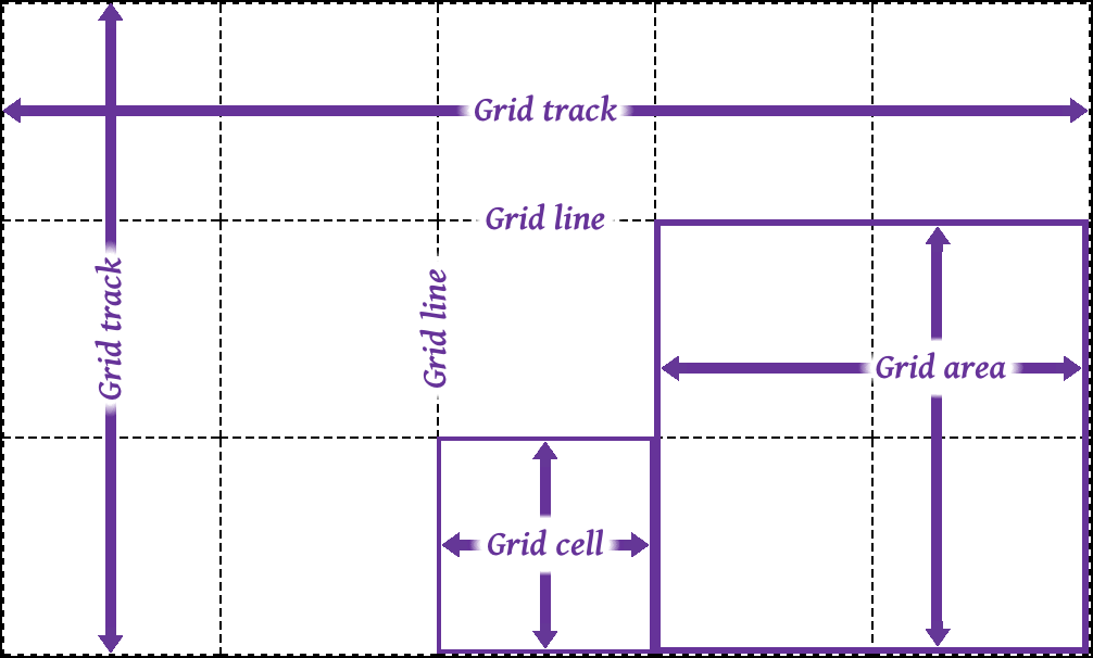
Figure 1-5. Grid layout components
The placement of grid lines can be quite complex, and is accomplished by defining grid track sizes. Between each grid track, a grid line is placed. These lines can be labeled with grid-line names, or left unlabeled and later addressed using numbers.
The formal syntax for defining grid track sizes is quite complicated, but the components are relatively simple to list and explain:
- <length> | <percentage>
-
Any non-negative length or percentage value. Thus,
5emdefines a 5-em gap between grid lines, whereas5%creates a gap between lines that is 5% of the total grid length in the given direction (i.e., the horizontal length for grid rows, and the vertical length for columns). - <flex>
-
A positive real number with the unit identifier
fr(e.g.,2fror3.14fr) which defines a flex factor for the grid track. min-content-
Sets the grid track’s width (or height) to be as small as possible while still containing all the content within the grid track. For example, column tracks that contain only text will become as narrow as the widest run of text that cannot be line-broken within the track.
max-content-
Sets the grid track’s width (or height) to be large enough to contain the largest rendering of all the content within the grid track. For example, column tracks that contain only text will become as wide as the longest run of text, without any line-wrapping of the text.
auto-
In most cases,
autois equivalent to the largest minimum size of the grid items occupying the grid track; that is, once all the minimum sizes of the grid items in the track have been determined, the track is made as wide as the widest of those minimums. Whenautois used as a maximum value (seeminmax()later in this list), it is identical tomax-content. minmax(<min>,<max>)-
Sets a range of sizes outside which the grid track cannot grow or shrink. Either <min> or <max> can be a <length> or <percentage> value,
min-content, ormax-content. <max> can be a <flex> value, but <min> cannot. If the minimum value computes to be larger than the maximum computed value, the maximum sizing is ignored and the minimum size is used as a minimum. fit-content([ <length> | <percentage> ])-
Equivalent to
minmax(auto,max-content)with an exception: if the track’s size is larger than theautovalue’s computed value, that size can’t go higher than the given value (a <length> or <percentage>). This is intended to let authors declare a maximum track size while still letting the track size be content-bound below that maximum. repeat([ <integer> |auto-fill|auto-fit],<track-list>)-
Allows authors to repeat a pattern of grid track sizes as many times as they like. The <integer> value must be positive.
auto-fillandauto-fitdelegate the number of tracks to the user agent. <track-list> can be any valid combination of track sizes.
There are three kinds of track sizing. These are:
- Fixed
-
Tracks are given a size in absolute lengths (such as
pxorem), or sized with%. Percentage values count as fixed track sizes because they are always the same for a given grid container size. The tracks’ sizing does not depend on their contents. - Flexible
-
Tracks are given a flex or fractional sizing via the
frunit. Their sizing does not depend on their contents. - Intrinsic
-
The tracks’ size is dependent on the things found within them; i.e., with
min-content,max-content,fit-content(), andauto. These tracks may always be the same size for a given container size and set of content, but they are not regarded as fixed for layout purposes because their contents directly affect their sizing.
The process of actually determining the size of grid tracks, including what to do when track sizes are overconstrained or could lead to circular dependencies, is too long to go into here. In broad strokes, this is the process to find the track sizes:
-
Initialize track sizes, including determining the minimum and maximum sizes for each track. Resolve fixed track sizes to absolute length values. Set intrinsically sized tracks’ minimum size to zero and maximum size to unlimited. Flexible tracks are left flexible, with an initial minimum size of zero.
-
Determine the size of intrinsic (e.g.,
auto) tracks, resolving each to an absolute length. First find sizes based on the items within the track, and then gradually add space to encompass items that span multiple tracks. -
Maximize tracks up to their growth limit (this is determined automatically).
-
Expand flexible (
fr) tracks by adding space according to the ratio of each track’s flex factor to the total of all flex factors in the grid track. -
Expand any
auto-sized tracks by dividing the remaining free space (if any) by the number ofautotracks and expanding them equally.
The details of each step are quite lengthy, and can be found in section 11 of the CSS Grid Layout Module Level 1 documentation.
Table Layout
The layout of tables can get quite complicated, especially because CSS defines two different ways to calculate table and cell widths, as well as two ways to handle the borders of tables and elements internal to the table. Figure 1-6 illustrates the components of a table.
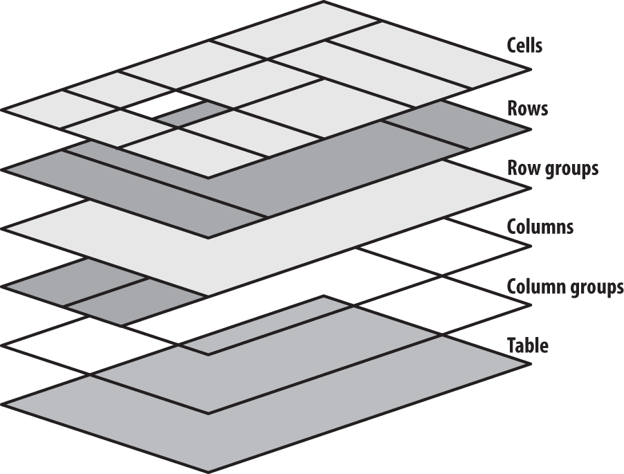
Figure 1-6. Table layout components
Table Arrangement Rules
In general, a table is laid out according to the following principles:
-
Each row box encompasses a single row of grid cells. All of the row boxes in a table fill the table from top to bottom in the order they occur in the source document. Thus, the table contains as many grid rows as there are row elements.
-
A row group’s box encompasses the same grid cells as the row boxes that it contains.
-
A column box encompasses one or more columns of grid cells. Column boxes are placed next to each other in the order in which they occur. The first column box is on the left for left-to-right languages and on the right for right-to-left languages.
-
A column group’s box encompasses the same grid cells as the column boxes that it contains.
-
Although cells may span several rows or columns, CSS does not define how that happens. It is instead left to the document language to define spanning. Each spanned cell is a rectangular box one or more grid cells wide and high. The top row of this rectangle is in the row that is parent to the cell. The cell’s rectangle must be as far to the left as possible in left-to-right languages, but it may not overlap any other cell box. It must also be to the right of all cells in the same row that appear earlier in the source document in a left-to-right language. In right-to-left languages, a spanned cell must be as far to the right as possible without overlapping other cells, and must be to the left of all cells in the same row that come after it in the document source.
-
A cell’s box cannot extend beyond the last row box of a table or row group. If the table structure causes this condition, the cell must be shortened until it fits within the table or row group that encloses it.
Fixed Table Layout
The fixed-layout model is fast because its layout doesn’t depend on the contents of table cells; it’s driven by the width values of the table, columns, and cells within the first row of the table. The fixed-layout model uses the following steps:
-
Any column element whose
widthproperty has a value other thanautosets the width for that column. -
If a column has an
autowidth, but the cell in the first row of the table within that column has awidthother thanauto, that cell sets the width for that column. If the cell spans multiple columns, the width is divided equally among the columns. -
Any columns that are still
auto-sized are sized so that their widths are as equal as possible.
At that point, the width of the table is set to be either the value of width for the table or the sum of the column widths, whichever is greater. If the table turns out to be wider than the column widths, the difference is divided by the number of columns and added to each of them.
Automatic Table Layout
The automatic-layout model, although not as fast as the fixed-layout model, is likely to be much more familiar to authors, because it’s substantially the same model that HTML tables have used for years. In most current user agents, use of this model will be triggered by a table with a width of auto, regardless of the value of table-layout—although this is not assured.
Here’s how the model works:
-
For each cell in a column, calculate both the minimum and maximum cell width.
-
Determine the minimum width required to display the content. In determining the minimum content width, the content can flow to any number of lines, but it may not stick out of the cell’s box. If the cell’s
widthvalue is larger than the minimum possible width, the minimum cell width is set to that value. If the cell’swidthvalue isauto, the minimum cell width is set to the minimum content width. -
For the maximum width, determine the width required to display the content without any line-breaking, other than that forced by explicit line-breaking (e.g., due to the
<br>element). That value is the maximum cell width. -
For each column, calculate both the minimum and maximum column width:
-
The column’s minimum width is determined by the largest minimum cell width of the cells within the column. If the column has been given an explicit
widthvalue that is larger than any of the minimum cell widths within the column, the minimum column width is set to the value ofwidth. -
For the maximum width, take the largest maximum cell width of the cells within the column. If the column has an explicit
widthvalue larger than any of the maximum cell widths within the column, the maximum column width is set to the value ofwidth. These two behaviors recreate the traditional HTML table behavior of forcibly expanding any column to be as wide as its widest cell.
-
-
In cases where a cell spans more than one column, the sum of the minimum column widths must be equal to the minimum cell width for the spanning cell. Similarly, the sum of the maximum column widths must equal the spanning cell’s maximum width. User agents should divide any changes in column widths equally among the spanned columns.
In addition, the user agent must take into account that when a column width has a percentage value for its width, the percentage is calculated in relation to the width of the table—even though that width is not known yet. The user agent must hang on to the percentage value and use it in the next part of the algorithm. Once the user agent has determined how wide or narrow each column can be, it can calculate the width of the table. This happens as follows:
-
If the computed width of the table is not
auto, the computed table width is compared to the sum of all the column widths plus any borders and cell spacing. (Columns with percentage widths are likely calculated at this time.) The larger of the two values is the final width of the table. If the table’s computed width is larger than the sum of the column widths, borders, and cell spacing, all columns are increased in width by an equal amount so they fill the computed width of the table. -
If the computed width of the table is
auto, the final width of the table is determined by summing up the column widths, borders, and cell spacing. This means the table will be only as wide as needed to display its content, just as with traditional HTML tables. Any columns with percentage widths use that percentage as a constraint, but it is a constraint that a user agent does not have to satisfy.
Once the last step is completed (and only then), the user agent can actually lay out the table.
Collapsing Cell Borders
The collapsing cell model largely describes how HTML tables have always been laid out when they have no cell spacing. The following rules govern this model:
-
Table elements cannot have any padding, although they can have margins. Thus, there is never separation between the border around the outside of the table and its outermost cells.
-
Borders can be applied to cells, rows, row groups, columns, and column groups. The
tableelement itself can, as always, have a border. -
There is never any separation between cell borders. In fact, borders collapse into each other where they adjoin so that only one of the collapsing borders is actually drawn. This is somewhat akin to margin collapsing, where the largest margin wins. When cell borders collapse, the “most interesting” border wins.
-
Once they are collapsed, the borders between cells are centered on the hypothetical grid lines between the cells.
Collapsing borders
When two or more borders are adjacent, they collapse into each other, as shown in Figure 1-7. There are strict rules governing which borders will win and which will not:
-
If one of the collapsing borders has a
border-styleofhidden, it takes precedence over all other collapsing borders: all borders at this location are hidden. -
If one of the collapsing borders has a
border-styleofnone, it takes the lowest priority. There will be no border drawn at this location only if all of the borders meeting at this location have a value ofnone. Note thatnoneis the default value forborder-style. -
If at least one of the collapsing borders has a value other than either
noneorhidden, narrow borders lose out to wider ones. If two or more of the collapsing borders have the same width, the border style is taken in the following order, from most preferred to least:double,solid,dashed,dotted,ridge,outset,groove,inset. Thus, if two borders with the same width collapse and one isdashedwhile the other isoutset, the border at that location will be dashed. -
If collapsing borders have the same style and width but differ in color, the color used is taken from an element in the following list, from most preferred to least: cell, row, row group, column, column group, table. Thus, if the borders of a cell and a column—identical in every way except color—collapse, the cell’s border color (and style and width) will be used. If the collapsing borders come from the same type of element—such as two row borders with the same style and width, but different colors—the one farthest to the left and top wins in left-to-right languages; in right-to-left languages, the cell farthest to the right and top wins.
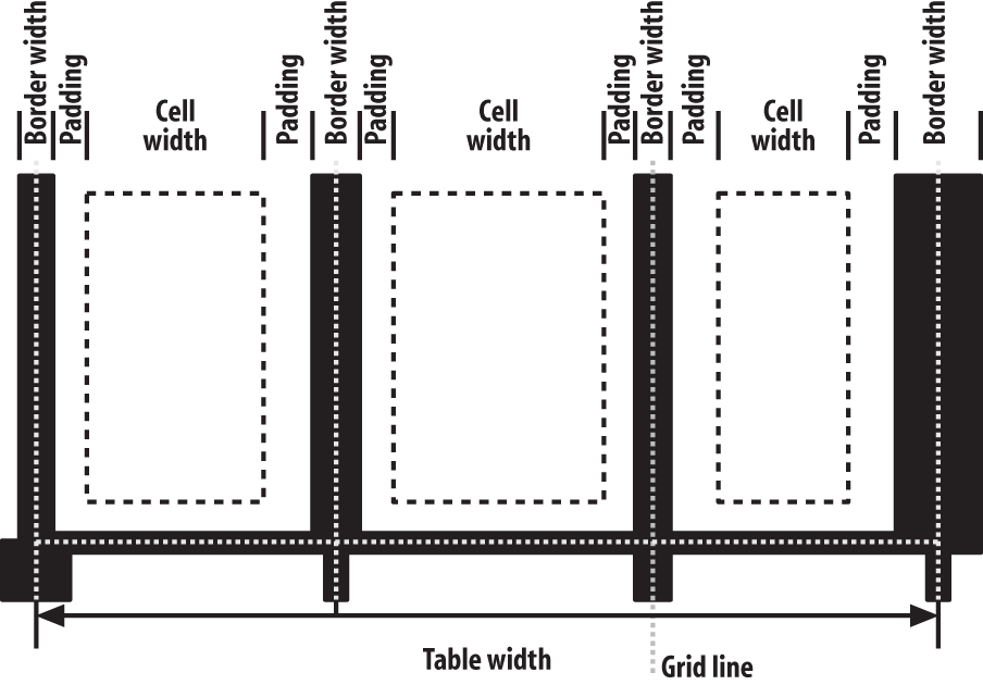
Figure 1-7. Collapsing cell borders model
Vertical Alignment Within Cells
The following describes the detailed process for aligning cell contents within a row:
-
If any of the cells are baseline-aligned, the row’s baseline is determined and the content of the baseline-aligned cells is placed.
-
Any top-aligned cell has its content placed. The row now has a provisional height, which is defined by the lowest cell bottom of the cells that have already had their content placed.
-
If any remaining cells are middle- or bottom-aligned, and the content height is taller than the provisional row height, the height of the row is increased by lowering the baseline in order to enclose the tallest of those cells.
-
All remaining cells have their content placed. In any cell with contents shorter than the row height, the cell’s padding is increased in order to match the height of the row.
Get CSS Pocket Reference, 5th Edition now with the O’Reilly learning platform.
O’Reilly members experience books, live events, courses curated by job role, and more from O’Reilly and nearly 200 top publishers.

