Creating a bubble plot
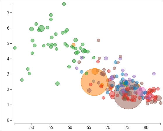
Bubble plots help us to visualize three or four dimensions of data. Each datum in a bubble plot consists not only of two values used to plot against the X and Y axes, but also one or two additional values which are commonly represented by different size symbols and/or colors.
To demonstrate a bubble plot, the following image shows the result of our example:

The data behind this chart is a data set that was pulled together from three different datasets from the World Bank. This data correlates life expectancy at birth relative to the fertility rate for all the countries in the World Bank data for the year 2013.
This chart plots ...
Get D3.js: Cutting-edge Data Visualization now with the O’Reilly learning platform.
O’Reilly members experience books, live events, courses curated by job role, and more from O’Reilly and nearly 200 top publishers.

