Helping your audience understand scale
A big part of visualizing data is conveying scale and differences in magnitude. The following few examples do this particularly well.
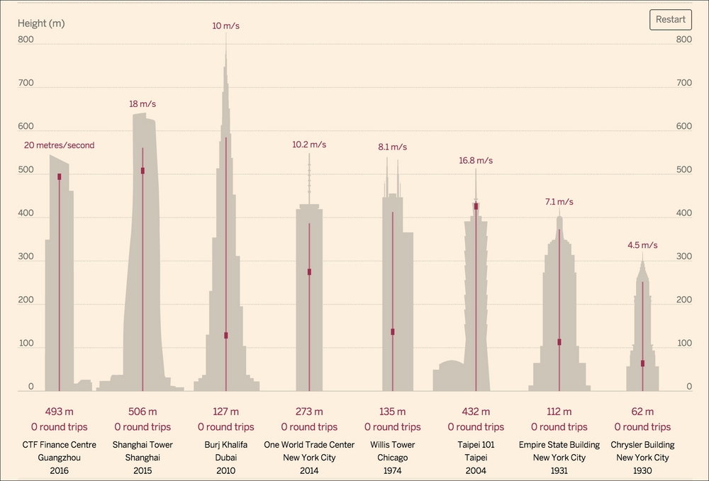
To start with, please view John Burn-Murdoch's graphic on high-speed elevators for the at http://www.ft.com/cms/s/2/1392ab72-64e2-11e4-ab2d-00144feabdc0.html.
The following screengrab doesn't really do it justice:

If the above were the live visualization, you would see the elevators in each building endlessly rise and fall, with a counter beneath tracking how many times the elevator has gone up and down while you were looking at the page. A nice bit of easing at the top and bottom ...
Get Data Visualization: Representing Information on Modern Web now with the O’Reilly learning platform.
O’Reilly members experience books, live events, courses curated by job role, and more from O’Reilly and nearly 200 top publishers.

