(F39)_Job:12-40337 Title:RP-Design Elements 2nd Edition
#175 Dtp:160 Page:130
128-185_40337.indd 130 12/19/13 6:39 PM 128-185_40
3
TEXT
choosing and using type
130
STRUCTURE AND OPTICS
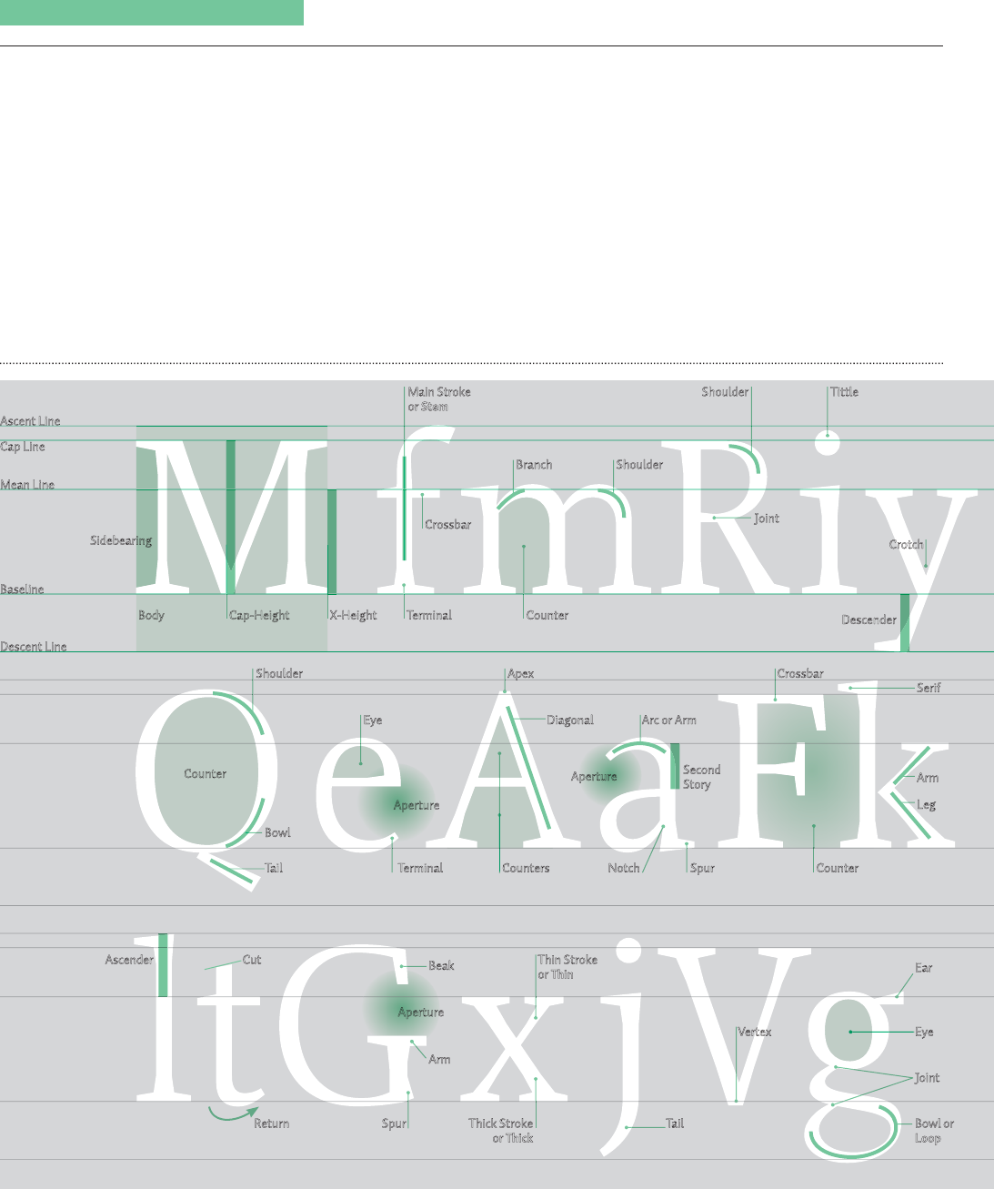
The Nuts and Bolts The letters of the
Western alphabet are built from a system
of lines with intricate visual relationships
that are nearly invisible. With letters at a
standard reading size, the eye perceives let-
ters to be all the same weight, height, and
width. This is the most critical aspect of
type: stylistic uniformity discourages dis-
traction during the reading process. When
the same type is enlarged, minute changes
in character height, stroke width, and
shape become apparent. Becoming sensi-
tive to these optical issues and understand-
ing their effect on spacing, organization,
stylistic communication, legibility, and
composition is crucial.
Ascent Line
Cap Line
Mean Line
Baseline
Descent Line
Main Stroke
or Stem
Sidebearing
Terminal
Descender
TittleShoulder
Crossbar
Cap-Height X-Height
Body Counter
Joint
Crotch
Branch Shoulder
Diagonal Arc or ArmEye
Eye
Joint
Apex
Serif
CrossbarShoulder
Bowl
Return Spur
Thin Stroke
or Thin
Thick Stroke
or Thick
Cut
Tail Spur
Second
Story
NotchTerminal Counters Counter
Tail
Vertex
Bowl or
Loop
Arm
Counter
Aperture
Arm
Ear
Ascender
Beak
Aperture
Leg
Aperture
(F39)_Job:12-40337 Title:RP-Design Elements 2nd Edition
#175 Dtp:160 Page:130
128-185_40337.indd 130 12/19/13 7:59 PM
131
As
J
o
Ligat
u
Swa
s
128-185_40
3

t
ion
130
9/13 6:39 PM
(F39)_Job:12-40337 Title:RP-Design Elements 2nd Edition
#175 Dtp:160 Page:131
128-185_40337.indd 131 12/19/13 6:40 PM
h
E
ye
J
oint
S
erif
B
owl or
L
oop
A
rm
E
ar
L
eg
t
ion
130
9/13 7:59 PM
TEXT
design elements
131
Enlarging letters reveals the
tiny adjustments made by their
designer to overcome optical
characteristics and unify them.
Differing angles, stroke shapes,
and overall size changes, evident
in a large setting, disappear in a
text-sized setting. The same is
true of corrections for weight and
width in a family of typefaces.
The interrelationship of detail
is apparent in these letterform
studies for a custom, corporate
typeface. Note the comparisons
of crossbars, letter widths, and
terminal shapes.
E-TYPES DENMARK
Ascender
Joint
Bowl
Ligature
Swash
(F39)_Job:12-40337 Title:RP-Design Elements 2nd Edition
#175 Dtp:160 Page:131
128-185_40337.indd 131 12/19/13 7:59 PM

TYPOGRAPHY
The art of designing
letters and text
TYPOGRAPHY
The art of designing
letters and text
(F39)_Job:12-40337 Title:RP-Design Elements 2nd Edition
#175 Dtp:160 Page:132
128-185_40337.indd 132 12/19/13 6:40 PM 128-185_40
3
TEXT
choosing and using type
132
STRUCTURE AND OPTICS
Form and Counterform: The Optics of
Structure
The spacing of letters in words,
sentences, and paragraphs is vital to create
a uniform gray value for minimal reader
distraction. Every typeface has a distinct
rhythm of strokes and spaces. This rela-
tionship between form and counterform
defines the optimal spacing of that par-
ticular typeface and therefore of the overall
spacing between words, between lines of
type, and among paragraphs.
Looking at letters set together as a word of-
fers a clue as to how they should be spaced
in that particular typeface and size. Creat-
ing a consistent gray value in text depends
on setting the letters so that there is even
alternation of solid and void—within and
between the letters. A series of letters that
are set too tightly, so that the counterforms
within the letters are optically bigger than
those between letters, creates noticeable
dark spots in the line: the exterior strokes
of the letters bond to each other visually
where they come together. At the other
extreme, letters that are set too loosely be-
come singular elements, divorced from the
line and recognizable as individual forms,
making the appraisal of words difficult.
Evenly set sequences of letters show a con-
sistent, rhythmic alternation of black and
white—form and counterform repeating at
the same rate from left to right.
Optical spacing for the Univers
regular weight is shown,
compared to mathematically
spaced or overly tight or loose
spacing. The optimally spaced
lines (second line) show a
consistent rhythmic alternation
between dark (the strokes) and
light (the counterforms), both
within characters and between
them. Dark spots are evident in
the examples spaced too
Tightening or loosening the
spacing between these pairs of
letters corrects for the awkward
counterspaces inherent in their
forms. Shifting the lowercase y to
the right, under the right crossbar
of the T, for example, allows the
spacing between them to become
optically similar to that of subse-
quent letters.
Uppercase letters are more uniform
in width and shape than lowercase
letters, as well as optically more
dense; to enhance their look and
legibility, all-uppercase setting
must always be spaced a little more
loosely than normal.
tightly, where the strokes are
closer together between letters
than within them. Compare the
normal spacing of these faces to
those of the bold condensed style
of Univers (A), the italic serif (B),
and the high-contrast modern
serif (C); note how the internal
logic of the stroke-to-counter
relationship in each provides the
clues to their optimal spacing.
Mathematical spacing
A
B
C
Overly tight spacing
Overly loose spacing
Optically normal spacing
Corrected spacing
Default spacing
(F39)_Job:12-40337 Title:RP-Design Elements 2nd Edition
01-AC70319 #175 Dtp:160 Page:132
128-185_C70319.indd 132 1/14/14 5:19 PM
133
Th
e
spa
c
ent
dar
k
eno
str
o
of t
h
so
m
un
e
of s
t
the
s
Alw
a
need
case
-
in a
p
caus
e
eith
e
asy
m
over
a
with
able
the s
on t
h
this
w
Corr
e
Defa
128-185_C
7
Get Design Elements, 2nd Edition now with the O’Reilly learning platform.
O’Reilly members experience books, live events, courses curated by job role, and more from O’Reilly and nearly 200 top publishers.

