ion
134
9/13 6:40 PM
(F39)_Job:12-40337 Title:RP-Design Elements 2nd Edition
#175 Dtp:160 Page:135
128-185_40337.indd 135 12/19/13 6:40 PM
ion
134
9/13 7:59 PM
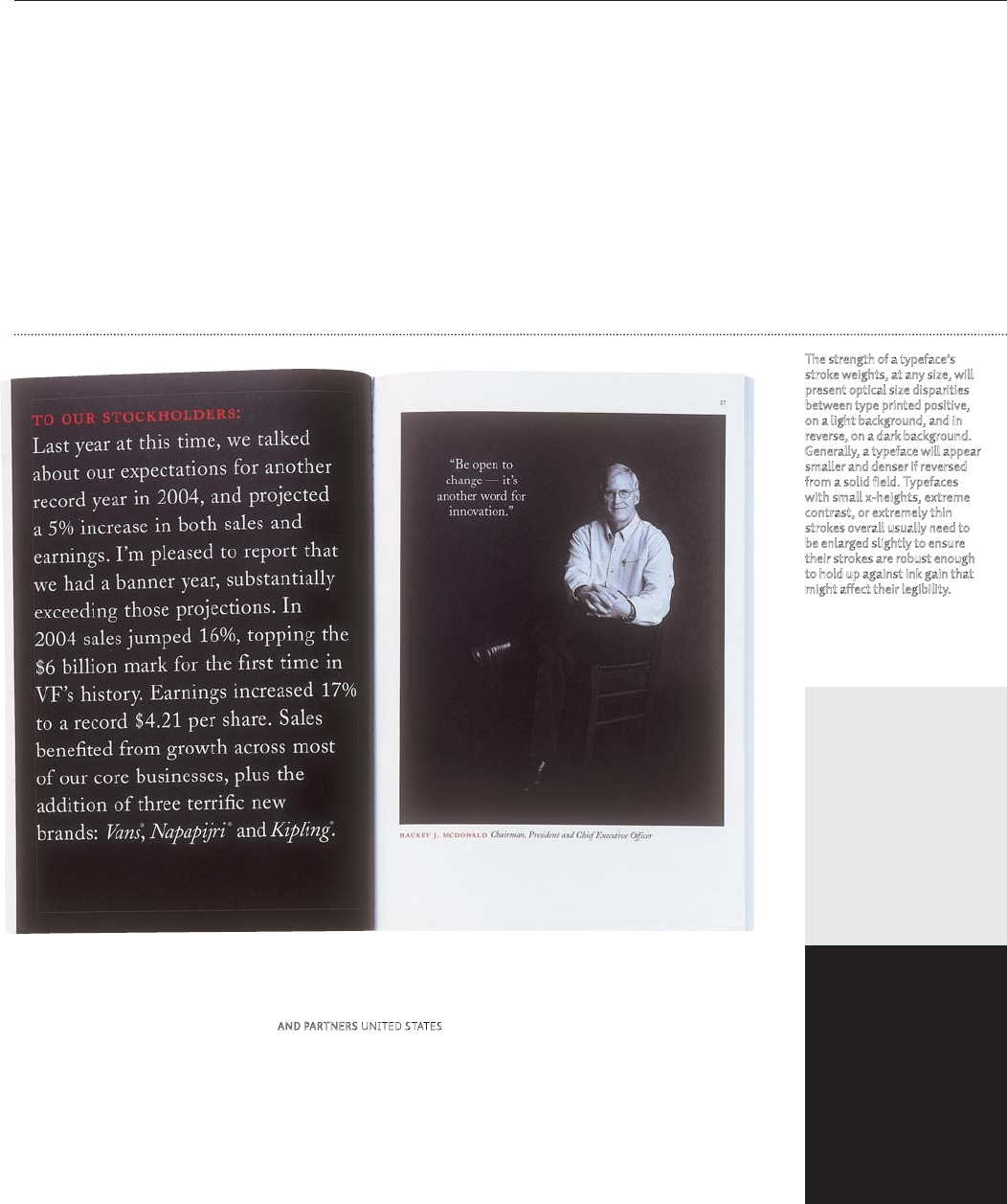
TEXT
design elements
135
and counterforms are evenly alternating.
As type is decreased in size, the letter-
space must be increased to allow the eye to
separate the letters for clarity. At the other
extreme, the space between letters must be
decreased as the type size increases beyond
reading size.
Setting type smaller or larger than the
optimal reading size for text also has an
impact on spacing. Comfortable and ef-
ficient reading of long texts, such as books,
newspapers, or journals, takes place ...


