3.3. Solution
Now that you have a good overview of the individual components that bring a skin package to life, let's deconstruct a few skins in an effort to understand how the concept of design applies to them.
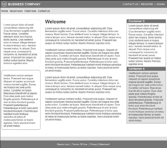
Let's start with a skin design example that is indicative of early DNN skin designs. In Figure 3-1, notice the simple skin design, which has a very boxy look and feel. This is how typical early DNN skins were created as more emphasis was placed on development rather than design.
Figure 3.1. Figure 3-1

Notice the seemingly three-column format of the content. Then, notice the tokens (user controls) used in this design: the logo in the upper-left corner, the register and signin links in the upper-right corner, the horizontal menu, and the copyright, terms, and privacy tokens in the footer.
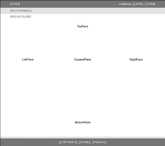
Now let's look at the underlying structure of our simple skin example to understand what is happening with the display of the skin.
Let's analyze the content pane structure in Figure 3-2 first. As you can see, the content structure has been defined with the following content panes:
LinkPane
TopPane
LeftPane
ContentPane (Remember, at least one of the panes within a skin must have an ID of "ContentPane.")
RightPane
BottomPane
Figure 3.2. Figure 3-2

These denote the individual panes, defined ...
Get DotNetNuke® Websites: Problem — Design — Solution now with the O’Reilly learning platform.
O’Reilly members experience books, live events, courses curated by job role, and more from O’Reilly and nearly 200 top publishers.

