Lesson 16: Responsive Design and Layout for Mobile Devices
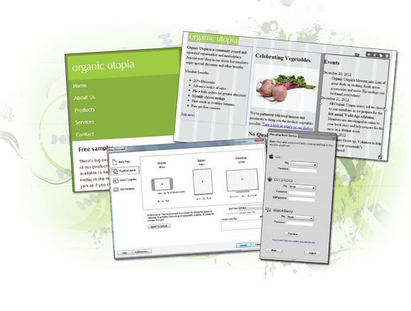
The Web is no longer only about desktop screens. Users of the Web are looking for their sites to function on many different size screens and devices. Dreamweaver has a few features designed to help you make your site compatible for mobile devices.
What you’ll learn in this lesson:
- • Previewing your web page using window sizes
- • Working with Media Queries
- • Creating styles for a mobile device
- • Working with Fluid Grids
Starting up
Before starting, make sure that your tools and panels are consistent by resetting your workspace. See “Resetting the Dreamweaver workspace” in the Starting up section of this book.
You will work with several files from the dw16lessons folder in this lesson. Make sure that you have loaded the dwlessons folder onto your hard-drive from www.digitalclassroombooks.com/epub/dreamweavercc. See “Loading lesson files” in the Starting up section of this book.
Before you begin, you need to create site settings that point to the dw16essons folder. Go to Site > New Site, or for details on creating a site, refer to Lesson 2, “Setting Up a New Site.”
The rise of the mobile web
Creating websites has always presented certain challenges. Among these challenges is the fact that the people who visit your site might have different size monitors; therefore, the page layout that works well on one screen might not ...
Get Dreamweaver CC Digital Classroom now with the O’Reilly learning platform.
O’Reilly members experience books, live events, courses curated by job role, and more from O’Reilly and nearly 200 top publishers.

