Chapter 4: Chartless Visualization Techniques
In This Chapter
• Using conditional formatting
• Leveraging symbols in formulas
• Using the Camera tool
Chartless visualization is less a feature specific to Excel than it is a concept that you can apply to your dashboard presentation. With these types of visualization, you can easily add layers of visualization to your dashboard and take advantage of some common worksheet features that can turn your data into meaningful views.
Enhancing Reports with Conditional Formatting
Conditional formatting applies to the Excel functionality used that dynamically changes the formatting of a value, cell, or range of cells based on a set of conditions you define. Conditional formatting allows you to look at your Excel reports and make split-second determinations on which values are “good” and which are “bad,” all based on formatting.
In this section, you discover the world of conditional formatting and find out how to leverage this functionality to enhance your reports and dashboards.
Applying basic conditional formatting
Thanks to the many predefined options offered with Excel 2013, you can apply some basic conditional formatting with a few clicks of the mouse. To get a first taste of what you can do, go the Ribbon, click the Home tab, and choose the Conditional Formatting icon (see Figure 4-1).
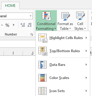
Figure 4-1: Click the Conditional Formatting icon ...
Get Excel Dashboards and Reports, 2nd Edition now with the O’Reilly learning platform.
O’Reilly members experience books, live events, courses curated by job role, and more from O’Reilly and nearly 200 top publishers.

