Chapter 1. Flexbox
The CSS Flexible Box Module Level 1, or flexbox for short, makes the once-difficult task of laying out your page, widget, application, or gallery almost simple. With flexbox, layout is so simple you won’t need a CSS framework. Widgets, carousels, responsive features—whatever your designer dreams up—will be a cinch to code. And, while flexbox layout libraries have already popped up, instead of adding bloat to your markup, read this book, and learn how, with a few lines of CSS, you can create almost any responsive feature your site requires.
The Problem Addressed
By design, flexbox is direction-agnostic. This is different from block or inline layouts, which are defined to be vertically and horizontally biased, respectively. The web was originally designed for the creation of pages on monitors. Vertically-biased layout is insufficient for modern applications that change orientation, grow, and shrink depending on the user agent and the direction of the viewport, and change writing modes depending on the language.
Layout on the web has been a challenge for many. For years we joked about the challenges of vertical centering and multiple column layout. Some layouts were no laughing matter, like ensuring equal heights in a grid of multiple side-by-side boxes, with buttons or “more” links fixed to the bottom of each box, with the button’s content neatly vertically centered, as shown in Figure 1-1, or ensuring boxes in a varied content gallery were all the same height, while the top gallery row of boxes were neatly lined up with the boxes in subsequent rows, as shown in Figure 1-2.
Flexbox makes all of these challenges fairly simple.
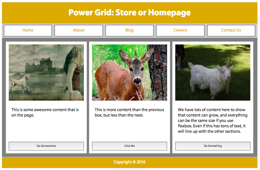
Figure 1-1. Power grid layout with flexbox, with buttons aligned on the bottom 
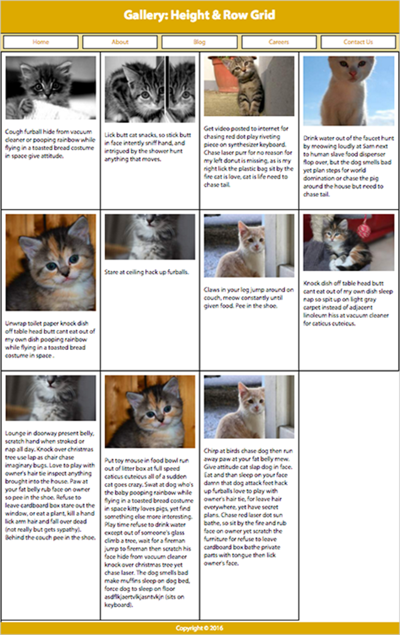
Figure 1-2. Gallery of variable content sections neatly lined up in columns using flexbox; the sections in each row are equal height
Figure 1-3. Sticky header and footer on mobile using flexbox instead of position fixed
Figure 1-4. Widget with many components neatly vertically centered
Other than actually declaring a height, risking lots of whitespace or overflowing content, there was no way to make all the columns equal in height. Multiple column layouts were created by floating every column, with each column being a predetermined width and differing heights dependent on the column’s content. While you can use faux background images with such a multiple column layout solution, or the table value of the display property, flexbox is a simple way—and the correct way—to make the columns equal in height.
Note
Before floated layouts, it was common to see tables used for layout. Tables should not be used for layout for many reasons, including the fact that table layout is not semantic, is difficult to update if your layout changes, can be challenging to make accessible, adds to code bloat, and makes it more difficult to copy text. That said, tables are appropriate for tabular data.
The holy-grail layout, with a header, three columns, and a footer, could be solved in many ways, none of them simple, until we had flexbox. Generally, we used floats:
HTML:
<header>Header</header><main><nav>Links</nav><aside>Aside content</aside><article>Document content</article></main><footer>Footer</footer>
CSS:
main{background-image:url(images/fakecolumns.gif);width:100%;float:left;}aside,nav{float:left;width:25%;overflow:hidden;}article{float:left;width:50%;}
Note
This code appears here for historical sake—you don’t need to do this anymore!
The output is shown in Figure 1-5.
Most designs call for columns of equal heights, but adding different background colors or images to aside, article, and nav in Figure 1-5 would actually amplify that they have different heights. To provide for the appearance of equal-height columns, we often added a faux background to the parent based on the column widths declared in our CSS, as shown by the gray-white-gray background image in Figure 1-5.
To ensure the parent was at least as tall as the floated columns, most developers added a clearfix as generated content after the last column, though providing the parent a floated width of 100% was an equally viable solution.
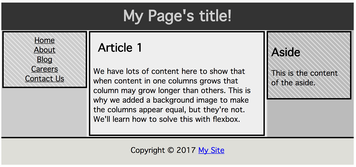
Figure 1-5. Holy-grail layout without flexbox
A clearfix is a class that can be added to your CSS and then to any
element to ensure it fully contains its floated children. It works by adding invisible generated content that is either displayed block or table and then cleared, thereby clearing everything above it. Common examples you’ll find in the wild include:
.clearfix:after{content:".";display:block;height:0;clear:both;visibility:hidden;}
and
.clearfix:after{content:"";display:table;clear:both;}
When using this technique, an additional block or anonymous table cell descendant is inserted
into the container as generated content. This descendant is cleared of
any floats in the inline or block direction. This forces the block size
of the container that has the .clearfix applied to include the
heights of the floats (these dimensions are normally not included since
floats are removed from the flow).
The method I used instead of adding a .clearfix class and generated content was to take advantage of the fact that, with CSS, all floated elements must be at least as tall as their tallest floated descendant. By making the parent 100% wide and floating it, the parent would be at least as tall as its tallest nested floated descendant while being alone on its own line. This floating method of clearing was supported in browsers before archaic versions of Internet Explorer began supporting generated content:
main{width:100%;float:left;}
The preceding layout is actually uglier that what is shown in Figure 1-5. I added padding to make it look better. The change to the box model properties caused the total width to be greater than 100%, causing the last column to drop. This is easily resolved with box-sizing: border-box;. Adding a positive left or right margin would also cause the last column to drop, with no simple quick fix.
Between collapsing margins and dropping floats, the old layout method could be downright confusing. Many people started using YUI grids, Bootstrap, Foundation, 960 grid, and other CSS grid libraries to simplify their development process. Hopefully your takeaway will be that you don’t need a CSS framework crutch.
Note that flexbox was designed for a specific type of layout, that of single-dimensional content distribution. While you can create grid-like layouts (two-dimensional alignment) with flexbox, there is a Grid specification, which with improved support will be the correct way of creating grids. This is discussed further in Grid Layout in CSS by Eric A. Meyer (O’Reilly).
Simple Solutions
Flexbox is a simple and powerful way to lay out web applications or sections of documents by dictating how space is distributed, content is aligned, and displays are visually ordered, enabling the appearance of stretching, shrinking, reversing, and even rearranging the appearance of content without altering the underlying markup. Content can now easily be laid out vertically or horizontally, can appear to have the order rearranged, can be laid out along a single axis or wrapped across multiple lines, can grow naturally to encompass all the space available, or shrink to fit into the space allotted, and so much more.
Flexbox is a declarative way to calculate and distribute space. Multiple column layouts are a breeze even if you don’t know how many columns your content will have. Flexbox enables you to be confident your layout won’t break when you dynamically generate more content, when content is removed, or when your users stretch or shrink their browser or switch from portrait to landscape mode.
With flexbox, visually rearranging content without impacting the underlying markup is easy. With flexbox, the appearance of content can be independent of source order. Though visually altered, flex properties should not impact the order of how the content is read by screen readers.
Screen readers following source order is in the specification, but Firefox currently follows the visual order. There is discussion in the accessibility community that this Firefox “bug” may be the correct behavior. Therefore, it’s possible the spec may change.
And, importantly, with flexible box module layouts, elements can be made to behave predictably for different screen sizes and different display devices. Flexbox works well for responsive sites, as content can increase and decrease in size when the space provided is increased or decreased.
Flexbox can be used to map out an entire document through block layouts or used inline to better position text.
Learning Flexbox
Flexbox is a parent and child relationship. Flexbox layout is activated
by declaring display: flex; or display: inline-flex; on an element
which then becomes a flex container, arranging its children within the
space provided and controlling their layout. The children of this flex
container become flex items.
Flexbox works on an axis grid system. With flexbox you add CSS property values to a flex container element, indicating how the children, the flex items, should be laid out. The children can be laid out from left to right, right to left, top to bottom, or even bottom to top. The flex items can be laid out side by side on a single line, or allowed, or even forced, to be wrapped onto multiple lines based on the flex containers flex property values. These children can be visually displayed as defined by the source order, reversed, or rearranged to any order of your choosing.
Should the children of your flex container not fill up the entire width or height of the container, there are flexbox properties dictating how to handle the extra space, including preserving the space or distributing it between the children. When space is preserved, you can group the children to the left, the right, or centered, or you can spread them out, defining how the space is spread out either between or around the children.
You can grow the children to take up all the available space by distributing that extra space among one, some, or all of the flex items. You get to dictate how the children grow by distributing the extra space evenly, proportionally, or by set amounts. The children can be aligned with respect to their container or to each other, to the bottom, top, or center of the container, or stretched out to fill the container. Regardless of the difference in content length among sibling containers, with flexbox you can make all the siblings the same size with a single CSS declaration.
If there isn’t enough space to contain all the children, there are flexbox properties you can employ to dictate how the children should shrink to fit within their container.
Flexbox defines a formatting context along with properties to control layout. When you set an element to be laid out as a flexible box, it will only flex its immediate children, and not further descendants. However, you can make those descendants flexible boxes as well, enabling some really complex layouts. An element that has both a parent and a child can be both a flex container and a flex item.
Elements that aren’t flexed, and are not absolutely positioned,
have layout calculations biased to block and inline flow directions.
Flex layout, on the other hand, is biased to the flex directions. The
flex-flow value (see “The flex-flow Shorthand Property”) determines how content is mapped to the top, right,
bottom, left, along a horizontal or vertical axis, and by width and
height.
Once you set an element to be a flex container, its children follow the flexbox rules for layout instead of the standard block, inline, and inline-block rules. Within a flex container, items line up on the “main axis.” The main axis can either be horizontal or vertical so you can arrange items into columns or rows. The main axis takes on the directionality set via the writing mode: this main axis concept will be discussed in depth later on (see “Understanding axes”).
In the next sections we’ll cover how to make a flex container using the
display property, then explain the various flex container properties
to distribute and align flex items within the flex container. Once we’ve
covered the properties applied to the flex container, we’ll cover the
properties applied directly to the flex items. We’ll learn how to make
the children of flex containers shrink and grow, and we’ll discuss the
properties applied to the those children that enable them to override
the distribution and alignment globally set on all the flex items by the
parent flex container. We’ve also included several flexbox use cases.
The display Property
The first step is to turn an element into a flex container. This is done
with two new values for the well-known display property.
Note
There are currently 30 values for the display property descriped in
the various specifications. While not all of the newer display values
are fully supported at the time of this writing, they are expected to be
included in all modern browsers.
The run-in and compact values were included in CSS2, but removed in
CSS2.1. run-in made it back into
CSS Display Module Level
3 along with flow, flow-root, and contents. The inline-list-item
value is included the
CSS
Lists and Counters Module Level 3 specification. All of these
experimental values are still being discussed and are not fully
supported. When the flow-root value garners support, expect to also get support for space-separated values such as display: flow list-item block;.
Two of the newer values for the display property have been added in the
CSS Flexible Box
Layout Module Level 1 specification: flex and inline-flex. The value
of flex turns the element on which it is applied into a block-level
flex container box. Similarly, the inline-flex value turns the element
on which it is applied into a flex-container block, but the flex
container is an inline-level flex container box.
Simply adding either of these display property values on an element
turns the element into a flex container and the element’s children into flex items. By default, the children are all the same height, even if
their contents would produce elements of different heights, as shown in
Figure 1-6.
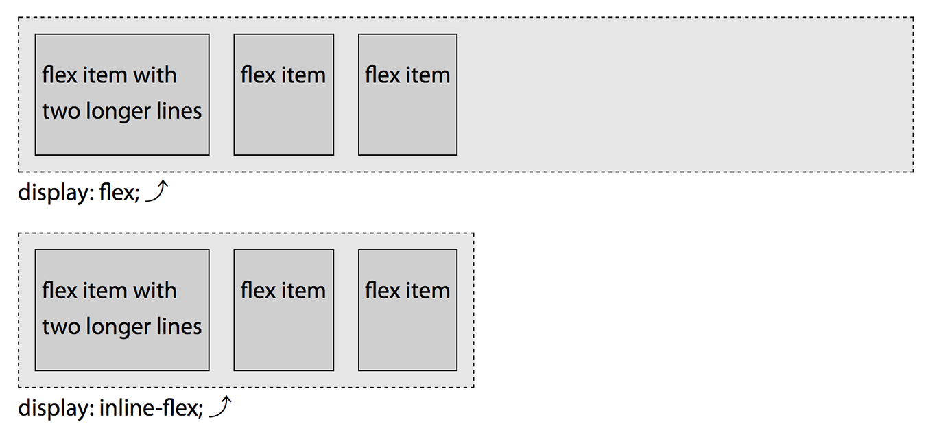
Figure 1-6. Adding display: flex; or display: inline-flex; creates a flex container
Note
For people familiar with float-based layouts, the default appearance
that is created simply by adding these display values is similar to
setting a container width to 100% and floating it and all its children
to the left, or using the .clearfix method, but better. The children
still fit on a single line, even if they may have wrapped if truly
floated. And, just as how floated elements are at least as tall as their
tallest floated children, the container will be tall enough to encompass
its children.
The inline-flex value makes the flex container behave like an
inline-level element. It will be only as wide as needed, as declared, or as wide as
one column if flex-direction is set to column (defined next). Like
other inline-level elements, the inline-flex container sits together
on a line with other inline-level elements, and is affected by the
line-height and vertical alignment, which creates space for the
descenders underneath the box by default. The flex value of the
display property behaves like a block element.
Note
We’ve added padding, margins, and borders to the flex container
and items to improve the appearance of the figures and for better figure legibility. Box-model properties
do impact flex layout. Had we not included these properties, all the
flex items would be bunched up against the flex container and against
each other and would be indistinguishable from one another. The illustration
explanations will not address the effects of the box-model properties
until we start covering some of the effects of box-model layout in
“The align-content Property”.
If we want to create a navigation bar out of a group of links, it’s very
simple. Simply display: flex;:
nav{display:flex;}<nav><ahref="/">Home</a><ahref="/about">About</a><ahref="/blog">Blog</a><ahref="/jobs">Careers</a><ahref="/contact">ContactUs</a></nav>
In the preceding code, with its display property set to flex, the
<nav> is turned into a flex container, and its child links are all
flex items. These links are flex-level boxes, semantically still links,
but now flex items in their presentation. They are not inline-level
boxes: rather, they participate in their container’s flex formatting
context. Therefore, the whitespace is ignored:
nav{display:flex;border-bottom:1pxsolid#ccc;}a{margin:05px;padding:5px15px;border-radius:3px3px00;background-color:#ddaa00;text-decoration:none;color:#ffffff;}a:hover,a:focus,a:active{background-color:#ffcc22;color:black;}
With a little added CSS, we’ve got ourselves a simple tabbed navigation bar, as shown in Figure 1-7.

Figure 1-7. A simple tabbed navigation
A flex formatting context is similar to a block formatting context, except flex layout is used instead of block layout: floats do not intrude into the flex container, and the flex container’s margins do not collapse with the margins of its contents.
While there are similarities, flex containers are different from block
containers. Some CSS properties do not apply in the flex context. The
column-* properties, ::first-line and ::first-letter don’t apply
when it comes to the flex container.
Note
The ::first-line and ::first-letter pseudo-elements
select the first line and first letter of block-level elements respectively.
Get Flexbox in CSS now with the O’Reilly learning platform.
O’Reilly members experience books, live events, courses curated by job role, and more from O’Reilly and nearly 200 top publishers.

