Chapter 5. Directory of Visualizations
This chapter provides a quick visual overview of the various plots and charts that are commonly used to visualize different types of data. It is meant both to serve as a table of contents, in case you are looking for a particular visualization whose name you may not know, and as a source of inspiration, if you need to find alternatives to the figures you routinely make.
Amounts
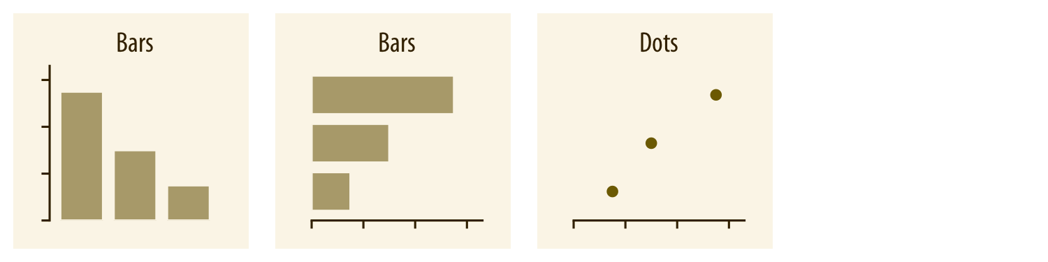
The most common approach to visualizing amounts (i.e., numerical values shown for some set of categories) is using bars, either vertically or horizontally arranged (Chapter 6). However, instead of using bars, we can also place dots at the location where the corresponding bar would end (Chapter 6).
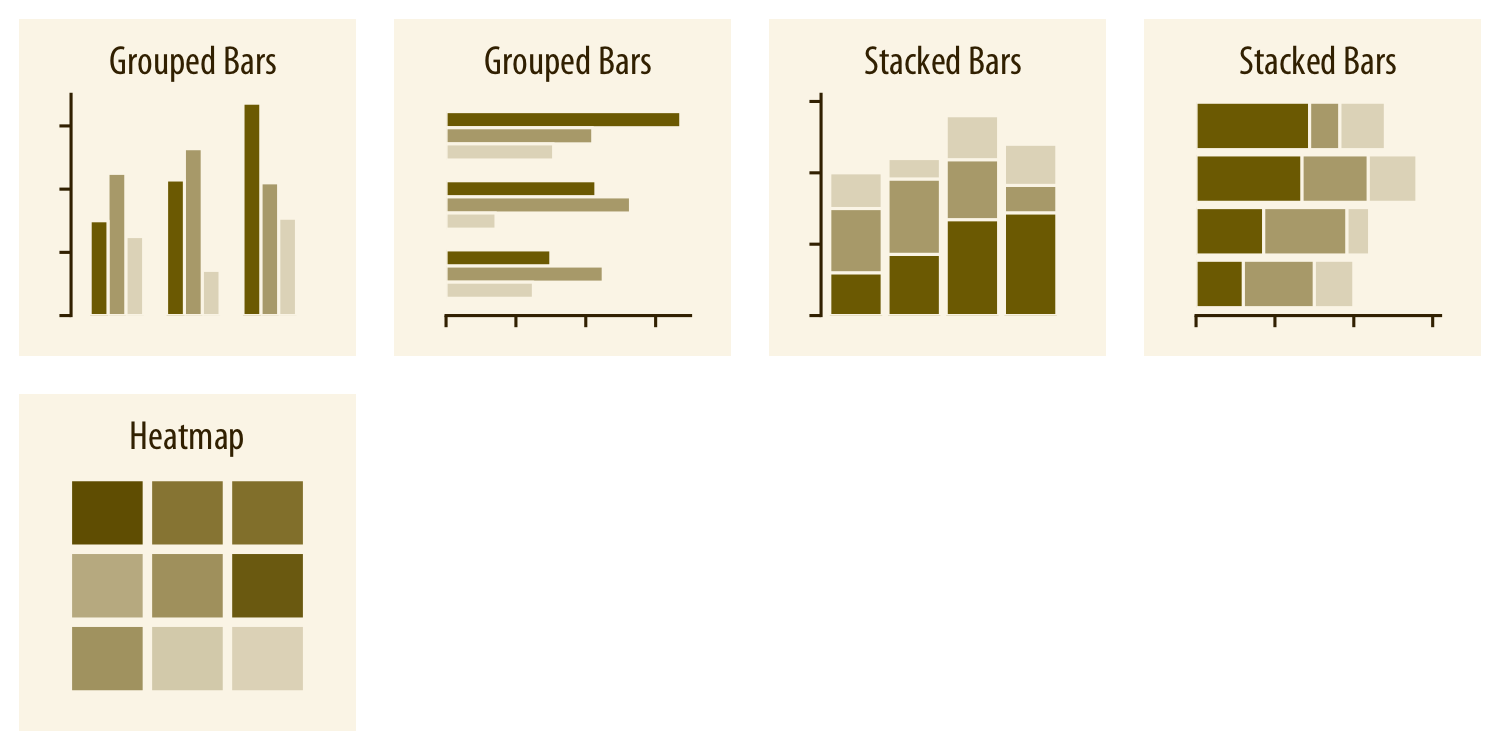
If there are two or more sets of categories for which we want to show amounts, we can group or stack the bars (Chapter 6). We can also map the categories onto the x and y axes and show amounts by color, via a heatmap (Chapter 6).
Distributions
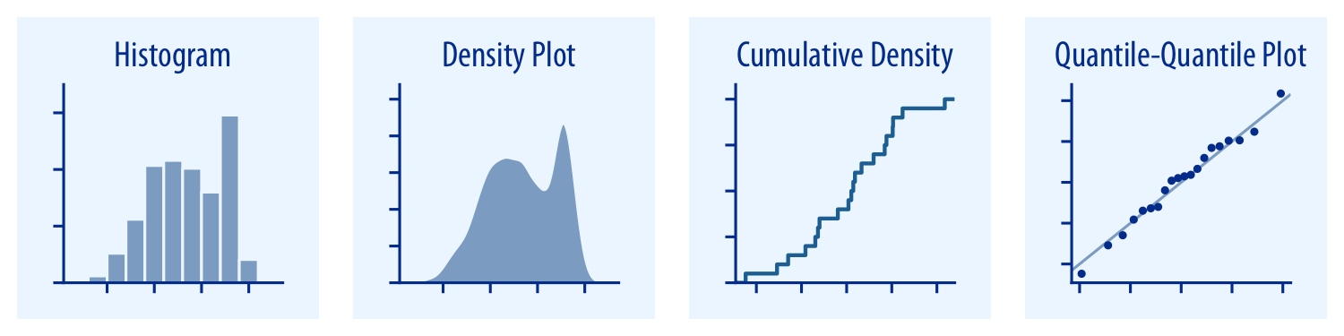
Histograms and density plots (Chapter 7) provide the most intuitive visualizations of a distribution, but both require arbitrary parameter choices and can be misleading. Cumulative densities and quantile-quantile (q-q) plots ...
Get Fundamentals of Data Visualization now with the O’Reilly learning platform.
O’Reilly members experience books, live events, courses curated by job role, and more from O’Reilly and nearly 200 top publishers.

