Job:12-84823 Title:RP-Graphic Design That Works (LDW)
175# Dtp:120/163 Page:218
Text (DS)
precis
Graphic Messaging
Because the offerings of Precis were quite complex, the
design firm’s first task was to get a clear understanding
of the company and to simplify the communication into
a provocative brochure. “Most of the research was getting
into the client’s shoes and trying to understand what it
is they do and to flush out key headlines,” says designer
Bryan Clark. “We learned that the service they deal with
provides knowledge—informing clients how they are,
how they are perceived, and the extent of their media.”
Once the design firm had a direction, the challenge
became how to conceptually and technically convey
their idea. “We decided to develop a series of questions
that would illustrate simple graphic stories about
uncovering information,” recalls Clark. “The before-and-
after approach was used as a point of illumination. This
created audience participation that endeared the reader
to carry on and to look forward to the next point being
made.” This simple, interactive guide takes the reader,
in an interesting and captivating way, through all the
CLIENT:
Precis measures communications
effectiveness for media-based
companies.
FIRM:
Lewis Moberly
CREATIVE DIRECTOR:
Mary Lewis
DESIGNERS:
Bryan Clark and David Jones
ILLUSTRATORS:
Bryan Clark and Steven Sayers
COPYWRITER:
Martin Firrel
ABOVE: The embossed and foil-
accented cover is made of light
board and gives a sense of
elegance to the piece.
Graphic Design That Works
218
216-229 84823 12/12/05 8:18 AM Page 218
Job:12-84823 Title:RP-Graphic Design That Works (LDW)
175# Dtp:120/163 Page:219
Text (DS)
W)
18
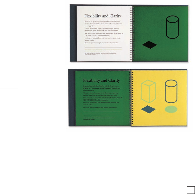
key points of the company. Colored film is used
throughout to reveal information and change perceptions.
“The tradition goes back to children’s storybooks
where you open the flap and certain things appear
and others disappear,” observes Clark. “Precis is about
uncovering new information and showing people
things. The illustrations are a metaphor for discovering
something new.” The graphic images were initially
sketched out on paper and then finalized in Adobe
Illustrator. With the addition of an embossed cover,
the interior spiral-bound brochure gained a more
formal presentation. “We played up areas to make it
look more special,” notes Clark. “Initially, we looked
at different things like varnishes and litho printing,
but embossing was more tactile and raised the
presence and feel of the brochure. It was the overture
to the beginning.”
ABOVE: Each spread illustrates
a key point. The colored film
allows certain things to appear
and to disappear—cleverly
delivering the message.
What Works
By using a before-and-after approach, the brochure
was able to clearly communicate, in an interactive and
captivating way, key points about the company’s ability
to uncover new information. The engaging brochure
helped to define and clarify exactly what Precis can
offer their clients and how this service can impact their
communications effectiveness.
219
216-229 84823 12/12/05 8:18 AM Page 219
Get Graphic Design That Works now with the O’Reilly learning platform.
O’Reilly members experience books, live events, courses curated by job role, and more from O’Reilly and nearly 200 top publishers.

