Text (DS)
Job:12-84823 Title:RP-Graphic Design That Works
(NEW)
175# Dtp:22 Page:244
plainspoke
Thinking about Flexibility
This flexible and easy-to-update promotional brochure
gives prospective clients a glimpse into the strategic
thinking behind the design work of Plainspoke. “I wanted
to have a little compact portfolio presentation that we
could send out to clients,” art director Matt Ralph
remarks. “We had been sending samples out, but it got
to be cumbersome. It just made sense to try and corral
some of our best work together in one piece.”
The most challenging aspect of the brochure was
developing the descriptive text for each project. “To
distill our creative thinking behind a project into a little
paragraph was difficult but important for the client to
see,” notes Ralph. “We always try to really think about
each project and what it communicates. I wanted people
to have background knowledge about the work we do,
rather than just showing a bunch of pictures.” The art
director also worked very closely with the photographer
to make sure that the composition on each shot was just
CLIENT:
Plainspoke is a graphic design
firm that specializes in educational
and cultural work.
FIRM:
Plainspoke
ART DIRECTOR/DESIGNER:
Matt Ralph
PHOTOGRAPHER:
Brian Wilder
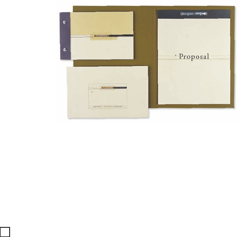
ABOVE: The piece is fashioned to
have the feeling of an old ledger.
The semiwraparound cover not
only conveniently hides the spine,
but also adds to the overall
dimensional quality of the piece.
It is sent out in a matching
envelope, along with a proposal
folder, when necessary.
244
244-257_84823 12/10/05 3:05 PM Page 244
Text (DS)
Job:12-84823 Title:RP-Graphic Design That Works
(NEW)
175# Dtp:22 Page:245
NEW)
e:244
right—varying the images from full bleed shots to
more traditionally cropped views. “In the pacing, I
wanted to break up the sequencing a bit,” explains
Ralph. “It was just too repetitive to have everything
looking all the same.” The text also alternates in
placement from front to back.
Two sets of inserts were printed, drilled, trimmed, and
stored in sections. Because the pages are loose and
not permanently bound, the design firm can customize
a brochure to fit any prospective target audience. “We
can skew it more towards identity or publication projects.
It gives us a lot of freedom and flexibility,” adds
Ralph. The handy and compact brochure can be easily
taken apart by disassembling the Chicago screws,
which are usually used on horse bridals. Silver is used
as an accent color throughout, tying the screws into
the overall color scheme.
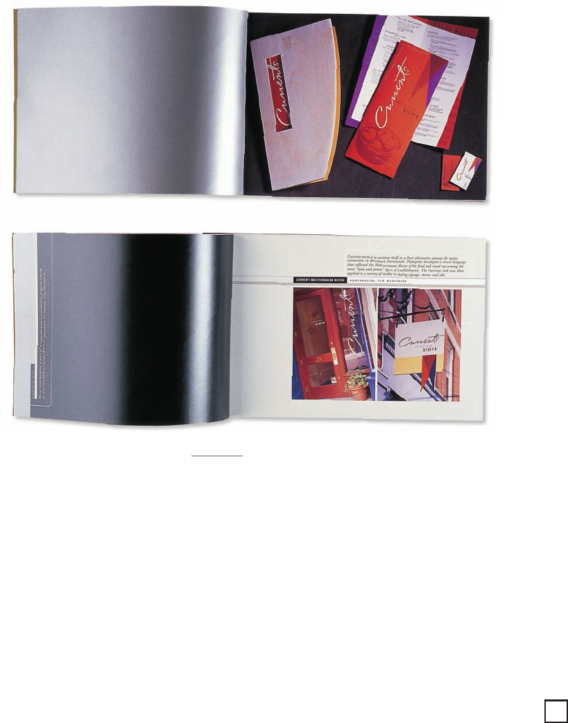
ABOVE: Each presentation
page is printed in six
colors—four-color process,
silver, and light gray. Spot
varnish is also used on
Potlatch McCoy matte
finish 65-lb. cover stock.
What Works
By providing prospective clients with a glimpse into
the strategic thinking behind each project, the design
team was able to highlight their ability to effectively
communicate ideas in a visual way—making the
brochure much more than a mere portfolio presentation.
Designing the pages to be interchangeable made the
promotional brochure extremely useful in the firm’s
marketing efforts. According to Ralph, “It has generated
many more projects for us.”
245
244-257_84823 12/10/05 3:05 PM Page 245
Get Graphic Design That Works now with the O’Reilly learning platform.
O’Reilly members experience books, live events, courses curated by job role, and more from O’Reilly and nearly 200 top publishers.

