
Text (DS)
Job:12-84823 Title:RP-Graphic Design That Works
(NEW)
175# Dtp:22 Page:270
One Step Beyond
Grids and templates provide a way to organize information and to create balance,
unity, and visual rhythm throughout any communications piece. Whether the usage
is subtle or quite apparent, an underlying grid can be useful in keeping the reader
focused and the communications clear and consistent. “Throughout any piece there
has to be something that reoccurs for the reader. Things can vary as long as they
are in a common place where they can be found,” shares creative director David
Cannon. “I think it is important to have a grid system in place to anchor hierarchies
of information.”
Using a grid system does not mean sacrificing creativity or expression. Like music,
variety must occur within the overall structure to maintain interest. By slightly
varying the elements within a grid, the page or spread will come alive, creating
movement and pacing from one page to the next. Establishing relationships
amongst the elements within a layout is also important. By flushing elements to
the same grid line helps to establish order. Repeating or echoing similar shapes or
textures creates an overall rhythm in a piece. There is also a connection between the
outside shape and the interior space of a layout. When choosing an exterior format,
keep in mind how it will effect what is going on inside. Varying either one will
greatly change the flow, continuity, and organization of a piece. It’s best to
experiment to find just the right combination to most effectively communicate the
client’s overall message.
With the convenience and speed of the computer, grids and templates are easier
than ever to set up and use. “With the advent of computers, the design grid has been
brought to the masses. Now, setting up a grid is as simple as a few clicks of a
mouse,” offers art director Shawn Murenbeeld. “Knowing what to do once the grid is
established is another matter entirely.” With this technological advance, a certain
level of artistic sensitivity has been compromised, and many designers have lost
touch with the craft of constructing a page. The best way to counteract such a loss is
to examine the work of the old masters, the great designers of the past. They used
and experimented with all kinds of grid systems to produce their work. “Some exam-
ples of the earliest and best uses of grids were created by designers in movements
like Constructivism, Bauhaus, De Stijl, and later in the Swiss or International Style,”
adds Murenbeeld. “When you look at the works of Laszlo Moholy-Nagy, El Lissitzky,
Jan Tschichold, and Josef Muller-Brockmann, to name a few, you’ll see that as well as
being practitioners of the grid, they were also pioneers of modern typography.”
Going back to the basics not only can enrich your understanding of what is possible
but can also act as a springboard for your own creative exploration.
Using Grids and Templates
Graphic Design That Works
270
258-273_84823 12/10/05 3:11 PM Page 270
Text (DS)
Job:12-84823 Title:RP-Graphic Design That Works
(NEW)
175# Dtp:22 Page:271
NEW)
e:270
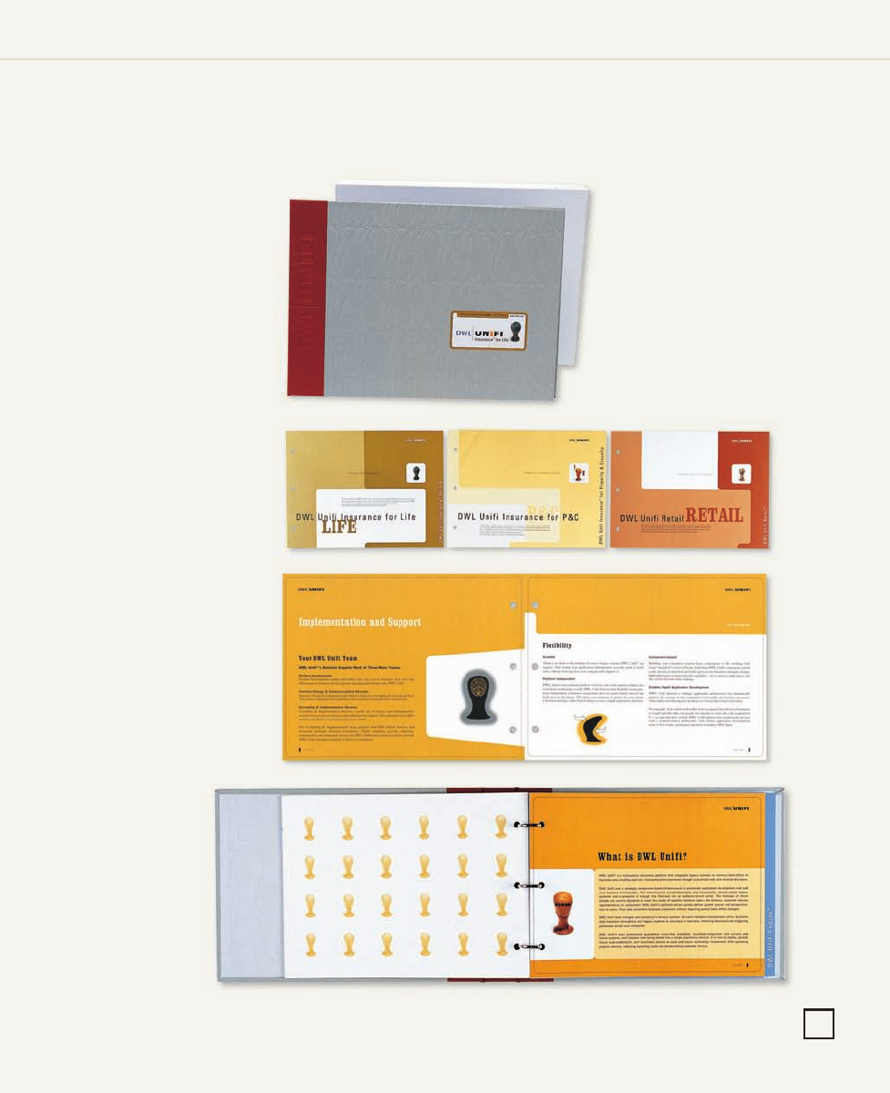
CLIENT:
DWL Incorporated’s enterprise cus-
tomer management applications
consolidate fragmented customer
relationship management (CRM),
back-office, and e-business systems
into unified industry solutions.
FIRM:
DWL Incorporated
(in-house creative services)
ART DIRECTOR/DESIGNER:
Shawn Murenbeeld
ILLUSTRATOR:
Shawn Murenbeeld
PHOTOGRAPHER:
Hill Peppard
COPYWRITER:
Leslie Ehm
LEFT: The customized three-ring
binder is adorned with cloth and
book tape and is debossed with an
overall pattern that is reminiscent of
the corporate head icon. The cover,
simple and subtle, is quite flexible.
Several color-coded stickers have
been designed to label the brochure
to meet the needs of the sales staff.
To ensure proper positioning, an area
has been debossed for the appropri-
ate sticker. Inside, the end papers
have been letterpress-printed with a
variation of the same icon pattern.
The brochure is housed inside a
white paper box.
RIGHT: On all of the main divider pages,
the header type and the various icon
designs are positioned in a consistent
arrangement. While maintaining a similar
overall shape, angle, and flow, the
position of the other elements varies
slightly within the horizontal format.
BELOW: Inspired by the look of an old
1940s trade catalog, the modular
brochure consists of geometric shapes
with rounded corners, which flow from
page to page. Each product section has
a unique four-column grid that varies.
The spreads are slightly different, but
maintain their cohesiveness. Having
a larger grid system in place provides
great flexibility and the opportunity
to move and alter elements within
the space.
271
258-273_84823 12/10/05 3:11 PM Page 271
Get Graphic Design That Works now with the O’Reilly learning platform.
O’Reilly members experience books, live events, courses curated by job role, and more from O’Reilly and nearly 200 top publishers.

