Creating a Visual Metaphor
Because the design objective included communicating
the Global Technology. Asian Focus message in the
logo as well as each succeeding campaign component,
designers decided to include Asian-inspired images
as visual metaphors that when combined, compared,
and contrasted with high technology images, created
unusual and unexpected juxtapositions of graphics.
Gee + Chung created several of these design elements
that were used consistently throughout the entire
campaign.
One such element is the use of a universally accepted
Asian color palette of red, gold, and black, which is
prevalent throughout many Asian cultures and con-
notes such positive characteristics as good luck, good
fortune, prosperity, and longevity. The word iAsia was
set in red type because it complemented the word
Works
in black and the color break played to the logo’s
advantage. A modified extension of the logo form—
an outline—was replicated as a gold outline on a red
field, simulating gold embroidery on red silk, and was
established for secondary uses. The secondary system
also employed a pattern of reversed out, embossed
circles—representing the pattern on an ancient Asian
doorway and symbolic of a gateway to Asia—which
gave the presentation folder a dynamic tactile aspect.
ABOVE: The iAsiaWorks logo
and variations of it were
carried through each ele-
ment of the campaign to
create a visual that when
combined with an integrated
circuitry pattern functions
as a visual metaphor for
linking Asian cultures
through technology.
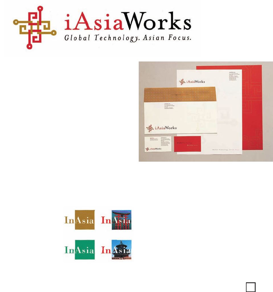
RIGHT: The iAsiaWorks sta-
tionery system utilizes an
outline pattern of the logo
simulating gold embroidery
on red silk and a dot pattern
derived from the logo and
representing an ancient
Chinese door.
Tying the Imagery to the Message
The iAsiaWorks logo, its outlined version, and other Asian-inspired graphics were
carried through each element of the campaign to create imagery that when com-
bined with an integrated circuitry pattern, functions as a visual metaphor for linking
Asian cultures through technology. For example, the iAsiaWorks stationery system
utilizes both the standard logo as well as the outlined version simulating gold
embroidery on red silk and a dot pattern derived from the logo, representing an
ancient Chinese door. The presentation folder uses the logo to form a string tie
clasp, transforming the folder into a special gift for potential clients. The inside
pockets have embossed dots simulating the rivets on an Asian door, and the curved
flaps convey a Chinese moongate motif.
295
GY
Text (DS)
Job:12-84823 Title:RP-Graphic Design That Works
(NEW)
175# Dtp:174 Page:295
NEW)
e:294
294-301_84823 12/10/05 2:10 PM Page 295
Get Graphic Design That Works now with the O’Reilly learning platform.
O’Reilly members experience books, live events, courses curated by job role, and more from O’Reilly and nearly 200 top publishers.

