Text (DS)
Job:12-84823 Title:RP-Graphic Design That Works
(NEW)
175# Dtp:22 Page:334
D
ESIGN
F
IRM
:
TD2, S.C. Identity and
Strategic Design Consultants
A
RT
D
IRECTORS
:
Rafael Trevino Monteagudo,
Rafael Rodrigo Cordova Ortiz
D
ESIGNERS
:
Rafael Trevino Monteagudo,
Rafael Rodrigo Cordova Ortiz,
Erica Bravo, Hernandez,
Edgar Medina Graciano,
Brenda Camacho Saenz,
Alejandra Urbina Nunez
I
LLUSTRATORS
:
Adalberto Arenas Castillo,
Sergio Enriquez Davila
C
LIENT
:
Helados Nestlé México
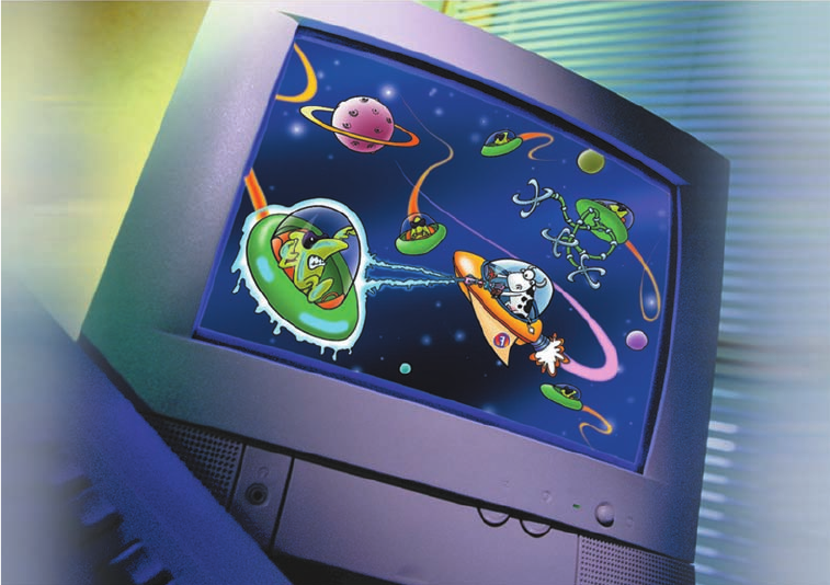
ABOVE: Designers didn’t
miss any opportunity to
bring these characters into
kids’ daily lives—including
creating a screen saver that
keeps the Galáctea 7 brand
front and center.
Galáctea 7:
Space-Age Graphics, Superhero Fun
334-341_84823 12/10/05 2:34 PM Page 334

Text (DS)
Job:12-84823 Title:RP-Graphic Design That Works
(NEW)
175# Dtp:22 Page:335
NEW)
e:334
BELOW: Color is abundant
on all the promotional
materials to catch kids’
eyes including the
point-of-purchase
displays, price board,
and refrigerator display.
The Process
When Helados Nestlé México retained TD2, S.C.
Identity and Strategic Design Consultants to launch
its newest ice cream product targeted to eight-to-
twelve-year-old kids, three primary objectives were
clear. The identity had to innovative, relevant to the
preteen market, and, most important, fun.
The dessert was already a known brand—La Lechera
—being marketed to adults in a promotion that talked
to its older market. This time, the product was being
aimed at kids, so Helados Nestlé needed a new
marketing approach.
335
334-341_84823 12/10/05 2:34 PM Page 335
Text (DS)
Job:12-84823 Title:RP-Graphic Design That Works
(NEW)
175# Dtp:22 Page:336
The client already had a mold in the shape of a rocket and
a jet, so designers decided to pursue a space-age theme.
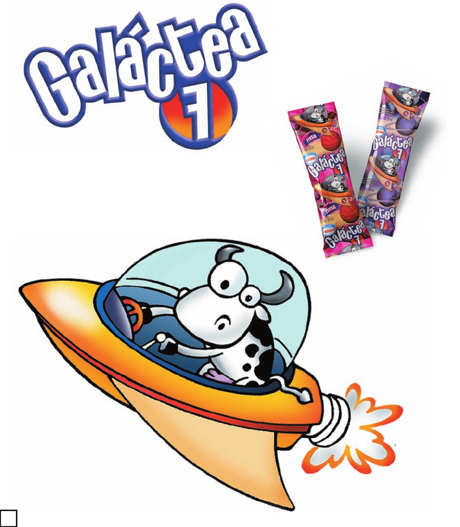
Next, they set out to give the product a name. “We worked
to create a name that communicated the spatial mood, but
close to milk—combining Galaxy with Via Lactea—Spanish
for Milky Way—resulting in Galáctea,” explains Rafael
Rodrigo Cordova Ortiz, art director. “The seven was added
to enhance the theme since most spaceships in history
had a number like the
Freedom 7
, the first Mercury that
orbited Earth.”
LEFT: The logo prominently
features the product name,
which is derived from
designers combining Galaxy
with Via Lactea—Spanish
for Milky Way—resulting in
Galáctea. The number seven
was added because most
space missions include a
number, like
Freedom 7
and
Apollo 7
.
RIGHT: The main character
in Galáctea 7 is Super Muu,
a cow piloting his own space-
ship, which, designers credit
with being the key element
in the brand identity.
ABOVE: Product packaging
is characterized by its abun-
dant use of color. Designers
took special care in using
the right inks to allow the
metallic material to shine
through the graphics.
Graphic Design That Works
336
334-341_84823 12/10/05 2:34 PM Page 336
Text (DS)
Job:12-84823 Title:RP-Graphic Design That Works
(NEW)
175# Dtp:22 Page:337
NEW)
e:336
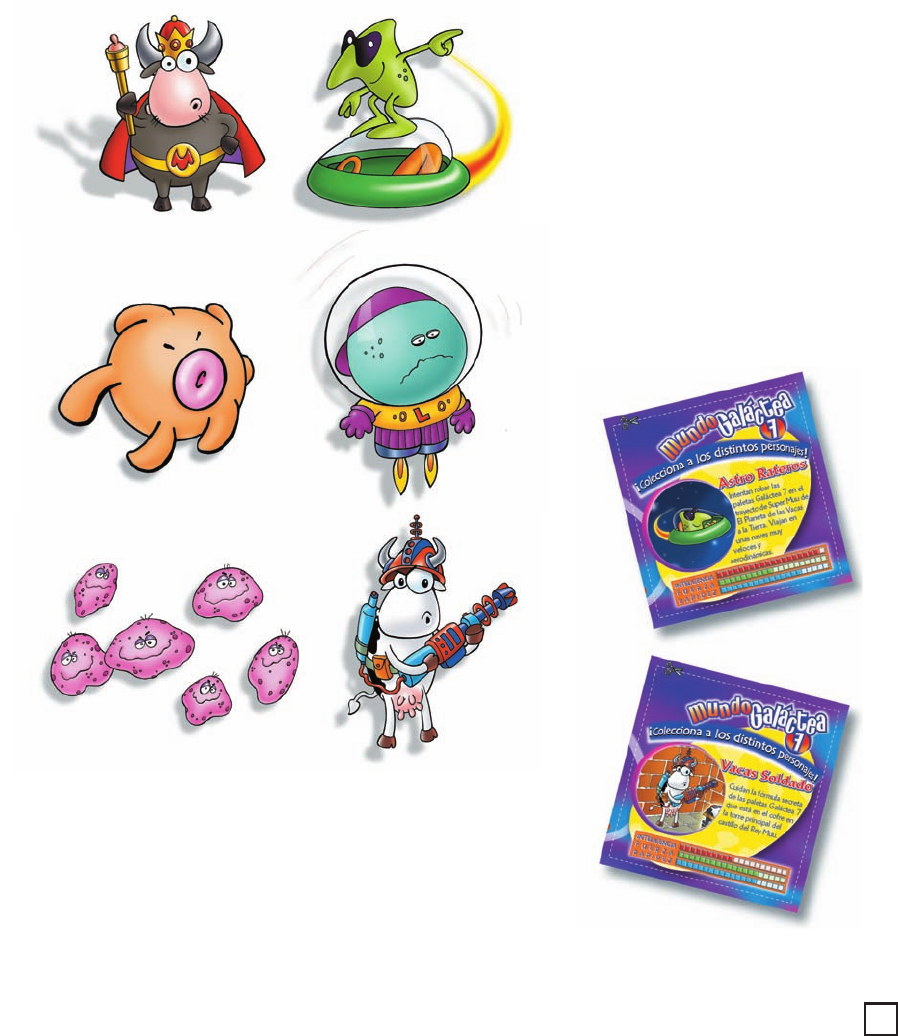
Adding personality and kid appeal to the spaceship is
a superhero in the form of a cow—Super Muu, which
became the single most important element of the branding,
according to designers. “Through the use of humor and a
very distinctive use of illustration, we came up with a very
successful character,” adds Ortiz. Designers went on to
develop a family of characters with whimsical names—
ReyMuu, Astroratero, Comeleche, LaloLelo, Virulelas, and
Vaca Solado—who tell the story of Galáctea 7. Kids wanting
to learn more about these characters can read up on their
adventures from collectible cards included in the packaging.
BELOW: Collectible cards,
included with the product,
tell the individual stories
of Galáctea 7’s cast of
characters.
ABOVE: The main character,
Super Muu, is not alone in
space. He has plenty of
friends including ReyMuu,
Astroratero, Comeleche,
LaloLelo, Virulelas, and Vaca
Solado—who tell the story
of Galáctea 7.
337
334-341_84823 12/10/05 2:34 PM Page 337
Text (DS)
Job:12-84823 Title:RP-Graphic Design That Works
(NEW)
175# Dtp:22 Page:338
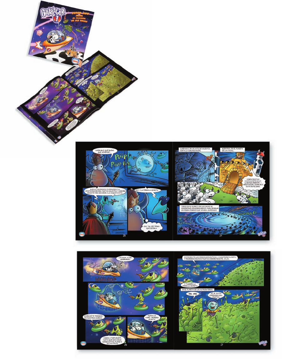
THIS PAGE: A comic book
brings the cast of charac-
ters to life within an action
adventure in space.
A cast of such colorful characters in space set the stage for action adventures,
so designers created an accompanying comic book. Distinguishing all of the
promotional elements is color—abundant color, sure to catch the eye of any kid
wandering the refrigerated section of the grocery store. The vibrant use of color
was no accident but part of the strategic design plan. “To achieve packaging with
plenty of impact, we were very careful about using inks with or without a white
base to allow the metallic material to live through the graphics,” says Ortiz.
Delineating the do’s and don’ts of the identity system is an equally colorful brand
book. No staid standards manual will do for this product; its manual is as colorful
as the packaging.
334-341_84823 12/10/05 2:34 PM Page 338
Get Graphic Design That Works now with the O’Reilly learning platform.
O’Reilly members experience books, live events, courses curated by job role, and more from O’Reilly and nearly 200 top publishers.

