Soapbox Design
Communications
Job:12-84823 Title:RP-Graphic Design That Works (LDW)
175# Dtp:120/163 Page:66
Text (DS)
Process
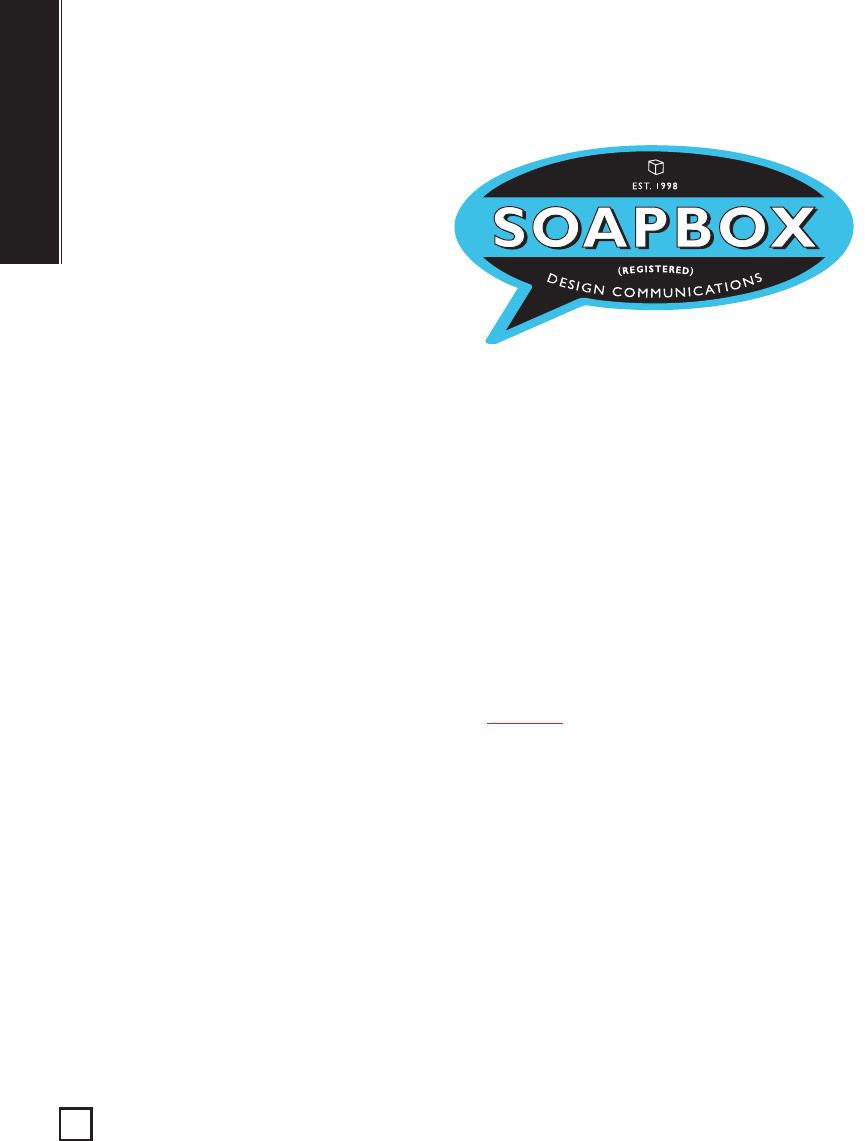
The first step in creating the Soapbox identity was finding a way to visually convey
the Old World feel of a soapbox. For inspiration, designer Gary Beelik and his col-
leagues turned to packaging design from the 1930s and 1940s, focusing in particular
on soapbox labels. From this research emerged two ideas: creating a logo that was a
label or a sticker, and secondly, incorporating some of the graphic elements common
in early-twentieth-century packaging design, such as ovals, eye-catching color, and
all-capital letters, into the final mark. Next, the team explored different ways to
update the vintage designs they had been looking at. “We are a pretty laid back firm,
so we wanted to create a logo with a bit of a humorous twist,” says Beelik. That
twist turned out to be a speech bubble, a symbol that connotes both speech in gen-
eral and the populist speech of comic books in particular. As a typeface the team
chose Gill Sans, a font that was introduced in the 1930s but whose clean strokes
lend it a modern feel today. For colors, the team again turned to vintage soapbox
labels. “But we wanted to update them slightly,” says Beelik. “We made the oranges
a little bit brighter and the blues a bit more current.” The result is a logo that is play-
ful and modern, but which also carries a sense of history.
What Works
The company’s name alludes to the way wooden crates were once dragged into town
squares and used as improvised platforms for spontaneous speech. Visually, the
logo represents this type of communication: The comic book-style bubble conveys a
sense of informal speech, while the attention-getting colors and all capital letters
suggest the passion and urgency with which the speech is delivered. And just as Old
World soapboxes were easily adaptable to a range of environments, so too is the
logo: it varies in size, shape, and color depending on the application.
Client
Soapbox Design Communications is a Toronto-based
graphic design firm.
DESIGNERS
Gary Beelik, Jim Ryce, Victoria Primicas
FIRM
Soapbox Design Communications
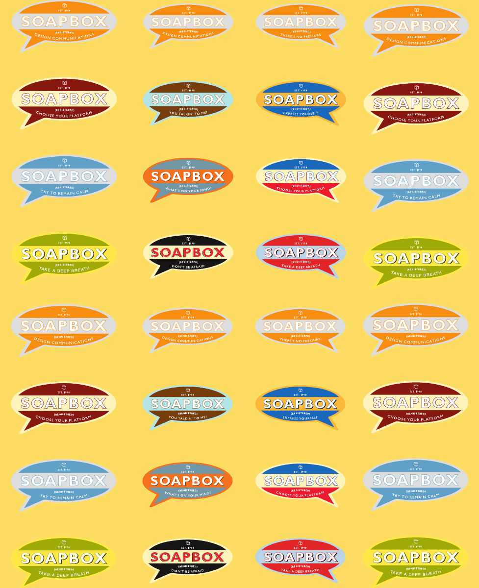
The logo comes in
twelve variations and
features six different
sayings, including
“Choose your platform,”
which is used for
promotionals, and “Try
to remain calm,” which
is applied to invoices.
Graphic Design That Works
66
040-069 84823 10/12/05 2:05 PM Page 66
Text (DS)
DW)
ge:66
n
and
re
nt
g
atform,”
d “T
ry
which
ices.
Job:12-84823 Title:RP-Graphic Design That Works (LDW)
175# Dtp:120/163 Page:67
040-069 84823 10/12/05 2:05 PM Page 67
Get Graphic Design That Works now with the O’Reilly learning platform.
O’Reilly members experience books, live events, courses curated by job role, and more from O’Reilly and nearly 200 top publishers.

