Magazines that survive the ages become staples of our culture:
Life, Harper’s,
and
Time
among them. These titles
are as familiar to us as great film classics and works of literature because they shaped how entire generations have
seen the world.
GQ
can easily be esteemed as one of the great magazines to weather the turbulent decades. After more than 70
years in circulation, the magazine’s title has become synonymous with fashionable, as in, “You look so
GQ
.”
The magazine’s design has progressed over the decades to mirror the changing image of the stylish, affluent man.
In the era of 20-something millionaires and 30-something retirees, design expresses quality and confidence with a
cool, yet reserved, edge.
WHY IT WORKS:
With few frills,
GQ
is straightforward in its attempt to be a timeless publication, giving a nod to its history while
firmly maintaining its stylish reputation. Richly colored photographs and striking type treatment boldly accentuate
clean, classic page layout—offering variety but staying grounded with a proud sense of the magazine’s identity.
GQ
Fashion for the New Affluent Man
Job:12-84823 Title:RP-Graphic Design That Works (LDW)
175# Dtp:120/163 Page:90
Text (DS)
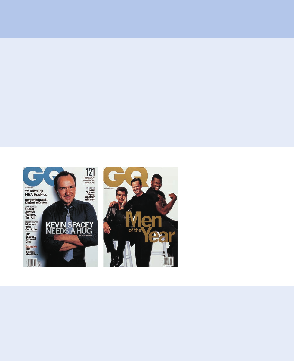
far left Strong, bold cover lines outline a straight-on
portrait of Kevin Spacey on the front of the October
2000 issue—an example of the magazine’s
assertive,confident covers.
left A stunning lineup of stars grace the cover of
GQ
's coveted "Men of the Year" issue.
090-095 84823 10/12/05 2:32 PM Page 90
DW)
ge:90
Job:12-84823 Title:RP-Graphic Design That Works (LDW)
175# Dtp:120/163 Page:91
Text (DS)
Still,
GQ
hasn’t avoided becoming “a lot hipper” over
the last several years, mainly to appeal to younger au-
diences who have grown up rather quickly, says design
director Arem Duplessis.
“With the economy as good as it’s been, we have a
more sophisticated audience who’s increasingly con-
cerned with overall style,” he says. “He dresses for the
job he wants, not the job he has.”
The New Gentleman
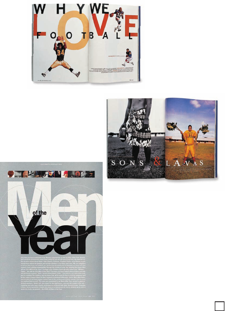
left
GQ
excels in cover-
ing a wide variety of sub-
jects, reflecting the tone
and message of each ar-
ticle through its design,
while maintaining con-
sistency. This playful se-
ries of layouts for the
September 1999 football
issue uses the subdued
palette and plenty of
white space, but inserts
fun images and type to
play off the energy and
excitement of the fea-
tured game.
above A variation on
the football theme for the
same September issue is
a spread of loud colors
and patterns, introducing
the sport in Samoa.
left Tightly cropped
photos act as a colorful
banner across this silver-
coated page introducing
GQ
’s coveted “Men of the
Year” awards—an exam-
ple of how accented color
touches up ordinarily
subdued pages.
Average readers range from recent college grads to
around 40 years old, generally hold advanced de-
grees, and make between $35,000 and $100,000 a
year. Such an age gap may be difficult for other mag-
azines to straddle, but Duplessis says the
GQ
reader
responds less to generational messages and more to
a prevailing attitude.
“Our readers already know who they are,” he says.
“We avoid anything over the top and stick to a classic
aesthetic, one that has no time period.”
91
090-095 84823 10/12/05 2:32 PM Page 91
Get Graphic Design That Works now with the O’Reilly learning platform.
O’Reilly members experience books, live events, courses curated by job role, and more from O’Reilly and nearly 200 top publishers.

