“It’s more than a magazine—it’s a movement.”
You’d expect this kind of statement from a grassroots title like
Utne Reader,
but it seems a strange assertion from a
business magazine. Yet that’s the groundwork on which
Fast Company
is built and, among loyal readers, the six-year-
old title is a staple of the changing business culture. From its inception, the design has been integral in the “move-
ment” by screaming for change through bold covers, unconventional images, and a propensity for breaking the rules.
WHY IT WORKS:
Fast Company
incites readers to embrace new ideas with bold, illustrative type and intrigues them with insightful,
entertaining photography. Once covers and opening spreads draw them in, basic layout and a careful use of white
space keep them hooked through long articles.
Fast Company
The Best in Entrepreneurial Ideas
Job:12-84823 Title:RP-Graphic Design That Works (LDW)
175# Dtp:120/163 Page:168
Text (DS)
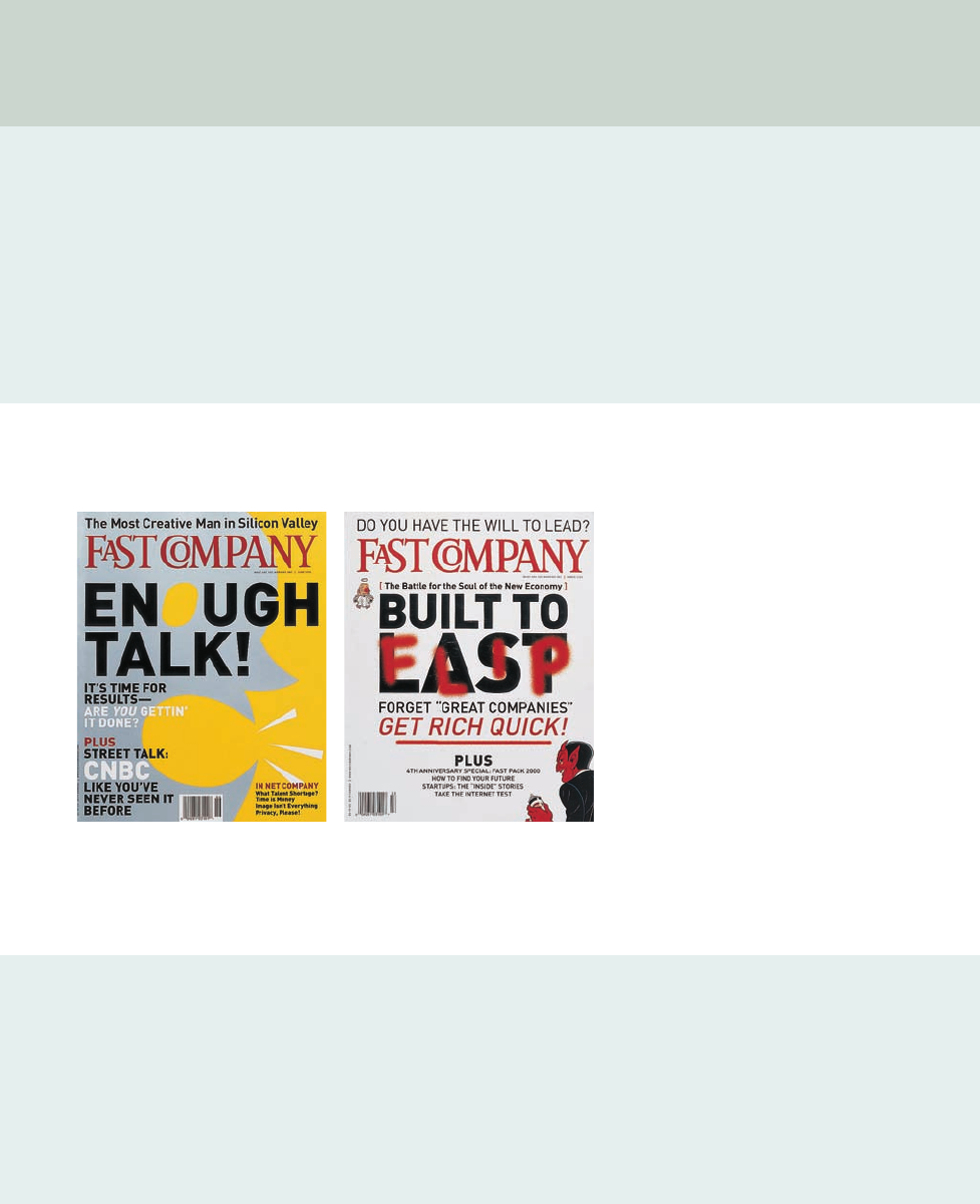
far left The cover of
Fast Company
is emblazoned
with the brilliant ideas and quotes of people profiled
inside. Loud colors, humorous graphics, and sensa-
tional type reflect the creative energy of these entre-
preneurs and experts.
left When they’re not all-text proclamations, covers
often feature funny illustrations. Here, the March
2000 cover portrays the “battle for the soul” of the
economy, in which the devil has spray painted over
the original headline.
166-173 84823 12/12/05 7:38 AM Page 168
Job:12-84823 Title:RP-Graphic Design That Works (LDW)
175# Dtp:120/163 Page:169
Text (DS)
W)
68
Fast Company
positions itself as the mouthpiece for a
radical new breed of businesspeople who invent the
rules as they go along. “
Fast Company
was the first
business magazine to fully realize that the Internet
was about to change everything,” says creative director
Patrick Mitchell. “For our audience, it changed the way
people worked, where they worked, the way they man-
aged people, the way they communicated.”
Founded in 1995 by two former editors from
Harvard
Business Review,
the magazine has grown to include a
well-known Web site, an organization of readers
called Community of Friends, and an education pro-
gram as part of its brand.
The formula has been wildly popular and, amid com-
petition from other new economy titles, it experienced
exponential growth. Paid subscriptions soared 500
percent since the magazine’s inception, while news-
stand sales increased 155 percent.
The magazine targets businesspeople who have big
ideas, uninhibited energy, and the strength and posi-
tioning to make a difference. Readers tend to be in po-
sitions of power at established or startup companies,
yet young and open-minded enough to plow through
convention. According to the magazine’s media kit,
“Their goal is to overthrow the status quo.”
Fast Company’s
design reflects this maverick way of
doing business. “The goal of the design was to cap-
ture the excitement and almost revolutionary under-
tones of what was happening in business and
society,” says Mitchell.
Radical Business Ideas
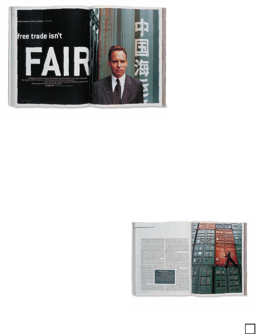
left and below The
photograph and reversed
page of text create ten-
sion appropriate to an
article about a grassroots
organizer against free
trade. A complex green
grid growing out of the
F
in the headline plays off
the colors in the photo
and other text and mim-
ics the shot on the fol-
lowing spread.
169
166-173 84823 12/12/05 7:38 AM Page 169
Get Graphic Design That Works now with the O’Reilly learning platform.
O’Reilly members experience books, live events, courses curated by job role, and more from O’Reilly and nearly 200 top publishers.

