7
(RAY)
Job:07-26153 Title:RP-Graphic Designer’s Essential Reference PB Edn
#175 Dtp:204 Page:32
001-035_26153.indd 32 7/12/11 10:32 AM
32
(Text)
GRAPHIC DESIGNER’S ESSENTIAL REFERENCE
{}
Making a comfortable, easily read text that is
pleasant to look at is much like developing
reliable pastry dough. The amount of water,
fl our, egg, and milk and the working tem-
perature all need to work together or the
dough will be too tough, too fl aky, and so
on. Similarly, a good text setting is one in
which a constellation of variables achieves
a harmonic balance.
Text that is legible in size, encourages sequen-
tial reading, shows decisive (and consistent)
rags and spacing, clearly separates para-
graphs, and exhibits a minimum of hyphens,
widows, and orphans
—
this often becomes the
foundation of a strong layout.
Crafting Reader-Friendly
(and Beautiful!) Text
Tricks for Resolving Rag and
Justification Problems
If the hyphenation is excessive (whether in a ragged or justifi ed
column), it may mean the type size is too big relative to the width
of the column. Reduce the text size by a half-point or widen the
columns by three letter-widths.
For rags that are inconsistent—soft and rippling in some
places and very deep elsewhere—or if just a few lines seem hope-
less, force the rag to be much deeper or active throughout; this
approach provides more options for breaking diffi cult sequences of
lines, and hides disparities in the rag from location to location.
Dramatically loosening the leading in a narrow column will
diminish the irregularity of a rag.
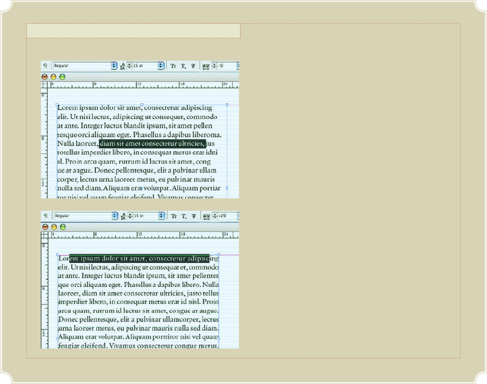
If a sequence of lines in an otherwise consistent rag is too
short or too long, select those lines and adjust their kerning
independently—but not to the point that they look different. This
approach may also be applied to single lines that are just too short
or too long.
In a justifi ed column where one line of text is exceptionally
tight and dark, return the last word to the following line and then
adjust the spacing for the newly broken line to loosen it. The
opposite approach—forcing an extra word onto a very loose line—
will also often work.
In justifi ed text that seems overly loose, with a great deal of
rivers, it is likely that the column measure is too wide for the type
size. First try enlarging the type by a half point to see if that helps.
The next step is to narrow the column by a couple of letter-widths.
Tip
(RAY)
Job:07-26153 Title:RP-Graphic Designer’s Essential Reference PB Edn
#175 Dtp:204 Page:32
001-035_26153.indd 32
7/12/11 10:30 AM
Get Graphic Designer's Essential Reference now with the O’Reilly learning platform.
O’Reilly members experience books, live events, courses curated by job role, and more from O’Reilly and nearly 200 top publishers.

