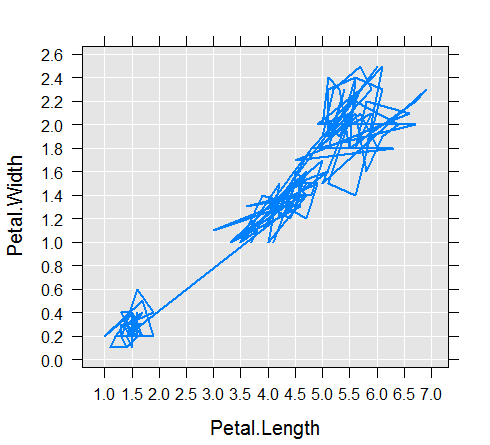
A histogram is only one way of visualizing the data. Another example is the rxLinePlot example, which creates the line of a scatter plot using data. For this function, this formula should have one variable on the left-hand side of the ~ that reflects the y axis, and one variable on the right-hand side of the ~ that reflects the x axis. Here is an example of the line plot:
We can also transform subsets of data using other features and functionality in Microsoft ML Services, and then revisualize the data.
Once we can see and understand our data, we can enrich it further by using additional Microsoft ML Services functionalities. ...

