Chapter 9. Material Views: A Material World
Most apps need a slick UI that responds to the user.
Youâve so far learned how to use views such as text views, buttons and spinners, and applied Material themes to make sweeping changes to your appâs look and feel. But thereâs so much more you can do. Here, youâll learn how to make your UI more responsive with the coordinator layout. Youâll create toolbars that can collapse or scroll on a whim. Youâll discover exciting new views such as checkboxes, radio buttons, chips, and floating action buttons. Finally, youâll find out how to display friendly pop-up messages using toasts and snackbars. Read on to find out more.
Material is used throughout Androidville
In the previous chapter you learned how to use toolbars, bottom navigation bars, and navigation drawers to help users navigate your app, and styled them using a theme from the Material library. As you may recall, Material is a design system that helps you build apps with a consistent look and feel across all screens.
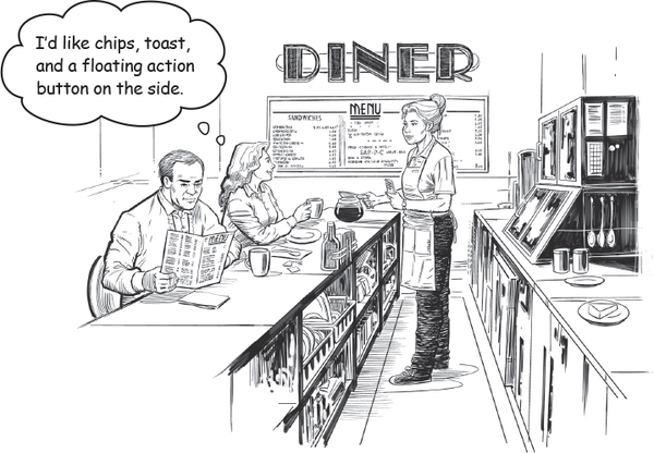
Material isnât just limited to toolbars, navigation drawers, and bottom navigation bars; it styles every view in your app, from buttons to text views.
Here are some more examples of components and features that use Material:
 Scrolling and collapsing ...
Get Head First Android Development, 3rd Edition now with the O’Reilly learning platform.
O’Reilly members experience books, live events, courses curated by job role, and more from O’Reilly and nearly 200 top publishers.

