Lesson 5
Structuring Pages with CSS
In the previous lesson, you looked at how individual elements could be styled with CSS. This lesson builds on this knowledge and looks at how elements come to occupy the screen position that they do, how this can be manipulated, and how this impacts other elements around them.
The Box Model
The box model is one of the most important CSS concepts and dictates the width and height each element will occupy onscreen. The box model starts from the observation that all elements in the document occupy rectangular boxes, but the rules for calculating their height and width are not as straightforward as you may think.
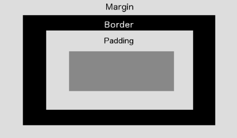
For a start, the height and width occupied by an element is greater than the height and width required for the content of the element for several reasons. For instance, the element may have a border that occupies additional space. In the previous lesson, you created borders that were 1 pixel in size. Thus, these borders added 2 pixels to the height and width required for the element.
Padding may also be added between the content and the border, as with the table cells in the previous lesson. Finally, it may also be necessary to add additional margin between the element and its neighboring elements.
The total space occupied by the element's box can therefore be visualized in Figure 5.1.

In order to see this in action, ...
Get HTML5, JavaScript, and jQuery 24-Hour Trainer now with the O’Reilly learning platform.
O’Reilly members experience books, live events, courses curated by job role, and more from O’Reilly and nearly 200 top publishers.

