Sparklines
Growing in popularity as a data visualization option, Sparklines are inline charts that represent the general shape of a variation (typically over time) in some measurement (such as miles per gallon or home value), in a simple and highly condensed way. Splunk provides the ability for you to add Sparklines to stats and chart searches, improving their usefulness and overall information density.
A simple Splunk search example like
sourcetype=csv "0001" "USD" | chart AVG(Jan) by PERIOD
creates the following results table:
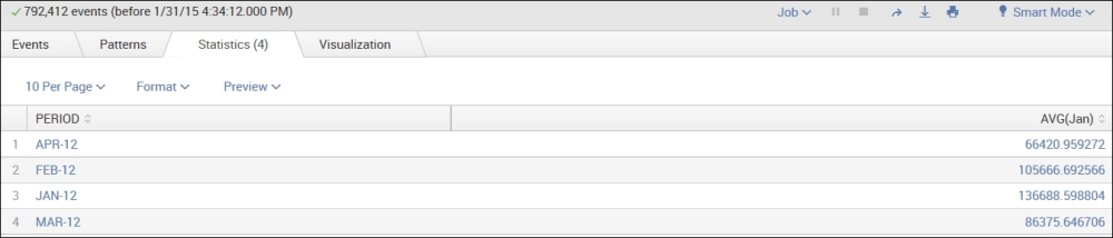
As you can see, the preceding example of a search, generates a table that shows average amounts by the field PERIOD—just two ...
Get Implementing Splunk - Second Edition now with the O’Reilly learning platform.
O’Reilly members experience books, live events, courses curated by job role, and more from O’Reilly and nearly 200 top publishers.

