UNDERSTANDING THE VISUAL STORYTELLING SPECTRUM
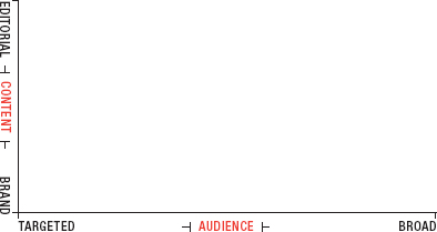
We can assume a format-agnostic approach for now, and focus on illustrating the concept above (Figure 3.1). To better understand this concept, let’s think of the Who as being the label for the x-axis, and the What as being represented along the y-axis.
Figure 3.1: The Visual Storytelling Spectrum

The quality of an application of infographics is largely measured by how it is leveraged to reach its specific objectives. Simply, popularity—or broad reach—should not be misinterpreted as a litmus test for quality, as reaching a large audience is not always the goal. For instance, if you are creating an internal (brand-centric) report for shareholders, it likely will not be interesting to an audience larger than who it was intended for: the shareholders. However, if someone is trying to create a really fun editorial piece, that they think will have broad appeal, but in the end it falls on deaf ears, then that my friend is a failure.
You should also think of each application along the visual storytelling spectrum as occupying a territory or range, rather than as a single point. And for each brand, these ranges will have different levels of overlap. For instance, ...
Get Infographics: The Power of Visual Storytelling now with the O’Reilly learning platform.
O’Reilly members experience books, live events, courses curated by job role, and more from O’Reilly and nearly 200 top publishers.

