September 2012
Beginner
263 pages
5h 59m
English
In previous chapters, we have discussed various applications for creating a visual story with data and information, most of which are based on a narrative approach. In this chapter, we will look at more explorative applications, specifically the use of data visualization in interactive interfaces. Companies and brands can use these types of visualizations in web applications, software, or mobile apps, and the visualizations can be executed in a variety of different ways. These interfaces display data in ways that provide the viewer with information that, with viewer analysis, can be readily transformed into insight.
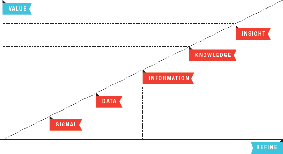
Dave Campbell, a Technical Fellow at Microsoft who works on solving problems surrounding big data, presented one model of this transformation. We see the evolution from Signal > Data > Information > Knowledge > Insight as refinement increases, outlined in Figure 7.1. This process is similar to the DIKW Hierarchy— typically used in a more philosophical context—which presents the key components of Data > Information > Knowledge > Wisdom.
Figure 7.1: Dave Campbell’s model of information refinement.
Displaying data in interactive visualizations makes it easier to transform this data into information because it’s grouped in meaningful ways that allow viewers to recognize trends, patterns, and correlations, which are also referred ...
Read now
Unlock full access


 O’Reilly covers everything we've got, with content to help us build a world-class technology community, upgrade the capabilities and competencies of our teams, and improve overall team performance as well as their engagement.I wanted to learn C and C++, but it didn't click for me until I picked up an O'Reilly book. When I went on the O’Reilly platform, I was astonished to find all the books there, plus live events and sandboxes so you could play around with the technology.I’ve been on the O’Reilly platform for more than eight years. I use a couple of learning platforms, but I'm on O'Reilly more than anybody else. When you're there, you start learning. I'm never disappointed.I'm always learning. So when I got on to O'Reilly, I was like a kid in a candy store. There are playlists. There are answers. There's on-demand training. It's worth its weight in gold, in terms of what it allows me to do.