DASHBOARDS
Dashboarding is an area that has been using information design to communicate key business metrics for decades. In terms of purpose, these interfaces have embodied many of the best practices surrounding visual communication. Yet their aesthetic and creative value is often lacking (Figure 7.2). This is an area of great opportunity in business communication; while well intentioned, the dashboard’s traditional format and appearance could benefit from a bit of a makeover.
Figure 7.2: Example of traditional dashboard design.
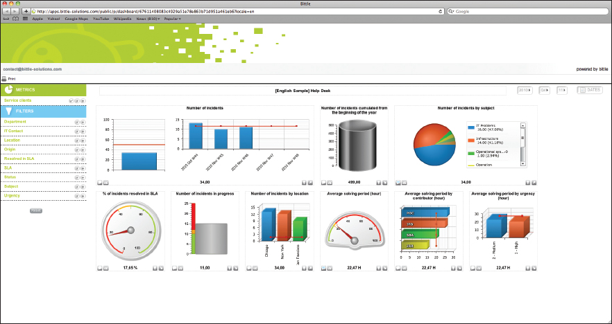
It’s easy to see that traditional dashboard inclusions are designed to make analysis incredibly simple for the viewer. They reduce an entire organization’s worth of data to a few line charts, fuel gauges, and traffic-light-style color coding. Each business is unique, and as with all design, dashboards should cater to the information they display. Since companies now track more of the data that will inform their decisions, it is appropriate that they begin to think of new ways to display them. Creative and innovative use of infographics has made it possible to display more data in less space, thus providing viewers with greater insight in the same amount of time.
Individuals and organizations can apply infographic thinking in a few different areas to improve the way that they report data, regardless of the audience. One example might be analytics programs ...
Get Infographics: The Power of Visual Storytelling now with the O’Reilly learning platform.
O’Reilly members experience books, live events, courses curated by job role, and more from O’Reilly and nearly 200 top publishers.

