Chapter 11
Custom Pickers
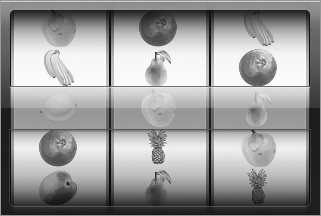
In Lesson 9 you learned about the UIPickerView class. Picker views do not have to be restricted to displaying text; in fact, they can just as easily display images, or a combination of images and text. In this lesson you learn how to provide your own UIView subclasses for individual elements of a picker view, thus creating pickers that have images instead of text, as shown in Figure 11-1.
The key to implementing this functionality lies in three optional methods of the UIPickerViewDelegate protocol:
- (CGFloat)pickerView:(UIPickerView *)pickerView
           widthForComponent:(NSInteger)component;
- (CGFloat)pickerView:(UIPickerView *)pickerView
           rowHeightForComponent:(NSInteger)component;
- (UIView *)pickerView:(UIPickerView *)pickerView
            viewForRow:(NSInteger)row
            forComponent:(NSInteger)component
            reusingView:(UIView *)view;
You can customize the width of each picker component by returning an appropriate value from the pickerView:withForComponent: delegate method (Figure 11-2).
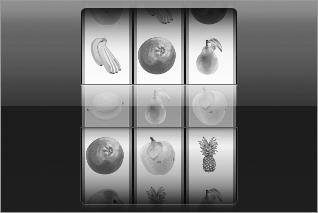
If you do not implement this method, the picker view distributes the available width equally between its components.
The pickerView:rowHeightForComponent: delegate method enables you to specify the height of each row in a given component. All rows in a component ...
Get iPhone and iPad App 24-Hour Trainer now with the O’Reilly learning platform.
O’Reilly members experience books, live events, courses curated by job role, and more from O’Reilly and nearly 200 top publishers.

