Chapter 15
Tab Bars and Toolbars
Lesson 12 illustrated navigation as one view controller pushing another view controller onto the navigation stack throughout the use of the navigation bar. Navigation bars arrange the presentation of data in a hierarchy by drilling down, and providing a path back to the root view.
This lesson presents two other navigation components:
- Tab bars
- Toolbars
Tab Bars
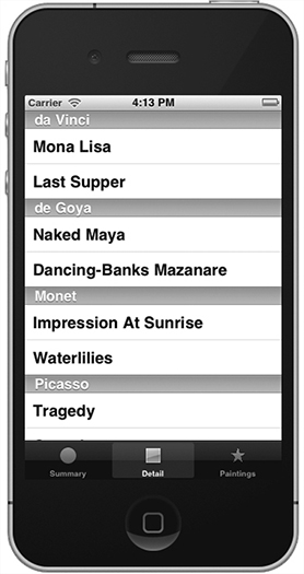
While not always followed in the real world of app development, Apple in its User Interface Guidelines proposes that the philosophy behind tab bar views is to provide a different perspective of the same set of data by using several view controllers, as shown in Figure 15-1.
Appearance Characteristics
Tab bars reside in a tab bar controller located at the bottom of the view, which manages the display of the multiple view controllers. The tab bar display consists of an icon and text to describe the perspective it represents. The tab itself has the ability to provide additional information that the applications may have to offer. The badge itself has the appearance of a red oval that will display a number or exclamation point. For example, when you may have any app updates from the AppStore the number of updates are displayed in a red oval.
The limitation for tab bars on the iPhone is that the tab bar cannot display more than five tabs at a time. If there are more than five tabs, ...
Get iPhone and iPad App 24-Hour Trainer now with the O’Reilly learning platform.
O’Reilly members experience books, live events, courses curated by job role, and more from O’Reilly and nearly 200 top publishers.


