March 2017
Intermediate to advanced
821 pages
18h 21m
English
The only change made in the Bootstrap 4 grid system is that a new extra-large breakpoint has been added. The class prefix for this breakpoint is .col-xl-. Here are the Bootstrap 4 grid breakpoints after this new addition:
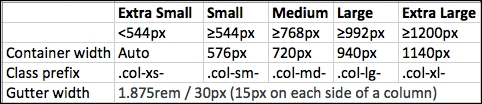
The .col-xl- breakpoint targets screen sizes of 1200px or larger, which was targeted by .col-lg- in Bootstrap 3. Therefore, this makes other breakpoints compress to target smaller screen sizes than they used to in Bootstrap 3. Here, you can see that .col-xs- now targets a screen width of less than 544px instead of the 768px it did in Bootstrap 3, making it easier to target mobile devices and have different layouts ...
Read now
Unlock full access


 O’Reilly covers everything we've got, with content to help us build a world-class technology community, upgrade the capabilities and competencies of our teams, and improve overall team performance as well as their engagement.I wanted to learn C and C++, but it didn't click for me until I picked up an O'Reilly book. When I went on the O’Reilly platform, I was astonished to find all the books there, plus live events and sandboxes so you could play around with the technology.I’ve been on the O’Reilly platform for more than eight years. I use a couple of learning platforms, but I'm on O'Reilly more than anybody else. When you're there, you start learning. I'm never disappointed.I'm always learning. So when I got on to O'Reilly, I was like a kid in a candy store. There are playlists. There are answers. There's on-demand training. It's worth its weight in gold, in terms of what it allows me to do.