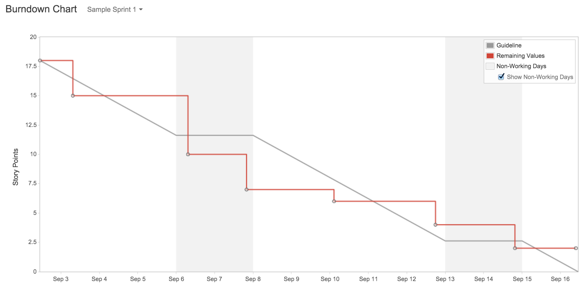
The burndown chart shows you a graphical representation of the estimated or ideal work that is left to be done versus the actual progress. The gray line acts as a guideline for the projected progress of the project and the red line is the actual progress. In an ideal world, both lines should be as close to each other as possible as the sprint progresses each day: