Example of a Dynamic Bubble Plot
This example uses the PopAgeGroup.jmp sample data table, which contains population data for countries and regions around the world. Examine the relationship between the proportion of younger and older people in the sample populations.
1. Select Help > Sample Data Library and open PopAgeGroup.jmp.
2. Select Graph > Bubble Plot.
The launch window appears.
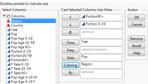
Figure 8.2 The Bubble Plot Launch Window

3. Select Portion60+ and click Y.
The portion of the population that are 60 years or older becomes the y coordinate.
4. Select Portion 0-19 and click X.
The portion of the population that are 0-19 years becomes the x coordinate. ...
Get JMP 13 Essential Graphing now with the O’Reilly learning platform.
O’Reilly members experience books, live events, courses curated by job role, and more from O’Reilly and nearly 200 top publishers.

