© Arshad Khan 2016
Arshad Khan, Jumpstart Tableau, 10.1007/978-1-4842-1934-8_32
32. Axis Formatting
Arshad Khan1
(1)Fremont, California, USA
Objective: This exercise demonstrates how to format the chart axes and display labels
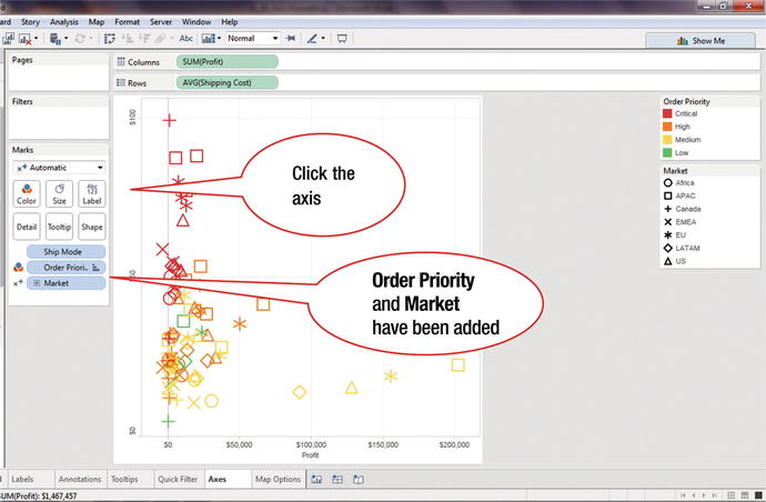
Figure 32-1 displays the sum of profits vs. the average shipping cost as a scatter plot. On the Marks card, Order Priority has been added to the Color shelf, while Market has been added to Shape.
Click the vertical axis, as shown in Figure 32-1, which leads to the display shown in Figure 32-2, where the axis is highlighted
Figure 32-2. Axis highlighted
Right-click the axis, ...


