Common plots used in statistical analyses
Having seen how to create, lay out, and annotate time-series charts, we will now look at creating a number of charts, other than time series that are commonplace in presenting statistical information.
Bar plots
Bar plots are useful in order to visualize the relative differences in values of non time-series data. Bar plots can be created using the kind='bar' parameter of the .plot() method:
In [24]:
   # make a bar plot
   # create a small series of 10 random values centered at 0.0
   np.random.seed(seedval)
   s = pd.Series(np.random.rand(10) - 0.5)
   # plot the bar chart
   s.plot(kind='bar');
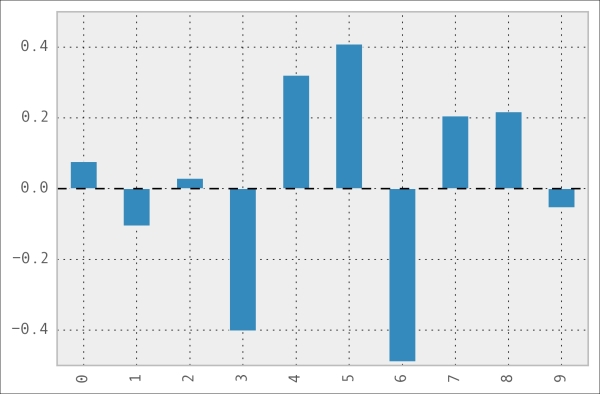
If the data being plotted ...
Get Learning pandas now with the O’Reilly learning platform.
O’Reilly members experience books, live events, courses curated by job role, and more from O’Reilly and nearly 200 top publishers.

