6 6
p82
Job no:82185(CTP) Title : RP-Logolounge 2 Client : Pro-vision
Scn :
#
175 Size : 228.6(w)279.4(h)mm Co : M6 C0 O/P: CTP
Dept : DTP D/O : 27.08.04 (Job no:000000 D/O : 00.00.01 Co: CM0)
Black Text
Job no:8
Scn :
#
1
Dept : D
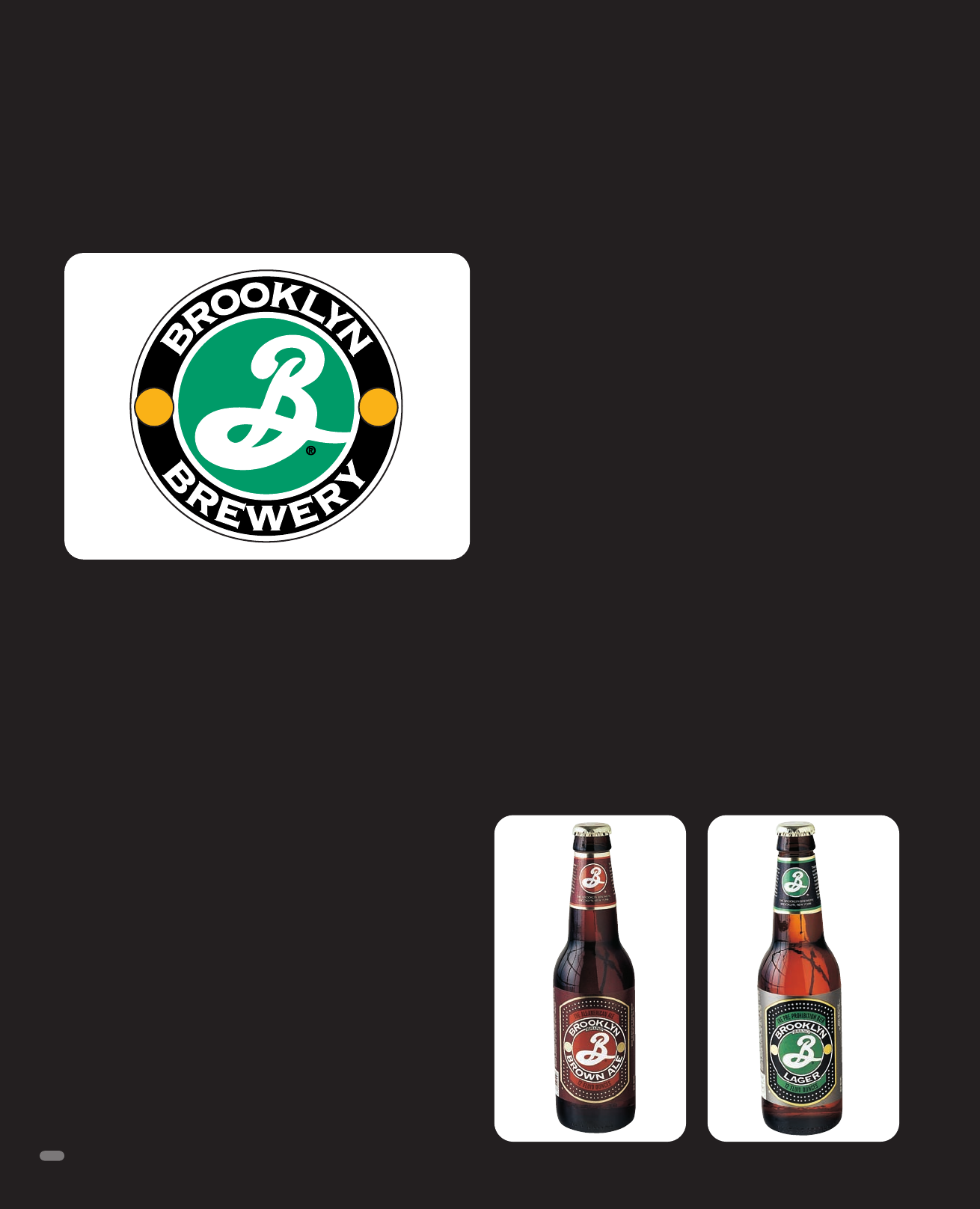
Brooklyn was home to forty-eight breweries a century ago, each
with its own culture and loyal neighborhood of customers. The
taverns that sold the locally brewed products were important
centerpieces in the borough’s neighborhoods, and the families
who started the breweries held positions of civic and social
importance.
Unfortunately, in 1976, the last of these local businesses was put
under by large Midwestern breweries. But in 1987, a former AP
foreign correspondent, who had taken up home brewing while
living in the Middle East where beer is not available, and his
Brooklyn neighbor, then a lending bank officer, brought brewing
back to Brooklyn.
The partners contacted Milton Glaser to create an identity for their
new company, Brooklyn Brewery. Glaser liked the company for sev-
eral reasons. First, he says the products taste terrific. “It’s made
intelligently. The brewmaster is very good, and the beer is as good
as anything you can get in Europe.” Second, he felt it would be a
great accomplishment to bring back this piece of local history.
Originally, the client wanted to call the company The Brooklyn
Bridge Brewery, but at Glaser’s recommendation, dropped the
“Bridge” portion to make the product feel more inclusive. In fact,
the team wanted to create an identity that looked vaguely Euro-
pean. The beer has a very intense taste, as European varieties do.
“The labeling we created is more minimal than the national
brands,” Glaser says. “People remember it when they see it. They
don’t associate it with American beers.”
But the identity he created does have one distinctly American
trait. The swooshing B in the logo reminds many people of base-
ball—specifically, the Brooklyn Dodgers. Glaser acknowledges
this reference to classic Brooklyn. It cashes in on the value of
local nostalgia and history, casting a fond eye back to when the
Dodgers were just as much a part of the borough as the neigh-
borhood beer.
The gold, green, and black logo that Glaser created transfers eas-
ily to differently colored labels, accommodating the company’s
eight lines of beers, plus some seasonal specialties.
Creating a new mark, especially one that must thrive in a market
with many prevailing products, is a balancing act. The logo must
fit the product category or buyers won’t understand what the
packaging contains. But it can’t lapse into similitude, either.
“European- or imported-beer drinkers have expectations, but
there are also the expectations of American beer buyers, which
might be shifted,” Glaser says. “You have to consider the context
of the product and be novel. It’s definitely a balancing act.”
Brooklyn Brewery
Identity and Package Design
Milton Glaser, Inc., New York, New York
82
LL2 070-083/M6 26/8/04 11:26 AM Page 82
Get LogoLounge 2 now with the O’Reilly learning platform.
O’Reilly members experience books, live events, courses curated by job role, and more from O’Reilly and nearly 200 top publishers.

