Design Firm
Client
Project
58
LogoLounge 5
Al Ahli Bank of Kuwait (ABK) is one of the Arabian Gulf’s most established
banking institutions with eighteen retail branches in Kuwait and an overseas
branch in the UAE. The bank has a successful history serving public and
private investors since its creation in 1967. When the bank’s management
decided it was time for an identity renewal, it was clear that the challenge
would be balancing the bank’s history with its modern vision for the future
in a region where tradition equals trust for many customers.
The bank selected Origin Communications based in Dubai to undertake
the project. “Origin’s success stems from over fi fteen years of working in
the Arabian Gulf, accumulating vast regional experience in a constantly
evolving market,” explains Origin design director Trevor Halton. “Our team
is made up of many nationalities including a number of Arabic staff, and we
deal with consultants in many Middle Eastern countries.”
“We wanted to refresh the existing brand but were aware that we had to
keep a link to the existing identity. Customer loyalty could erode with a
drastic change. With a rapidly growing populace in the country, we wanted
to create a more youthful image. Sixty percent of Kuwaitis are in their upper
twenties. This changing demographic is having a real infl uence on branding
in the country,” notes Halton. “The bank is expanding around the region
into markets where it is not yet established. To attract new accounts, they
needed a fresher brand to compete in a dynamic market.”
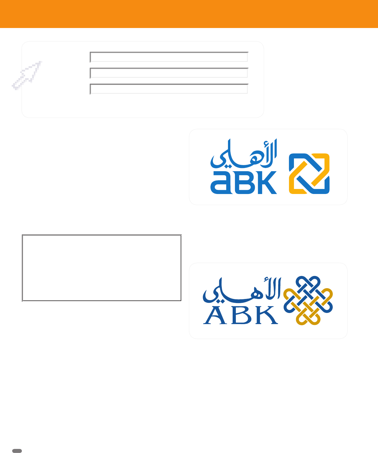
The bank’s original logo had been in place for five years. The icon is
believed to have been based on a symbol derived from a Persian coin. Its
shape was quite complex. It was clear that a cleaner icon could strengthen
its visual impact from a distance. The Latin letter portion of the old logo
was set in a font probably meant to match the accompanying Arabic cal-
ligraphy, but its readability was not ideal. The colors used in the logo were
also re-evaluated.
The new identity for ABK (Al Ahli Bank of Kuwait) is modern and
corporate, yet it is based on a pattern found in a Persian mosaic.
The design, created by Origin Communications, has some
resemblance to the bank’s previous design but has more
“shelf presence.”
ABK’s original identity did not have a warm, modern feel that the
bank desired. The color palette was drab, and many competitors
also used blue. The use of all capital letters was neither friendly
nor especially readable.
The bank is expanding around the region into
markets where it is not yet established. To
attract new accounts, they needed a fresher
brand to compete in a dynamic market.
Corporate Identity Redesign
Al Ahli Bank of Kuwait (ABK)
Origin Communications
TEXT
Black
(Provision RP) Logo Lounge 5
D209-128 / 4272 1st proof1st proof
LL5 058-069_NC_5C.indd 58LL5 058-069_NC_5C.indd 58 2/25/09 10:28:46 PM2/25/09 10:28:46 PM
Get LogoLounge 5 now with the O’Reilly learning platform.
O’Reilly members experience books, live events, courses curated by job role, and more from O’Reilly and nearly 200 top publishers.

