174
West Side Organics is a Hayward, California-based start-up com-
pany that delivers fresh, organic products to consumers in the San
Francisco Bay area. Its founders wanted potential customers to
perceive the new operation as a convenient, healthy, and hip part
of their lives. At the same time, they wanted an identity that would
clearly convey what they called “organicity” to all audiences.
Ash Sud, CEO of West Side Organics, contacted Grapefruit
Design of Iasi, Romania, because he wanted to work with an
agency that understood his unique business model and was able
create a brand that would position his company as a leader in the
organic mar
ketplace.
“We entered a rapidly growing market that had established com-
petitors and realized the importance of creating instant brand
awareness. We wanted to emotionally connect with our cus-
tomers,” Sud says.
Of course, the new company had no brand awareness in their target
market (middle- to upper-income people who want to be healthy but
don’t have time to shop) and, on top of that, low niche awareness.
“In spite of organic foods becoming more and more mainstream
these days all over the world, few people know that fresh,
organic produce is actually available for regular delivery to
their door i n major urban areas,” notes Grapefruit Design Chief
Creative Officer Mar
ius Ursache.
Ursache likes to use simple, widely recognized icons. For this proj-
ect, the leaf—an element common to fruits and veggies—was cho-
sen for its simplicity and associations with nature, purity, and health.
The designers selected Info, from FontFont, as the typeface. The
smooth, round shape of the letterforms creates a modern, friendly
look, as do the all-lowercase letters.
“While trying to keep the symbol very simple, I realized that using
asingle, simplified leaf would fail to create a memorable logo,
since it was too generic,” says Ursache. “On the other hand, a
fru
it or a vegetable would have appeared more complicated and
restricted the message the logo needed to convey. So a bunch of
leaves imposed itself as the simplest and most straightforward
solution.” A foliage pattern was created to carry the identity over
to most of the company’s collateral, such as their delivery vehi-
cles. It is an extension of the logo and transmits the same values:
freshness, naturalness, and healthfulness.
Grouping leaves in a bunch further stresses the notion of good-
ness and makes the symbol much more recognizable. Like all the
elements in the logo, the leaves have smooth angles, creating a
soft, modern look.
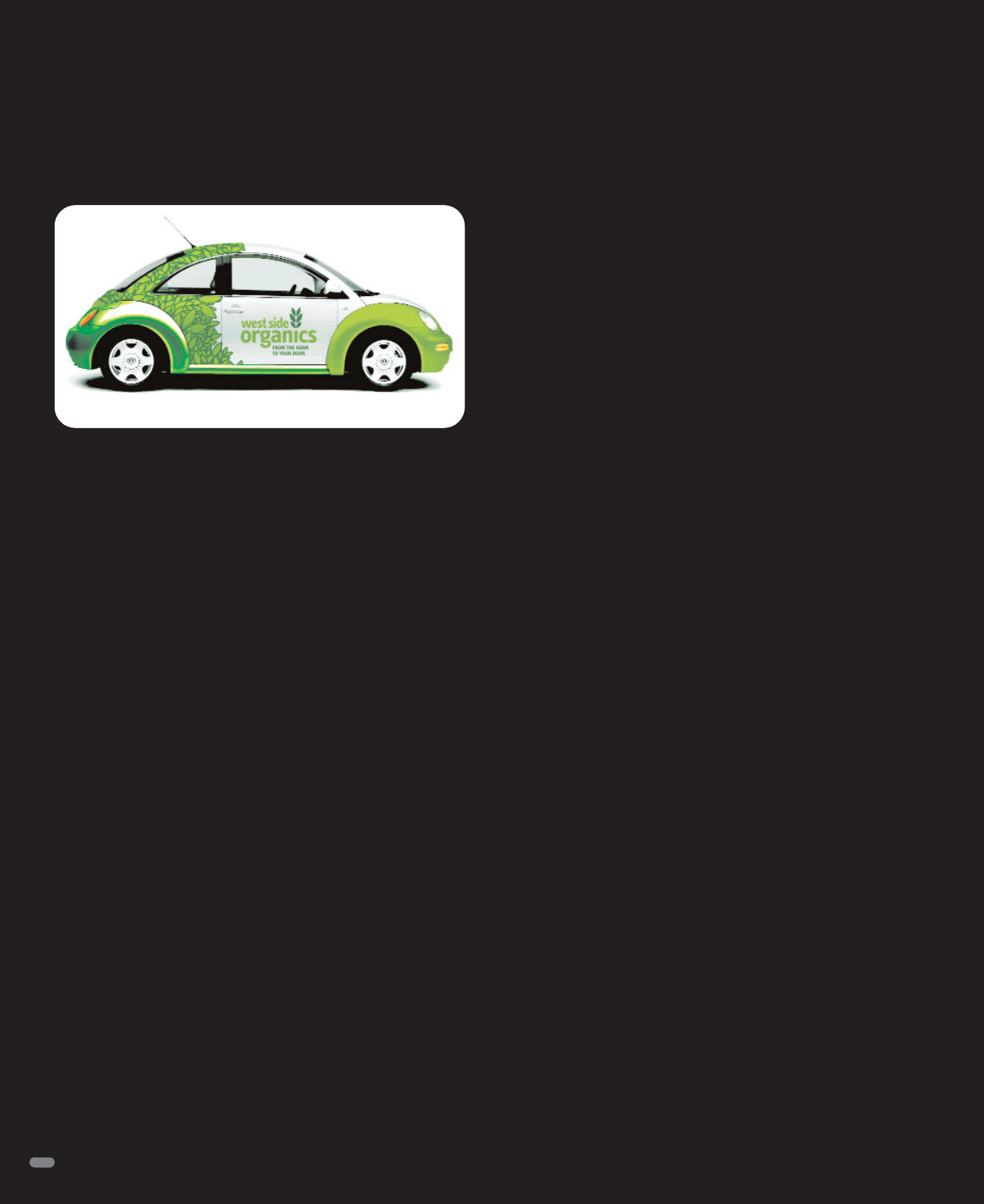
The delivery vehicles have served as the most public manifesta-
tion of the identity thus far, and have already become a popular
icon in the Bay area. The surface of the company’swhite vans
is
about one-quarter a painted jungle of leaves, and the owner’s own
Volkswagen Beetle also received the leafy treatment over nearly
half of its body. The vehicles’ li ght back ground colors enhance the
shades of green Ursache specified and keep the contact informa-
tion visible, making the autos eye-catching curiosities.
As a direct result of their branded vehicles and logo, West Side
Organics has reported a signifi cant increase in its customer base
and revenue, as well as sustained press coverage in major local
newspapers. “When customers see our leaf-covered delivery van
dri
ve up, there is no doubt about who is delivering their food,”
says Sud.
“The best thing about the design,” Ursache says, “is i ts immense
versatility, despite its simplicity. The two shades of green and the
leaf motif allow for almost boundless creativity while keeping any
future designs well in line with the company’s corporate identity.
The design gives us as much freedom as we want in any [appli-
cation]—for stationery, product packaging, signage, and so on.”
West Side Organics
Identity Design
Grapefruit Design, Iasi, Romania
Get LogoLounge now with the O’Reilly learning platform.
O’Reilly members experience books, live events, courses curated by job role, and more from O’Reilly and nearly 200 top publishers.

