Perform the following steps to visualize a dataset:
- Load the iris data into the R session:
> data(iris)
- Calculate the frequency of species within the iris using the table command:
        > table.iris = table(iris$Species)
        > table.iris
        Output:
              setosa versicolor  virginica
         50         50         50
- As the frequency in the table shows, each species represents 1/3 of the iris data. We can draw a simple pie chart to represent the distribution of species within the iris:
        > pie(table.iris)
        Output:
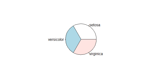
The pie chart of species distribution
- The histogram creates a frequency plot of sorts along the x-axis. The following example produces a histogram ...

